weekly pjm1's 52 in 2014 week 52 (Support) added... FINISHED!

As an ex forces member I always appreciate when people take such poignant photographs as these and offering crit, I always find difficult.

The low perspective works really well, the DOF is bang on, the hint of orange from the sunset really makes a cracking photograph.

Crit, oooffff, bugger it....I can't crit this one.

Thanks for posting (y)

Cheers.

Thanks Andy... anyone who puts their lives on the line for us all is a superstar to me :)

Glad you like the photo and it was a pleasure taking it. Sunrise photo felt a lot more "joyous" than taking a sunset one, given the subject.

Definitely one of those that I've been particularly pleased with - sometimes things just click. Cheers!
 
Hi Paul :)

Re-Shoot STRONG - Composition wise very nice, a nice looking old castle, shame about the sky as you say, the low PoV is what makes it work for me, makes it look very imposing !!!

Close - Ahhhh very nice idea, like how you did the lighting, the flare on the lens is very effective, the DoF certainly helps the Close feel, my only crit would be to possibly clone out the bottom of your speedlight or is that a trigger ?? - anyhow, bang on theme (y)

Live - Now this is similar to what I was originally thinking, either a meter or testing screwdriver... finally got out today so did neither :D

I like your letterbox crop but think the bottom of the meter is a tad tight, as you say it's a great background,
and for me the cables stand out a treat, especially the live, so works well for me :)
 
It's a trigger, Dean! Speedlights left and right :)

Thanks for the comments - Strong reshoot wasn't quite as strong as I wanted (photographically) but glad it ticked a box for you. Skies are what they are - not much we can do sometimes!

Cheers :)
 
Yep, colour and exposure looks good on my cheap uncalibrated laptop :p:D

Excellent image Paul, love the dof, detail where it's needed (y)......not sure on the crop,but maybe its not cropped at all :)
 
Strong - you've made a good job of tweeking the sky - very atmospheric and an extremely strong-looking castle!

Close - nice dof and I like the composition showing the whole of your hand and the suggestion of movement of your "trigger" finger (y)

Live - I think you've been a bit hard on yourself with the livewires shot. I really like the composition, mix of colours and, of course, the very black background! But the remembrance shot is superb! We've all seen plenty of shots of the poppy display by now, but this take on it is far more original and the slightly muted colours in the bg prevent give the right balance of sentimentality without it looking too fake and mawkish.

Thanks Elaine... I'm quite good at being harsh on myself :) It's the way I like it... and the best pressure is that which you place on yourself, IMO.

Thank you for the very kind comments - not perfect shots by any stretch, but a couple I'm pleased with.

Onwards and moving ever closer towards the finishing line... Week 45, First.

I had a simple idea for this - a winner's medal and certificate. Fortunately, my son was declared a "winner" by virtue of being good in nursery, so I think that counts :)


First: proud parents
by pjm1 (Paul), on Flickr

I actually started off shooting this on a black glass table, but I couldn't get the reflections to look right - I ended up with triple or even quadruple reflections for some reason. A nice black gloss marble would have worked a treat, but sadly our kitchen is a rather strange patterned Corian (not our choice at all!) So, after some quick thinking, I decided our bath makes the perfect infinity curve even if it is a touch difficult to get into to in order to take the actualy photo! I can't say I'm hugely excited by this shot because I really wanted a high gloss black background, but just couldn't get it to work. Very frustrating...

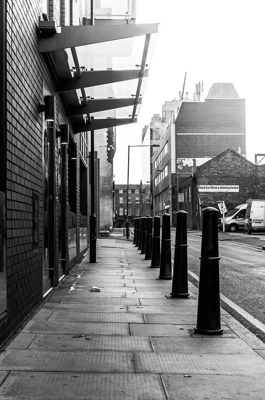
But then I've been mucking around with a bit of street photography (aka "outdoors pictures converted to B&W...") and a photo at first light seemed to work for me, even though somewhat devoid of subject:


First light
by pjm1 (Paul), on Flickr

Two totally contrasting styles, but that's half the fun sometimes...
 
Can just make out the super star award here, I think its important, but obviously needs to be oof. Nice and bright, without burning my eyes out, good colours. Was the starburst on the certificate or have you added it?


Your street shot looks like a great start, just really does need a subject. That bit of litter is almost enough, maybe a bin bag or something would do it. Not necessarily a person.

Processing is good though, liking the bright sky top right. Natura lighhtl or radial filter??

Hi Graham, thanks for the comments - quick off the mark :)

Yes, had a bit of a play with different looks on the first First shot... decided on pretty shallow DOF at f/2.8 and a decent level of light without blowing. The starburst was already there and I hadn't noticed until I pulled the image into LR... I was quite pleased with my accidental placement of it!

The street shot (which I shall confusingly call the second First shot) was fun and I think with a bit more litter it might make for a more interest photo. There was a touch of light spill TR but it was barely noticeable so I boosted it with a +1EV (I think) grad filter in LR as you guessed :) - actually linear rather than radial but it was subtle enough for that not to really matter...

Cheers!
 
Hi Paul, simple idea indeed but not always the easiest to pull off I think you have got it just right in terms of lighting, DoF and the composition, who'd have thunk it a bath, nice bit of improv (y)

The second one does lack a little something as Graham says some kind of object, nothing wrong with it just doesn't hold the attention,
did have me confused at first look without the explanation wasn't sure what you were getting at, nice conversion though.

Thanks Allan... the first one was quite different from the intended shot but I have to say, a bath is quite a good place to shoot if you want lots of diffuse light! Just need a chiropracter to sort out my back after folding myself up to take the shot...

Second was even more of an experiment in some ways - I haven't taken street shots before (apart from a brief muck around in France) so was really just playing around. The light was lovely so in some ways it was a crime to convert to B&W... I'm looking forward to doing a few more over time, especially during the winter when more people are up & about at first light.

Cheers for looking and commenting (y)
 
Ok, no mucking around this time - I had an idea for one of my last catch up shots (week 2, play) and set it up and grabbed it.

Had to do a tiny tweak in post to get the look I was after and that's it...


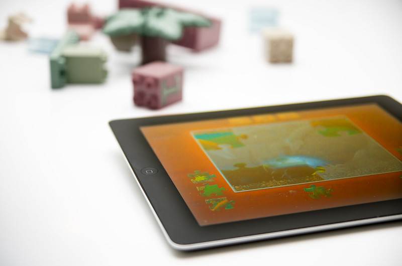
Modern play...
by pjm1 (Paul), on Flickr

(to be fair my son currently still prefers his lego to the iPad... just!)

Rather strangley there was a slight vignette on all corners except the bottom left. So to "correct" I decided to add one there too, rather than remove the others - it felt the right thing to do in the circumstances...
 
Hi Paul ....every time I hop on here you've been so busy :)

Live .... I love the composition ...the single cross with the writing on makes it very poignant, a really super well thought out image. I really wish I had made it to see the display.

First .... a perfect choice in with the medal and the super star award, I really like the DOF and the focus on the medal....these little things are always special aren't they :)

First Light I think loses it's link to the topic by being b&w, although it's an interesting shot and does suit the b&w, I really like the aspect. I did some b&w industrial stuff up at my sons in Middlesbrough last week and really enjoyed it.

I'm not too sure about Play ....I can see the thinking behind the idea and I do like the use of the ipad. Maybe you could have included your son in the image somewhere ...although they never sit still when you want them to !
 
Cut - Hits the theme although I'm not so keen on the text albeit I groaned from the humour.

Balance - You've done a good job on lighting this one as given that the trophy is silver there'd be reflections everywhere. Super sharp as well. Locating the subject off centre

Change - Loving this one. It's not just change - you've added a whole story to this. Very clever. Even the tone you've added is well suited to the subject. A big thumbs up from me.

Big - Wow. You've really done a super job with this one. You've obviously planned ahead and thought about the approach and techniques. I had a couple of quick goes at astro shots but both times have been spur of the moment and you can tell the difference between those and your excellent image. It's also great to hear you've had fun and learnt from the exercise - always a bonus.

Grow - This is my favourite image of this bunch I'm catching up on. Again creative thinking with the nicely positioned tomatoes all a different shade from green to red and left to right. I even like the fact you've blended the music sheet into the table. My only feedback would echo Posiview's liking of odd numbers but please see that as my preference rather than a crit of your image.

Reshoot - Good lead in towards the castle. It doesn't look the best weather photography wise but you've handled the exposure well. I'd have been tempted to straighten the walls which I guess have been accentuated by the lower POV - unless the castle is like that of course LOL

Close - That's definitely a mirror shot given which side you shutter finger is on. The DoF is good but I think you'd have seen more of the camera and you if the lens hood had been removed.

Live #1 - Bugger! This was my idea as well. It's the addition of the multimeter, nicely thrown oof, that really boosts this one. You've got the wires spot on focus wise and with just the right amount of lighting

Live #2 - Double bugger! Another idea gone. After dropping the electrical idea I thought about Remembrance Day and all the lives that were lost. This is absolutely spot on and taken at the right time of day to get some nice muted colours. using the backdrop of that wonderful poppy display at the Tower of London is inspired. Well done.

First #1 - Nice idea. Great use of a shallow DoF with nice bright colours and exposure. Should all the corners be included in the shot? I don't think so. Nice one.

First #2 - I'm struggled with this one I'm afraid. I feel it's in need of something for the eyes to fix on as I keep gazing around the image trying to settle.

Play - Modern and old. Nice thinking. I do hope the future of traditional toys and games continues. As much as I believe in technology, I do feel children still need that grounding in practical hands on things in their lives.
 
Hi, First #1 is a belter. Looks really fresh, clean, well composed and lovely vivid colours. Big clap to your son for winning the medal, bet he was really chuffed :)

First #2, B&W works well, but doesn't scream first to me. I'd like to see someone in the photograph, perhaps walking away from you.

Play, Isabelle spend way too much time on her Pad....then again, so do I :) It's on theme, nice subtle shadows under the iPad, light looks a little uneven in places.

Good catch up and are you uptodate now??

Cheers.
 
Hi Paul, works for me because of the juxtaposition of the old and new, nice DoF the lego only just being visible as it where, nice composition and well lit considering that shiny screen

Is the lego colour slightly muted? as it looks like it on my screen, but I could be wrong
 
Blimey... they keep coming here... can't wait till 2015 when you can only post one a week lol :D

First - Super sharp image this, liking your placement with the angled cert, being ubber picky I would be tempted to clone the small blemish on the bottom of the medal, back to reality very little to fault Paul, a lovely bright image (y)

First Light - I like the street shot despite no people, the corridor produced by the wall, canopy and pillars, just feel the top rh is too washed out, so definitely first image for me :)

Play - Hmmmmm not sure on the placement/clip of ipad, the base leads to the blocks nicely, but my eyes don't settle on anything, I'm liking the idea showing the now broad spectrum of childs toys and also like the pastel colours :)
 
Hi Paul

1st First shot I like , nice n clean, colors that pop,good focus & a lovely white bg...(y) Image the black BG you wanted would also have worked well & looked quite stylish - plenty of time for a reshoot ......

Street shot I like for the mono conversion (y) but,as per others comments, feel it needs something...a person walking away or towards maybe ?


Play.....Like the placement of the ipad & focus on the off/on button , well lit but slightly darker corners , only niggle is the DOF.....think I'd like slightly more just to give a touch more definition to the lego & bits.......
 
First - a simple idea that fits well with the theme, but as you rightly say, the simple ideas are sometimes the most difficult to actually set up! I love your idea of shooting it in the bath. It's kind of similar to mine of using the bottom of my fridge, but the bath gives you so much more scope for playing around with the angles and lighting AND you don't have to worry about leaving the fridge door open for too long. I can see myself pinching that one at some time in the future :clap:

The street shot is spot on for its composition and all those angles that draw your eye to the end of the road, but I have to agree that it's missing something and it's a shame that the building at the end didn't have a bit more going for it.

Play - I like the dof, colours and focus on the iPad, but I'm not too sure about all the white space in the bottom left corner and wonder whether including a hand actually touching the screen would have emphasised Play a little more.
 
Hi Paul ....every time I hop on here you've been so busy :)

Live .... I love the composition ...the single cross with the writing on makes it very poignant, a really super well thought out image. I really wish I had made it to see the display.

First .... a perfect choice in with the medal and the super star award, I really like the DOF and the focus on the medal....these little things are always special aren't they :)

First Light I think loses it's link to the topic by being b&w, although it's an interesting shot and does suit the b&w, I really like the aspect. I did some b&w industrial stuff up at my sons in Middlesbrough last week and really enjoyed it.

I'm not too sure about Play ....I can see the thinking behind the idea and I do like the use of the ipad. Maybe you could have included your son in the image somewhere ...although they never sit still when you want them to !

Thank you Susie... Live was a lovely one to capture and really pleased I happened to be down when it was on.

First - well, I'm pleasantly surprised the first first was such a hit (relatively speaking) but thank you :)

The second first was genuinely a bit more of an experiment and it worked as such, but not as an image....

Play - well, thanks to everyone's feedback I have a new one to post shortly ;)

Thanks as always for the detailed comments!
 
Cut - Hits the theme although I'm not so keen on the text albeit I groaned from the humour.

Balance - You've done a good job on lighting this one as given that the trophy is silver there'd be reflections everywhere. Super sharp as well. Locating the subject off centre

Change - Loving this one. It's not just change - you've added a whole story to this. Very clever. Even the tone you've added is well suited to the subject. A big thumbs up from me.

Big - Wow. You've really done a super job with this one. You've obviously planned ahead and thought about the approach and techniques. I had a couple of quick goes at astro shots but both times have been spur of the moment and you can tell the difference between those and your excellent image. It's also great to hear you've had fun and learnt from the exercise - always a bonus.

Grow - This is my favourite image of this bunch I'm catching up on. Again creative thinking with the nicely positioned tomatoes all a different shade from green to red and left to right. I even like the fact you've blended the music sheet into the table. My only feedback would echo Posiview's liking of odd numbers but please see that as my preference rather than a crit of your image.

Reshoot - Good lead in towards the castle. It doesn't look the best weather photography wise but you've handled the exposure well. I'd have been tempted to straighten the walls which I guess have been accentuated by the lower POV - unless the castle is like that of course LOL

Close - That's definitely a mirror shot given which side you shutter finger is on. The DoF is good but I think you'd have seen more of the camera and you if the lens hood had been removed.

Live #1 - Bugger! This was my idea as well. It's the addition of the multimeter, nicely thrown oof, that really boosts this one. You've got the wires spot on focus wise and with just the right amount of lighting

Live #2 - Double bugger! Another idea gone. After dropping the electrical idea I thought about Remembrance Day and all the lives that were lost. This is absolutely spot on and taken at the right time of day to get some nice muted colours. using the backdrop of that wonderful poppy display at the Tower of London is inspired. Well done.

First #1 - Nice idea. Great use of a shallow DoF with nice bright colours and exposure. Should all the corners be included in the shot? I don't think so. Nice one.

First #2 - I'm struggled with this one I'm afraid. I feel it's in need of something for the eyes to fix on as I keep gazing around the image trying to settle.

Play - Modern and old. Nice thinking. I do hope the future of traditional toys and games continues. As much as I believe in technology, I do feel children still need that grounding in practical hands on things in their lives.


Wow Peter, that's a massive catcup with some great detail given the number of photos you've commented on... thank you!!

Really pleased that Big, Change, Grow and Live have worked for you - thanks for the very positive comments.

And for all of them thanks for the detailed crit which is really helping me! :) (y)
 
Hi, First #1 is a belter. Looks really fresh, clean, well composed and lovely vivid colours. Big clap to your son for winning the medal, bet he was really chuffed :)

First #2, B&W works well, but doesn't scream first to me. I'd like to see someone in the photograph, perhaps walking away from you.

Play, Isabelle spend way too much time on her Pad....then again, so do I :) It's on theme, nice subtle shadows under the iPad, light looks a little uneven in places.

Good catch up and are you uptodate now??

Cheers.

Cool - thanks for the big thumbs up! Glad the first first worked for you and the other two were definitely more experimental... Something to work with, if you will :)
 
Hi Paul, works for me because of the juxtaposition of the old and new, nice DoF the lego only just being visible as it where, nice composition and well lit considering that shiny screen

Is the lego colour slightly muted? as it looks like it on my screen, but I could be wrong

Hi Allan, thanks for the feedback. That was absolutely the idea and plan, so glad it came through. And my desaturation work on the lego - well done for spotting :) Deliberate in order to convey the new taking over from the old...
 
Blimey... they keep coming here... can't wait till 2015 when you can only post one a week lol :D

First - Super sharp image this, liking your placement with the angled cert, being ubber picky I would be tempted to clone the small blemish on the bottom of the medal, back to reality very little to fault Paul, a lovely bright image (y)

First Light - I like the street shot despite no people, the corridor produced by the wall, canopy and pillars, just feel the top rh is too washed out, so definitely first image for me :)

Play - Hmmmmm not sure on the placement/clip of ipad, the base leads to the blocks nicely, but my eyes don't settle on anything, I'm liking the idea showing the now broad spectrum of childs toys and also like the pastel colours :)

Hiya Dean... thanks for stopping by again :) (Yes 2015 will be easier for us all, I think!)

I did think about cloning out the blemish but just felt it was there so the photo should show it! Glad you liked it.

Not to worry on the other two, they were me mucking around... and I have a new play :)
 
Hi PaulL

1st First shot I like , nice n clean, colors that pop,good focus & a lovely white bg...(y) Image the black BG you wanted would also have worked well & looked quite stylish - plenty of time for a reshoot ......

Street shot I like for the mono conversion (y) but,as per others comments, feel it needs something...a person walking away or towards maybe ?


Play.....Like the placement of the ipad & focus on the off/on button , well lit but slightly darker corners , only niggle is the DOF.....think I'd like slightly more just to give a touch more definition to the lego & bits.......

Hiya Lynne... thanks for the comments. Glad you liked First (first) and yes, I'd have liked to get the black BG one but maybe next time.

The other two were me mucking around and the lack of definition on the lego was intentional! Maybe a case of style over substance?

First - a simple idea that fits well with the theme, but as you rightly say, the simple ideas are sometimes the most difficult to actually set up! I love your idea of shooting it in the bath. It's kind of similar to mine of using the bottom of my fridge, but the bath gives you so much more scope for playing around with the angles and lighting AND you don't have to worry about leaving the fridge door open for too long. I can see myself pinching that one at some time in the future :clap:

The street shot is spot on for its composition and all those angles that draw your eye to the end of the road, but I have to agree that it's missing something and it's a shame that the building at the end didn't have a bit more going for it.

Play - I like the dof, colours and focus on the iPad, but I'm not too sure about all the white space in the bottom left corner and wonder whether including a hand actually touching the screen would have emphasised Play a little more.

Cool, thank you Elaine! Would definitely recommend the bathtub for shooting! Apart from specular highlights it's actually a very kind place to shoot (well, and the yoga required to position oneself!!)

Thanks for the comments which I agree with entirely and appreciate you taking the time to post them :)
 
Oh that's a much better image :clap: I love the expression on his face that really looks as if you've caught him unawares mid-play, rather it being a posed set up and the lighting is spot on. Glad to hear you shot it against a backdrop and didn't have him sitting in a cold bath ;)
 
Oh that's a much better image :clap: I love the expression on his face that really looks as if you've caught him unawares mid-play, rather it being a posed set up and the lighting is spot on. Glad to hear you shot it against a backdrop and didn't have him sitting in a cold bath ;)

Cool, thank you Elaine... glad you like it. I thought the lighting (being so fierce) might be a marmite thing... even though I really like the look.

Loving having a play with the backdrop - gives so many more options for shots (not just portraits either)... it's a bit of a pain to put up and down each time (being 2x4m and weighing 15lbs) but I'm pleased I bought it.

As for the shot, I left him sitting there playing with his iPad for a few minutes while I watched. The lights had already been tested with a prop (bear on a stool) so no need to do testers with him... once he'd forgotten why he was there i just called his name and clicked.
 
Ok, here's my entry for Week 46, Smooth.

Thought process was as follows... smooth - as a baby's bum. Well, I'm not going to stick a photo of my baby's bum on the interweb so what's a bit like that? A peach! But that's fuzzy and not actually very smooth... so nectarines it is.

The shot idea was I wanted a low key and black background shot for a change (I've have countless white backgrounds now). My new vinyl backdrop is double-sided with black on the reverse, so that's ideal. I also wanted a glossy surface and the only thing I could find was my old laptop which has a granite-effect (plastic) case. It actually gave precisely the surface I wanted :)

Onto the lighting - I wanted a strong backlight but unfortunately I couldn't position a flash in quite the right place without it being in shot (basically, directly behind the peaches from the camera's viewpoint)... so I had to move it around 20 or so degrees towards the left which meant the rim lighting was only on a tiny bit of the top-most peach (the "tail" of the fruit for want of a better description!). The backlight was tightly snooted so it was just falling on the area I wanted without spilling onto the surface.

Main lighting was from camera right level with the fruit. Flash had my lampshade diffuser on to soften the light a lot and fill in a bit more of the fruit. The edge of the diffuser was basically just at the right side of the frame, so very very close to the subject. A bit of water spray and some dodging & burning in PS just to get the look how I wanted and I'm done.

Comments very welcome folks - we're nearly there!


Smooth (and juicy)
by pjm1 (Paul), on Flickr

Edited to add: this one definitely works better viewed on flickr full screen with no title bar (f11)... and in a dark room if you really want to push the boat out :)
 
Last edited:
Hi Paul

Close - like the concept and the trouble that you have taken with the set up and the lighting. My suggestion would be to have cloned out the highlights in the lens so that it was all a deep mysterious black.

Live - like others I am not sure of the necessity of the meter at the rear, but, as you wanted to include, then I would say that you have done well on the comp and the dof. Like the lighting on the wires but pity that the main light and the shadow falls on the neutral and earth, rather than the live- so that they are much more noticeable. Not like the old colours when the live would have been a nice popping red.

Live#2 - excellent handling of the subject (y)- good comp and dof highlighting the main cross. My be just a slight exposure boost:thinking:

First - #1 - simple , colourful hits the mark. Nothing more to say
#2 - not really doing anything for me , sorry. Without the title i would not even have known your intention. Others have suggested more points of interest and perhaps that is why it does not work too well.

Play - another good concept. i was not sure of the desat of the Lego but i have read your thinking - perhaps in that case the iPod screen should be showing something with more vibrant colour because it too looks a bit muted.
#2 - good capture of your son - he really does look as if he is playing rather than posing. good colours and lighting(y) Small, small crit would be the light spill in the gap between arm and body which lands on the ipod screen.

Smooth - lovely light - I have mentioned before my likeness for northern European still life paintings and this really hits the mark. Two small points - one, i don't think that the reflection is necessary and without this the top of the pic could be larger than the bottom, and two (and this one is a bit weird) I would prefer the fruit on the LH third rather than the RH third. I know that the fruit aren't moving or looking but it is something to do with allowing space for the object to move or the subject to see IYSWIM:thinking: Bonkers:D

Hiya Alan - thanks for that comprehensive reply... much appreciated (y)

Re: Close, I like your idea and someone else (Lynne?) had a similar suggestion I think. It would be a different image, but that's ok... it's all about experimentation, this challenge (at least it is for me).

Glad Live #2 worked and you're right, a technically "correct" image would have a slight exposure lift... but for me a slightly more sombre / moody image worked better (contrast with First #1 which is probably technically overexposed by a stop or so, but again I think works in the context of the story). Live #2 was one of my favourite shots and somewhat unexpected in that I was just assuming I'd be there to take the "normal" poppy pictures... but when I spotted the little remembrance marker, I knew I'd found something more interesting...

First #1 and Play #2 - both high key shots (especially the second Play) and something I haven't played with that much. I do find high key a challenge not to blow highlights too much, but it's fun mucking around. Thanks for the positives (and you're spot on with the light spill on Play #2). Play #1 isn't perfect - you won't believe how much I had to lift the colours and contrast on the iPad as it was... the direction of flash basically made it a blank grey screen :(

I completely get what you're saying on Smooth. TBH, I was fretting more about whether the darks were too dark (which was the look I wanted, but as with all of these things you can take it too far)... but I agree the reflection isn't really prominent enough to be worthwhile. I really did want a reflection (hence the choice of a laptop as a surface!) but it hasn't quite worked, because of my lighting setup. Simply bounce flash off the ceiling would have yielded a lovely reflection, but then I wouldn't have had the lighting effect I wanted... :(

Also agree with you re: positioning on the thirds, specifically the left third. Someone (@posiview perhaps?) mentioned it's to do with reading left to right...

Also, I wanted to try to disprove the point about odd numbers sitting better in these sorts of shots... I don't think that works when you're stacking a pyramid of fruit ;)

Thanks again for commenting - plenty of food for thought! And more practice on the lighting setup (which I do enjoy...)
 
Hi Paul

Play #1 ... I agree the Lego could be a little better focused but now you've told us you desaturated it, I think yes nice work.

Play #2 ... Harsh lighting but it works. Love the backdrop, wish I had one.

Smooth ... Excellent lighting again ... you brought out some incredible colour. Hmmm ... might look more Still-life-ish (I love those too) without the reflection. o_O
 
Hi Paul, you have lit it very well (y) the rim light on the top fruit is excellent, the colour of the fruit is superb, I might have tried to bounce a little back to the front of the fruit :thinking:
but that may well have ruined the look you where going for
I am with the above comment about the reflection, not really sure its needed, well not as much as you have got in there.
 
Hi Paul .... I like the re-shoot for Play .... super shot of your little boy, well caught with the expression, you have to be quick don't you before they get fed up ! Love that white backdrop .... I would love to do some of my family with something like that, it's always hard to find a background that's not distracting.

I thought of smooth as a baby bum too ....then decided it maybe wasn't such a good idea !
However, the nectarines work for me, I'm not sure about the reflection ....it looks a slightly odd shape compared to the fruit, I think it's the very bottom one, it looks a bit too bright. But the fruit is really lovely, the dewy look on the top one, the superb colour and the texture are smashing.....I tried it in a really thick black frame and I liked it.
 
Beautiful colours and lighting. I tend to agree with Alan that I would have preferred it further over to the left and with the pointy bit pointing into the corner. Can't make my mind up about the reflection - on the one hand it gives the fruit a bit of grounding, but it does tend to distract a little from the fruit itself o_O
 
Back
Top