weekly pjm1's 52 in 2014 week 52 (Support) added... FINISHED!

$1,000 bills, helllooooo :)

I wasn't sure on the colour but it's grown on me. Nice focus on the $1,000 and the drawings add a nice touch. The lighting is soft and moody as well, so the work you put in paid off.

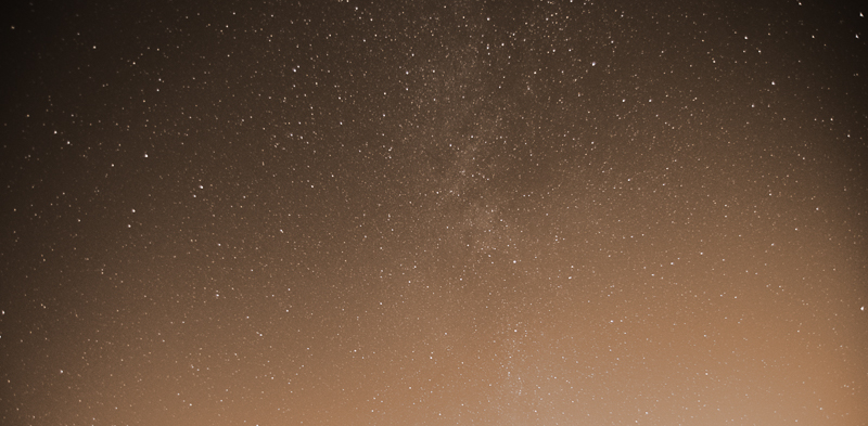
Big, cracking location and the Milky Way has some nice detail. I'd prefer more of the sky, failing that a panorama crop.

Cheers.
 
Wow! So many comments while I've been away... thank you everyone now I'll try to get round each of you in turn with follow-up :)

Hi Paul :)

Cut - Love the colour of them there carrots, liking the depth of field too, just enough on the knife to show the blade, well lit, great clean background... the quote made me smile :D

Balance - I'm with you on this, I like the highlights, it certainly helps show the shine off to a tee, composition wise it works too, and just enough shadow to ground the trophy, a nice crisp shot (y)

Change - Love how you have lit this, and the explanation of how it was done, the pp has a nice old feel to it, and again the DoF as you said captures all the relevant info were wanting to see - Like It :)

Big - Sky... WOW I love that, I can't crit that at all, sooooo much to see, wonderful colours, a fantastic sky and seascape silhouettes... bang on for me :clap:

Thanks Dean for the positive comments - I do like a pat on the back sometimes (especially when I've been away working like a trojan and can only squeeze in a few photos a week)!

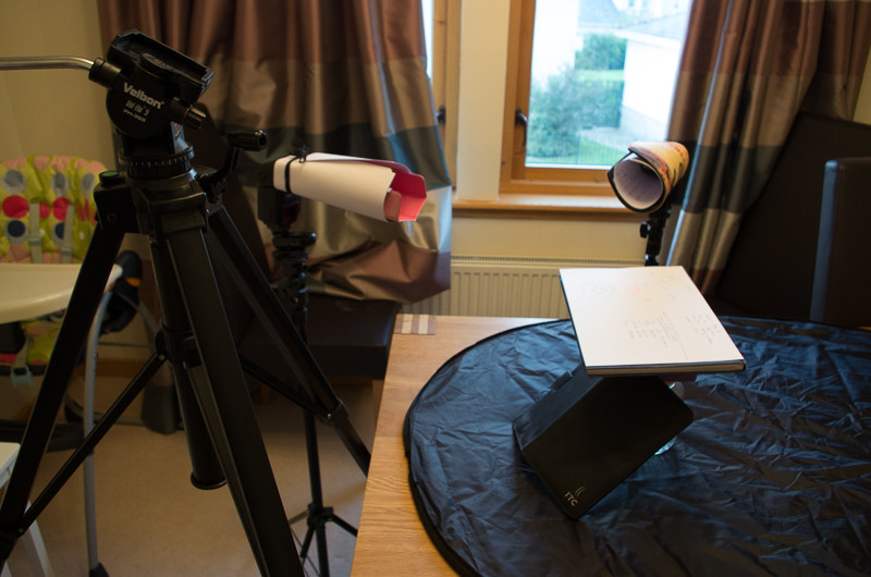
Here's a setup shot showing how everything was positioned for the Change photo (minus money which had fallen onto the floor I think):

JrFLIbG.jpg


Yes, I'm using a mouse mat and an ipad cover as snoots :oops: :$
 
Hi Paul

I've finally got some time to catch up on everyone's threads so I apologise if I'm re-iterating others comments as not reading them, rather concentrating on the photo's & feedback

Balance....I keep looking at this & wondering.......using flash on a shiny object is asking for trouble but you've handled it well ( wouldn't have expected anything else ).I wonder what the result would have been using just natural light & reflectors ? The background works for but again I wonder about a purer white or even black with a pool of light around the base allowing for a shadow to ground it...if that makes sense ? The biggest thing for me is the position of the statue ,for reason's I'm not quite sure of I want it rotated so the writing on the base is pointing to the righthand side...though I'm then not sure how the statue would appear , as in would you still see it's face ?But you would see the left hand more clearly :thinking: Sorry if that all sounds negative , not intended that way , just writing my thoughts....

Change.....no crit from me , those notes really jump out of the screen at me & I love the color tone :clap:

Big.....one helluva lot of work gone in to that for a pretty impressive result . I've never got the hang of shooting stars so for that I applaud you :clap:My only crit is.......the foreground is Big as opposed to the sky....need to see more of it, probably reverse the ratio of sky to foreground that you currently have ?

Thanks so much, Lynne. No need to apologise at all as there have been loads of photos posted recently - I'm struggling to get round them all with work being a bit busier at the moment.

I think you're right about balance (although not sure about Elaine's suggestion of a selfie!!!) - composition isn't quite right. I'll be honest and say it was a bit of a gratuitous shot in that I wanted to play around with lighting and set myself a challenge... it was less about the image than whether or not I could successfully light a very shiny object.

You're definitely right about Big... it was something I thought about before posting (the sky needing to be more of the frame) but just couldn't make it work without reshooting the foreground. Next time!!!

Thanks Lynne ;)
 
Hi Paul ...two really super images there ....I love the composition for change ....focus is spot on, and the sepia adds a rather thirties feel to it, I imagine the heist was planned by men in trilby hats in smoke filled rooms :)

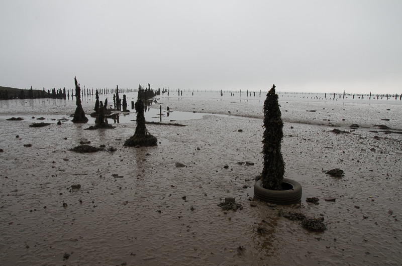
But Big is even better again.... I like it just as it is.....it definitely needs to be viewed full screen. It keeps reminding me of the Van Gogh quote 'I know nothing with any certainty ...but the sight of the stars makes me dream'. The line of posts slowly disappearing into the horizon make it look magical ....I love it :clap:

Thanks Susie... I wasn't sure if Change would quite hit the mark and it seems it did! :) I was going for that kind of look (also know as the "grotto-ghetto" look, courtesy of Mr Si as corrupted by me ;) )

A bit embarrassed that any of my photos are mentioned in the same sentence as Van Gogh but thank you anyway! :)

Really appreciate the massively positive comments... :banana:
 
Well done Paul

Big ... cleverly done ... to great effect ... absolutely love that glow on the horizon. (y)

Change ... it's all been said. I absolutely love it, and I know how difficult it is to get the lighting, focus and everything right for this kind of set up. (y)

Thanks David... it seems to have split opinion as to which of the two is preferred... I think I prefer Change as it's more "complete" as a picture and although Big has perhaps a touch more wow factor at first, there are loads more things I'd like to change and improve in it :)

Thank you though and appreciated as always!
 
Hi Paul

Big - looks great. My only comment would be that as the sky is the big part it might have been better with the horizon lower so the sky is 2/3 do the picture.

Change - great shot, well composed, interesting and well lit :clap:

Thanks Richard - you're not alone with your crit for Big. For what it's worth, I think you're spot on and if I was shooting it again, I'd definitely make that change. Cheers!


Balance - lighting works for me, but I would have been more impressed if you had posted a selfie in that position :p

Change - hmm, your idea of loose change is obviously a bit different from mine :eek: Good black bg and dof with plenty of sharp detail in the notes and the masterplan fading off into the distance.

Big - fantastic sky against a very alien foreground :clap: Tend to agree with other posters that I would maybe prefer a bit more of the sky and a bit less of the black at the bottom, but other than that it's a beautiful shot.

Thanks Elaine. I thought that might make people smile... although in my defence, $1000 might be loose change in the context of a bank heist! Glad you liked it.

Thanks for the comments on Big... now you can see how much processing went into the finished image - it almost feels like I cheated given the original two images :oops: :$
 
$1,000 bills, helllooooo :)

I wasn't sure on the colour but it's grown on me. Nice focus on the $1,000 and the drawings add a nice touch. The lighting is soft and moody as well, so the work you put in paid off.

Big, cracking location and the Milky Way has some nice detail. I'd prefer more of the sky, failing that a panorama crop.

Cheers.

Thanks Andy... if only those bills were real and not printed on my inkjet :) Glad you like it... the sepia can be a bit marmite - almost like selective colour, but it suited the era of image I wanted to create, I think.

Agree completely with you re: Big (and everyone else)... better luck next time, but I'm happy with that as a first attempt. Gives me something to improve on :)
 
Great work with them shots to get that big sky image, a cracking result for a first attempt (y)

Thanks Dean :)

Right, I'm going to be a bit quick off the mark but I thought of something for Grow so I've decided to go for it. Mrs is away, kids are asleep... sounds like the perfect time for a bit of photography.

Oh, and no ambient ;)

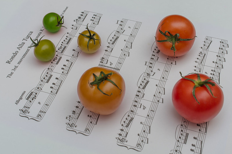
So here is "Music makes them grow..."


Music makes them grow...
by pjm1 (Paul), on Flickr

It's actually very close to SOOC apart from a bit of tweaking to the colour of individual tomatoes :oops: :$... I also blended the sheet music into the white table a bit so that it all looks "continuous". I guess I could have achieved that in camera had I had a printer which printed onto A3... but I don't!

As always, any comments are welcome :)

I'd better get thinking about catching back up with previous weeks as well (weeks 1-3). And my reshoot for this week... hmmm...
 
Hi, Grow, has a surreal feel to it, which I like.

I'm a fan of odds so I might loose one of the tomatoes. Slightly under exposed...or looks that way on my MBP.

you have controlled the lighting on the tomatoes well..no specular highlights (y)

I had a quick edit on PS and will post, if you like.

Cheers.
 
Hi Paul, another good idea, liking the way the tomatoes are arranged, i know the theory about odd numbers but this works well,
well exposed and the colours are good, maybe a slight lift in the brightness as Andy says but :thinking:
Quick off the mark too, its nice sometimes to have a little time to yourself for these things (y)
 
Ooooo nice !!!

I'm liking the sheet music filling the frame and no page edges in sight, and REALLY impressed that you found these different sizes :D

I'm with the other guys on the tweaks, slightly brighter background and a boost of blacks for the music for me ... Soooo good having no interruptions so you can get on !!

Nice One (y)
 
Hi Paul

Change - lots of effort in that and it has paid off. good idea which works well in the final outcome. Lovely sepia tone which is not overdone - sometimes the effect is too orange for me (partic when i do it:)). Lots of detail to hold the attention without detracting from the whole. :clap: Very impressed with the set up shot as you have achieved the outcome without a camera - one in the eye for nikon, canon, pan , oly fuji etc

Big - far too complicated for me to understand but an excellent result. (y) Lot of time and effort again and you must be happy with the outcome. It might have flaws that others have pointed out but theses are more areas for improvement than anything else.
I am not sure about the balance because it is about a big sky - and the sky is only 1/3 of the shot - and the excess foreground, being so dark, draws the eye, but with no useful result. But that is the only meaningful comment that i can make because it is such a well thought out and put together shot. It was all going so well and then you mentioned Kate Bush......:arghh::D

grow - third excellent idea. Bit grey for the b/g - agree with DK re the light and the blacks - but the use of the tomatoes is top notch. really like the way that you have them growing i n size and changing colour to show maturity. :clap:
 
Right, a HUGE apology from me to you all for being soooo slow in responding. I was stuck down in London most of the week (and part of that unexpectedly because of a flight back home being cancelled) and was so snowed under / generally shattered, I didn't have a chance to log onto the site. I now see I have lots of comments to catch up with and oodles of your photos to comment on...

I'm working for chunks of today and I'm being told we're going out to view a few new houses, but I will try to squeeze in as much as I can before the working week comes around again :arghh:

Hi, Grow, has a surreal feel to it, which I like.

I'm a fan of odds so I might loose one of the tomatoes. Slightly under exposed...or looks that way on my MBP.

you have controlled the lighting on the tomatoes well..no specular highlights (y)

I had a quick edit on PS and will post, if you like.

Cheers.

Hi Andy... thanks for the comments - I do like surreal as well. I really do struggle with exposure sometimes even though I can see it in others' photos. Too close to it, perhaps, to critique my own work effectively?

Please do post your edit - I'd love to see it. Glad the lighting worked for you - it was actually a very simple bounce flash off the ceiling.

Hi Paul, another good idea, liking the way the tomatoes are arranged, i know the theory about odd numbers but this works well,
well exposed and the colours are good, maybe a slight lift in the brightness as Andy says but :thinking:
Quick off the mark too, its nice sometimes to have a little time to yourself for these things (y)

Hi Allan, thanks for the kind comments. I'm also very conscious of the odd numbers concept, but I personally feel it falls away after about 5 because we're less well able to immediately count higher numbers. I think if the arrangement is very ordered it probably becomes more important again, but all opinions are valid :)

It was fun doing this one and thinking a bit more creatively about the theme. I'm always slightly amused by the idea of people singing or playing music to their plants to make them grow, so decided to reference it for this!

Ooooo nice !!!

I'm liking the sheet music filling the frame and no page edges in sight, and REALLY impressed that you found these different sizes :D

I'm with the other guys on the tweaks, slightly brighter background and a boost of blacks for the music for me ... Soooo good having no interruptions so you can get on !!

Nice One (y)

Thanks Dean - very nice of you to say so :) I had to do a touch of blending to make up for not having a larger print on A3, but glad you approve. Genuinely no changes to the tomatoes (size or otherwise) except for the colours... my parents grow them and delivered a massive glut of various sized and coloured tomatoes (including black ones, which I admittedly didn't use for this), so all I had to do was use what I had an play around with the colours a bit more.

It sounds like everyone's in agreement re: brightness...

Hi Paul

Change - lots of effort in that and it has paid off. good idea which works well in the final outcome. Lovely sepia tone which is not overdone - sometimes the effect is too orange for me (partic when i do it:)). Lots of detail to hold the attention without detracting from the whole. :clap: Very impressed with the set up shot as you have achieved the outcome without a camera - one in the eye for nikon, canon, pan , oly fuji etc

Big - far too complicated for me to understand but an excellent result. (y) Lot of time and effort again and you must be happy with the outcome. It might have flaws that others have pointed out but theses are more areas for improvement than anything else.
I am not sure about the balance because it is about a big sky - and the sky is only 1/3 of the shot - and the excess foreground, being so dark, draws the eye, but with no useful result. But that is the only meaningful comment that i can make because it is such a well thought out and put together shot. It was all going so well and then you mentioned Kate Bush......:arghh::D

grow - third excellent idea. Bit grey for the b/g - agree with DK re the light and the blacks - but the use of the tomatoes is top notch. really like the way that you have them growing i n size and changing colour to show maturity. :clap:

Hi Alan, thanks for the catch up. Glad Change hit the spot for you - it was really fun doing it and although a bit of effort went in to the setup, I find that is so much more rewarding for me personally (when I look at the final image) versus mucking around in post, digitally "enhancing" images. Yes, I might have been using the camera in the setup shot to... erm... take the setup shot picture :)

Big - thank you again for the kind words. You're definitely right about the balance between sky and foreground. I think I'm going to be reshooting something similar but better next time we have a cloudless, moonless night!

And finally, Grow, thanks again for being so positive in your comments. Again, there are things I'd probably change next time slightly, but it is pretty much the image I had in my mind when I conceived the shot, so aside from wanting to take on all of your comments, I'm pretty happy with execution.

There's always room for improvement!!

HI Paul

Brilliant original idea for Grow........Even numbers works well - rules need to be broken sometimes ! Other than boosting the blacks a smidge no crit here :clap::clap:

Thanks Lynne... I know it's another producty-type shot, but I felt it was sufficiently "random" not just to appear to be a simple lighting & placement job. There was a bit more thought into this one :)

Glad you like and thanks for the suggestion re: tweaks (very consistent with the other comments) (y)

Thanks again to everyone for taking the time to look and comment while I've been holed away unable to do anything :(
 
Last edited:
I have an idea for "Live" which is something I've been wanting to shoot for a while. The only question is whether I can get down to it at a good time (sunrise?) with ok weather. It's in London but I'm going to be there for chunks of next week again anyway...

Failing that, I have another idea which is also something I've been wanting to do for a while, but requires a bit more setup.

We'll see!
 
Me too, Dean ;)

A weekend of looking at houses (ugh!) interspersed with a trip to a castle... around sunset and I had my camera with me! Unfortunately the clouds were not really playing ball - and I had no tripod, so had to crank the ISO and recover as much as I could in post. It's far from ideal and I've gone to town with a bit of OTT processing, but I do like to have a play sometimes.

So here's my reshoot for week 43 which is going all the way back to Strong. I did think about making it the reshoot of "cut", thinking about the scene from Holy Grail with the Black Knight's "flesh wound"... The castle here is Doune Castle, which was where a lot of the filming took place, but decided it was just too tenous? So strong it is...


Reshoot: strong
by pjm1 (Paul), on Flickr

C&C welcome as always and I do think I'm more or less caught up with everone's photos, comments-wise?
 
Right, another catch-up this time going back to week 3 (my reverse-order catch-up is nearly complete!)

Close... had a few ideas but in the end decided on a selfie. It's probably not particularly original, but it was fun getting the lighting set up how I wanted it. Twin flash - one at fairly acute angle to the mirror (i.e. nearly parallel to it) to add some side lighting from frame left and a very gently flash (1/128) pointed more or less at the mirror from behind my right shoulder (so frame right). Both bare flashes so deliberately harsh lighting to try to create a bit more drama to go with the closeness of image. I managed to get the lens flare actually on the lens which was the intention...

Super shallow DOF really just to emphasise the falling away of distance.

C&C welcome folks!


Close
by pjm1 (Paul), on Flickr
 
Ok, I'm a bit like buses... nothing for ages then three come along at once. Well, not three "me"s exactly (I'm not sure the world could cope...) but three of my photos.

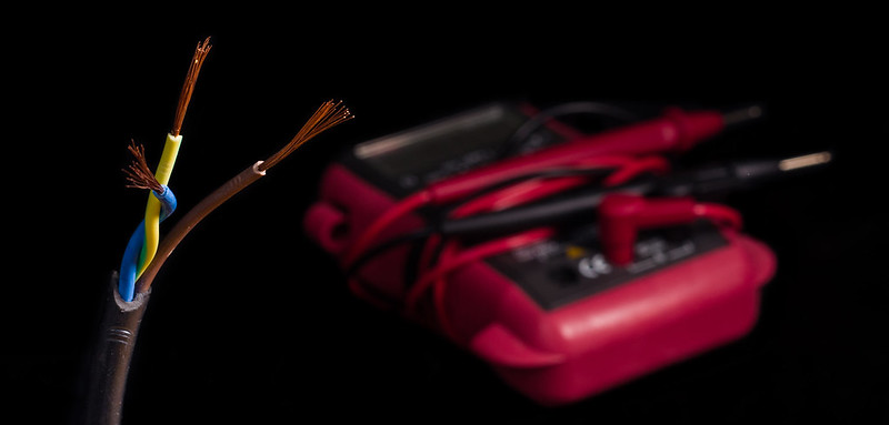
I'm not confident that I'll be able to get to take the shots I want this week... I have a feeling work is going to become hectic again with no real opportunity to get out there. So, I've decided to go for a placeholder for now for Live. I'm not hugely excited about it (although I'm pleased with my black background for once).


Live? (Placeholder)
by pjm1 (Paul), on Flickr

So, not either of the shots I really wanted but one requires about 3 hours of setup and some fairly heavy post and the other requires me to be in London at the right time, right place etc. and be lucky with weather. So for now this will have to do.

Lighting was a challenge because I'm still struggling to get my subjects far enough away from the background. I don't know whether some sort of holder mechanism which could attach to my light stands might work, but for now I'm having to sit things on top of black surfaces which doesn't really bode well for a blacker-than-black background, given light spill.

Key light camera right, pointing across the frame, almost slightly back towards the camera. I had a fairly big diffuser (more or less using the "3x as big rule") although I did want some specular highlights on the very ends of the wires. Additional fill was provided by bouncing bare flash into the corner of the room, high left of frame and behind - this was the main cause of the light spill onto the background, of course but without it the key light was just too directed. Light spill then corrected in post by painting some -EV onto the background. Poor in-camera composition was then improved slightly by picking up and moving the multimeter in Photoshop :exit:

It's far from perfect but if I don't get something in, there's a chance I simply won't until next weekend and I'll be behind again :(

C&C very welcome and apologies again for yet another indoor shot!
 
Hi Paul....First real visit for me....have been meaning to stop in for absolute ages.

Week 43 re-shoot strong: As you say lighting is not ideal, flat and grey although there is some nice cloud detail coaxed out of the sky. Composition is nice, with low pov reinforcing the strengh and size of castle. Path leading up to the door also creates a nice lead in line and perspective. Kind of 'feels' abit wonky but appreciate this is probably just due to the old building and low POV? Did you try any lens correction or such?

Week 03 re-shoot close: A commonly seen picture with a twist as I cant say I've seen it shot this close or with such extreme DOF :) Works well though. I usually look at the pictures for some time before reading the posters comments and I am glad to say that my first impression of the 'lens flare' was positive, liking this element instantly. Think it adds interest as well as dynamicism. I like the bokeh, as I am partial to a bit of this ;)

Live: Dont apologise for the indoor shots! I am a fan of tabletop photography so like seeing this sort of thing. Agree with you on the background - super black and suitably monotone, so well done on this :clap:. Composition is pretty pleasing so your PS efforts to recompse must have paid off right. I like how the wire and prongs of the tester are all roughly pointing off to right. Nicely controlled lighting creating some refined highlights on the tester and added depth and seperation between the wires and tester.

Good work Paul!

Cool, thanks Jason - given the standard of your photos, I'm always pleased to get positive comment from you :)

Comments on Strong are spot on for me: it was really too cloudy to get a decent sunset but there were some nice colours in the (which I have boosted) but I had to expose for the sky leaving the foreground very dark. I was happy with the composition even though the image doesn't really jump out at you perhaps because of the flat light. I did use LR's lens correction: the building has no straight lines though! I suppose it is quite old and as with most castles, built on a hill... Thank you!

Glad you liked Close: I thought it might be a bit of a marmite shot but, a bit like the first one in reverse - I think the outcome was mainly due to the lighting. It took a bit of time to get it right, because of my closeness to the actual mirror. I was quite pleased with the outcome and little things like the half light/half dark of the filter screw part of the lens.

Live: I won't tell you how many shots I took! I actually tried to handhold the tester for a while but just couldn't get a satisfactory composition. In the end I think I had lost the will a bit which resulted in me needing to move stuff around in post rather than "properly". It's also caused the slightly strange aspect ratio: I just wasn't happy with how much unnecessary negative space I had. I think it's a placeholder rather than a shot I'm going to be particularly proud of, to be honest! Glad you approve of it though :)

Thanks for the quick-off-the-mark comments...
 
Grow, love the idea, brightness covered (could go a bit brighter), plenty of DOF here leaving everything super sharp. Wonder if adding the extra paper to the sides has left the music a bit lost in the centre? A bit of woodgrain down the edges wouldn't have hurt.

Reshoot strong on the castle, certainly does appear on the wonk, but as there's very little to actually set a vertical too, better left alone. agree the light is a tad flat which hasn;t helped, think you;ve done the best you could have hoped for there. Composition and use of the path works really well. Just needed the weather a bit more on your side.

Close I really like though, super close and super shallow DOF leaving a bit of anonymity there, but leaving it clear whats going on. :clap:

Live, I've said meh before, and I'll probably say it again here... I wonder if it actually needs the muiltimeter in the shot, it's not really adding a lot and the floating-ness of it, combined with the probes poiinting out of shot doesnt help.

Up to date though, which at this stage of the game is where you need to be. (y)
 
Hi Paul....I like the wonkiness of the castle, and I really like the pathway leading you into it ... I would probably have a bit more sky at the top to give it a bit more space that's all.

Close looks good ...I'm sure that's not easy to do to get everything right to achieve that DOF .

Live ...I wonder if the wires would have worked on their own against the that super black background....the OOF meter is almost distracting my eye away from them.

Well done with keeping up so well .. your life sounds quite hectic :)
 
Hi Paul, the castle is a great building and certainly strong, you have caught the colour and texture of the stone well, not really sure on the placement of the path in the frame seems a little to cramped on the left.

Close, you have certainly got the lighting spot on so well done it can't have been easy, right choice wth the DoF too

Again you have done well with the lighting on "live" the wires are well lit and twisting the earth and neutral together is a nice touch, can't tell you moved the light meter.

sounds interesting the other choice for live, i am intrigued :thinking:
 
Hi Paul

Strong re-shoot....quite partial to castles especially when they have a bit of interest in the sky....path works well as a lead in , the wonkiness does my OCD no good at all but I realise you can't do anything much about that ..... (y)You say you've gone a bit OTT on pp but it looks fairly natural so would be great to see the original for comparison ? I'de also be curious to see if a contrasty B&W or even sepia would work :thinking:

Close.....not sure on this one......think it's the lights in the lens that are putting me off, damm small DOF !

Live ....like this , simple, on theme , well lit & well placed in the frame (y) I do wonder if a slightly large DOF might work....the wires seem to almost be pasted on rather than part of the image -IYSWIM ...a slightly increased DOF might bring it together more ?
 
Liking the castle Paul, good detail when viewed large on flickr (y) .....:thinking:.....would it have been possible to move more left, having the cobbles coming in more from the right and having the left hand side (as we look at it) of the castle in shot? ....looking at it straight on makes it look a little flat :)

Close really does look close, well done on the lighting (y)...........is the dof all in camera?....it could just be me, but it looks a bit PP'ed :confused:

Live looks a little squashed with the crop ( and I like letter box crops) Lighting, again, well done,black bg, excellent detail in the wire and good dof for a blurry multimeter (y)
 
Just a quick note on the fly to thank you all for comments... I've managed to get the shot(s) I wanted for Live so will be adding that after I get back home on Friday night.

I will reply to each of your comments individually when I am not typing it on my phone!!
 
Hi, Paul, strong, what a cracking building...busting with character. I might have moved left and pivoted right to get a better perspective and sorted the verticals in post.

Close, another interesting take on the theme and is indeed close. Not sure, but the LHS (as you look at it) of the glass and surround look a little OOF :thinking:

Live (placeholder), I really like how the blue and green appear to be dancing and the brown looks a little fed up. I'd have gone for a more minimal approach and removed the thingy in the BG. Good overall lighting, nice BG and the light on the works works really well.

Cheers.
 
Grow, love the idea, brightness covered (could go a bit brighter), plenty of DOF here leaving everything super sharp. Wonder if adding the extra paper to the sides has left the music a bit lost in the centre? A bit of woodgrain down the edges wouldn't have hurt.

Reshoot strong on the castle, certainly does appear on the wonk, but as there's very little to actually set a vertical too, better left alone. agree the light is a tad flat which hasn;t helped, think you;ve done the best you could have hoped for there. Composition and use of the path works really well. Just needed the weather a bit more on your side.

Close I really like though, super close and super shallow DOF leaving a bit of anonymity there, but leaving it clear whats going on. :clap:

Live, I've said meh before, and I'll probably say it again here... I wonder if it actually needs the muiltimeter in the shot, it's not really adding a lot and the floating-ness of it, combined with the probes poiinting out of shot doesnt help.

Up to date though, which at this stage of the game is where you need to be. (y)

Thanks Graham... Grow definitely isn't perfect but thanks for the comments and feedback - there are things I'm happy with but definitely plenty of room for improvement as you say. Glad you liked Close - it's a bit of a marmite idea but that means we're pushing things :)

Live... well, it was a placeholder and I now have my "real" shot I wanted to capture. So meh away!!

Hi Paul....I like the wonkiness of the castle, and I really like the pathway leading you into it ... I would probably have a bit more sky at the top to give it a bit more space that's all.

Close looks good ...I'm sure that's not easy to do to get everything right to achieve that DOF .

Live ...I wonder if the wires would have worked on their own against the that super black background....the OOF meter is almost distracting my eye away from them.

Well done with keeping up so well .. your life sounds quite hectic :)

Thanks Susie :) Close did take a few shots to get right! At least how I wanted it look "right" anyway... Thanks for commenting as always. Per above, live is about to be consigned to the meh heap...
 
Hi Paul, the castle is a great building and certainly strong, you have caught the colour and texture of the stone well, not really sure on the placement of the path in the frame seems a little to cramped on the left.

Close, you have certainly got the lighting spot on so well done it can't have been easy, right choice wth the DoF too

Again you have done well with the lighting on "live" the wires are well lit and twisting the earth and neutral together is a nice touch, can't tell you moved the light meter.

sounds interesting the other choice for live, i am intrigued :thinking:

Hi Allan! Thanks for the comments - they're not the best shots and I'm not totally chuffed with any (although I do like Close as it's "my" sort of photo)... live revisited is on its way imminently!

Hi Paul

Strong re-shoot....quite partial to castles especially when they have a bit of interest in the sky....path works well as a lead in , the wonkiness does my OCD no good at all but I realise you can't do anything much about that ..... (y)You say you've gone a bit OTT on pp but it looks fairly natural so would be great to see the original for comparison ? I'de also be curious to see if a contrasty B&W or even sepia would work :thinking:

Close.....not sure on this one......think it's the lights in the lens that are putting me off, damm small DOF !

Live ....like this , simple, on theme , well lit & well placed in the frame (y) I do wonder if a slightly large DOF might work....the wires seem to almost be pasted on rather than part of the image -IYSWIM ...a slightly increased DOF might bring it together more ?

Hiya Lynne... Sorry to mess with your OCD ;) Close isn't one for everyone but it was the image I was after, so pleased with my execution.

Live... is about to be replaced but thank you for the comments on that image - I wasn't happy with it but was worried I wouldn't get the image I'm about to post.
 
Liking the castle Paul, good detail when viewed large on flickr (y) .....:thinking:.....would it have been possible to move more left, having the cobbles coming in more from the right and having the left hand side (as we look at it) of the castle in shot? ....looking at it straight on makes it look a little flat :)

Close really does look close, well done on the lighting (y)...........is the dof all in camera?....it could just be me, but it looks a bit PP'ed :confused:

Live looks a little squashed with the crop ( and I like letter box crops) Lighting, again, well done,black bg, excellent detail in the wire and good dof for a blurry multimeter (y)

Hi Phil - Genius idea on the castle shot - I think an angle onto the castle itself would have made a huge difference. Will bear that in mind next time!!

Close... yes, a touch of circular grad in LR dropping the clarity but TBF the SOOC was shallow DOF already - I will post when back home!

Live ain't great but I have a new one...

Thanks for the comments as always :)

Hi, Paul, strong, what a cracking building...busting with character. I might have moved left and pivoted right to get a better perspective and sorted the verticals in post.

Close, another interesting take on the theme and is indeed close. Not sure, but the LHS (as you look at it) of the glass and surround look a little OOF :thinking:

Live (placeholder), I really like how the blue and green appear to be dancing and the brown looks a little fed up. I'd have gone for a more minimal approach and removed the thingy in the BG. Good overall lighting, nice BG and the light on the works works really well.

Cheers.

Hi Andy, it was used for Monty Python's Holy Grail so it's definitely bursting with character!

Love your crit/comments on Live - you have really made it come to life!! Cheers...
 
Last edited:
Right, I managed to get the Live shot I wanted. I'm currently holed up in a blooming awful hotel in London which does have the bonus of being a few minutes walk away from my client and also ten minutes from the Tower of London. So I reversed my old walk to work (I used to live next to Tower Bridge) this morning and caught sunrise at the poppies...

So here is "Live forever in remembrance"


Live forever in remembrance
by pjm1 (Paul), on Flickr

Now the only caveat I'll add is that I'm working off my horrible laptop which a gamma of something close to -1 and sRGB coverage of 0.3%... so I'm not sure if the colours or exposure is right at all. When you have to check an image by sending it to your phone because its display is better you know you need a new computer!

I took loads of "normal" shots of the poppies (minus crowds at 7am) but this was my favourite - partly because it's different and partly because I think it's actually far more on theme. You may disagree, of course!
 
As close to perfection there as it's possible to get Paul. You've done really well here to balance the important compositional elements exceptionally well. The tower in the BG with the beautiful but subtle bokeh from the lights, the red sea of poppies and water marked cross in the fg.

The rain streaked writing on the cross (can just make out Grandad, 3rd may 1985 (?) at the top) adds greatly, suggesting that many things can be washed away almost immediately, but there are others that will live on for much much longer.

A timely and moving image Paul.

The reduced saturation suits the image well too. I'm prepared to believe that was a processing decision rather than the laptop screen there. :)
 
Last edited:
Grow: I like very much, neat idea, colourful, clean, sharp, nice arrangement.

Reshoot Strong: a seriously forbidding image. I don't know what "OTT processing" you did Paul but I like it. Nice composition too.

Live: I like that box in the BG. Very nice focus and lighting on the little individual wires.
 
Hi Paul, well that is a different take on the Tower poppies and very poignant especially at this time, everything looks fine maybe a slight lift in exposure but very slight.

It was certainly worth the wait, would love to see them but won't get a chance

:clap:
 
As close to perfection there as it's possible to get Paul. You've done really well here to balance the important compositional elements exceptionally well. The tower in the BG with the beautiful but subtle bokeh from the lights, the red sea of poppies and water marked cross in the fg.

The rain streaked writing on the cross (can just make out Grandad, 3rd may 1985 (?) at the top) adds greatly, suggesting that many things can be washed away almost immediately, but there are others that will live on for much much longer.

A timely and moving image Paul.

The reduced saturation suits the image well too. I'm prepared to believe that was a processing decision rather than the laptop screen there. :)

Hi Graham... thanks for the very kind and generous comments... wow! I'm glad it hit the spot and I'm also pleased looking back that I went with the shot I did, rather than one of the "normal" shots of the poppies... I'm nothing if not a bit different sometimes :)

Grow: I like very much, neat idea, colourful, clean, sharp, nice arrangement.

Reshoot Strong: a seriously forbidding image. I don't know what "OTT processing" you did Paul but I like it. Nice composition too.

Live: I like that box in the BG. Very nice focus and lighting on the little individual wires.

Thanks David, glad you liked them... it's good to get feedback so thank you.
 
Hi Paul, well that is a different take on the Tower poppies and very poignant especially at this time, everything looks fine maybe a slight lift in exposure but very slight.

It was certainly worth the wait, would love to see them but won't get a chance

:clap:


Hi Allan, I deliberately left the exposure slightly under (at least as far as I could tell from looking on my phone) as it was quite dark still in "real life". When I took the shots of the poppies and chimped, I was actually really surprised as the punchiness of the image which came back, which was a bit fake for me, so I did knock down the exposure a touch and also as David spotted, leave the contrast at a slightly lower level than I might otherwise. It is also quite a sombre image in many respects, so I feel it suits a very slightly darker and less exuberant treatment in post.

I'm glad you like it and thanks for the comments and feedback - very helpful as always!

Hi Paul

well done for holding out to get the shot you wanted for Live.......very emotive .Everything just works, perfectly placed , excellent DOF , a hint of sunrise & a sea of red....brilliant :clap::clap:

Thanks Lynne and glad you like it... really pleased it's hitting the mark.
 
Back
Top