weekly pjm1's 52 in 2014 week 52 (Support) added... FINISHED!

Hi, Cut, I do like a well crafted Knife :)

Well composed and good detail, the caption made me smile :)

Nice subtle shadows from the knife and carrots.

No meaningful crit from me.

Cheers.

Sorry Andy can't seem to multi quote on my phone so having to reply to you each individually... Thanks for the positive comments and thought I'd try something different with the caption for a change. Maybe a bit marmite but hey ho. Cheers!
 
The clear winner for me on this one is the fantastic colour on the carrots, lovely orange there.

Composition is good, knife blade closer would be the other way of doing it but would lose the "just put down look".

Dof is close, think you have just enough but think it would work with more.

White border works to show the super even white you have (natural light?), and the text is nice, but easy to ignore too if you don't want to see it.

Thanks Graham, glad you liked this. I was experimenting with a few things - very close key light about 10cm away from subject camera left so inverse square really had an effect which made lighting the background harder. Fill/ambient was bounce flash from the wall/ceiling camera right.

Caption and border was something I hadn't done before but fancied a go at.

Cheers for comments as always (especially when they're as positive as yours!)
 
Hi Paul, I like the simple composition of it and the DoF works well with the knife blade fading away, colour of carrots has been mentioned, cant really fault it, well maybe the writing not really a fan of that
good to see you back (y)
Hi Allan, thanks for the feedback and good to be back even if very briefly between work and holidays!

I will be making a longer stop mid week this coming week when I'll have time to catch up on everyone's threads :)
 
Hi pail

Catch up time
Mineral - colourful and good focus on the salad. Good arrangement. I note a comment on it being a bit tight but i go the other way on these food in bowl shots. I would consider cropping top and left side to remove the edges of the bowl and the table. We know that the bowl is there and do not need to see that - our attention should on the food, not the shape of the bowl. I have looked a t lots of commercial shots of food (Mrs SP has an enormous library of cook books) and it is notable how many do crop away parts of the containers

Smoke - I think that you have nailed that for the theme and most unusual. (y) The question mark is a bit of a distraction as because it is in the mist it is hard to believe that something like that exists and has not been added by the togger.

Bubble - both good but #2 for me as i like the difference in bubble size and the hint of pink and gold.

Communication - as you say, not an object that screams out to be shot. Good capture of the blur and a nice brooding/bright sky. Difficult exposure and i agee with Allan @alsjazzera that maybe even make it more of a silhouette.:thinking:

Dark - disturbing but original idea and very well handled(y) agree that the knife better other way round. Not surprising that Allan @alsjazzera likes it as he does weird things with his toy bears.:eek::)

Cut - The text does not add to the shot IMO. Think that the blade of the knife should be in focus and perhaps laid a little more acutely, even touching the carrots. Good colours and b/g tho.
Wow thank you for such a detailed set of comments... really do appreciate you taking the time :)

I do like your suggestion for mineral and suspect it would move it from being a slightly dull shot to something much more "grabbing".

Smoke is a very odd place and one I'm planning to shoot again. Question marks are most peculiar! Also think your silhouette suggestion on communicate is a good one.

I don't think I want to start a competition between Allan and I as to who can be more disturbing with the toy shots ;)

Thanks for comments on cut - haven't ever added captions or borders before so was just mucking around... realise they can be a bit marmite.

Thanks again for detailed crit! :)
 
Hi Paul


super color on those carrots...good composition & no blown bits on the shiny knife ..want to give you the thumbs up smilie but for some reason it doesn't want to load on the laptop ??

My only crit is the lighting...which I know you're really really good at so this has me a little perplexed ....seems brighter on the lhs ,partic the carrot ends then darker at the front of the pile and near the knife handle ? Viewing on laptop which may be different to the desktop but seems to have a very very slight blue/grey cast........
 
Hi Paul


super color on those carrots...good composition & no blown bits on the shiny knife ..want to give you the thumbs up smilie but for some reason it doesn't want to load on the laptop ??

My only crit is the lighting...which I know you're really really good at so this has me a little perplexed ....seems brighter on the lhs ,partic the carrot ends then darker at the front of the pile and near the knife handle ? Viewing on laptop which may be different to the desktop but seems to have a very very slight blue/grey cast to the bg ?
 
Hi Paul


super color on those carrots...good composition & no blown bits on the shiny knife ..want to give you the thumbs up smilie but for some reason it doesn't want to load on the laptop ??

My only crit is the lighting...which I know you're really really good at so this has me a little perplexed ....seems brighter on the lhs ,partic the carrot ends then darker at the front of the pile and near the knife handle ? Viewing on laptop which may be different to the desktop but seems to have a very very slight blue/grey cast........

Hi Lynne, thanks for the comments - spot on as always :)

I was experimenting a bit with the lighting, so happy to concede it might not have worked. I had a diffused flash coming from camera left as key, really to cast light in the same direction (broadly) as the sticks of carrots - to pick out detail along their length. The downside of this is of course it lights up the ends of the sticks quite a bit more as they're flat on to the light. Fill light from camera right which is a simple bounce flash off the wall & ceiling.

I was hoping the key light wouldn't be distracting re: ends of carrots, but it sounds like I might have been wrong?

Re: colour cast, it's quite possible as I forgot to shoot my grey card so picked a white point from the background. There was ambient coming in from a nearby window (helps with focus lock) so that might have caused a slight variation in colour temperature between the point I picked and the rest of the scene?

Thanks again... appreciated!
 
Ok, I still need to do "big" but I'm waiting for something suitably "big" to come along :)

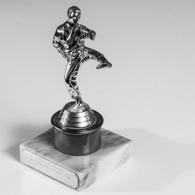
This week's theme of balance had me stumped for a while until I commented on one of @XenosElaine 's pictures which had some specular highlights. That made me think of shiny objects I had which could be interesting subjects for an experimentation into lighting these notoriously difficult b**gers. Well, I just happen to have a very old trophy which, after dusting down (quite literally) seems apt for the theme of "balance". It was from back in the days when I sort of had some...


Balance: the art of...
by pjm1 (Paul), on Flickr

Simply put, this is me trying to improve my lighting skills and unfortunately for all of you, you're being subjected to my "experiments"... I will understand if you're getting bored and I will endeavour to move onto another type of photography very soon, I promise! Another boring image, I'm afraid...

Accent lighting here from a way off camera left which has produced the specular highlights on his right thigh, right temple, right shoulder and other parts of the suit. I wanted to keep these as much in control as possible, so the positioning of the flash and its power (think I settled on 1/32) was a bit of trial and error. Principal lighting was bounced from the corner of two walls & a ceiling, camera right and behind - effectively this providing the majority of the light in the scene and is responsible for the more attractive of the two shadows (the darker one behind the subject and bottom left of frame). The other shadow I toyed with removing further by increasing the strength of the key light, but I don't find it particularly objectionable, so left it as I managed to get the lighting more or less how I wanted it. I could also have bounced it more from the ceiling than the walls I think to wipe that shadow.

Simple B&W conversion, but doing my usual of ramping up the contrast, which I do think suits the subject and makes the shiny object look even shinier.

Yes, the are a few spots where the highlights are blown, but it's a very shiny, polished object and pretty much any ambient light will blow something, somewhere. Pulling it all the way back just makes it flat - for me the highlights are what make the image (but happy for others to disagree!)

I've also decided this image needed a mid grey background, rather than pure white. I played around with a more high key version, but it just seemed to lose something. Again, you may feel differently.

C&C always welcome and given this is really quite a challenging subject to capture, I'm steeled for some harsh critique already!
 
Hi Paul
Quite frankly, I don't always get the idea of criticism of highlights in all circumstances. Many objects are bright and reflect light and as that is an integral part of their make up, I don't mind them. This shot is fine IMO for the lighting, as the outline of the figure is not blown and the lighter elements show its shiny nature. I am looking at stuff on the desk now and some objects have shiny bits reflecting the daylight and I cannot make out detail in them but that is how it is.
I think that the light to the left may have flattened the engraved words a bit (and this is an area where the detail is needed IMO).
Cannot make up my mind about the shadow to right.
Agree that a high key b/g would prob not work to well but not sure of your grey. Maybe not grey enough as such a colour verges on the 'grubby' (hope not too harsh a word). possibly one of those where a slightly coloured b/g would work

Thanks Alan (and title now corrected :))

Now that you come to mention it, the background is a bit grubby, colour-wise. Maybe it did need to be a lighter grey or proper mid-grey? Given I converted it to mono, not sure a coloured background would add much ;)

I'm now also going off the shadow to the right. Grrr! Thanks for the comments - plenty of food for thought. (y)
 
Hi Paul, what can i say as you are an outstanding pupil at Tae Kwondo, I think its excellent :LOL:

You have chosen a really hard subject to photograph, but you have done well can't really see any blown out bits, well nothing thats bothering me to much, maybe the engraving on the left is a little washed out
BG is excellent I think it works well with the trophy, shadow on the right is maybe a bit large, all minor points
The actual statue lighting works it's just the little details that need some work, not that I could do any better
Well done (y)

You'd better watch it matey... I was a white belt, I'll have you know ;)

Yeah, I don't like "easy" do I? That was kind of the point of it though... I actually think it's a touch underexposed on further reflection (see what I did there?)

The BG is completely unprocessed although I'd quite like to reshoot to see what it looks like with a black BG as an alternative. With my flash setup as-is though it wouldn't be very black as there would have been a huge amount of light spill so I'd have needed to rethink that.

I was keen to see what you and the other assembled producty-type-shot-people think about lighting these sort of things (paging @blondie606 and others...) as I just mess around with the setup until I get something I'm reasonably happy with. Unfortunately that means that I never know the outcome of what I haven't tried... so it's a bit frustrating in that regard. I'm hardly going to run through every possible flash setup (especially with two flashes as the combinations are endless!)

Cheers for the comments and encouragement. Still need to grab that "big" photo. I'm in Edinburgh tomorrow and London on Friday so maybe I need to take my camera with me on both trips...
 
Hi Paul ... Interesting to see your shots on white backgrounds as I need to get to grips with this a bit and not keep reverting to black. ... I notice you've tended not to make them too white and have included shadows which does seem to 'ground' the object and not make it too floaty.

I don't mind the shiny bits either... as Alan says ..they are shiny, and I think if they aren't huge flarey bits then they just just add to the overall image.
 
Thanks Susie - just seen your balance shot so understand your interest in the white background! Funnily enough, I prefer off white BGs partly because I just do but also because I seem to remember reading from someone who's an expert in product shots (perhaps Gary at Lenscarta?) that off white is actually a "better" BG... although I now can't remember the reason!
 
oooh better watch what I say from now on... knowing you're a white :jawdrop: belt in the martial arts..... Reckon you could take Andy?? :LOL:

It's shiny, it's gonna have shiny bits, so no problems there, agree the BG could go a touch brighter. (Just put 2 stops of exposure on it and didn't blow any BG).

Double shadow??? If the one on the right hadn't've (love that word :)) been mentioned, I wouldn't've (that one too :)) had any cause to be worried by it, but as it has...........
 
Hi, time is short, I'm afraid...:(

Balance, Karate...you still train?

OCF and metal, never easy.

On theme and you've handled the lighting well. I might have been tempted to crop in a little further.

Cheers.
 
Thanks for the comments!

I agree that blown out white doesn't look great. Might have been pookeyhead you were thinking of?

http://www.talkphotography.co.uk/th...ground-and-make-it-white.542665/#post-6266690

Maybe... I think I've read it a couple of times, but can't for the life of me remember where/when/who :)

oooh better watch what I say from now on... knowing you're a white :jawdrop: belt in the martial arts..... Reckon you could take Andy?? :LOL:

It's shiny, it's gonna have shiny bits, so no problems there, agree the BG could go a touch brighter. (Just put 2 stops of exposure on it and didn't blow any BG).

Double shadow??? If the one on the right hadn't've (love that word :)) been mentioned, I wouldn't've (that one too :)) had any cause to be worried by it, but as it has...........

Nope - not mentioned at all :) Thanks for looking and appreciate the comments.

Hi, time is short, I'm afraid...:(

Balance, Karate...you still train?

OCF and metal, never easy.

On theme and you've handled the lighting well. I might have been tempted to crop in a little further.

Cheers.

Sadly not (although it was Taekwondo rather than karate)... a very long time ago.

Thanks for the feedback and I'm sure you're right that a tighter crop would focus the attention more. So, I've taken this on board for my next shot.

Week 42: Change

In my case, "Loose change". I had one prop - some pretend banknotes (which are probably illegal, but hey ho) but sadly little else. I decided I wanted portray a bank heist but without guns etc. to hand, the only thing I could think of was to sketch out some sort of "plan" for the heist, leaving the bundle of notes as the "spare change" from the successful mission. Not sure if it works.


Loose change: from the heist
by pjm1 (Paul), on Flickr

Lighting was fun, because I wanted to get a black background, so I had to raise the subject up above the table. Flashes were very carefully positioned and snooted to avoid light spill onto the table below (which was only about 4-5" away) and in the end, the magnolia walls meant I had to put a black sheet down on the table cloth as well, as the reflected light (basically ambient at that point) was causing the table to be very slightly lit.

One light was the top left of the frame, basically lighting up the paper and taking some of the shadows away. Although it was more of a fill light / background (i.e. paper) light, I had it fairly bright - half the power of the key light. Key was bottom left corner, aimed directly at the bank notes. Both flashes were pretty close to the action and completely parallel to the surface of the paper (and therefore just slightly higher) again to avoid light spill. I added a couple of small grads in LR to the far (top) and left side of the paper, just to make it less stark against the black background. Aside from that and the conversion to sepia I didn't muck around with it in post.

DOF was hard - I was up at f/11 because the camera was so close to the notes yet I wanted the vault code and $1000 in focus enough to read.

I think the lighting works and I had fun setting it up, but very keen to have some C&C as always. The composition might not quite be right - I'm a bit unconvinced by the edge of the pad showing, for example.
 
I like it and it seems you have put a lot of thought, time and effort into creating your scene. Lighting works, it's kinda like an underground grotto lighting in my mind and it's a great idea for the theme.
 
I like it and it seems you have put a lot of thought, time and effort into creating your scene. Lighting works, it's kinda like an underground grotto lighting in my mind and it's a great idea for the theme.

Thanks Simon... that was exactly the look I was after but couldn't think of a description. "Ghetto" lighting is a great term!

It probably took half an hour to set up and shoot which is quite a while for me with these theme shots... but most of that was playing around with different flash positions and powers. Good fun!
 
Hi Paul, thats really well thought out lots of little details that keep you interested, lighting for me spot on as is the composition,
the side of the pad would be easy enough to clone out but I don't think it matters
very good take on the theme
hard to find anything to crit on that :clap::clap:

He said grotto not ghetto:whistle:
 
Last edited:
Hi Paul, thats really well thought out lots of little details that keep you interested, lighting for me spot on as is the composition,
the side of the pad would be easy enough to clone out but I don't think it matters
very good take on the theme
hard to find anything to crit on that :clap::clap:

He said grotto not ghetto:whistle:

Thanks Allan - really appreciate that :) glad you like it and nice to have an idea in your head which does more or less translate to the image itself... more often than not it doesn't!!
 
Well, I've decided the weather / moon isn't going to play ball for the rest of the month so I'm going to have to go with what I have for BIG.

The idea was to make a composite and blend from two photos of the same image: one exposed (multiple times) for the stars and one exposed for the ground. The reason for this is I've been playing around with stacking multiple 15-30sec exposures of the night sky to capture more stars and detail... because stars move you're limited to that sort of exposure length otherwise you end up with trails. There's a clever program called DeepSkyStacker which then aligns and composites the multiple exposures to produce a single image full of stars and detail. It's amazing! Only downside is the land them becomes blurry because it aligns the stars, meaning the land gets moved around with each exposure. Hence the reason for a double exposure and blending required if using this technique.

Anyway, I've been playing with this on the rare cloudless, windless and moonless nights we've had. All one of them recently :(

Looking at the forecasts for the rest of the nearly moonless nights in October, it's pretty rubbish so I'm going to have to go with what I have taken so far. Unfortunately, it's no where near as good as I wanted: I left it too late in the night to capture the part of the Milky Way I wanted, which is a bit frustrating. Also, I simply snapped these in our back garden which is hardly a dark skies area, so there was a massive glow which I've just had to go with. Also, I wasn't able to capture the ground image I wanted, so I had to resort to a previously taken photo which wasn't done at night... meaning there are a few artefacts which wouldn't have been there had I taken this the way I was planning.

Well, here goes - Week 39: Big (sky)


Week 39: Big (sky)
by pjm1 (Paul), on Flickr

It was fun doing it and I've been learning LOADS about astrophotography, the stars in general, as well as some more photoshop skills. So while this is far from the image I had in mind, I think it's ok for a first attempt and I know what I'd like to improve (a lot!) next time. All parts of the composite are photos I've taken myself and the only addition is a touch (ahem!) of PS including the glow right next to the horizon.

That's me caught up from Week 4 to the current week, so I can put my feet up for a bit now :) oh, and get on with commenting on more of your photos!

Edit: the title (Big Sky) is also a nod to Kate Bush... my favourite artist of all time ;)
 
Last edited:
This is fantastic and I'm rather jealous of the photo. Anything with Milky-way-ness in it is generally a winner in my book and this has captured it well. Deep Sky Stacker is a very good program from what I've heard. I've not yet had opportunity to use it but it's a very powerful too.

I love the shot and it's a great scene to take with the stars in the background too.

All I can say about Kate Bush is that, she is erm, different. (I don't share the love).

Thanks Simon - I really appreciate the thumbs up given I've never tried one of these sorts of shots before. It was a lot of fun. I think with this, product shots and macro, I've discovered some completely new and hugely exciting areas of photography I never realised existed... I seem to have moved a long way away from simple snaps of "kids and mountains" at the beginning of this year, which was my original purpose for buying an SLR :)
 
Your bank heist plans are certainyl something different Paul... :), plenty to hold the eye in there, checking out the code and the participants. :) Processing is great, completely suitable and effective. The notes have a thrown down look to them which complements the well planned "plans". I had to look to see what you meant by "the edge of the pad showing", I see it now and it's not a big deal.

BIG sky, worth waiting for this one... Not an easy theme was it! This needs to be viewed BIG too, I want it filling my screen, and to that end don;t mind slicing a bit off the bottom, it really then brings that post centre right into prominence.

Fantastic colours in the sky, and an amazing number of stars captured, and just enough detail in the foreground. Nice back garden BTW, just needs a bit of grass and a swingset. ;)

You've said that its a composite, and that works really well, seamless is the only word I can use.

As for Kate Bush? Before my time. :D

Hi Graham, thank you so much for the massively positive feedback :)

Glad you liked the heist shot... quite a bit of planning and time went into the shot prep and relatively little in post. Lighting was the key and most time consuming part.

Conversely, Big Sky was more about the processing. I think I took 10 fifteen second exposures and aside from finding the Milky Way, it was just a case of wait for the cloud to go and shoot away on the tripod. Processing and stacking etc probably took closer to an hour because it was all new.

Yes, you're spookily right about our garden (which was where the sky was shot on a SW bearing)... We do have grass and a swingset! The foreground of the composite was the Timber Ponds across from our house which was also the subject of my smoke picture (anyone remember the very odd question mark coming out of the mist?). I actually shot the foreground before sunrise so had to completely change the look to make it seem like a night shot. Hence the time in post!

Thanks again and looking forward to Friday!
 
Hi Paul, big very nice idea and well executed, sky is fantastic, not able to tell its joined to the ground, would like to have seen some more of it after all its "big sky"
you could crop some of the bottom of the pic, its all a bit dark down there and distracts from the sky, though the sticky up things (technical term) do make it look a very alien landscape

another nice image from yourself :clap:

Hi Allan

Thanks very much for the crit - very helpful as always. Funnily enough I did think to myself, "I like the image but it probably needs more sky to be on-theme"! Only issue was, I'd really need to have recomposed it as I didn't want to lose or chop the vertical sticky-up-things. I opted to post what I had rather than wait another week or so to be able to capture the Timber Ponds just how I wanted. PABD a bit, I guess...

Glad you approve subject to the comments you've made and when I get back home at the end of the week (currently in London again) I'll post the two SOOC* shots. I think the timber pond "ground" shot might suprise!

* The sky won't be SOOC as it's created by DeepSkyStacker, but I'll post the "before further adjustment in PS" version!
 
Hi Paul :)

Cut - Love the colour of them there carrots, liking the depth of field too, just enough on the knife to show the blade, well lit, great clean background... the quote made me smile :D

Balance - I'm with you on this, I like the highlights, it certainly helps show the shine off to a tee, composition wise it works too, and just enough shadow to ground the trophy, a nice crisp shot (y)

Change - Love how you have lit this, and the explanation of how it was done, the pp has a nice old feel to it, and again the DoF as you said captures all the relevant info were wanting to see - Like It :)

Big - Sky... WOW I love that, I can't crit that at all, sooooo much to see, wonderful colours, a fantastic sky and seascape silhouettes... bang on for me :clap:
 
Hi Paul

I've finally got some time to catch up on everyone's threads so I apologise if I'm re-iterating others comments as not reading them, rather concentrating on the photo's & feedback

Balance....I keep looking at this & wondering.......using flash on a shiny object is asking for trouble but you've handled it well ( wouldn't have expected anything else ).I wonder what the result would have been using just natural light & reflectors ? The background works for but again I wonder about a purer white or even black with a pool of light around the base allowing for a shadow to ground it...if that makes sense ? The biggest thing for me is the position of the statue ,for reason's I'm not quite sure of I want it rotated so the writing on the base is pointing to the righthand side...though I'm then not sure how the statue would appear , as in would you still see it's face ?But you would see the left hand more clearly :thinking: Sorry if that all sounds negative , not intended that way , just writing my thoughts....

Change.....no crit from me , those notes really jump out of the screen at me & I love the color tone :clap:

Big.....one helluva lot of work gone in to that for a pretty impressive result . I've never got the hang of shooting stars so for that I applaud you :clap:My only crit is.......the foreground is Big as opposed to the sky....need to see more of it, probably reverse the ratio of sky to foreground that you currently have ?
 
Hi Paul ...two really super images there ....I love the composition for change ....focus is spot on, and the sepia adds a rather thirties feel to it, I imagine the heist was planned by men in trilby hats in smoke filled rooms :)

But Big is even better again.... I like it just as it is.....it definitely needs to be viewed full screen. It keeps reminding me of the Van Gogh quote 'I know nothing with any certainty ...but the sight of the stars makes me dream'. The line of posts slowly disappearing into the horizon make it look magical ....I love it :clap:
 
Well done Paul

Big ... cleverly done ... to great effect ... absolutely love that glow on the horizon. (y)

Change ... it's all been said. I absolutely love it, and I know how difficult it is to get the lighting, focus and everything right for this kind of set up. (y)
 
Hi Paul

Big - looks great. My only comment would be that as the sky is the big part it might have been better with the horizon lower so the sky is 2/3 do the picture.

Change - great shot, well composed, interesting and well lit :clap:
 
Balance - lighting works for me, but I would have been more impressed if you had posted a selfie in that position :p

Change - hmm, your idea of loose change is obviously a bit different from mine :eek: Good black bg and dof with plenty of sharp detail in the notes and the masterplan fading off into the distance.

Big - fantastic sky against a very alien foreground :clap: Tend to agree with other posters that I would maybe prefer a bit more of the sky and a bit less of the black at the bottom, but other than that it's a beautiful shot.
 
Back
Top