weekly pjm1's 52 in 2014 week 52 (Support) added... FINISHED!

Play with the iPad and the Lego was bugging me when I first saw it and I couldn't work out why.. The blocks in the BG are fine with their level of oof ness, the desat works. Focus on the iPad is perfect. Not really setting the need for the white base though, I think a more natural setting would work, carpet or wooden floor maybe. Also not sure the image on the screen is working, I can see it's a jigsaw but not much more than that. Maybe angry birds or summat???

The second is a nice portrait, the white, blown out (?) BG works. Nice natural look, unposed is always going to be a winner with kids.

The nectarines shows good control of the lighting to achieve your aim.. Anything to crit would just be about how someone else might have done it, which wouldnt necessarily make it better, just different. Saying that, I'd have the top fruit the right way up, with some of the stalk hole visible.

Definately though, this is a massive step up from your last fruit shot.. The apple in the hallway one, which was also upside down iirc?? :)
 
.....(and this one is a bit weird) I would prefer the fruit on the LH third rather than the RH third.

Sounds like a definite case of OCD to me :p :exit:


Hiya Paul

Yep, I like that, great lighting, the water droplets are a good touch,I quite like the reflection(y)..... I'm not sure, but there looks to be some sort of ghosting behind the bottom, left back nectarine :thinking:
 
Wow... so many comments! Thanks everyone - I'll get round each of your posts individually.

Hi Paul

Play #1 ... I agree the Lego could be a little better focused but now you've told us you desaturated it, I think yes nice work.

Play #2 ... Harsh lighting but it works. Love the backdrop, wish I had one.

Smooth ... Excellent lighting again ... you brought out some incredible colour. Hmmm ... might look more Still-life-ish (I love those too) without the reflection. o_O

Thanks David

Yes, the choice of DOF on the lego (i.e. throwing it very OOF) was deliberate, along with the desat but it might not be to everyone's taste.

Play #2 was a slightly unconventional lighting idea - it's verging on being too much, but hopefully I've just prevented it being too far off the scale and just sits at the "punchy" end of things :)

Smooth was pretty much how I envisioned it, although as you and almost everyone has picked up on, the shadows/mirror effect haven't quite come out right on reflection (see what I did there?!?)
The colour was straight out of camera - I didn't touch a vibrance or saturation slider at all. I did knock up the contrast (just to make the lighting look even more stark) and a bit of selecting dodging & burning (possibly only dodging TBH) just to bring the shadows back where I wanted them etc. Glad it struck a note :)

Hi Paul, you have lit it very well (y) the rim light on the top fruit is excellent, the colour of the fruit is superb, I might have tried to bounce a little back to the front of the fruit :thinking:
but that may well have ruined the look you where going for
I am with the above comment about the reflection, not really sure its needed, well not as much as you have got in there.

Cool, thank you Allan... barring the reflection, I'm very very happy with that shot. For me the success was more about how I was imagining the lighting and what I achieved as an end result - ok, the image itself isn't perfect, but the lighting is pretty close to intended... the only mini fail was not being able to get that rim lighting all the way around.

But I have a plan for that too - next time, I'm going to be raising the subject up higher, so I can get a flash behind and just below the line of sight. That was what I was doing wrong!

Cheers!
 
Hi Paul .... I like the re-shoot for Play .... super shot of your little boy, well caught with the expression, you have to be quick don't you before they get fed up ! Love that white backdrop .... I would love to do some of my family with something like that, it's always hard to find a background that's not distracting.

I thought of smooth as a baby bum too ....then decided it maybe wasn't such a good idea !
However, the nectarines work for me, I'm not sure about the reflection ....it looks a slightly odd shape compared to the fruit, I think it's the very bottom one, it looks a bit too bright. But the fruit is really lovely, the dewy look on the top one, the superb colour and the texture are smashing.....I tried it in a really thick black frame and I liked it.

Thank you Susie... Glad you liked Play #2. The white backdrop (which is HUGE and black on the other side) is a brilliant thing. I picked it up as a second from xl studio something or other for about £50 including P&P. That sounds like a lot but it's massive. I have to use a LOT of strategically placed masking tape to hold the thing to the wall... and we already have some paint removed so I'm going to have to get the brush out! :eek:

Thanks for the comments on the fruit... you're right that the reflections look a bit wrong - might be the angle and the very shiny nature of the surface. The bottom most one and the one (just a sliver) right-most in frame. Never mind :)

Beautiful colours and lighting. I tend to agree with Alan that I would have preferred it further over to the left and with the pointy bit pointing into the corner. Can't make my mind up about the reflection - on the one hand it gives the fruit a bit of grounding, but it does tend to distract a little from the fruit itself o_O

Oops - pressed send before answering your post, Elaine!

Thank you for the kind comments... think you're right on all counts, although I've never been one to place fruit "conventionally" - as others have noted!!
 
Play with the iPad and the Lego was bugging me when I first saw it and I couldn't work out why.. The blocks in the BG are fine with their level of oof ness, the desat works. Focus on the iPad is perfect. Not really setting the need for the white base though, I think a more natural setting would work, carpet or wooden floor maybe. Also not sure the image on the screen is working, I can see it's a jigsaw but not much more than that. Maybe angry birds or summat???

The second is a nice portrait, the white, blown out (?) BG works. Nice natural look, unposed is always going to be a winner with kids.

The nectarines shows good control of the lighting to achieve your aim.. Anything to crit would just be about how someone else might have done it, which wouldnt necessarily make it better, just different. Saying that, I'd have the top fruit the right way up, with some of the stalk hole visible.

Definately though, this is a massive step up from your last fruit shot.. The apple in the hallway one, which was also upside down iirc?? :)

Thanks Graham... Play #1 wasn't ideal and I did have to play about with it a fair bit, which is usually a sign of a below par shot for me! The iPad game is "Dinosaur Train jigsaw"... whatever that is, but Master pjm1 likes it!

The portrait was fun to do - yes, the background was intentionally blown in the middle (basically 255 all around him)... I think I'm going to be taking a few shots of the little ones over the coming weeks/months!

Thanks for the very sensitive crit on the nectarines (although no need to be sensitive with me :)) and obviously you're wrong about putting the fruit the other way around because I always put them upside down ;)

(but yes, the previous apple shot wasn't quite the hit I had I mind!!)

Sounds like a definite case of OCD to me :p :exit:

Hiya Paul

Yep, I like that, great lighting, the water droplets are a good touch,I quite like the reflection(y)..... I'm not sure, but there looks to be some sort of ghosting behind the bottom, left back nectarine :thinking:

Hi Phil... thank you and glad the water spray worked for you... the reflection probably wasn't the right choice in the end but not sure what the ghosting is as it doesn't jump out to me on my screen? Never mind - I think I'd like to improve that shot in a couple of ways now... (y)
 
Some cracking intepretations for this week's theme.

Smooth indeed, lovely colours and subtle shadows on the nectarine.

Side lighting has resulted in the blacks being a little uneven, especially on the RHS.

Cheers.
 
Some cracking intepretations for this week's theme.

Smooth indeed, lovely colours and subtle shadows on the nectarine.

Side lighting has resulted in the blacks being a little uneven, especially on the RHS.

Cheers.

Yes, you're right Andy. I still need to work on my lighting for that type of shot - it's getting better I think but still some way to go with evenness etc. as you rightly say.

Thanks everyone for the crit, especially since I'm playing catch up still.

BUT NOT FOR LONG!!

Huzzah... a bit of a landmark for me - here is my WEEK 1 shot (Line). I had a flick through the submissions at the beginning and I can't remember seeing this idea... Land line.

I've got bored of apologising for doing producty type shots now... so you're just getting what you get ;) But I'm trying to experiment with different lighting and this one is something I've flirted with before but I do think I've achieved closer to what I wanted this time:


Week 1: Land line
by pjm1 (Paul), on Flickr

Lighting setup couldn't have been easier. Snooted flash placed directly behind subject with a sliver of flash poking around (in fact you can't really see it, but you can see the effect in the starburst). I'm holding the camera and a massive reflector somehow in my right hand so there's a fair bit of reflected light bouncing back. And that's it.

The slightly embarrassing bit though is the number of different setup shots I did before I found the lighting I wanted. Over 50! Bearing in mind this is a one-flash setup, that's a crazy amount of "not having a clue what I'm doing"! To be fair, I hadn't settled on a fully backlit shot until the last 10 or so, but still... trial and error with a definite bias towards error for me :)

Comments welcome and from now on it'll just be the one shot per week! (Dean will be pleased...)
 
it's getting better I think.....

Too right. I've learned a lot about lighting, but do realise sometimes I need more lighting equipment. For my Smooth, for example, I would have liked a flash at each side, at abound 20% power of the other flash......and a bigger kitchen :)

Week 1....eeekkkk

B&W works well.

For some reason I'm in a 'get closer mood' lately. I think getting in closer for a more abstract photograph, leaving just enough for it to be recognised as a phone, would be good as well.

Cheers.
 
Thanks Andy - good idea. I reckon with the starburst nearer a thirds intersection, as well. I've had a play and here's a tighter crop:


Week 1: Land line (crop)
by pjm1 (Paul), on Flickr

More lighting equipment = more modifiers, for me at least. I have two flashes and a reflector and, TBH, could get 90% of what I wanted with just one flash. I'd really like to get a gridded softbox - ideally a big one, but as a temporary measure a 95 (or, better, a 120cm) octobox would be good. A proper snoot would be handy too.

But biggest bugbear is not being able (easily) to attach my reflector to a lightstand. I think I need to Heath Robinson some sort of clamp thing for it...
 
Hi Paul, not really sure on this either of them, not sure but to me its not sitting in the frame in a pleasing way :thinking: other than compositionally I can't put my finger on it

but at least you are up to date, sorry for being a little negative about it
 
Possibly going to agree with allan here... cant deciede if i ike the starburst or not, or its position. I did move it so it was by the bright spot just right of the c of the brand.... but still didnt like it. :)

I like the numbers and the way the light is giving a contour to the side, can see the display is on, but it doesnt jump out.. is it an orange backlit display? selective colour maybe? :exit:

At least we get 6 weeks of just one a week from you from now on. ahhhhhhhhhh. ;)

That's not to say I'm not impressed by the lighting and your determination to get it as you envisaged, just maybe the subject is letting it down a bit here, and that's the fault of the theme rather than yourself. :)
 
Last edited:
Hi Paul, not really sure on this either of them, not sure but to me its not sitting in the frame in a pleasing way :thinking: other than compositionally I can't put my finger on it

but at least you are up to date, sorry for being a little negative about it

Not to worry Allan... if it's any consolation I'm not entirely convinced on reflection - I think the flashburst simply doesn't work... it sort of looks incongruous. It was fun to do but we live and learn! Thanks for commenting :)

Possibly going to agree with allan here... cant deciede if i ike the starburst or not, or its position. I did move it so it was by the bright spot just right of the c of the brand.... but still didnt like it. :)

I like the numbers and the way the light is giving a contour to the side, can see the display is on, but it doesnt jump out.. is it an orange backlit display? selective colour maybe? :exit:

At least we get 6 weeks of just one a week from you from now on. ahhhhhhhhhh. ;)

That's not to say I'm not impressed by the lighting and your determination to get it as you envisaged, just maybe the subject is letting it down a bit here, and that's the fault of the theme rather than yourself. :)

Sadly not an orange display unless you press one of the buttons... and yes, the big bonus is one theme per week from now on!!
 
Hi Paul ....

I prefer the first one of the phones ....very nicely lit around the numbers....I'm not sure about the starburst ...I think maybe it should be smaller and more subtle. Well done on finally catching up ...it's been a very interesting journey to follow :clap:

Thanks Susie. Glad you approve of the lighting - the numbers were just light with a reflector so nothing fancy.

And best of all, I've just bought myself a new camera!!

Well, an old one: a medium format film camera. Not sure I'll be able to develop and scan shots within the week so I don't think I'll be using it for next year's 52 but you never know ;)
 
I quite like the starburst and prefer the cropped version. The only thing I'm not too keen on is the highlight to the edge of the back of the phone's base unit and I think I would have been inclined to paint that out in pp.
 
I quite like the starburst and prefer the cropped version. The only thing I'm not too keen on is the highlight to the edge of the back of the phone's base unit and I think I would have been inclined to paint that out in pp.

Thank you Elaine. I agree with you... on the cropped version the highlight is definitely too prominent. Lighting failure methinks, so it needs some more work!

Right... I've posted a bit of a "general apology" on the main thread (the chatter thread for the 52s). I'm snowed with work at the moment, spending almost no time at home and certainly none with the camera. I haven't even had a chance to comment on peoples photos because I've been working till the small hours ever day :(

But, I grabbed 15 minutes to set up the shot I wanted for this week's theme, just before we get a new one... :arghh:

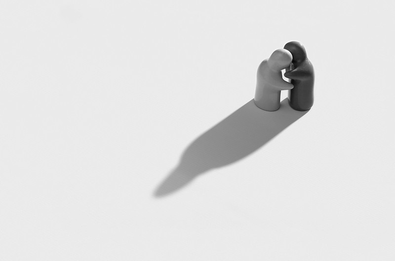
I've played around a little bit with it in post. For once I didn't want a high contrast look - I want a high key shot. So, I could have boosted the contrast and made the dark character nearly black, but that would spoil the look I was going for. Of course, the look I was going for could well be a rubbish idea! I also wanted lots of negative space to reinforce the attachment / detachment aspect. However that caused lighting problems with my simple setup, so I had to resort to sorting that a bit in post :exit:

But on to the theme... for attached, I decided that there is something which, given the right light, is always attached to anything and you're not able to get rid of it: a shadow. Of course, move into bright, even light or darkness and it goes away, but you simply can't escape your shadow otherwise... it stays attached.

So, I knew what I wanted to shoot, sort of. But I hadn't found the actual subject... until I happened across this salt and pepper set which shows a different kind of "attached" which was a bit of a result :)

Here we are then: attached in two ways...


Touching
by pjm1 (Paul), on Flickr

Any comments welcome but I realise I'm behind on all of yours so will understand if you don't!
 
Very similar in layout / shape to Andy's leaf showing above it in the pictures thread... But very different too.

Love the sense of / lack of scale from the space around them... It could almost be two real people in an Italian square being bathed in evening sunlight,. :)

Also of interest is how the shadow goes from hard at their feet to soft round their heads and how the two "people" share the one shadow, strengthening their attachment..

Can't see any bit that you've added in post although the pixel count seems a bit high for your camera??

(y)
 
Hi Paul, We have exactly the same salt and pepper pots I used them earlier in the 52 too,
nice composition love the use of the dead space, shadow is excellent too, very nice bit of work for a quickly grabbed shot (y)
 
Very similar in layout / shape to Andy's leaf showing above it in the pictures thread... But very different too.

Love the sense of / lack of scale from the space around them... It could almost be two real people in an Italian square being bathed in evening sunlight,. :)

Also of interest is how the shadow goes from hard at their feet to soft round their heads and how the two "people" share the one shadow, strengthening their attachment..

Can't see any bit that you've added in post although the pixel count seems a bit high for your camera??

(y)

Hiya Graham... thanks for commenting. Will catch up with everyone's comments tomorrow as I'm just back from hillwalking and need to have a bath!

I was really pleased with this photo and I'm very glad you like it - it was a very different style from my "usual" of tight crops (even if it was producty and B&W!)

The softening of the shadow wasn't something I did deliberately, but I think the reflection of the flashes off the white vinyl caused it (two flashes for this shot: key from behind, hence the glare highlight on the black character's back of head; fill bounce flash from wall behind camera and ceiling on top, so LOADS of light).

My post processing was just fixing bad setup which was quicker to do in PS than muck around with a 6kg roll of vinyl: I had a couple of slight kinks in the flat surface the vinyl was lying on, so it came through - I did a bit of frequency separation and then just made the low frequency layer part of the background all the same colour. Job done, without affecting the high frequency which contained the pattern of the background :)

Then I decided I wanted more empty space (which I couldn't get in shot because of space limitations) so I added some extra space around the edge with content-aware fill. Reckon it was about 10 minutes of silly playing around because I'd forgotten how to do FS in 16 bit mode as it's been a while.

So that's why I have a few more pixels than my camera can manage!
 
Hi Paul, We have exactly the same salt and pepper pots I used them earlier in the 52 too,
nice composition love the use of the dead space, shadow is excellent too, very nice bit of work for a quickly grabbed shot (y)

Cool, they're quite good subjects aren't they? Interesting, even thought they're just S&P pots! One of the arms has broken off (the darker guy) so I had to strategically place them so that didn't show :)

Thanks for the kind comments... I haven't really done a dead space shot before so that was fun and I do like the look. I think I could have got away with even more space around them, to be honest.

Most of the time was getting the sodding vinyl out and trying to remove all the creases. It's 4mx2m so big and heavy... and difficult to position unless it's just hanging. Because it was a grab shot, I didn't want to set up the proper "studio" so just rolled it out on the sofa with some shelving to provide a sort of level firm surface. Not ideal and if I'd had more time, I could have achieved precisely the shot I wanted in camera!

Thanks for looking and commenting... will be catching up with comments tomorrow :)
 
Attached. I'm a mahoosive fan of negative space so this works really well for me. The emotion exudes from them.

I did wonder if a little more contrast was needed, did an edit, and decided it didn't :)

Cheers.
 
Yep, works for me Paul, suites b&w, positioning, composition, shadow are good (y) I'm guessing the shadow, definite to soft is dof? works very well (y)
 
Hi Paul ... so you've now done all 48 themes? Well done indeed. :clap:

But I'm sorry to say - whilst I don't know the first thing about lighting - LINE just doesn't work for me. The light makes the subject look old and tired. o_O

On the other hand, ATTACHED is great stuff. I remember your salt & pepper, and I hope this is not the last we see of them. I agree with what's been said about the long shadow, empty space, positioning etc. Excellent. (y)
 
Hi Paul


Smooth....hmmm....for the theme it works , lighting on the fruit , as normal with your images , is good , just high lighting the moisture enough :)
I think the placement has been mentioned already , it seems a bit awkward to me but I think that's because there's more light to the right of the shot than the left . If the light was stronger from the left then putting the fruit on the right might make it sit a bit easier .....not sure that makes sense to anyone but me :eek: The reflection isn't strong enough for me & seems a little unbalanced with the brighter area of light on one of the fruits in the reflection .The biggest thing that jumps out at me though is what appears to be lots of noise , partic in the light area's of the base and up the majority of the lhs ,almost wondering if the fruit is sat on a glittery top ? Apologies if that sounds harsh but , for me , your images are usually much stronger technically than this one :exit:

Week 1 Line... like this one , cheeky little star burst , bit of rim lighting on the base & mono works well ( I have your phone's twin sister by the way :D ) Unlike Andy....for a change I'd like to have seen the whole phone rather than the slightly cropped top version....sorry :(

Attached....perfect as is...really like this ( must get myself one of those cruet sets !) ,fabulous shadow, brilliant lighting & great use of negative space , also like the downward POV on this one :clap:
 
Hey Paul :)

Play re-shoot - Now this is nice, liking the high key look a lot... Great eye contact, colours not too bright and even though the background is super white there is some grounding shadow still - Nice One (y)

Smooth - Really like the lighting on this, thanks for the detailed set-up, I really must try some snooted shots... A good reflection and cropped just at the right place, the water works well on the top fruit, would be nice to see a tad on the others too :)

Attached - Agreeing with Graham here, this could be a shot from anywhere, liking it in B&W presuming they are coloured, like how the shadows meet and create one form, real good lighting again, like the point of view too... can't fault this myself :clap:
 
Attached. I'm a mahoosive fan of negative space so this works really well for me. The emotion exudes from them.

I did wonder if a little more contrast was needed, did an edit, and decided it didn't :)

Cheers.

Hiya Andy - thanks for looking and commenting :) Glad it's striking a chord with you (and so many, it seems)...

Yes, my "usual" preference for B&W is high contrast, but I just didn't think it would work - I didn't even try it, to be honest... kept my slider fiddling to a minimum for a change ;) Thank you for taking the time to have a play and confirm my thoughts though!

Yep, works for me Paul, suites b&w, positioning, composition, shadow are good (y) I'm guessing the shadow, definite to soft is dof? works very well (y)

Hiya Phil, thanks for the comments. I'm still struggling with the cause of the shadow softening... even though I like it, it wasn't exactly intentional! I think it's more reflection based than DOF but could be wrong. I'm currently working my way through "Light: Science & Magic" which is an amazing book on lighting for photography so will see if they have an explanation tucked away!!

Cheers.
 
Hi Paul ... so you've now done all 48 themes? Well done indeed. :clap:

But I'm sorry to say - whilst I don't know the first thing about lighting - LINE just doesn't work for me. The light makes the subject look old and tired. o_O

On the other hand, ATTACHED is great stuff. I remember your salt & pepper, and I hope this is not the last we see of them. I agree with what's been said about the long shadow, empty space, positioning etc. Excellent. (y)

Hiya David - thanks for commenting, and yes, I'm caught up now apart from this week's which is incoming shortly :) No worries re: Line... to be fair, it is old and tired! My treatment in post was quite harsh, as was the lighting... it was never going to be a flattering shot.

Glad you liked attached though. This was one of those which I thought about, came across the pots and thought I'd just try to grab the shot. It was rushed and far from perfectly set up, but I've managed to rescue some average lighting with a bit of photoshop :)

Hi Paul ...agree with everything above ...super idea, super composition, super shadow, and super choice for the theme :)

Thanks Susie - appreciate you commenting and we're nearly there!!! Glad you like it :)
 
Hi Paul


Smooth....hmmm....for the theme it works , lighting on the fruit , as normal with your images , is good , just high lighting the moisture enough :)
I think the placement has been mentioned already , it seems a bit awkward to me but I think that's because there's more light to the right of the shot than the left . If the light was stronger from the left then putting the fruit on the right might make it sit a bit easier .....not sure that makes sense to anyone but me :eek: The reflection isn't strong enough for me & seems a little unbalanced with the brighter area of light on one of the fruits in the reflection .The biggest thing that jumps out at me though is what appears to be lots of noise , partic in the light area's of the base and up the majority of the lhs ,almost wondering if the fruit is sat on a glittery top ? Apologies if that sounds harsh but , for me , your images are usually much stronger technically than this one :exit:

Week 1 Line... like this one , cheeky little star burst , bit of rim lighting on the base & mono works well ( I have your phone's twin sister by the way :D ) Unlike Andy....for a change I'd like to have seen the whole phone rather than the slightly cropped top version....sorry :(

Attached....perfect as is...really like this ( must get myself one of those cruet sets !) ,fabulous shadow, brilliant lighting & great use of negative space , also like the downward POV on this one :clap:

Hiya Lynne... thanks for dropping in. My first shot was me attempting to nail a low key "painting" style shot, but I'm not there yet. I really like your idea of placement of the subject being linked to the direction of the light - obvious really but never thought about it... thank you! Re: the glittery surface, yes... it was a laptop case as I wanted that marble look, but sometimes my ideas don't quite work!

I think the Line shot was one of those which was fun to do (more for my benefit than anything) but didn't lead to a strong image. I enjoyed honing my skills but again, more work to do there :)

Attached - well, looks like I rescued it... third time lucky! I must confess I'm quite pleased with this one: apart from the softening of the shadow at the head end, it's pretty much exactly as I imagined in my mind before setting it up. Thanks for looking and commenting as always :)
 
Hey Paul :)

Play re-shoot - Now this is nice, liking the high key look a lot... Great eye contact, colours not too bright and even though the background is super white there is some grounding shadow still - Nice One (y)

Smooth - Really like the lighting on this, thanks for the detailed set-up, I really must try some snooted shots... A good reflection and cropped just at the right place, the water works well on the top fruit, would be nice to see a tad on the others too :)

Attached - Agreeing with Graham here, this could be a shot from anywhere, liking it in B&W presuming they are coloured, like how the shadows meet and create one form, real good lighting again, like the point of view too... can't fault this myself :clap:

Hi Dean, thanks for the comments all round. I enjoyed setting up Play and I'm pleased with the high key effect. Smooth - it still hasn't quite worked as I want, but I'm getting closer. Lynne has given me some more ideas and hopefully I'll get there with #3 attempt! And finally, glad you like my simple Attached shot... sometimes the quickest setups yield the best shots! Most annoying when it works the "wrong" way!
 
Well, Thanks to everyone for the crit on Attached (and other photos). The consistent theme at the moment is never-ending work :( So, I know I'm not going to have much of a chance to get a shot for Energy before the end of this week.

Mrs pjm1 wanted some family shots today for Christmas presents (I hope she's not planning those ghastly "selfie" Christmas cards with our family photos on the front!!! :eek:)... So I moved everything out of the kids play area and put up the backdrop, set up the lights etc. It's a bit of a faff as I don't have a backdrop stand yet (£50 seems like quite a bit when masking tape seems to do a reasonable job for about half an hour before it all falls down...) and also my lighting setups are a bit Heath Robinson: despite having a pair of stands and umbrellas - other modifiers are held together with bits of string etc. The biggest faff though is setting up the camera on a tripod (easy) but tethered to my LCD monitor which I place just beneath it, looking back towards the "studio"... this means we can see ourselves in Live View when we're positioning ourselves ready for remote shutter release. It's all a bit chaotic, interspersed with the vinyl falling down off the wall and kids screaming periodically for no good reason other than that's what kids do. But a fun way to spend a Sunday... I think.

Well, I also managed to get a couple of shots of just the two kids: Ollie and Izzy. This was obviously far easier as I could make faces and decide precisely when to press the shutter as I was taking the photo rather than relying on the remote control and a 3s delay. Unfortunately, I'm not sure the lighting setup worked as well with just the two of them: it looks very low contrast for some reason? Isabella isn't 100% well so I think that's why she looks very pale... but it may well be that my lighting isn't helping as well. I had key flash bouncing out of an umbrella through a large diffusion screen (although from the highlights it still looks like quite a small light, so I need to work on that...). No fill as such but I did have a second flash bouncing behind them off the ceiling to light the backdrop as much as possible and eradicate shadows falling onto the wall part of the backdrop. I do think this light has acted as quite a nice hairlight on Izzy.

Now... is it on theme? Well, technically this photo is the one that isn't. I must have taken 30 shots and believe me, every other one of them has one of them doing something busy/active/silly/funny/all of the above. Ollie saying something (not sure what) is about as still as I can get him - including when he's asleep :) So yes, they are full of energy, even if they don't look it in this photo!


Full of energy
by pjm1 (Paul), on Flickr

I know people are a bit sensitive commenting on kids' photos, but feel free here. There's something which I feel hasn't quite worked for Izzy in particular... although maybe she's just not well? :thinking:

Thanks!
 
Hi Paul, you start by explaining the lighting set up, I don't think you need to explain, the lightings good, very even across the picture, the whites could maybe do with a little work, but I can see you don't want to push them to much because of Ollie and Izzy's clothing.
I think you have caught some lovely expressions and I am sure no one would argue about kids energy, I am glad mine are grown up although I do have two grandchildren under one :eek:

it's a lovely shot of them both (y)

Can't offer any advice on how to improve the whites, sorry :(
 
Hi Paul,certainly on theme, no worries there! Lighting looks fairly good, maybe a little harsh? Could be my screen brightness though. For me, I know its tricky but eye contact would have made it a stronger image. The red of the trousers is quite strong and dominant, for me I might have considered a different color which wasn't as vibrant. A nice one for the album though.
 
come on Paul - who's going to say anything bad about those two cuties eh? Super lighting there, the fact they are both in light coloured tops and you don;t loose them against the white is impressive. Nice catchlights in the lads eyes too.

The biggest thing I think I've learnt recently, is a low power light positioned closer, is faaaaar better than a high power one far away. Both give the same light, but the closer one appears to be a larger source.

To make this a super shot I think needs eye contact, or at least them both looking at the same thing. But I know only too well how hard it is to get two nice poses / smiles / eye contacts in one shot. (And mine are 7 & 9).


ETA

I'm still struggling with the cause of the shadow softening... even though I like it, it wasn't exactly intentional! I think it's more reflection based than DOF but could be wrong.

I saw this as more the light sort of "wrapping" around the figures more than any focus phenomenon. The texture of the vinyl is similarly in focus both by the feet and the heads. Guessing you used a (relativlely) large source? Had you had a smaller source the shadow would have been harder all round?? :thinking: Doesn;t matter either way. I like it. :)
 
Last edited:
Hi Paul I hope life is going well for you and your not working to hard. I myself I am still playing catch up with things ( real effort to have it all done by the end of today ). I have just had a speedy look back at some of what you have posted for the earlier themes, and may I take the time to say well done for some outstanding work and some good takes on the themes.
 
Hi, Paul, well, it doesn't scream Energy, but it's a lovely photograph and the lighting, despite your details self crit, works well for me. Soft shadows, the red really pops. OK, Izzy's face looks a little darker than it could, but you've done well...

Only other crit, I'd like eye contact and perhaps have them a little closer to each other.

I'd love to have a little studio, maybe use the garage :naughty:

Cheers.
 
Hi Paul, you start by explaining the lighting set up, I don't think you need to explain, the lightings good, very even across the picture, the whites could maybe do with a little work, but I can see you don't want to push them to much because of Ollie and Izzy's clothing.
I think you have caught some lovely expressions and I am sure no one would argue about kids energy, I am glad mine are grown up although I do have two grandchildren under one :eek:

it's a lovely shot of them both (y)

Can't offer any advice on how to improve the whites, sorry :(

Thanks Allan - kind words appreciated!

The reason for explaining the lighting setup is that it wasn't that long ago that I really didn't know how to analyse photos to establish what the lighting setup is. Sometimes it can still be quite hard... so I like to set it all out for others to know how it was achieved - partly in case they're interested and partly because they may spot something I've done which could be easily improved.

I agree the whites are quite light grey, but as you say, dressing them in white hasn't made my life very easy!

They're great fun and it's hard being away from home at the moment with work... needless to say they get plenty cuddles when I get back (like now)!
 
Hi Paul,certainly on theme, no worries there! Lighting looks fairly good, maybe a little harsh? Could be my screen brightness though. For me, I know its tricky but eye contact would have made it a stronger image. The red of the trousers is quite strong and dominant, for me I might have considered a different color which wasn't as vibrant. A nice one for the album though.

Just seen your attached photo Paul, really like it, it works really well for me. Wouldn't change anything.

Cool, thanks for commenting, Michael. You're right that the light hasn't softened as much as I wanted. I was trying every trick to maximise the size of the lightsource, but I think there's no substitute for a REALLY big softbox, sometimes. Yes, the red is definitely quite punchy (and that's after desaturating it)!

Thanks for the very kind comment on Attached as well - that one seems to have worked well :)


come on Paul - who's going to say anything bad about those two cuties eh? Super lighting there, the fact they are both in light coloured tops and you don;t loose them against the white is impressive. Nice catchlights in the lads eyes too.

The biggest thing I think I've learnt recently, is a low power light positioned closer, is faaaaar better than a high power one far away. Both give the same light, but the closer one appears to be a larger source.

To make this a super shot I think needs eye contact, or at least them both looking at the same thing. But I know only too well how hard it is to get two nice poses / smiles / eye contacts in one shot. (And mine are 7 & 9).


ETA


I saw this as more the light sort of "wrapping" around the figures more than any focus phenomenon. The texture of the vinyl is similarly in focus both by the feet and the heads. Guessing you used a (relativlely) large source? Had you had a smaller source the shadow would have been harder all round?? :thinking: Doesn;t matter either way. I like it. :)

Thanks Graham :) Per my comment above, I'd like to get a big softbox at some point, but having just bought a medium format camera and a couple of lenses, I think I'm going to have to pause my spending for a bit!!

Re: the comment on the Attached lighting - I think you're spot on about the light wrapping around, but... and this is the weird thing... I used a bare bulb snooted flash to create the shadow - so the only "wrapping" could have been from reflection off the white vinyl. The fill light was bounced off the wall behind camera, so a big fill-in light source from quite a way away, so I'm struggling to see light fall off from that causing the problem? Bizarre!
 
Hi Paul I hope life is going well for you and your not working to hard. I myself I am still playing catch up with things ( real effort to have it all done by the end of today ). I have just had a speedy look back at some of what you have posted for the earlier themes, and may I take the time to say well done for some outstanding work and some good takes on the themes.

Hiya Mandy, glad to have you back! I am working myself a bit to the bone, but it'll be worth it (and it does allow me to spend more frivolously on hobbies!!) - hope your new job is going well. Thanks for looking back over the photos and I'm so glad some of them worked for you :)

Hi, Paul, well, it doesn't scream Energy, but it's a lovely photograph and the lighting, despite your details self crit, works well for me. Soft shadows, the red really pops. OK, Izzy's face looks a little darker than it could, but you've done well...

Only other crit, I'd like eye contact and perhaps have them a little closer to each other.

I'd love to have a little studio, maybe use the garage :naughty:

Cheers.

Spot on with your crit Andy (as always)... the gap between them is very frustrating looking back on it, but hey ho - you know how it can be with little ones. You definitely need to be able to set up a studio... if only my garage weren't used for my car and random junk, that'd be a great idea. As it is, I have to put all the kids toys into the living room and tape my vinyl up onto the wall. If we ever have that "concerned" look in any photos, it'll be because the vinyl is starting to fall down behind us!!

Thanks for commenting and looking :)
 
Last edited:
Back
Top