weekly SiblingChris' 52 in 2013

Thanks everyone

I was in two minds about the packet myself, I suppose I should have done one with and one without, but preferred it in. I suppose I could pp it out, but think I'm going to leave since a new theme will be out tomorrow

I like the blue of the tin, it is pale, but I just tweaked the saturation up a small amount which I think helped it

Lighting-wise, although i guess there was a lot in the setup (you don't know how many times e kitchen roller blind went up and down, and doors opened and closed!), I think it shows how good the 35mm f/1.8 Nikon lens is for the money to be honest and it wasn't even wide open for this shot..mainly because I didn't want such a narrow depth of field.
 
Hi Chris


Work.....wasn't sure about the crop idea for this shot to lose the branches from the top...but it works really well....love the desaturated tonoes & striking red of the sign & that a fab bit of pp to lose the car :clap:

Gluttony....nicely exposed, good angle , good colors & you've caught the textures in the biscuits well (y) I too would haveleft the empty packet out...but probably only after someone on here had suggested it...all round good stuff mister (y)
 
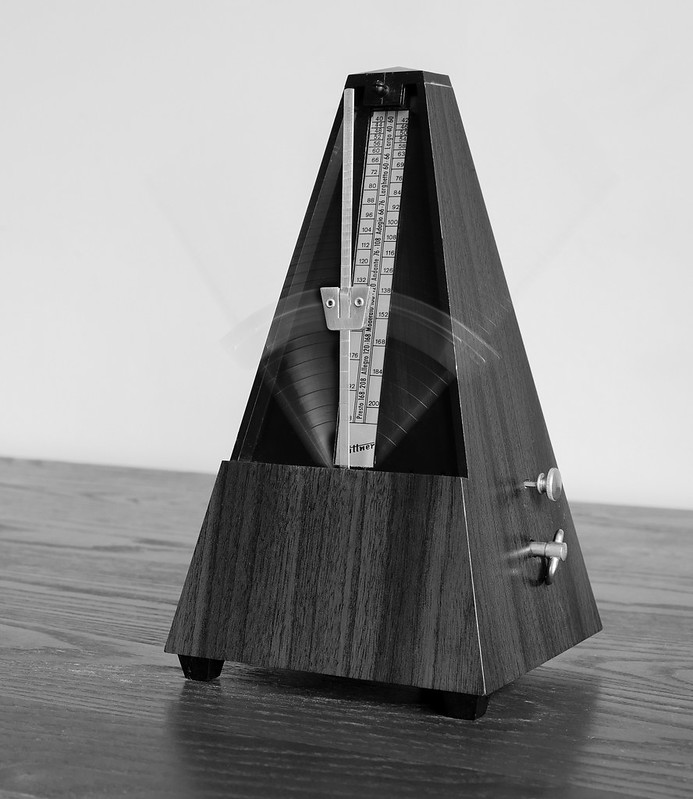
ok, well someone beat me to it with a metronome shot, but here is mine
I've kept it fairly simple and clean, B&W conversion in LightRoom with a blue filter applied

Then in photosop, a shot with the metronome in action, stacked on top of a still one so as to give a sense of motion but still see the arm clearly

here are uncropped and cropped versions


Week 8 - Time by Sibling Chris, on Flickr


Week 8 - Time by Sibling Chris, on Flickr
 
Last edited:
Cropped version for me. Like it in b&w. Only thing that bugs me is the table not being level, more so in the uncropped version.
 
Cropped version for me also. Excellent shot, detailed, well focussed, lit and edited. I particularly like how you have caught the swing in the pendulum. Great job and well in theme. Full marks!
 
Great interpretation of this week's theme and a cracking looking shot to boot. The metronome is sharp, the b&w compliments it and you've caught the motion of the pendulum just right. I prefer the cropped version.
 
Cropped version for me. Like it in b&w. Only thing that bugs me is the table not being level, more so in the uncropped version.

The table is level otherwise my food would be on the floor :D

Seriously though, thanks for the comments. for the table to be straight I would have to be at 90 degrees to it and then turn the metronome so it was not a straight shot from the front, personally not sure I would prefer it that way

I took a shot of this first with my stage piano in the background, but for me it was a bit "fussy"...perhaps if I had been playing it might have worked: next time maybe!
 
Cropped version for me also. Excellent shot, detailed, well focussed, lit and edited. I particularly like how you have caught the swing in the pendulum. Great job and well in theme. Full marks!

Thanks, getting the movement was tricky, had to play a lot with aperture and shot time to get it where I wanted and in the end did -5 exposure compensation on the camera too!
 
Great interpretation of this week's theme and a cracking looking shot to boot. The metronome is sharp, the b&w compliments it and you've caught the motion of the pendulum just right. I prefer the cropped version.

Cheers
I liked the space in the original at first, but I think the cropped version is growing on me now too.
 
Hi. Great minds and all that lol
Love the capture of the movement and that you caught arm upright.
I've had same problem with table not looking level.....find it difficult when, like you say, not doing a 'straight on' shot.
 
Brilliant last two chris - absolutely no crit on either from me... which is unusual!

Love the detail you caught in the metronome, and layering static version over a moving version was a fantastic idea, as you get the best of both shots in one.

And it has to be the cropped in version - with that much detail in the shot - you have to see it up close.
 
Hi

Gluttony - good shot, very well handled partic given yuor description. Would have been just as much on theme and a cleaner shot without the wrapping.

Time - again interesting to hear your description of how it was taken. Both shots very clear and well focussed. I think that I will buck the trend and go with the uncropped version. The cropped version is good and well on theme but is just a well shot metronome.

To me the uncropped version adds the element of interpretation/imagination to the viewer and , without taking too much of a flight of fancy, I see it as a machine in a time and space which is created by the sloping back line, the fading of focus to the left and the movement / momentum of the object created by the pointer and the feet. Hope that makes sense :thinking:
 
No1 for me the crop is better caught the movement of the metronome really well
 
This was my first idea for time, but you beat me to the punch. :bonk:

On the flipside, mine wouldn't have looked as good as this anyway. The lighting, the movement and the processing is spot on for me. I prefer the first shot from a composition point of view.
 
Well I had quite a few ideas for this week's theme, but last week's them has not been on my side ;)

So this is my "effort". I was determined to get outdoors
I'm pleased with my intepretation of the theme but not so much the shot I took

I ended up using an underexposed version, slighlty cropped and actually then created 3 different exposures from it through LIghtRoom, which I subsequently did some light HDR on using Picturenaut

I then used InPaint to very quickly remove a couple of lamposts that I found distracting, and I didnt do a great job if I am honest...a quick pass through noiseware pro...

and then?... well I guess I was in a hurry so that's it for me for this week!


Week 9 - Juxtaposition by Sibling Chris, on Flickr
 
Last edited:
Like it and on theme. Composition is great and nice detail. I'd like to see a shallower DOF.

Cheers.

i don't necessarily disagree, i probably erred on the side of caution with the aperture setting as I know the 35mm f1.8 has quite a shallow DoF

So I just added some fake DoF in pp...
 
Last edited:
Good shot. (y)

Dof looks ok to my taste as it has the bloke and the lady at the cashpoint in focus but the bank sign and A-board and red brick building in lesser focus. Good colours. Paric like the fact that the board says that gold cash shop is opposite poundland - juxtaposition in one sign. (y)
 
Good shot. (y)

Dof looks ok to my taste as it has the bloke and the lady at the cashpoint in focus but the bank sign and A-board and red brick building in lesser focus. Good colours. Paric like the fact that the board says that gold cash shop is opposite poundland - juxtaposition in one sign. (y)


Ahh.. Sorry! I probably should have posted a separate edit, but after posiview's comment I did a bit of pp to add a graduated blur to simulate a shallower DoF. Originally the buildings further down the street and the other people where all in focus.
 
Apologies Chris, I haven't commented for a while :(
The cropped version for time gets my vote, it really focuses the viewers eye on the level of detail in there. The movement is fantastic, (y)

I like your juxtaposition too, the bright vivid colours are very eye catching. Its bang on theme for me.
Some minor crit, the people in the background with their heads chopped off I find a little distracting but other than that, spot on. Iain

that's a fair comment matey... I took about a dozen shots hand held and felt a tad "exposed" my self - a tripod might have allowed me to stack the shots and remove people from the background more easily. Don't think I would have felt comfortable with the tripod there though.

Anyway, it was tricky getting someone at the cash machine and other people not blocking them, so this unfortuantely was the best one of the bunch.
 
A good spot.

Works well with the theme, sharp, and really nice colours. There's a life to it, good 'out and about' photography that really keeps you returning to the image.
 
Well I took these a week ago now and as expected the week wizzed by and I have only just had chance to get them into lightroom

some desaturation applied, except to the actually subject.

these were from the NIA last week at the All England Open Badminton Championships - unfortunately not allowed to photograph the actual event :(


Week 10 - Letter (R) by Sibling Chris, on Flickr


Week 10 - Letter (S) by Sibling Chris, on Flickr
 
good use of the theme i think i prefer the first in the second the rubbish is a bit distracting
 
both interesting shots and well on theme, but spoiled somewhat by the rubbish in both I'm afraid.

Liking the idea, orientation, DOF, processing, composition...... just not the rubbish.
 
Back
Top