
You are using an out of date browser. It may not display this or other websites correctly.
You should upgrade or use an alternative browser.
You should upgrade or use an alternative browser.
weekly Superpippo's 52 in 2014 Week 52 - Support added and FINISHED
- Thread starter superpippo
- Start date
OP
- Messages
- 4,846
- Name
- Alan
- Edit My Images
- Yes
Hi Alan... a couple of great shots there.
Possibly two tiny suggestions/comments: a touch of shadow lifting on the black parts of the lens and, separately, I'm not sure the shadow onto the background adds anything: I'd probably prefer to see it missed out (although not easy to achieve with all of the other lighting challenges mentioned). But still a great shot!
The "nuts" shot for Smooth is good... loads of good curves. I actually rather like the processing / look you've applied. Sure, there are a few little glitches that you've mentioned (possibly over clarity?) but the look of the sea and nuts is very stark, which works for me. It looked deliberately treated, rather than someone who's ramped the sliders too far without care/thought... so well done! Great front-back sharpness too, and I really like the composition.")
Thanks Paul - there is a bit of reflected light n the lens in order to raise the letters but maybe not enough. The shadow on the b/g was almost unavoidable and as I took about 40 before I was satisfied, I left it in.
Nice of you to comment "It looked deliberately treated, rather than someone who's ramped the sliders too far without care/thought..." because I thought long and hard and did a lot of fiddling so as not to overdo it - except clarity
loving the camera, looks in excellent condition, very profeshunally shot too. Enough detail in the black bits for me, think the texture on the body is great, nothing is too shiny, and there is a beautiful "ching" of light above the lens. Well positioned in the frame and the tiny splash of green, yellow and red pops nicely.
Sea wall is nice too, curves away into the distance and up and over your position. The green of the seaweed is a welcome addition to break up the grey, blue and sandy colurs elsewhere.
I got LR earlier in the year... and love it. Agree with Paul, could be over clarity, or over sharpening that tends to give white lines or halos at high contrast interesctions. Also as ISO is getting up a (little) bit here, sharpening / clarity works less well on a "noisy" image.
I generally try and keep in mind, if in doubt, go with half of what you think looks good. Also, I try to view the image at 100%, or 1:1 when sharpeneing / adding clarity to really see whats happening. The adjustment brush is also useful if you only want to add it to a certain area.
Thanks Graham. First attempts with LR but amazing what it can achieve. And maybe take your advice and go to where I think OK and then back off a bit. Haven't found the Adjustment brush yet
Super smooth shot Alan .... I love the perspective, textures, and the soft curves... the top right of the wall looks like a wave ... a really excellent choice for the theme
Thx Susie
OP
- Messages
- 4,846
- Name
- Alan
- Edit My Images
- Yes
Hi Alan, the camera shot is great, love the lighting on it you have done well with all those reflective surfaces, excellent work
sea wall shot is another cracker plenty of curves, love the curve on the top of the right hand wall,
its worthwhile sticking with Lightroom started using it myself about 3 months ago takes a while to get used to still learning its possibilities,
there are some good tutorials on you tube, especially for the hard of thinking like me
Cheers Allan - pleased with both shots -. In LR got to say that it is easy to overdo it because of its power - trouble now is that instead of spending hours commenting on 52s I have added hours watching tutorials - and then watching them again cos I forgot what was said :banghead:
OP
- Messages
- 4,846
- Name
- Alan
- Edit My Images
- Yes
First, cracking camera, nice low key lighting and the white text on the lens really pops. A little star burst as well
Smooth, like it as well. The perspective works well as does the, as Paul said, front to back sharpness. I did try a few crops, but could not improve on yours.
Cheers.
Thanks Andy - coming from the king of the crop farmers that is praise indeed.
SMOOTH ... fantastic composition Alan ... can't work out if you're on the wall with camera over the side, standing on nuts or feet on firm ground zooming in!
"...standing on nuts ...."
Actually on terra firma - set of stairs down to the beach
- Messages
- 6,502
- Name
- Peter
- Edit My Images
- Yes
Grow - We have oranges like this :-( What a great idea though. The blueish tint of the mould compliments the orange colour nicely. I like the side lighting plus the reflection of the colour on the surface. Nice one.
Live - A decent fish shot taken through glass which definitely makes the job a lot harder
First - Now this is a great image of the camera. I like the angle but most of all the lighting has been extremely well handled keep the reflections to an absolutely minimum whilst still retaining the detail in the metal. Super shot.
Smooth - I quite like this. There are plenty of lines to take the eye around the picture. Sounds like you've learnt some new editing techniques as well which must be a bonus especially as they seem to have turned out well.
- Messages
- 13,760
- Edit My Images
- Yes
Hi Alan
First - Nice bit of kit there mate, must agree with others here, really nicely lit, bringing out some real good detail - nice one
Smooth - I really like this, the jagged blocks on the smooth curve, the green band really finishes it off nicely too, well chosen PoV mate and nice even light
First - Nice bit of kit there mate, must agree with others here, really nicely lit, bringing out some real good detail - nice one
Smooth - I really like this, the jagged blocks on the smooth curve, the green band really finishes it off nicely too, well chosen PoV mate and nice even light
OP
- Messages
- 4,846
- Name
- Alan
- Edit My Images
- Yes
 Attached - DSC_1605
OP
- Messages
- 4,846
- Name
- Alan
- Edit My Images
- Yes
Grow - We have oranges like this :-( What a great idea though. The blueish tint of the mould compliments the orange colour nicely. I like the side lighting plus the reflection of the colour on the surface. Nice one.
Live - A decent fish shot taken through glass which definitely makes the job a lot harder
First - Now this is a great image of the camera. I like the angle but most of all the lighting has been extremely well handled keep the reflections to an absolutely minimum whilst still retaining the detail in the metal. Super shot.
Smooth - I quite like this. There are plenty of lines to take the eye around the picture. Sounds like you've learnt some new editing techniques as well which must be a bonus especially as they seem to have turned out well.
Thx Peter. The LR has begun to make a difference altho I ma very slow inlearning
Hi Alan
First - Nice bit of kit there mate, must agree with others here, really nicely lit, bringing out some real good detail - nice one
Smooth - I really like this, the jagged blocks on the smooth curve, the green band really finishes it off nicely too, well chosen PoV mate and nice even light
Cheers DK .. Kind words
- Messages
- 8,398
- Name
- Lynne
- Edit My Images
- Yes
Hi Alan
super shot for 1st , proper product shot for a mag . Well positioned, super sharp , no really nasty blown bits & a hint of shadow....top job
Smooth....I've also just got LR & it takes some getting used to for sure ! I still keep going back to photoshop ! Love the curves you have going on there,the almost mono color palette & although the pp seems a little harsh I quite like the overall effect
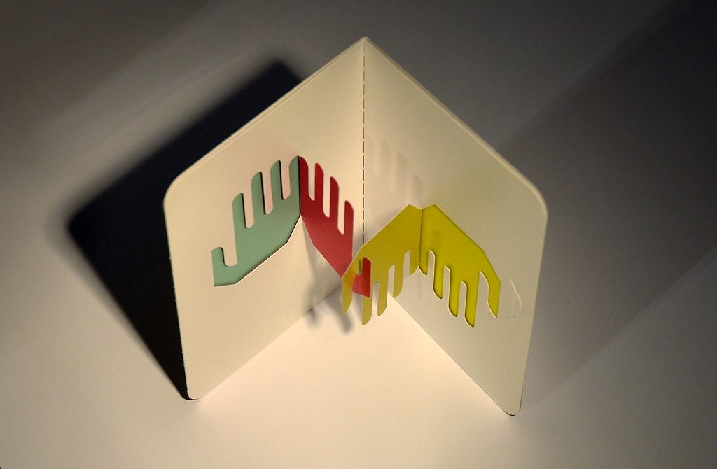
Attached....I can see the middle hands are pushed out from the outer hands & the perforation type lines in the corner but have no bloomin idea what it's for / is / does Interesting piece of abstract art , nice touch with the shadow , only niggle is s bit of a red hue over the left most hand (4th & 5th fingers mainly then it fades over the rest )......
Blondie606Photography
MyFlickr My 52 2014
super shot for 1st , proper product shot for a mag . Well positioned, super sharp , no really nasty blown bits & a hint of shadow....top job
Smooth....I've also just got LR & it takes some getting used to for sure ! I still keep going back to photoshop ! Love the curves you have going on there,the almost mono color palette & although the pp seems a little harsh I quite like the overall effect
Attached....I can see the middle hands are pushed out from the outer hands & the perforation type lines in the corner but have no bloomin idea what it's for / is / does
Interesting piece of abstract art , nice touch with the shadow , only niggle is s bit of a red hue over the left most hand (4th & 5th fingers mainly then it fades over the rest )......Blondie606Photography
MyFlickr My 52 2014
OP
- Messages
- 4,846
- Name
- Alan
- Edit My Images
- Yes
Week 48 - Energy
Really not sure about this but as time ticks towards the end of the year i need to get something up. The concept was the energy of the weather with a storm brewing over the other side of the estuary and the sun rising adding power to the day.
Had a lot of trouble exposing and spent ages with the LR sliders - they need oiling now
EDIT there is a slightly diff version on Flickr with the foreground lightened slightly - title Energy 2
 Energy by Superpippo0547, on Flickr
Really not sure about this but as time ticks towards the end of the year i need to get something up. The concept was the energy of the weather with a storm brewing over the other side of the estuary and the sun rising adding power to the day.
Had a lot of trouble exposing and spent ages with the LR sliders - they need oiling now
EDIT there is a slightly diff version on Flickr with the foreground lightened slightly - title Energy 2
Energy by Superpippo0547, on Flickr
Last edited:
OP
- Messages
- 4,846
- Name
- Alan
- Edit My Images
- Yes
Hi Alan
super shot for 1st , proper product shot for a mag . Well positioned, super sharp , no really nasty blown bits & a hint of shadow....top job
Smooth....I've also just got LR & it takes some getting used to for sure ! I still keep going back to photoshop ! Love the curves you have going on there,the almost mono color palette & although the pp seems a little harsh I quite like the overall effect
Attached....I can see the middle hands are pushed out from the outer hands & the perforation type lines in the corner but have no bloomin idea what it's for / is / does
Blondie606Photography
MyFlickr My 52 2014
Thanks Lynne
The hands are on a birthday card that Mrs SP bought me last week. As you open it the hands come forward. See what you mean about the red hue spillage which is due to the red hand being at right angle to the grey hand and the light from the left is being reflected back.. Must admit i did not see that - but wondering what i would have done about it anyway.
OP
- Messages
- 4,846
- Name
- Alan
- Edit My Images
- Yes
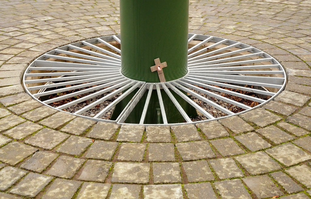 Round DSC_1591 - Copy
- Messages
- 4,088
- Name
- Graham
- Edit My Images
- Yes
Attached, and there was me thinking you'd cut them out youself. can;t decide if teh shadow behind the third hand adds or distracts. Like that you can see the depth of the card and where the hands fold out from
Energy - WOWZERS.... that is a pretty awesome scene. At first look it looks like you're up in a plane above the clouds, then you get the sliver of land to ground and scale it, those cloud shapes are amazing and the sun looks very well handled.
To top it off you even have a heli flying towards the sun.
Round - it is indeed - simple, well composed for centrality and symmetry. Well found cross to add a bit of interest and story to it too.
can;t decide if teh shadow behind the third hand adds or distracts. Like that you can see the depth of the card and where the hands fold out from Energy - WOWZERS.... that is a pretty awesome scene. At first look it looks like you're up in a plane above the clouds, then you get the sliver of land to ground and scale it, those cloud shapes are amazing and the sun looks very well handled.
To top it off you even have a heli flying towards the sun.
Round - it is indeed - simple, well composed for centrality and symmetry. Well found cross to add a bit of interest and story to it too.
- Messages
- 8,398
- Name
- Lynne
- Edit My Images
- Yes
Wayy hayy.....back so quick , a 1st for me
Energy...works perfectly for me , cracking cloud formation, chopper in frame , sun beaming out.....super capture
Round....well spotted with lots of rounds going on in there Only miinor niggle ( I blame my OCD !)...can you guess ?? I really want you to be stood square on to the little wooden cross.....
Energy...works perfectly for me , cracking cloud formation, chopper in frame , sun beaming out.....super capture
Round....well spotted with lots of rounds going on in there
Only miinor niggle ( I blame my OCD !)...can you guess ?? I really want you to be stood square on to the little wooden cross.....- Messages
- 7,548
- Name
- susie
- Edit My Images
- Yes
Hi Alan you've been busy...
Attached .... that makes a smashing abstract type image ...I hadn't a clue what it was 'till I read the explanation , an excellent unusual choice for the theme.
Energy .... love this one ....cut a few millimeters off and you're flying high above the clouds ...great perspective, the helicopter is the icing on the cake.
Round ...round and round ...very well spotted and bang on theme ... and I like the little cross tucked in there.
- Messages
- 11,089
- Name
- Allan
- Edit My Images
- No
Hi Alan, hands picture is very odd, there is a little red hue as Lynne points out obviously the reflection from the red hand, nothing you could do about that, works well for the theme
I get were you are coming from for energy, and I think it almost works though it does need an explanation its a great cloud shot anyhow, as said above the helicopter is a nice touch
round, couldn't get more round if you tried, strange place to keep a wooden cross though
I get were you are coming from for energy, and I think it almost works though it does need an explanation its a great cloud shot anyhow, as said above the helicopter is a nice touch
round, couldn't get more round if you tried, strange place to keep a wooden cross though
- Messages
- 13,760
- Edit My Images
- Yes
Hi Alan
Attached - Nooooo what you doing to my brain !!!!
Love the colours, feeling it could be a tad sharper ?? but really like the idea, goodness knows how you have done this but it works really well
Energy - Not so sure theme wise, but boy what a great combination of stuff going on, a strip of land, heavy stormy clouds and bright sky above, that chopper looks minute in that vast sky
Round - Really like this, the green pole even works, a good spot seeing this cross, a good choice for the crop too... as round as round can be
- Messages
- 9,095
- Name
- Mandy
- Edit My Images
- Yes


- Messages
- 7,516
- Edit My Images
- Yes
Three good images Alan
Attached, great idea using the card with hands, I studied quite awhile before realising that the two middle hands were cut out from the bg card, then I read what it was
Energy- yep, link to the theme works for me, definitely energy in the weather. Nice bit of blue and the black, dramatic clouds below ..........I wasn't too sure on the helicopter but it does give it a sense of scale
Round- Good simple idea, works well ..........I did think it needed slight anti-clockwise rotation, but a quick check tells me it doesn't ....some sort of an illusion? or just my wonky eyes
Attached, great idea using the card with hands, I studied quite awhile before realising that the two middle hands were cut out from the bg card, then I read what it was
Energy- yep, link to the theme works for me, definitely energy in the weather. Nice bit of blue and the black, dramatic clouds below
..........I wasn't too sure on the helicopter but it does give it a sense of scale Round- Good simple idea, works well
..........I did think it needed slight anti-clockwise rotation, but a quick check tells me it doesn't ....some sort of an illusion? or just my wonky eyes - Messages
- 6,502
- Name
- Peter
- Edit My Images
- Yes
Attached - This is really interesting if nothing else just to work out which bit are cut out and which sticking out. Almost like a Escher type image. Well done to choosing this for the theme
Energy - Definitely a sense of a storm brewing. I'm not too sure about the helicopter being so central and small in the image though. Maybe on the classic third would have helped.
Round - There's lots of rounds here. The cross is just an added extra which you usually associated with a cenotaph so I immediately wondered what the story was.
- Messages
- 19,461
- Name
- Andy
- Edit My Images
- Yes
Hi, Attached. I can't quite work out whether it's been 'shopped of not an interesting take but as lynne states some of the colours seem to have bled.
Energy, I've been keeping my eye out for an opportunity to take a similar photograph, with a very small strip of land and a great expanse of sky. I like it and the inclusion of the helicopter really adds scale.
Round, yeah, lots of rounds. I'd like a slightly higher perspective.
Cheers.
an interesting take but as lynne states some of the colours seem to have bled.Energy, I've been keeping my eye out for an opportunity to take a similar photograph, with a very small strip of land and a great expanse of sky. I like it and the inclusion of the helicopter really adds scale.
Round, yeah, lots of rounds. I'd like a slightly higher perspective.
Cheers.
OP
- Messages
- 4,846
- Name
- Alan
- Edit My Images
- Yes
Attached, and there was me thinking you'd cut them out youself.
Energy - WOWZERS.... that is a pretty awesome scene. At first look it looks like you're up in a plane above the clouds, then you get the sliver of land to ground and scale it, those cloud shapes are amazing and the sun looks very well handled.
To top it off you even have a heli flying towards the sun.
Round - it is indeed - simple, well composed for centrality and symmetry. Well found cross to add a bit of interest and story to it too.
Thx Graham. see below for another shot of Attached
Pleased that you like Energy
Wayy hayy.....back so quick , a 1st for me
Energy...works perfectly for me , cracking cloud formation, chopper in frame , sun beaming out.....super capture
Round....well spotted with lots of rounds going on in there
Thx Lynne - I understand your OCD but in view of the context I left it alone - it is surrounded by a fence anyway.
Hi Alan you've been busy...
Attached .... that makes a smashing abstract type image ...I hadn't a clue what it was 'till I read the explanation , an excellent unusual choice for the theme.
Energy .... love this one ....cut a few millimeters off and you're flying high above the clouds ...great perspective, the helicopter is the icing on the cake.
Round ...round and round ...very well spotted and bang on theme ... and I like the little cross tucked in there.
THx Susie
Hi Alan, hands picture is very odd, there is a little red hue as Lynne points out obviously the reflection from the red hand, nothing you could do about that, works well for the theme
I get were you are coming from for energy, and I think it almost works though it does need an explanation its a great cloud shot anyhow, as said above the helicopter is a nice touch
round, couldn't get more round if you tried, strange place to keep a wooden cross though
Thx Allan - red hue noted and you have understood why.
Cross is part of a small memorial - see below
Hi Alan
Attached - Nooooo what you doing to my brain !!!!
Love the colours, feeling it could be a tad sharper ?? but really like the idea, goodness knows how you have done this but it works really well
Energy - Not so sure theme wise, but boy what a great combination of stuff going on, a strip of land, heavy stormy clouds and bright sky above, that chopper looks minute in that vast sky
Round - Really like this, the green pole even works, a good spot seeing this cross, a good choice for the crop too... as round as round can be
Cheers Dk. Shot below to unscramble your brain.
Three good images Alan
Attached, great idea using the card with hands, I studied quite awhile before realising that the two middle hands were cut out from the bg card, then I read what it was
Energy- yep, link to the theme works for me, definitely energy in the weather. Nice bit of blue and the black, dramatic clouds below
Round- Good simple idea, works well
Wonky eyes
Attached - This is really interesting if nothing else just to work out which bit are cut out and which sticking out. Almost like a Escher type image. Well done to choosing this for the theme
Energy - Definitely a sense of a storm brewing. I'm not too sure about the helicopter being so central and small in the image though. Maybe on the classic third would have helped.
Round - There's lots of rounds here. The cross is just an added extra which you usually associated with a cenotaph so I immediately wondered what the story was.
Thx Peter . Helicopter was abonus as i had taken the shot then had to quickly turn to try to incorporate it. They move quickly!
Photo attached of Spitfire memorial
Hi Alan
Attached ... I like because I don't understand it.
Energy ... heavenly ... taken from another plane?
Round ... lots of roundness there ... and that little wooden cross, and the fact that is falling ... poetic.
Cheers David
Hi, Attached. I can't quite work out whether it's been 'shopped of not
Energy, I've been keeping my eye out for an opportunity to take a similar photograph, with a very small strip of land and a great expanse of sky. I like it and the inclusion of the helicopter really adds scale.
Round, yeah, lots of rounds. I'd like a slightly higher perspective.
Cheers.
Thx Andy - no p shopping at all. See below.
Those skies are typical of round here when the weather is having one of its wobblers.
No higher on round cos of fence around so cannot get too near.
Attached set up shot
 Attached v2 DSC_1610 by Superpippo0547, on Flickr
Round - context
 Spitfire memorial by Superpippo0547, on Flickr
 Memorial by Superpippo0547, on Flickr
Last edited:
OP
- Messages
- 4,846
- Name
- Alan
- Edit My Images
- Yes
Week 50 - Nonsense
A filler from me as I cannot think of anything to do for this theme in this week.
No comments necessary as it is just an experiment in P/S for me.
I now have a better idea as to how I might shoot and process it again at least.
 Nonsense DSC_1464 - Copy_edited-1 by Superpippo0547, on Flickr
A filler from me as I cannot think of anything to do for this theme in this week.
No comments necessary as it is just an experiment in P/S for me.
I now have a better idea as to how I might shoot and process it again at least.
Nonsense DSC_1464 - Copy_edited-1 by Superpippo0547, on Flickr
Last edited:
- Messages
- 11,089
- Name
- Allan
- Edit My Images
- No
Hi Alan, it has to be one of the worst topics ever, you have made an interesting image, I am still trying to figurer out what on earth it is
I think the best thing to come out of it is you have at least learnt to do something and have a clearer idea of how to achieve your goal next time, always a good thing.
I do like a bit of Spike Milligan too
I think the best thing to come out of it is you have at least learnt to do something and have a clearer idea of how to achieve your goal next time, always a good thing.
I do like a bit of Spike Milligan too
OP
- Messages
- 4,846
- Name
- Alan
- Edit My Images
- Yes
OP
- Messages
- 4,846
- Name
- Alan
- Edit My Images
- Yes
- Messages
- 4,182
- Name
- Paul
- Edit My Images
- Yes
Hi Alan... a few interesting images here and sorry it's been so long since I last posted on your thread...
Attached - this is a genius idea: I really like it. I'm a bit confused why it seems so noisy as presumably it was a setup shot where you could have added more light? Maybe not though. I reckon I'm in the camp that finds the background shadow a bit distracting, but I can also see why you/others might prefer it left it - definitely a personal choice rather than one being right or wrong. I love the colours, too. I reckon it could do with a stop or so more exposure, which might also help make those vibrant colours pop even more, but it's still a good shot regardless - and a very smart take on the theme
Energy - It's on theme enough for me, partly because of the blown sun! It almost looks like a distant explosion, so ticks the energy box for me. Unlike everyone else, I'm struggling to fall in love with it as much as some of your other shots, but I think you've handled shooting into the sun well and I'll take the blown sun as a deliberate objective to convey the theme I like the sliver of land at the bottom...
Round - I like that composition... feels very "settled" for want of a better word. I also think the cross adds something. I wonder whether it could do with a tiny lift of maybe half a stop perhaps... obviously not sure how white the white grate really was!
Nonsense - well I really like this. I have no idea why... as it's almost not a photo, but I really like the image. I'll confess I'm less a fan of the type - I think it needs a different colour and something with a thicker typeface as I'm struggling to read it easily, but I do like the idea. For me, this is a good example of something which probably shouldn't work but does. Which begs the question... what on earth is it?!?
Attached - this is a genius idea: I really like it. I'm a bit confused why it seems so noisy as presumably it was a setup shot where you could have added more light? Maybe not though. I reckon I'm in the camp that finds the background shadow a bit distracting, but I can also see why you/others might prefer it left it - definitely a personal choice rather than one being right or wrong. I love the colours, too. I reckon it could do with a stop or so more exposure, which might also help make those vibrant colours pop even more, but it's still a good shot regardless - and a very smart take on the theme
Energy - It's on theme enough for me, partly because of the blown sun! It almost looks like a distant explosion, so ticks the energy box for me. Unlike everyone else, I'm struggling to fall in love with it as much as some of your other shots, but I think you've handled shooting into the sun well and I'll take the blown sun as a deliberate objective to convey the theme
I like the sliver of land at the bottom...Round - I like that composition... feels very "settled" for want of a better word. I also think the cross adds something. I wonder whether it could do with a tiny lift of maybe half a stop perhaps... obviously not sure how white the white grate really was!
Nonsense - well I really like this. I have no idea why... as it's almost not a photo, but I really like the image. I'll confess I'm less a fan of the type - I think it needs a different colour and something with a thicker typeface as I'm struggling to read it easily, but I do like the idea. For me, this is a good example of something which probably shouldn't work but does. Which begs the question... what on earth is it?!?
- Messages
- 13,760
- Edit My Images
- Yes
Hi Alan
Nonsense - Agree a difficult theme, the below quotation sums it up really well, must say the colour of text doesn't work for me very well, a bit hard to read, but really liking the background image
Nonsense - Agree a difficult theme, the below quotation sums it up really well, must say the colour of text doesn't work for me very well, a bit hard to read, but really liking the background image
- Messages
- 9,095
- Name
- Mandy
- Edit My Images
- Yes
Great few images from you.
OP
- Messages
- 4,846
- Name
- Alan
- Edit My Images
- Yes
Hi Alan... a few interesting images here and sorry it's been so long since I last posted on your thread...
Attached - this is a genius idea: I really like it. I'm a bit confused why it seems so noisy as presumably it was a setup shot where you could have added more light? Maybe not though. I reckon I'm in the camp that finds the background shadow a bit distracting, but I can also see why you/others might prefer it left it - definitely a personal choice rather than one being right or wrong. I love the colours, too. I reckon it could do with a stop or so more exposure, which might also help make those vibrant colours pop even more, but it's still a good shot regardless - and a very smart take on the theme
Energy - It's on theme enough for me, partly because of the blown sun! It almost looks like a distant explosion, so ticks the energy box for me. Unlike everyone else, I'm struggling to fall in love with it as much as some of your other shots, but I think you've handled shooting into the sun well and I'll take the blown sun as a deliberate objective to convey the theme
Round - I like that composition... feels very "settled" for want of a better word. I also think the cross adds something. I wonder whether it could do with a tiny lift of maybe half a stop perhaps... obviously not sure how white the white grate really was!
Nonsense - well I really like this. I have no idea why... as it's almost not a photo, but I really like the image. I'll confess I'm less a fan of the type - I think it needs a different colour and something with a thicker typeface as I'm struggling to read it easily, but I do like the idea. For me, this is a good example of something which probably shouldn't work but does. Which begs the question... what on earth is it?!?
Thanks Paul.
Attached - good point re noise and so I looked at the exif - The shot is f4.5 at 1/250 ISO 5000. The other smaller shot is same except for ISO tat 450. This is an example of my carelessness because i have ISO set for auto and a min speed usually of 1/100 but up to 1./250 for zoom/telephoto shots because my technique and holding is not so hot. Quite simply I had not reduced the speed from the day before when i had been on the beach.:banghead:
Nonsense - struggled with the typeface and colour and this was the best that i thought at the time but no doubt it could be improved with more time and care. B/g is oof water falling from a hosepipe in the sun against a dark b/g
OP
- Messages
- 4,846
- Name
- Alan
- Edit My Images
- Yes
Hi Alan
Nonsense - Agree a difficult theme, the below quotation sums it up really well, must say the colour of text doesn't work for me very well, a bit hard to read, but really liking the background image
Cheers DK - struggled with the typeface and colour and this was the best that i thought at the time but no doubt it could be improved with more time and care. B/g is oof water falling from a hosepipe in the sun against a dark b/g
OP
- Messages
- 4,846
- Name
- Alan
- Edit My Images
- Yes
 Extravagance - P1050401 - Copy
Last edited:
- Messages
- 11,089
- Name
- Allan
- Edit My Images
- No
Hi Alan, great image and very appropriate, I take it they are all yours from over the years they all look very well cared for,
slightly dark perhaps, could be a monitor thing.
will pop in for your last one and as i have just read you are not doing this next year
Will see you around the forum, it's been a pleasure
Have a good new year
slightly dark perhaps, could be a monitor thing.
will pop in for your last one and as i have just read you are not doing this next year
Will see you around the forum, it's been a pleasure
Have a good new year
Last edited:
- Messages
- 1,414
- Name
- Elaine
- Edit My Images
- Yes
A lovely image and a great idea for the theme.
- Messages
- 4,088
- Name
- Graham
- Edit My Images
- Yes
I like the spike Milligan quote with the falling rain, nicely nonsensical, just the color of the text for me but with the black and the white behind it it is going to be very difficult to make it stand out. Maybe a solid colour rectangle at a lower opacity over the rain, but below the text might work?? Bring text into images is harder than it at first seems though.
Extravagant, 5 cameras plus the one you're taking the shot with is there a flash bouncing off the wall behind to give the brighter centre of the bg? Adds a nice bit of interest.
Arranging them in size order works well.
One more to go.
Extravagant, 5 cameras plus the one you're taking the shot with
is there a flash bouncing off the wall behind to give the brighter centre of the bg? Adds a nice bit of interest.Arranging them in size order works well.
One more to go.
- Messages
- 9,095
- Name
- Mandy
- Edit My Images
- Yes
Great image for extravagant I really like that image a lot.
- Messages
- 4,182
- Name
- Paul
- Edit My Images
- Yes
Hiya Alan
As others have said, a super idea for extravagent! Perfectly on theme and a very nice composition of all of those fantastic cameras
Lighting wise, I might prefer to see a touch more light generally: not just exposure, but perhaps more diffuse light getting into those difficult to reach areas on the black bodies, especially. I actually wonder if the main light coming slightly more from camera left might help, as it would bring the fronts of each camera out of shadow. I'm guessing you've set a flash behind the subjects to bounce light up and back towards the camera (as well as light the background?) which works but might also benefit from some fill if that's where you want to position the key?
Whatever the comments above say, it's still a great idea for the theme which you've executed well. Some lovely cameras on display too which always helps!