You are using an out of date browser. It may not display this or other websites correctly.
You should upgrade or use an alternative browser.
You should upgrade or use an alternative browser.
weekly XenosElaine's 52s Thread - Support added
- Thread starter XenosElaine
- Start date
blakester
Shine On Harvest Moon
- Messages
- 6,679
- Name
- Iain
- Edit My Images
- No
Hi Elaine,
The chimneys get my vote for twisted, well spotted
The only critique is maybe taking a wider view of them to give a sense of place but other than that, well done.
Daisy's get my vote for fresh, i particularly like how you have filled the frame with them.
The chimneys get my vote for twisted, well spotted
The only critique is maybe taking a wider view of them to give a sense of place but other than that, well done.
Daisy's get my vote for fresh, i particularly like how you have filled the frame with them.
- Messages
- 9,095
- Name
- Mandy
- Edit My Images
- Yes
Fresh - I like both your ideas for fresh, the Daisy's look beautiful the composition works well.
- Messages
- 1,408
- Name
- Elaine
- Edit My Images
- Yes
Thanks to everyone who has had a look and commented. I do read them all and take in all the feedback and suggestions, even if I don't always have time to reply individually!
So, Week 19 already!
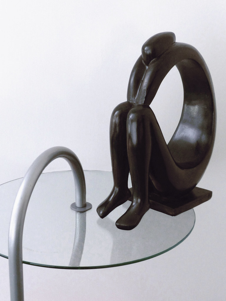
I really love the shape of this statue that somebody bought for me a while ago, so I knew I wanted to do something with it, but it was harder than it looked! After trying various different locations and positions, this is what I ended up with. I know the background could do with being a bit brighter and more uniform, but I didn't want to pump it up any further and blow the reflections. The idea is supposed to be reflecting the shape of the statue with the metal table support and its reflection, but I'm not sure whether that comes across very well.

- Messages
- 1,408
- Name
- Elaine
- Edit My Images
- Yes
Thanks Andy. This was one of my first efforts that I rejected, because I just thought it looked slightly odd on its own without any contextHi, the left and right compliment each other, as does the table.
I'd like a much simpler photograph, by getting in closer to the statue.
Cheers.

- Messages
- 1,408
- Name
- Elaine
- Edit My Images
- Yes
I even tried inverting the colours, but that looked even odder 


- Messages
- 7,499
- Edit My Images
- Yes
Hi Elaine, the path through the woods is a lovely shot, composition, sunlight, colours are great  ....... a far cry from the weather outside today

Shape I like, interesting, as Andy said, the glass shelf compliments it very well ........
 probably not possible because of the size of the shelf, but its a shame you couldn't have got all the reflection in the glass

Shape I like, interesting, as Andy said, the glass shelf compliments it very well
 probably not possible because of the size of the shelf, but its a shame you couldn't have got all the reflection in the glass
 - Messages
- 1,408
- Name
- Elaine
- Edit My Images
- Yes
Thanks Phil. Yes, I did try and get the whole reflection in, but the only way to do it was to get right over the table and that foreshortened the shape of the statue :banghead:
- Messages
- 765
- Name
- Anita
- Edit My Images
- Yes
Hi Elaine
Like the first shape shot. The table support reflects the curve in the statue. Would have been nice to see reflection in glass but then we cant always get what we want
Like the second shot too but would have maybe twisted statue a little to right? And yes the inverted colours one does look weird but sometimes weird is good?
cowboy
Guy Fawkes
- Messages
- 3,143
- Name
- Mark
- Edit My Images
- No
Hi Elaine your first image for me its interesting shame you had to cut the table but can see why

- Messages
- 13,760
- Edit My Images
- Yes
Hi Elaine 
Sorry... looks like your thread is one of the ones I keep missing
Some excellent shots, I love the fresh shot, lovely spring greens and a track leading into the trees, makes you want to explore !!!
Fresh as a daisy - That's very nice, 3 main daisy's work really well, excellent detail and again well lit
Shape - Much prefer your first edit, I don't think an object like that needs context, the shape alone works perfectly well for me
Of the other I missed, I like the crop of the chimney and the Fireworks, have subscribed to your thread so I hope not to miss any more
- Messages
- 1,408
- Name
- Elaine
- Edit My Images
- Yes
Thanks for all the replies. The differing opinions on the table v no table really do show that photography can be very subjective and that you can't please all the people all the time 
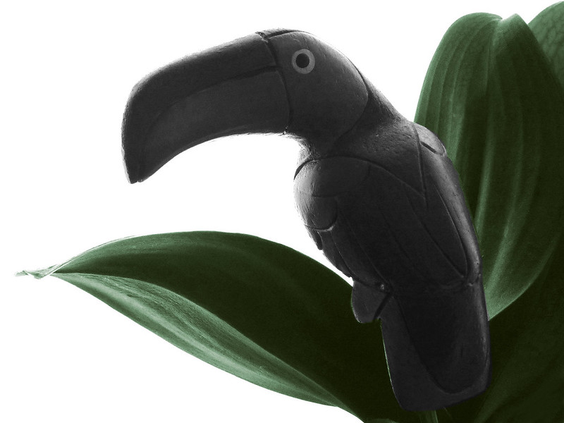
Anyway, it's been another wet and miserable day here, so having nothing better to do (or nothing better that I really wanted to do!) I've done an alternative shot for Shape
Shape Number Two-can (sorry couldn't resist!)
Anyway, it's been another wet and miserable day here, so having nothing better to do (or nothing better that I really wanted to do!) I've done an alternative shot for Shape
Shape Number Two-can (sorry couldn't resist!)


Last edited:
- Messages
- 1,408
- Name
- Elaine
- Edit My Images
- Yes
Thanks d00d. No idea where he originated from, because he was a wedding present from my late brother-in-law (along with a note saying "Toucan live as cheaply as one") and he's lived in various plant pots for many years now.
- Messages
- 4,088
- Name
- Graham
- Edit My Images
- Yes
well done one this one keeping detail in the shadow side of the toucan even with teh strong backlighting. makes for a really striking shot.
good choice to keep the greens in colour too, they work well as a splash of muted colour with the black and the white.
good choice to keep the greens in colour too, they work well as a splash of muted colour with the black and the white.
- Messages
- 1,408
- Name
- Elaine
- Edit My Images
- Yes
Thanks Graham. I started off by desaturating the whole thing because I felt that the multi-colours of the toucan distracted from its basic shape, but then I decided to put a bit of green back into the leaves and thought it looked better. It's nice to know that someone agrees with me 
Last edited:
- Messages
- 1,408
- Name
- Elaine
- Edit My Images
- Yes
Thanks for the comments Andy and Simon. I deliberately chose to backlight it to emphasise the shape of the silhouette, but found that using purely silhouette, even without the leaves, just made it look like an unidentifiable black blob. I added a little muted light in pp to bring out some of the detail of the carving to show what it actually was without detracting from the basic shape - hence the slightly under-exposed look.
- Messages
- 7,548
- Name
- susie
- Edit My Images
- Yes
Hi Elaine...I love the figurine in the first shot a really lovely shape there, I can see why you put the table in, but I do like it as stand alone image, maybe against pure white !!
The toucan looks cute...smashing pure white background....I have been trying to do a few of those, and it's not easy ...well done to you
The toucan looks cute...smashing pure white background....I have been trying to do a few of those, and it's not easy ...well done to you
- Messages
- 9,095
- Name
- Mandy
- Edit My Images
- Yes
- Messages
- 1,408
- Name
- Elaine
- Edit My Images
- Yes
Week 20 Number(s). Three from me this week.
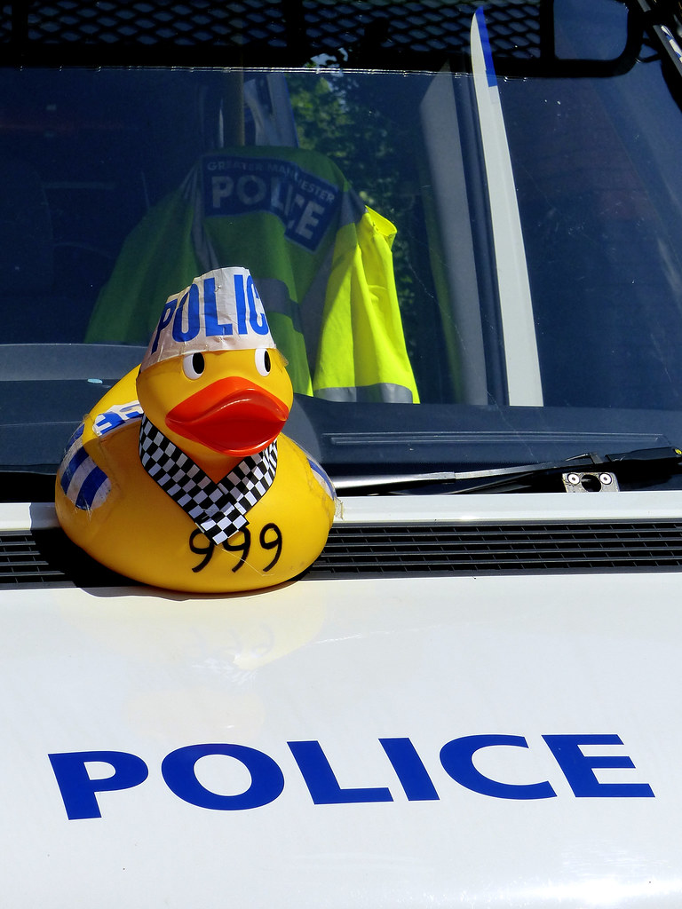
1 The local Rotary club held their annual duck race on the stream in the park this morning. Spotted this little guy sitting on the bonnet of a police van, helping to keep the peace
999 - Fire, Ambulance or Duck?
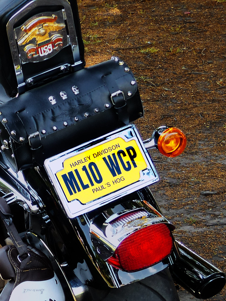
2 I liked the number plate on this Harley
Number Plate
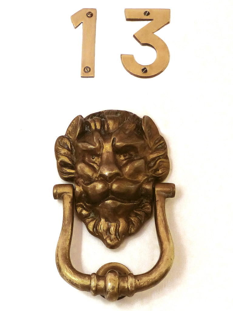
3 This last one is our front door and yes, I know the numbers aren't properly aligned with the knocker, but they were like that when we moved in
Unlucky for some
1 The local Rotary club held their annual duck race on the stream in the park this morning. Spotted this little guy sitting on the bonnet of a police van, helping to keep the peace
999 - Fire, Ambulance or Duck?

2 I liked the number plate on this Harley
Number Plate

3 This last one is our front door and yes, I know the numbers aren't properly aligned with the knocker, but they were like that when we moved in
Unlucky for some

Last edited:
- Messages
- 9,095
- Name
- Mandy
- Edit My Images
- Yes
Three good entry's for numbers I like the number plate on the motorbike and the door knocker.
- Messages
- 13,760
- Edit My Images
- Yes
Hahaaaa at Two-can 
Nice shot, nothing wrong with that at all, good to have a tenuous link, good colours, liking the black against the bright plant
Numbers - some great ideas again, I love the humour and set up of the 999 shot, but my choice goes with the number plate, really like the crop and again the angle, works really well


