You are using an out of date browser. It may not display this or other websites correctly.
You should upgrade or use an alternative browser.
You should upgrade or use an alternative browser.
weekly DM's First 52 Challenge 2015 I'M STILL HERE BIIIIIG CATCH UP Week 13, 14, 15, 16, 18 & 19 ADDED!
- Thread starter DowntonMini
- Start date
- Messages
- 27
- Name
- Jimmy
- Edit My Images
- No
Hi Mark. A brilliant image for Fragile. I stumbled upon this on Flickr yesterday (I think) and didn't realise what it was until now reading your thread.
I really like the drama in the shot, so not offering any crit at all...just wondering what this would look like as a perfectly square crop with the full sphere included? Maybe brushing out everything outside the sphere to black?
I really like the drama in the shot, so not offering any crit at all...just wondering what this would look like as a perfectly square crop with the full sphere included? Maybe brushing out everything outside the sphere to black?
Last edited:
- Messages
- 13,760
- Edit My Images
- Yes
Hi Mark 
Liking your globe shot, the way the light trail on the right is reflected on the LH side of the orb, really nicely exposed, must get one of them things one day
Liking your globe shot, the way the light trail on the right is reflected on the LH side of the orb, really nicely exposed, must get one of them things one day
- Messages
- 4,562
- Name
- Mark Gameson
- Edit My Images
- Yes
Thank you for all your comments
Last night was the club competition I entered a version of fragile into and I have to say I'm over the moon and slightly shocked that it scored 19 out of 20.
Last night was the club competition I entered a version of fragile into and I have to say I'm over the moon and slightly shocked that it scored 19 out of 20.
- Messages
- 4,562
- Name
- Mark Gameson
- Edit My Images
- Yes
I'm still here  and I haven't given up
Been a bit hectic here
First up Week 3 Scenic
 SCENIC by MARKGAMESON1 (Downton Mini/Mini59), on Flickr
 and I haven't given up
Been a bit hectic here
First up Week 3 Scenic
 SCENIC by MARKGAMESON1 (Downton Mini/Mini59), on Flickr
- Messages
- 4,562
- Name
- Mark Gameson
- Edit My Images
- Yes
Next up Companions
I took several shots and couldn't decide which one I like best
Mom and Dads 2 Boarder Collies Rory and Finley
 COMPANIONS 1 by MARKGAMESON1 (Downton Mini/Mini59), on Flickr
 COMPAIONS 4 by MARKGAMESON1 (Downton Mini/Mini59), on Flickr
 COMPANIONS 3 by MARKGAMESON1 (Downton Mini/Mini59), on Flickr
 COMPANIONS2 by MARKGAMESON1 (Downton Mini/Mini59), on Flickr
Thank you for dropping my
I took several shots and couldn't decide which one I like best
Mom and Dads 2 Boarder Collies Rory and Finley
 COMPANIONS 1 by MARKGAMESON1 (Downton Mini/Mini59), on Flickr
 COMPAIONS 4 by MARKGAMESON1 (Downton Mini/Mini59), on Flickr
 COMPANIONS 3 by MARKGAMESON1 (Downton Mini/Mini59), on Flickr
 COMPANIONS2 by MARKGAMESON1 (Downton Mini/Mini59), on Flickr
Thank you for dropping my
- Messages
- 4,344
- Name
- Martin
- Edit My Images
- Yes
It's dogs again and therefore it's a brilliant picture -- I'm a little biased.
Seriously though, the first picture of the two border collies is by far the best for me. it sums up the bond between a couple of dogs. Love it.
Seriously though, the first picture of the two border collies is by far the best for me. it sums up the bond between a couple of dogs. Love it.
- Messages
- 9,095
- Name
- Mandy
- Edit My Images
- Yes
Scenic - fits the theme I like it.
Companions - some great shots but the first image by far for me.
Companions - some great shots but the first image by far for me.
- Messages
- 4,562
- Name
- Mark Gameson
- Edit My Images
- Yes
Thanks for the comments everyone.
The older Collie (Rory) usually looks the other way when I pick my camera up but will pose for everyone else!
Here are a couple from 12 months ago when Finley joined out family from a farm I Wales
View attachment 30126
I love this one Rory put his leg over Fin as if he was protecting him the first time they came over to our house
View attachment 30127
View attachment 30128
- Messages
- 4,562
- Name
- Mark Gameson
- Edit My Images
- Yes
So for week 5's theme I have had to resort to cheating and head to my archives why well one there have been lots of swans and I have had a cold all week so have not ventured out with the camera since last Sunday.....
Any way I have 3 images form the Goodwood FOS 2013
E-Type
 ELEGANT 1 by MARKGAMESON1 (Downton Mini/Mini59), on Flickr
Bugatti
 ELEGANT 2 by MARKGAMESON1 (Downton Mini/Mini59), on Flickr
Ferrari
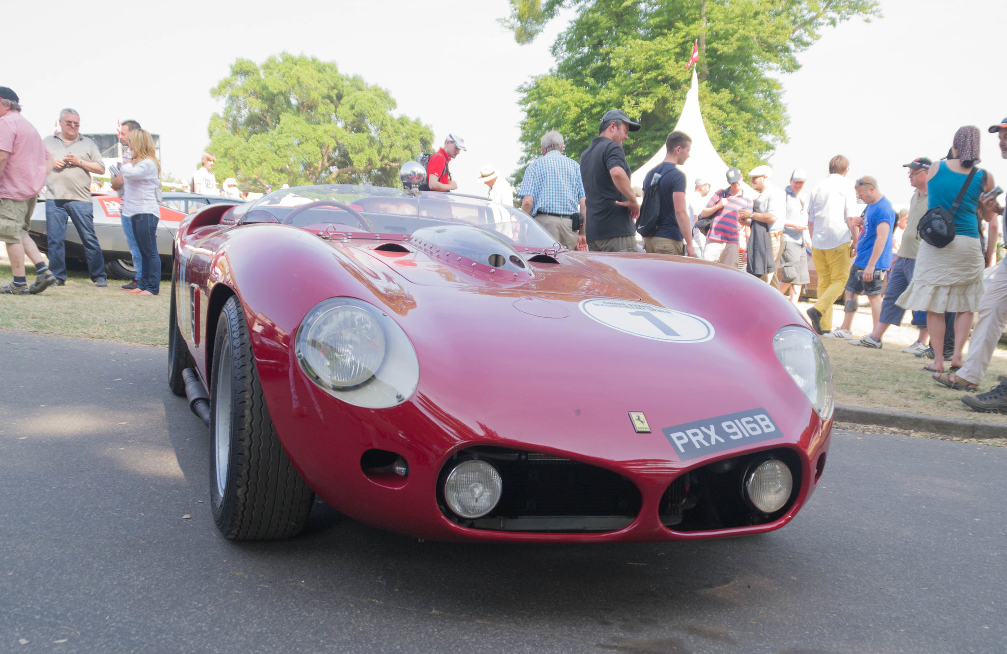 ELEGANT 3 by MARKGAMESON1 (Downton Mini/Mini59), on Flickr
Any way I have 3 images form the Goodwood FOS 2013
E-Type
 ELEGANT 1 by MARKGAMESON1 (Downton Mini/Mini59), on Flickr
Bugatti
 ELEGANT 2 by MARKGAMESON1 (Downton Mini/Mini59), on Flickr
Ferrari
 ELEGANT 3 by MARKGAMESON1 (Downton Mini/Mini59), on Flickr
Last edited by a moderator:
- Messages
- 97
- Name
- Karl
- Edit My Images
- Yes
S1 E-Type, about as elegant as they come, though I would have liked to have seen it a bit more isolated from the throng, and from an angle which emphasized its lines a little better - capturing the elongated profile and catching some nice light reflections along those glossy flanks..
I believe that they have one in the New York Museum of Modern Art. No downer on your picture though.
I believe that they have one in the New York Museum of Modern Art. No downer on your picture though.
- Messages
- 9,095
- Name
- Mandy
- Edit My Images
- Yes
Elegant - 

- Messages
- 4,182
- Name
- Paul
- Edit My Images
- Yes
That E-type really is a beauty for elegant. Couldn't be more on-theme! And for once we can show those Italians a thing or two about elegance 
Would obviously be great to get that car isolated from the crowd but difficult to achieve unless it's yours! Shallower DOF could help, perhaps?
Would obviously be great to get that car isolated from the crowd but difficult to achieve unless it's yours! Shallower DOF could help, perhaps?
- Messages
- 4,562
- Name
- Mark Gameson
- Edit My Images
- Yes
Thanks for the feed back everyone.
If the weather had of been kinder I would have been able to get some shots of 2 of my favourite Jaguars fo all time a 1955 XK140 FHC and a 1938 3.5Ltr SS100 but with how the weather has been they stayed in the garage.....
Just sorting out my Watery image then I need to get some ideas for Bold....
If the weather had of been kinder I would have been able to get some shots of 2 of my favourite Jaguars fo all time a 1955 XK140 FHC and a 1938 3.5Ltr SS100 but with how the weather has been they stayed in the garage.....
Just sorting out my Watery image then I need to get some ideas for Bold....
- Messages
- 4,562
- Name
- Mark Gameson
- Edit My Images
- Yes
For Watery I had a number of ideas but as I had just brought a SplashArt kit from this very forum it seamed like the perfect time to use it.
Now I had never used anything like this before... I'm glad I'm shooting digital that's all I'll say!
Anyway my first atempt was done using a quickly knocked up backdrop and base and using a speedlight on camera so not ideal. But I think they are possible some of the best crowns I have achived todate
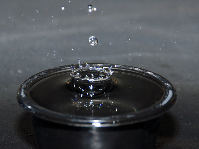 WATERY 3 by MARKGAMESON1 (Downton Mini/Mini59), on Flickr
For this one I added a bit of squash to the water
 WATERY 1 by MARKGAMESON1 (Downton Mini/Mini59), on Flickr
So I decided I needed to get a few cheap flash guns and tigger receiver set.... In the meantime my brother bade a back drop holder and proper base board (he says he's going to make it into a table at some point) HTe flash gels I have ordered are still on there way so I cut of a plastic folder (very BLue Peter I know) to try colour the flash light.
This time I added some food colouring to the water and used a cut glass glass
 WATERY 5 by MARKGAMESON1 (Downton Mini/Mini59), on Flickr
 WATERY 8 by MARKGAMESON1 (Downton Mini/Mini59), on Flickr
 WATERY 9 by MARKGAMESON1 (Downton Mini/Mini59), on Flickr
 WATERY 4 by MARKGAMESON1 (Downton Mini/Mini59), on Flickr
As I say it is a process of keep adjusting the settings on the SplashArt kit by tiny amounts at a time.
I must have taken over 300 photos during this process and most of them have been deleted!
There are a few more from the set in my Flickr Album https://www.flickr.com/photos/markgameson/sets/72157650042490982/
Now I had never used anything like this before... I'm glad I'm shooting digital that's all I'll say!
Anyway my first atempt was done using a quickly knocked up backdrop and base and using a speedlight on camera so not ideal. But I think they are possible some of the best crowns I have achived todate
 WATERY 3 by MARKGAMESON1 (Downton Mini/Mini59), on Flickr
For this one I added a bit of squash to the water
 WATERY 1 by MARKGAMESON1 (Downton Mini/Mini59), on Flickr
So I decided I needed to get a few cheap flash guns and tigger receiver set.... In the meantime my brother bade a back drop holder and proper base board (he says he's going to make it into a table at some point) HTe flash gels I have ordered are still on there way so I cut of a plastic folder (very BLue Peter I know) to try colour the flash light.
This time I added some food colouring to the water and used a cut glass glass
 WATERY 5 by MARKGAMESON1 (Downton Mini/Mini59), on Flickr
 WATERY 8 by MARKGAMESON1 (Downton Mini/Mini59), on Flickr
 WATERY 9 by MARKGAMESON1 (Downton Mini/Mini59), on Flickr
 WATERY 4 by MARKGAMESON1 (Downton Mini/Mini59), on Flickr
As I say it is a process of keep adjusting the settings on the SplashArt kit by tiny amounts at a time.
I must have taken over 300 photos during this process and most of them have been deleted!
There are a few more from the set in my Flickr Album https://www.flickr.com/photos/markgameson/sets/72157650042490982/
Last edited by a moderator:
- Messages
- 7,548
- Name
- susie
- Edit My Images
- Yes
Hi Mark ....I've tried this and it's not easy, although I don't have the proper 'kit' I'd love to have a go with one.
I think your first watery shot is the best one, I think they look better when done using something shallow rather than the glass as it tends to distract from the actual splash, you can add colour in PP by adjusting the colour temp. and this can look good too, I had try with the first one and it looks good as a nice deep blue.
Well done for your first attempt
- Messages
- 4,562
- Name
- Mark Gameson
- Edit My Images
- Yes
Thanks for the feedback Susie I must admit the first imiage is my favourite.
I have read somewhere that spoons are good to use but I haven't quite worked out how to set the spoon up I will have antoher go over the week
I have read somewhere that spoons are good to use but I haven't quite worked out how to set the spoon up I will have antoher go over the week
- Messages
- 2,908
- Name
- Summer
- Edit My Images
- Yes
I know how hard this is to get right so practise is good, I think the 1st one is the best and I am not sure I like the colour at all. Have you tried adding food colouring to milk then using a contrasting colour for the drop? I've seen this done really well but I am far to busy to play about right now lol
- Messages
- 8,398
- Name
- Lynne
- Edit My Images
- Yes
HI Mark
good work on the watery drops...1st is best for me I've tried this so know how irritatingly frustrating they can be so well done for persevering :banghead:
Companions...super set of shots of 2 beautiful dogs, 1st for me again, classic collie pose & lovely n sharp but the whole set is wonderful
good work on the watery drops...1st is best for me
Companions...super set of shots of 2 beautiful dogs, 1st for me again, classic collie pose & lovely n sharp but the whole set is wonderful

- Messages
- 4,562
- Name
- Mark Gameson
- Edit My Images
- Yes
Ok so for Bold I have used a photo taken a couple of weeks ago on my IPhone and I think it's Bold for what has been done to the original design
View attachment 31650
View attachment 31650
- Messages
- 4,562
- Name
- Mark Gameson
- Edit My Images
- Yes
Slowly catching up
Week 8 Relax
After a cuircuit training class followed by a spin class in this cold weather I like to take my trainers off and Relax by the fire.
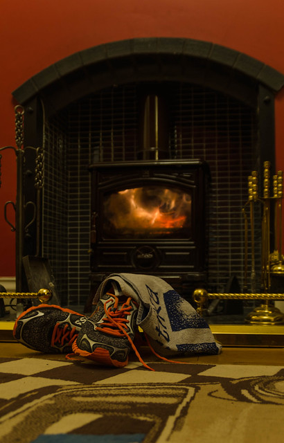 334 by MARKGAMESON1 (Downton Mini/Mini59), on Flickr
Week 8 Relax
After a cuircuit training class followed by a spin class in this cold weather I like to take my trainers off and Relax by the fire.
 334 by MARKGAMESON1 (Downton Mini/Mini59), on Flickr
- Messages
- 9,095
- Name
- Mandy
- Edit My Images
- Yes
- Messages
- 4,562
- Name
- Mark Gameson
- Edit My Images
- Yes
Thanks for the feedback guys
Trying to catch up a bit I've got a shot for vertical but not happy with it.
Off to greenwich and financial disrict tomorrow so maybe I'll get a better one there
Trying to catch up a bit I've got a shot for vertical but not happy with it.
Off to greenwich and financial disrict tomorrow so maybe I'll get a better one there
- Messages
- 4,562
- Name
- Mark Gameson
- Edit My Images
- Yes
Ok so I reaal need to up my game with getting images done in the week they are meant to be
Week 9 Vertical
 VERTICAL 1 by MARKGAMESON1 (Downton Mini/Mini59), on Flickr
Week 9 Vertical
 VERTICAL 1 by MARKGAMESON1 (Downton Mini/Mini59), on Flickr
- Messages
- 8,315
- Name
- Ian
- Edit My Images
- No
Hey Mark I seem to have missed this thread...
Vertical... I see what I think you're trying to do here, but for me I'm not sure what the subject is. The blob of wood on the bottom edge and the bits of wall top right corner distract. For something like this, I think a bit more abstract would work better. How about just picking out the verticals and take the context of the staircase away. We know they are bannister supports, we don't necessarily need to see all the stairs.
I do like the soft lighting and the warm tones you've got going on. I also like that DoF although the front post looks a little blurred. Clicking through to Flickr, I'm not surprised at 1/6 sec assuming you're hand-held? Overall, I think it's a good idea, although for me, I'd like a bit more vertical wood and less stairs.
- Messages
- 4,562
- Name
- Mark Gameson
- Edit My Images
- Yes
Thanks for your feed back.
To be honest I'm not entirely happy with the image and may revisit it.
It was shot handheld
To be honest I'm not entirely happy with the image and may revisit it.
It was shot handheld
- Messages
- 9,095
- Name
- Mandy
- Edit My Images
- Yes
Vertical - simple but fits the theme, I feel however the composition of the image could be improved.
- Messages
- 4,562
- Name
- Mark Gameson
- Edit My Images
- Yes
Ok so needed a catch up to get up to date.
First Up Mouth taken from my archives infact one of the first Photos I took after getting my first DSLR
 MOUTH by MARKGAMESON1 (Downton Mini/Mini59), on Flickr
First Up Mouth taken from my archives infact one of the first Photos I took after getting my first DSLR
 MOUTH by MARKGAMESON1 (Downton Mini/Mini59), on Flickr
- Messages
- 4,562
- Name
- Mark Gameson
- Edit My Images
- Yes
Next Up Week 11 Crowd taken on a recent visit to Grennwich and Canery Wharf
 CROWD by MARKGAMESON1 (Downton Mini/Mini59), on Flickr
 CROWD by MARKGAMESON1 (Downton Mini/Mini59), on Flickr
