- Messages
- 126
- Name
- John Lindsay
- Edit My Images
- Yes
I'm going to give this a go.
Not been on the forum in a while but was thinking before the new year that I'd like to do something along the lines of the 365's. Most notably Jimmy Lemon's made me want to give this a go, has been quite a bit of an inspiration.
Not only that I don't take enough photo's, it's a fact. My dad gets on to me from time to time, saying that I've got more photography equipment than you could shake a stick at and I don't make the most of it.
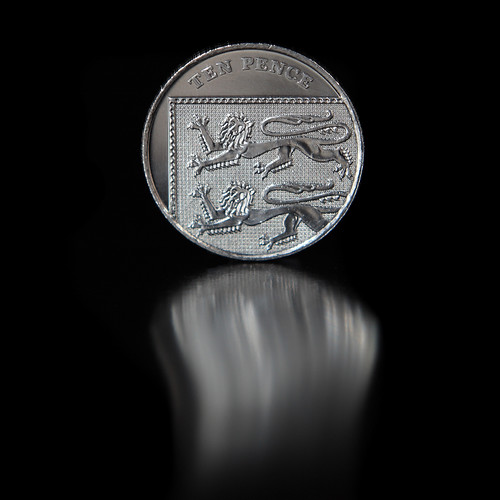
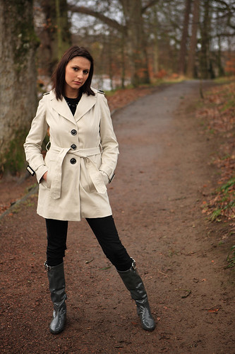
I decided to do this when on a "photographic expedition" before New Year and as such I'm cheating with my first photo because it wasn't taken this week.
So you may say this is the Photo that really made me actually go through with it so I think it's okay to cheat with it, plus I really do like it!
Week 1:
Larger
Hope I can keep it up for the rest of the year.
Cheers,
John
Not been on the forum in a while but was thinking before the new year that I'd like to do something along the lines of the 365's. Most notably Jimmy Lemon's made me want to give this a go, has been quite a bit of an inspiration.
Not only that I don't take enough photo's, it's a fact. My dad gets on to me from time to time, saying that I've got more photography equipment than you could shake a stick at and I don't make the most of it.
I decided to do this when on a "photographic expedition" before New Year and as such I'm cheating with my first photo because it wasn't taken this week.
So you may say this is the Photo that really made me actually go through with it so I think it's okay to cheat with it, plus I really do like it!
Week 1:
Larger
Hope I can keep it up for the rest of the year.
Cheers,
John
Last edited:

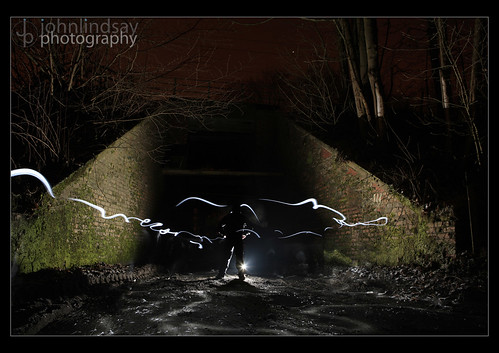
 ) but it's a very atmospheric shot.
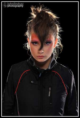
 Not that you've ever heard that before eh? lol, my Mum's called Jean by the way!