- Messages
- 1,513
- Name
- Alex
- Edit My Images
- Yes
Thanks Alex, seem to have got my enthusiasm back this week, i shot 80 photos off in the factory, kept seeing other bits that i thought would make good images
Always good to get that feeling
Thanks Alex, seem to have got my enthusiasm back this week, i shot 80 photos off in the factory, kept seeing other bits that i thought would make good images
Always good to get that feelingI am waiting for it to hit. Lacked that bolt of inspiration last week too. Maybe worth doing just a general set if there is quite a bit that grabs you.
Hi Lizzy - good shot of the cakes. Bit mesmerising probably because of just the few colours. Sends me a bit batty when i scroll the screen though![]()


......watch them coming down at 15000 an hour![]()
another good take on the theme, like your latest one best![]()
Really - Golly that's a lot to sell!
No 3 for me, I think the dark works well just a pity it doesnt continue to the right edge to hide that diagonal bit


3 for me too. You could do some simple PP on it to satisfy all the requests. You can easily add a darker area along the top and you could clone buns into the gaps too.
Great shot though and DoF is spot on.![]()
HI Liz
Your thread is making me hungry
Sweet.....they look scrummy ...all crit has been mentioned ( sorry for taking so long to get here) so
from me
Secure....love the processing on the 1st image....works superbly
Industry....#3 for me...your cropped version hits the spot....liked the original as well
We all have weeks that drive us scatty...you've got the right idea with getting out with the camera & then looking back to see what you achieved....sometimes the best shots or ones that work well for some unknown reason can be the least planned![]()
Hiya Liz, number 1 on secure me, like the processing, it works very well. As for industry, it has to be your latest version. Looks much better full with cakes. Nice work!
Number 4 for me. They're all good shots, but that one says Industry most to me.
nice set for industry Liz. like the number 3 for the DoF, but i like the colour in number 1
Really like you're latest take on industry, nice framing, angle and DOF.
Feeling a little hungry now..
OOoo very nice Liz... a great set, I'm liking 1 and 4, 1 for the colours and DOF, and 4 is a cracking shot, love the dof and angle on that one![]()
2nd one for me even though the 4th one is the one screaming "industry" but the blue in the second shot, the buns, and the intricate pattern of the blue plastic just pops right out of the screen to me.
Well done


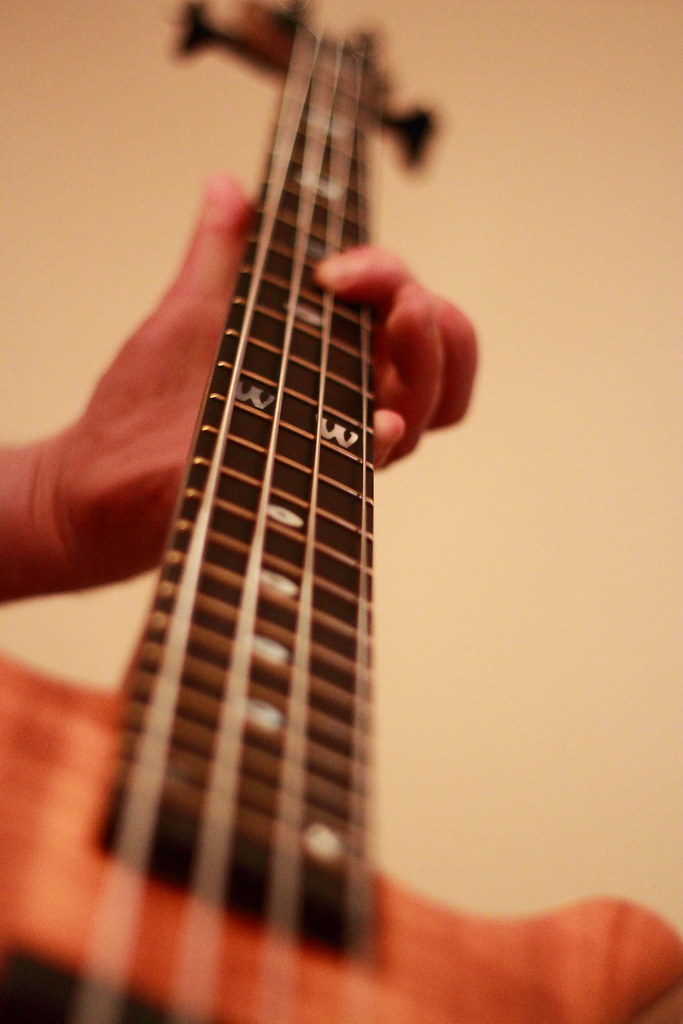
Hi Liz. I really like your second root shot; the first is a nice composition, but I think it needs the hand in focus to really work.
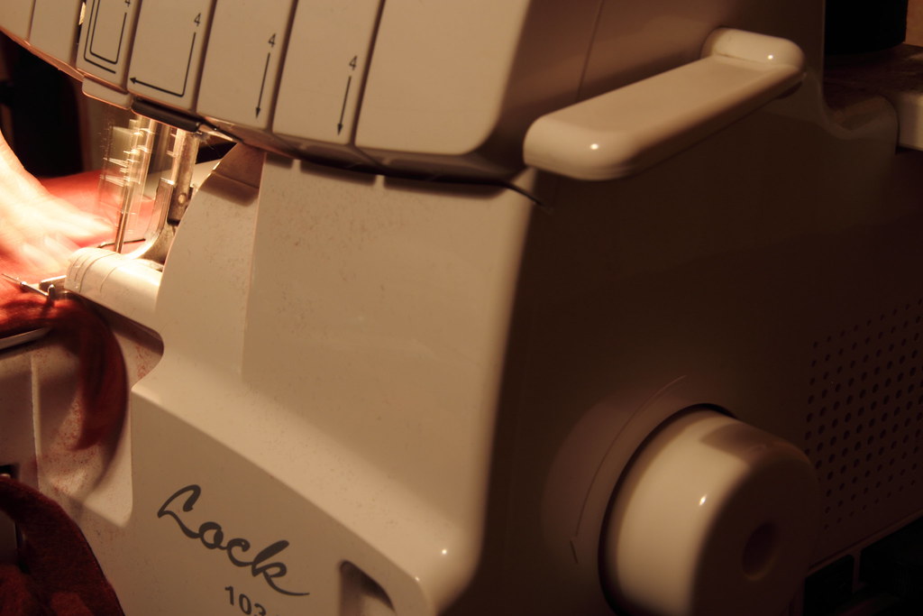
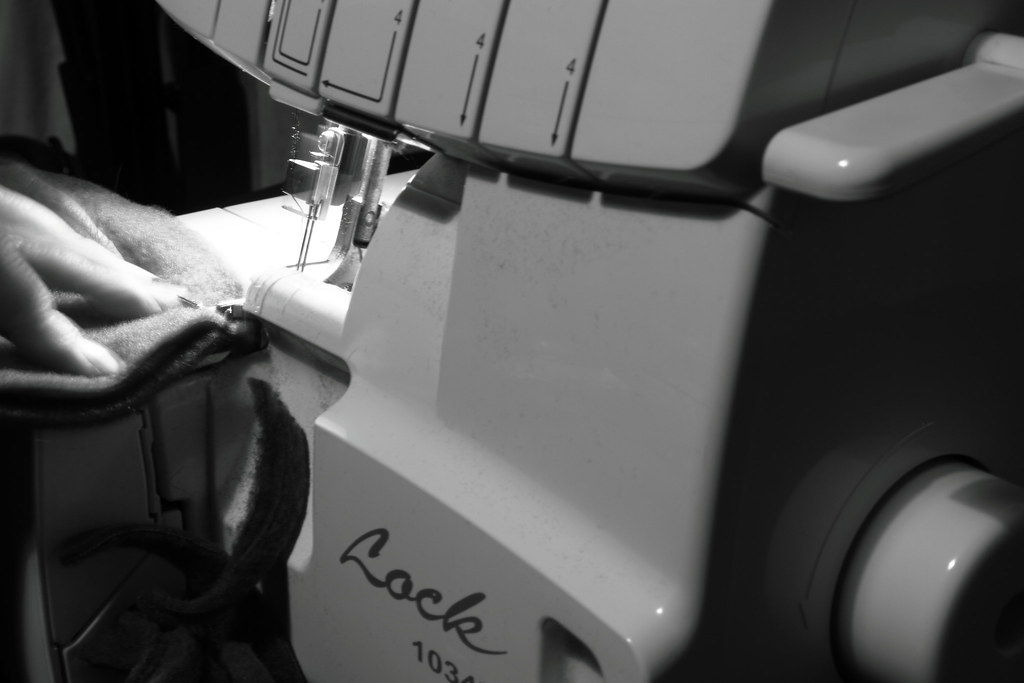
Handmade, I'm not completely getting the theme from. I know it IS handmade, but for me too much of the machine is coming through. Nice image though; I prefer the colour one as its almost monochrome anyway.
Yep, Im not getting handmade primarily either again even though it's obvious you're sewing something and again I think it's due to the large placement / focus on the machine rather than the "craft"
Hi Liz, I'm liking your first root shot, I agree that the focus should be more on the hand though and I also agree with the comments that the sewing machine should be less prominent to be more on theme. Saying that though it's still a well taken image.
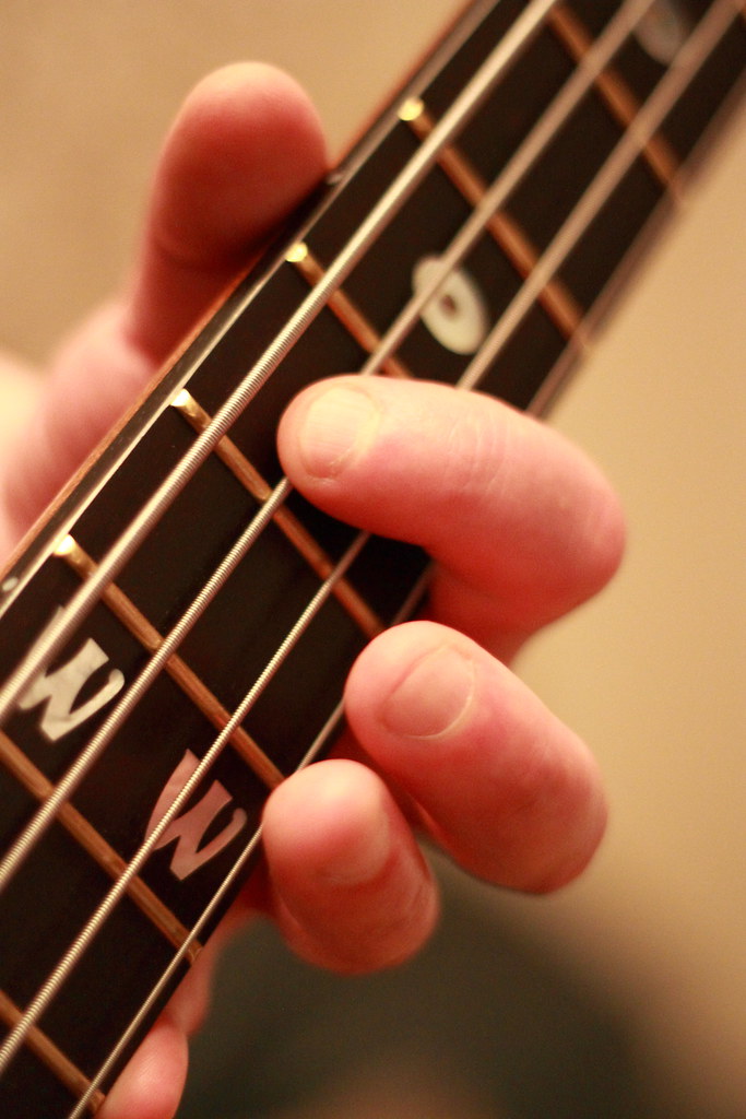
Hi Liz I like your Root #1 shot very much - my favourite of all 3 shots you posted.
But please excuse my ignorance - what is the 'root' connection to the guitar - some musical term I guess??


Number 2 for me Liz
Nice DoF and better colours
Yes definitely number 2. Very nice indeed![]()
I can't decide to be honest, I think if number 1 wasn't quite as dark at the top it would be my favoured shot as I really like the colouring in it.