You are using an out of date browser. It may not display this or other websites correctly.
You should upgrade or use an alternative browser.
You should upgrade or use an alternative browser.
weekly Michael23, A 4th 52 wk project 2014, finished!
- Thread starter michael23
- Start date
- Messages
- 8,398
- Name
- Lynne
- Edit My Images
- Yes
& another looney to the slaughter......
Gets addictive this lark...look forward to following your thread again mister
Gets addictive this lark...look forward to following your thread again mister
- Messages
- 9,095
- Name
- Mandy
- Edit My Images
- Yes
This is my first go at this I have seen some of your 365 so I look forward to following you along on this.
- Messages
- 14,766
- Name
- Michael
- Edit My Images
- No
- Messages
- 13,760
- Edit My Images
- Yes
Hey Michael - Good to see you back in this year 
Well done with the PP, although there is a bit gone astray, that's a damn good effort, nice idea too
Well done with the PP, although there is a bit gone astray, that's a damn good effort, nice idea too
- Messages
- 14,766
- Name
- Michael
- Edit My Images
- No
- Messages
- 19,461
- Name
- Andy
- Edit My Images
- Yes
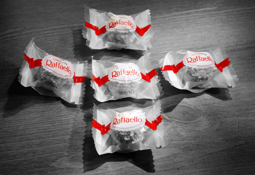
Are you sure you haven't uploaded the same one?
The LH still has some red in the white. Anyway, I'll move on.
Cheers.
- Messages
- 14,766
- Name
- Michael
- Edit My Images
- No
Not a fan of selective colouring - but a good warm up
Thanks Sarah
Are you sure you haven't uploaded the same one?
The LH still has some red in the white. Anyway, I'll move on.
Cheers.
It is different, but I see the bit you mean, I used the smart brush to bring the colour back on the centre of the wrapper, had I gone purely for the lettering it wouldn't have come through.
Nice idea. I'm a fan of selective colouring and it works for me. Good luck for 2014!

- Messages
- 9,095
- Name
- Mandy
- Edit My Images
- Yes
Great start to the challenge, good take on the theme not sure the selective colouring on this image is working for me
- Messages
- 81
- Name
- Nick
- Edit My Images
- No
I'm not a fan of SC either, just my personal taste though. I like the composition, the lighting is good too.
- Messages
- 8,398
- Name
- Lynne
- Edit My Images
- Yes
Hi Michael
as you possibly remember I'm a sucker for SC.....good solid start , couple of slight misses on the edit but it's a fiddly thing to get spot on when done on a large area let alone the small area's you chose....nowt like making life simple
as you possibly remember I'm a sucker for SC.....good solid start , couple of slight misses on the edit but it's a fiddly thing to get spot on when done on a large area let alone the small area's you chose....nowt like making life simple
- Messages
- 14,766
- Name
- Michael
- Edit My Images
- No
Here is one for linear, had to crank the iso upto 6400 to get a hand holdable shutter speed, wish I had the tripod with me! Had to crop the top part of the image out as the rest of the building wasn't reflecting the lights and it just looked odd and a blue!
So, for the moment this is this weeks photo, it may or may not stay that way! Looks much better on flickr!

Week 1, Linear by scilly puffin, on Flickr
So, for the moment this is this weeks photo, it may or may not stay that way! Looks much better on flickr!

Week 1, Linear by scilly puffin, on Flickr
- Messages
- 9,095
- Name
- Mandy
- Edit My Images
- Yes
I like the colours in this image another good take on the theme.
Happysnapper79
Suspended / Banned
- Messages
- 710
- Name
- John
- Edit My Images
- Yes
I love the colours but I may have been tempted to shoot without the fence for a cleaner image.
- Messages
- 6,502
- Name
- Peter
- Edit My Images
- Yes
Odd - Not keen on selective colour but the reds are nice and vivid
Linear/Line - I really like this one. Lovely tones.
Linear/Line - I really like this one. Lovely tones.
- Messages
- 13,760
- Edit My Images
- Yes
Nice on Michael !!!!
Real nice colour, I actually like the railings, and the image is nice and square on - Spot On
Real nice colour, I actually like the railings, and the image is nice and square on - Spot On


