Project 100 - Red (eekkk long time since last post :).

Messages
19,461
Name
Andy
Edit My Images
Yes
I've decided to start another project.

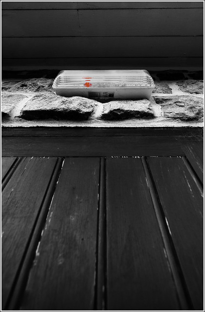
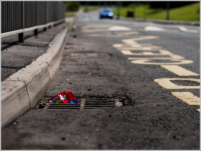
I had loads of ideas: graphic, text, isolation, floor level photographs, signs, empty, rust, to name a few.

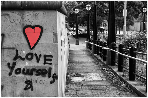
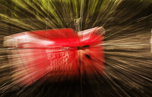
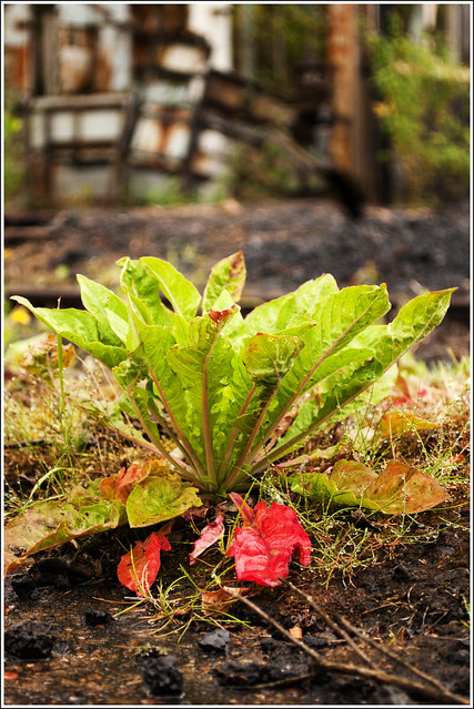
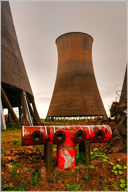
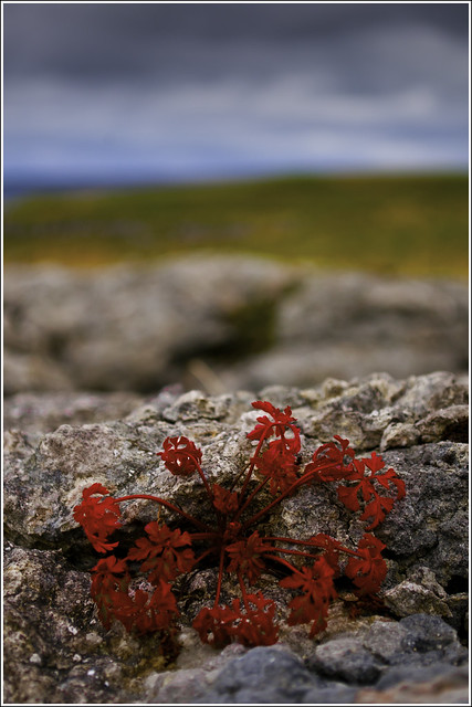
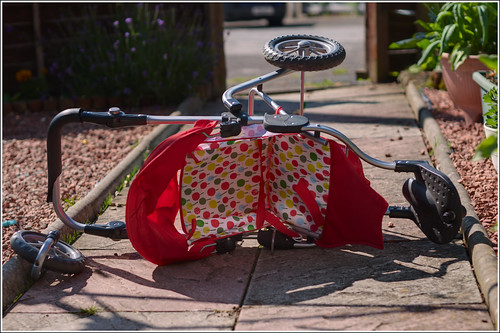
I decided to use Red as a theme and I'm really looking forward to getting it started. I'm looking to incorporate all the fundamentals: rule of thirds, lead in line, negative space, motion, framing, perspective and depth, to name a few.

I'm not going to set myself a timetable. If see an interesting subject I'll take a photograph and post it.

I'm really going to concentrate on capturing the image 'in camera' and I'll be keeping the post processing to a minimum, save a minor crop and curves/levels adjust.

I'd welcome any C&C you can add.

Cheers.
 
Last edited:
Good luck with it, looking forward to seeing some photos

Steve
 
Sheesh, I'm back in the 'Eyes darting around trying to find photographs for my project' frame of mind. Pulling up where ever and when ever I see an opportunity...:D

I'm really trying to think 'outside the box' and develop an eye for the unusual or even the usual in a different setting/guise.

Well, here's #1, taken on the road outside the gym I go to. I would have liked to have got a bit lower and even got my tripod out, but the road was a bit busy.

I fell I composted it well and it only needed a very minor crop. It's a tad dark, but that is what I was after.

I took around 50 photographs and around 40 were in portrait but I felt landscape suited it better.

Overall, I'm happy with this one.


Number 1 used by andysheader, on Flickr
Cheers.
 
Sheesh, I never knew there was so much red in the world...:puke:

It's like when Jackie was pregnant - everywhere I went there were pregnant women!

Anyway, number 2 was taken on my way back from the gym. I was sat outside the house for a while trying to work out how to compose the photograph. The flag is on top of the house and I didn't want any of the house is the photograph.

I also wanted to use a lot of negative space and I waited for a gap in the clouds.

I'd have liked a tad more red but I like the text that I caught.


Number 2 used by andysheader, on Flickr
 
It's like when Jackie was pregnant - everywhere I went there were pregnant women!


andy..you don't have to feel responsible for the others... ok...the 60s were the time of sowing wild seed ...ok. .:naughty: not that i remember the 60's ... i just had two 99s with a flake with the girl next door...
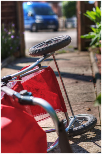
 
Hiya Andy,

Well done on taking on another project ... I will be watching this one as I did your previous project.

Good Luck

Cheers

Dawn :)
 
Hiya Andy,

Well done on taking on another project ... I will be watching this one as I did your previous project.

Good Luck

Cheers

Dawn :)

Thanks, Dawn.

Some of the photographs will, I hope, really push my boundaries and may not appeal to others.

Thanks and I'm metally preparing my sensual.....:naughty:
 
I like #1 :) I'm a fan of sharp shots and shallow DoF, so it works for me! The only thing I'd say is that it seems to have a colour cast on it, showing up in the whites on the road. The other two seem to suffer from it too, but it isn't as strong (or I may be imagining it in the other two, my eyes are really strained and tired tonight!).

Still, the first looks nice :)

Thanks, Niall. Can you expand on where you see colour cast? I really must get a calibrator...:(
 
The white writing on the roads has an almost pink tint to it, and looks a touch over saturated. I used to get this on my old Canon 300D when the camera adjusted things in camera.

I think I'm imagining it in the other shots though. I think the paving has faded colours and next to the red pram, it's just throwing my eyes.

{edit} You know what, it's just occurred to me that the road writing may actually be yellow, and your processing has washed it out, which could also explain it :D
 
Last edited:
The white writing on the roads has an almost pink tint to it, and looks a touch over saturated. I used to get this on my old Canon 300D when the camera adjusted things in camera.

I think I'm imagining it in the other shots though. I think the paving has faded colours and next to the red pram, it's just throwing my eyes.

{edit} You know what, it's just occurred to me that the road writing may actually be yellow, and your processing has washed it out, which could also explain it :D

That's it, I think. I recall desaturating (experimenting...:thinking:)
 
HI Andy


glad to see you've started another project , quite missing the daily dose of costa:LOL:

Love Number 4...SC really does work well (y)
 
Number 5. A bit of zoom burst.

I quite like how I maintained the fence in the photograph and that the text is still visible. The text also appealed to me because I'd been out hours and was shattered :puke:

I used a colour and b&w layer and overlayed them to get the somewhat grungy look.

No border as well, something of a novelty for me.

Cheers.

Number 5 Used by andysheader, on Flickr
 
Week 6.

One from my trip to Thorpe Marsh power station this week. Stunning place for a photograph shoot. Bit scary...:(

I really didn't expect it to be that big and standing inside the towers was ssooooo cool. The echos were as good as the scenery.

Just wish I'd done the fundamentals and moved the twig lower right....

Anyway, I managed to get this red one.

Cheers.


Number 6 used by andysheader, on Flickr
 
Have to say all these images have a lovely "feel" to them - sharp and really vibrant, with an almost tactile quality to them!

Looking forward to seeing what you come up with - hopefully I can steal some ideas or at least draw some inspiration for my 365.
 
Really like this idea, and particuarly like the final picture. (y)

Cheers, Joe.

Have to say all these images have a lovely "feel" to them - sharp and really vibrant, with an almost tactile quality to them!

Looking forward to seeing what you come up with - hopefully I can steal some ideas or at least draw some inspiration for my 365.

Cheers and steal away...(y)

Hiya Andy, I hadn't noticed your new project, well done with taking this on, I like the pics you have produced for it. Subscribed now so won't be missing the updates. (y)

Cheers, one of the best things about this project is I can really take my time, unlike the 52....:nuts:
 
Number 8 from my day at Malham.

Damn Flickr has really done a number on the colours. They are sssooo much brighter on my PC.

Not sure what the "original" looked like, I'm guessing the red was a little more vibrant?

However, I really like this muted feel. (y)

Subscribed btw!
 
I really like #9 ... but #10 isn't quite "right" to my eye. Maybe crop some of the leaves at the top of frame or darken them to remove the green hightlight?
 
I really like #9 ... but #10 isn't quite "right" to my eye. Maybe crop some of the leaves at the top of frame or darken them to remove the green hightlight?

Hi, Paul, I cropped, rotated, flipped....but could not get a better image. I learned a lot from taking that photograph.

Number 10 is great for me, I don't feel it's too busy, nicely composed.

Number 9 is also nicely composed, but doesn't really do anything for me.

Cheers and no worries. We all have our own favourite genres. (y)
 
Hi, Paul, I cropped, rotated, flipped....but could not get a better image. I learned a lot from taking that photograph.

I had a really quick play in GIMP, and I think there is a crop that works - although it needs some cloning work. I won't upload it as it was just a quick proof of concept and I don't want to derail your thread -

Basically I chopped the image in half vertically, clipped some of the space at the bottom and cropped the top just above the branch - then cloned the leaves and distractions which appeared above the top of the branch.

Ultimately these projects should always help to develop our skills and understanding of the craft - so it's a successful image regardless of whether I or anyone else think!
 
Last edited:
I had a really quick play in GIMP, and I think there is a crop that works - although it needs some cloning work. I won't upload it as it was just a quick proof of concept and I don't want to derail your thread -

Basically I chopped the image in half vertically, clipped some of the space at the bottom and cropped the top just above the branch - then cloned the leaves and distractions which appeared above the top of the branch.

Ultimately these projects should always help to develop our skills and understanding of the craft - so it's a successful image regardless of whether I or anyone else think!

Hi, I had a quick edit and works well with the crop... (y)


Number 10 2 by andysheader, on Flickr
 
Great little project, the photo's just keep getting better although the crop of number 10 is fantastic.
 
Back
Top