weekly Reanimated 52 2014 - Massive update to darkness

Very clever pp for strong Tony, excellent (y)
 
loving numbers, really suitable subject for the matrix style 1's and 0's

and another cracker for strong - I think the first one is enough, without the added extra in the second....

Lovely shot of your little 'un too (on flickr) :), is he really going to be named spud though!
 
Action - I prefer the jpg. Well done for the extra detail of the glow on the face and the character on the left in mid fall.

Mono - Some lovely detail captured with the water droplets.. Not sure if I'd have cropped further.

Twisted - Good fit to the theme. I like the DoF on this one

Fresh - Good idea. I'd have liked to have seen more light on the inside of the palm.

Shape - Sorry this doesn't seem to be showing on the link

Number – Very Matrix. I think the subject shows through by just the right amount

Strong – I like the the ideas for both of these. Good use of moody lighting for #1 and #2. I like the fact that you've used the broken mannequin for this one
 
Hi Tony

I have to report that Woody is most upset at seeing one of his family dismembered :crying: I do like your idea though........& I understand it......now I can't get that bloomin song out of my head :arghh:
 
Hi, dream is a fantastic pic, very surreal you have a very dark imagination, as always great processing too
texture i cant make out what the second pic is but its very intriguing, very alien like
 
HI Tony

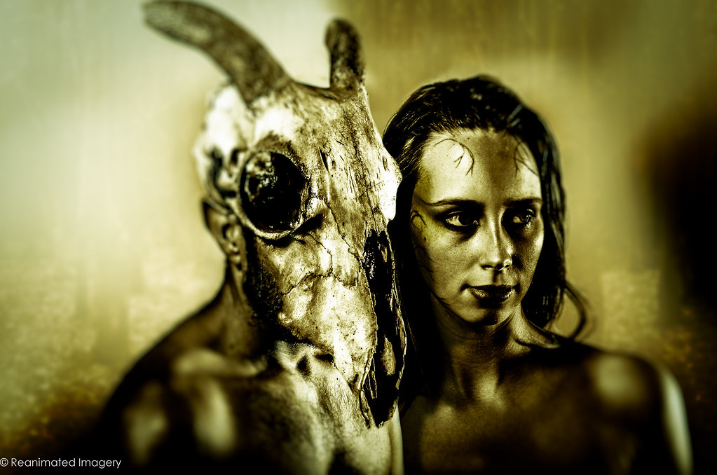
Your Wild image is both brilliant & seriously derranged.......excellent PP as always :clap: If I may be so bold as to crit.....the space to the lhs seems a little odd...
Texture 2...I'll have nightmares....very reminiscent of Alien ( the film ) was that the intention ?
 
It's actually a toy Alien bought for me by Mrs West to celebrate completing my Masters degree. :) here's another shot with a different texture where you can see him better


Video Nasty
by ReanimatedImagery, on Flickr

As to the spacing on the left of the Wild one, you got me - it's composited from two different portraits taken on two different days, hence the odd comp.
 
The simplicity if texture #1 works for me and the shadows are an added bonus.


Dreamy, more like nightmarey ;) works for me. The gold toning suites the subject, slight closer crop would work for me.

Cheers.
 
Cheers for the comments, all.

Dreams was one of those where I wasn't short of ideas, just time to take the bloody things.

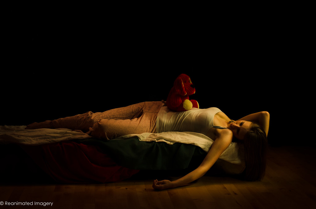
As it turns out, it was the perfect opportunity to crack a technique I've been wanting to play with for a while - light painting. It's actually quite simple; the only issue was the the 'demon' kept moving up and down as she breathed.

Anyway, based on Henry Fuseli's The Nightmare we have:

The Nightmare by ReanimatedImagery, on Flickr

And the other one was a fairly obvious concept to do, so I did two variations:

In Dreams I Can Fly by ReanimatedImagery, on Flickr
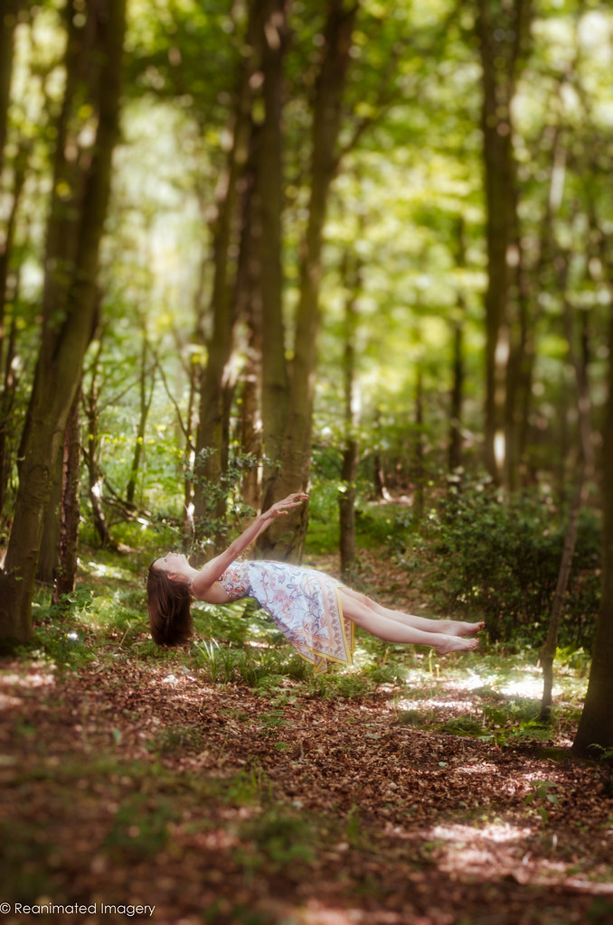
Looking to the Sky to Save Me by ReanimatedImagery, on Flickr
 
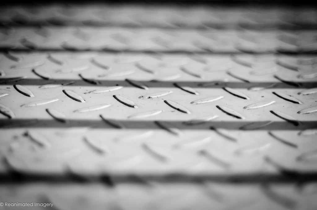
Texture - Nice metallic feel on this on. The DoF has been used well

Wild (or should I say Dream LOL) - I do like this. It's just not a standard shot which is its strength. The toning really does suit the style of image you were after. A big thumbs up from me

Dream - Another strong image. At first I thought it was a little dark but after looking at it longer that is exactly what it needs to be and suits the theme really well. I'm not sure whether the teddy is adding to the shot but there's something imposing about the way it's sat there. Another winner
 
Very strange, right above yours was Judi's submission and it featured the name artist!

Like it a lot, one of the best dreamy submission. Lovely warm colours, the teddy adds a bit of humour and the lighting is wonderful.

The other two are also great submissions but number one really stands out for me.

Cheers.
 
Wow Tony... so many of your shots (looking back through them) are great. I like the thinking that's clearly going on behind the camera... these are never just snaps (not that they are for other people's, but you know what I mean).

That first Dream is magnificent. I love the style / PP - and the lighting... well, it's just sumptuous. I've wanted an excuse to use that word for a while and now I've got it! Thank you ;)

Edited to add: if you could have got the teddy all blurry while the rest of the image was sharp it would have made it very spooky - and right in keeping with the Nightmare idea. Just a thought!
 
Last edited:
Hi Tony, your Dream Shots, the latter two especially are kinda creepy - it's like something from a horror/chiller type movie (I try not to watch them).
However, I think they've been executed really well. No crit from me.
 
That first dream shot is very nicely done. (y)

I must have viewed it a dozen times in the last two days and it cracks me up every time. ;)
 
Last edited:
Tony, I always look forward to seeing your shots and once again you haven't disappointed. That vertical image is just amazing. How many composites is it - just the two? The sky is fabulous and the actual take of the tower and "land" is perfectly executed. Are the "people" figurines?

It's utterly brilliant to look at and I'm crying out to know how you did it! One of your best shots for me - and given the quality of your others, that's saying something!
 
Hi Tony,
"In dreams I can fly" would get my vote for the dream theme. I always wonder how these type of shots are created.
There is more a sense of your model falling/floating in this one as opposed to the others.

Vertical, I can only echo what Paul has said above, such creativity, imagination and execution to realise your idea. Lovely surreal piece of work (y)
 
You're all too kind. It really was the simplest of shots and Blondie can tell you exactly how it was done: I took a shot of some cardboard boxes on some cardboard with sand scattered on it (light from the front and with a speedlights behind to black out the back wall) like so:


Setup
by ReanimatedImagery, on Flickr

Then a shot of two colleagues in the car park taken from a window for the figures and a sky from over the sea I took ages ago. The windows were a texture I grabbed off the internet and twisted with the perspective tool. I cloned in the ground to create a horizon and remove the joins in the cardboard and did some dodging and burning (using the grey layer method) to blend all the lighting in.

Took about an hour.

The floating shot is much the same - stick the camera on a tripod and take a shot of the empty scene. Then get the model in on a stool and take a shot with her there. Place the model shot as a layer on top of the empty background and rub out the stool. Job's a good 'un. The problem for me was that the stool ended up with a leg in front of the dress on the best shots of the model so I had to reconstruct the dress using a similar cloning technique to the wasteland in the Babel shot.
 
Hi Tony, the first Dream shot is a clear winner for me. You've definatly cracked light painting, nice even light applied from different angles. the partially light floor helps ground it and I really like the black negative space at top to keep it dark overall. very well done (y)
 
HI Tony

Vertical....stunning i both concept & execution as always....& great to read how you did it....I just don't have the imagination to come up with something like this !

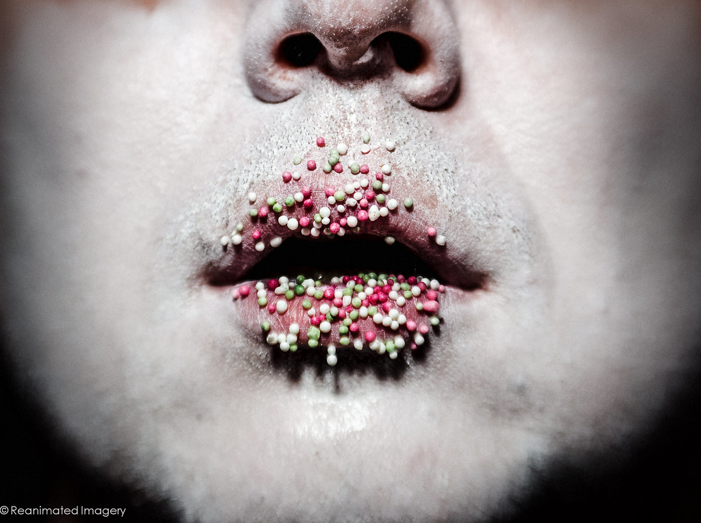
Yum.....hmmmm....I'm guessing the model has just put their face in a bowl of cake mix or something ? I get where you're coming from with this shot ( which is a miracle in itself ! ) but I'd prefer a clean face with the little beads as they are....sorry :coat:
 
Sorry to everyone else but I don't have time to comment on threads much at the moment.

But, I just wanted to say that this is 100% my kind of photo! I'm struggling to see it properly between my laptop (showing it a a proper size) and my phone (which has far better colour reproduction) but I love it!

I love the high key look which works so well with the hundreds and thousands. The lip detail and colouring is perfect. It feels like the style and lighting you'd see on a modern vampire film (not Twilight which is... something else not worth talking about!) In fact, it reminds me completely of Dark City - one of my favourite films... maybe that's why I like the photo so much?

Brilliant once more, Tony. Every time you put a photo up I'm excited about what's coming! Glad you haven't disappointed again ;)
 
Dream - excellent work on the two variants on the floating lady good pp skills as well wonderfully executed nothing for me to crit.

Vertical - great idea for the theme and again some excellent use off pp, truly outstanding work.
 
Right, I've been keeping up to date with my shots but haven't had a chance to post. End of term next week so hopefully I can get around everyone's threads for some comments.

So, massive update incoming:

Loud gave me two ideas, one of which was a chance to learn how to do shock waves. Not totally happy with the result, but it gives me a basis to learn from:


Banshee
by ReanimatedImagery, on Flickr


Shriek
by ReanimatedImagery, on Flickr

Reshoot I went for Fantasy: my original shot, although I was happy with it, I didn't learn anything - it was all techniques I'd used a hundred times before. So I decided to have a play with some light painting


Painted With Light
by ReanimatedImagery, on Flickr

And Rich I went with a couple of quotes:

First, I wanted to have a play with some subtle lens distortion


Greed Is Good
by ReanimatedImagery, on Flickr

And secondly some fairly straight composition


Chains
by ReanimatedImagery, on Flickr
 
Greed is good is a marvellous shot, perfect expression that makes the shot work even without anything else. But having the money, the inyerface look of the distortion, as well as the close framing all works, the pin stripe shirt is the icing on the cake. Great job.

On the shock waves, I do agree it's not quite there, and I really wish I could make a suggestion as to why it's not quite there. :thinking:, only thing I can come up with is it looks a bit more like he's in a bubble, so maybe having further, larger waves, but with a reduced effect / opacity would give the effect of the waves radiating out from him, with a bit of outwards motion blur or zoom burst effect? dunno! :)
 
HI Tony

good to see you back here :wave:

Loud....shock waves are amazing...no crit :clap:

Loud 2....yup , can see what you were going for but it doesn't sit quite right with me...the area with the missing piece of mirror seems to look like glass in the panel behind , is if it's see through...not sure I explained that too well & I'd like the cracks in the mirror to be bigger / extend further ? Hate criting your stuff cos I'd not get within an mile of anything so technical !

Fantasy doesn't work for me at all...prefer your original image but then I guess it;s good to play with different techniques ( I should know !)

Rich one.....just perfect , the expression, the hint of money either side ( though I'd like to see more ) & the pp....brilliant :clap:

Chains....yes ,agree with the statement but it's way to deep for a hot saturday evening :)
 
Vertical - I like the creative thinking and execution behind this one. There's something about the perspective that is playing with my eye though. Maybe it's the angle that the clouds are meeting the floor. Not sure.

Yum - I've seen this done before and usually with perfect skin, bright lighting, evenly spread sprinkles and saturated colours. But this works for exactly the opposite reasons. It could almost be on one of those horror movie posters. Nice one

Loud #1 - Nice idea but it doesn't quite work for me like your others in this thread have. The subject looks a little cut out and lighting isn't matching the background

Loud #2 - The mono conversion certainly suits this image. The addition of the broken part of the mirror really strengthens the shot. The darkness of the whole image adds to the feeling.

Reshoot - I think the light painting is quite clever with this image The choice of colour works well

Rich #1 - The lens distortion is just right for this close up portrait. Nice choice of mono conversion and to me the contrast is just right

Rich #2 - I feel the chain is a little dark in the image but that said it accentuates the picture. Apologies but the religious picture reminds me of those Yugioh cards from a few years ago LOL
 
Hi, all very imaginative images as always, Rich (greed is good) is definitely a stand out image
shockwaves in the first not to sure it works I agree with Graham its more like a bubble but still a great attempt
 
Some amazing photography and simply brilliant PP again... you certainly inspire the rest of us with your work!

Loud 1 - I like it and although the bubble could do with more work to make it more of a shock wave than a bubble, it's a great look.
Loud 2 - Super take on the theme (not too obvious) and great PP. I'd like a touch more shadow detail in the shirt without spoiling the dark mood, though
Reshoot - I'm not convinced by this one but it's technically very clever... I just prefer your other work!
Rich 1 - Super again. I like the distortion, expression and superbly on theme.
Rich 2 - good shot and composition but I prefer the first Rich.
 
Back
Top