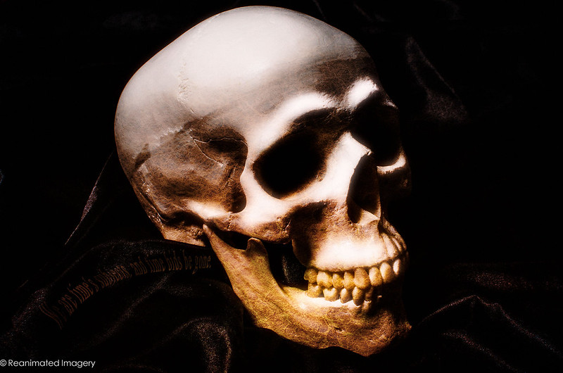
weekly Reanimated 52 2014 - Massive update to darkness

:notworthy:......nuff said !

Other than......I really do worry about you :D
 
Hmmmm. seen that chap before somewhere I think. :)

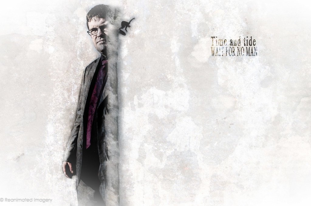
Unusually for me, I don;t "get" this one of yours. I see the tide reference, but struggling to put time in with the fella. Is he supposed to be looking wistfully out to sea, wishing he was surfing rather than stuck in his suit and tie??

Overall I'm a bit un-wowed this week if I'm honest.
 
I know what goes on in a photographers mind. He/she thinks that photograph reminds them of this or that and fits this weeks theme just right so long as I let people know what I'm thinking. It is quite common, I may have done it myself without knowing, to post a picture that seems to fit the theme but no one gets it without the explanation. I think these three images illustrate the point. They are all excellent images without doubt, but without the explanation I would not have had any clue as to what theme they were trying to portray. It's a statement I must make more often with other photographers pictures, that is: In a theme-based challenge, the theme itself must form a large part of the image's raison d'etre.

Still, nice pictures though.
 
See, I couldn't disagree more strongly, Martin: in any artistic endeavour the theme is the starting point, the inspiration. The challenge comes in finding your own way through that. The problem with a lot of photographers (and painters, though less so sculptors, oddly) is that they can be too literal in an approach. In my case, I post the explanations for the same reason I post the multiple images, as a form of digital sketchbook to keep track of how my ideas have developed.

The theme should be a springboard, not a shackle.
 
Then we must agree to disagree here; while I see your point I feel it doesn't really apply to this challenge. I mean I could take an arty picture of, say, a Morrisons supermarket and entitle the picture "'Time' I Went Shopping" and claim that I was inspired by the theme but then took a photograph that by no stretch of the imagination could it really apply to the theme 'Time'. It's just the way I see it.

I shall continue to endeavour to find alternatives to the theme that still stay close to the words of the theme as that is how I see the challenge. With your permission I shall continue to crit your pictures but now be accepting of your alternative view.


:snaphappy::):)
 
Everyone is entitled to their opinion; it seems, though, that our understanding of what photography is is so wildly divergent that you won't find anything of value in my posts.

I'd also suggest that your analogy of a photo of Morrisons tossed off with no thought is a touch on the insulting side in its dismissive attitude towards what I'm doing. You may well be better looking at other work that suits your preconceptions better.

To put it another way, I'm a touring bike rider. It would never even occur to me to look at my brother who's a knee-down speed demon and tell him he was riding wrong. We're all riding bikes just in different ways.
 
Last edited:
Hey, hey, chill out a bit. I'm not dismissing your work in any way or implying that your work is any less valuable than mine or anyone else's on the forum, I was merely trying to show that in a theme-based activity I prefer to keep as close to the theme as possible and that's my preference. I like your photographs and have said so on several occasions. If I see another of your pictures and I like it I shall say so again. We may have disgreed on this occasion but there is no need to fall out over it.

As an aside:

I too am a touring biker, but I also sometimes like to ride very fast and attempt (always unsuccessfully, probably fortunately) to get my knee down on occasions.

To use an Americanism: Are we cool?
 
Please don't tell me to chill out; I pretty much promise that that's a fairly good way to ensure a lack of coolness between anyone. I have no intention of falling out with anyone; I just think that, given your stated preferences, you're not going to find anything to enjoy about the way I approach my 52.

I'll just put down the Morrisons thing as a clumsy analogy that you didn't mean to come across as dismissively as it did and leave it at that.
 
Obviously I have not come across as the genuine person I feel I am. I was merely giving my opinion on the way you approached the theme and how it differs from mine (I was not the only one), I thought that was the point of the Challenge 52, to give opinions and critique. You seem totally unable to accept criticism unless it's all to the good and that's not what this is about. All my attempts to patch up what has probably been an initial misconception have been rejected so I give up. I will no longer critique your pictures, please do me the same courtesy.

Consider yourself ignored.
 
Last edited:
I have no problem with critique; I've always got incredibly valuable feedback here that's made me a better photographer, but that's not what you were offering - nor, based on the post you made in the main 52 thread did it look like that was what you were intending to do. You were very clear there was that you simply wanted to express your opinion. There is a difference between the two.

If you didn't come across how you wanted you may wish to consider why that was. I will simply point out that even here in this last post you are making assumptions about me and attitudes - in effect commenting on me as a person and a photographer rather than on the work. Look back at your last three posts in this thread and you might see why your contributions were less pleasant than the others who didn't see any connection between my shots and the theme.

I hope you enjoy your 52, I know I will mine.
 
Last edited:
Hi Tony

I'm fast coming to the conclusion that I really should have paid more attention at school....I find your images fascinating , sometimes disturbing but always well executed ......though most of the time I just don't have a clue what's going on in them :D
I digress......

Time n Tide......almost water color in presentation, great texture on the wall ( if thats what you used )......the surfer ?? seems a little out of place , 1st off I thought it was a smudge , read Grahams words & looked again.......sort of getting a connection based on what Graham said.....wishing he was out playing rather than being in a suit........can you put me out of my misery???;)

The Skull shot....well lit , plenty of detail , kinda like how the color changes toward the top of it....but a little to closely cropped at the top maybe ?

One man in his time plays many parts...understand the words.........not a clue about the image though :oops: :$

Good to see you hanging on in here given how busy you are with work...... (y)
 
You and Overbez certainly both read the tide one right - the chap is a mate from work who surfs - both shots are him! I need to have a think about how I could have made te link between them clearer - possibly the main shot should have been him in his wetsuit on the beach waiting rather than at work dreaming to close the gap between the two?

The skull one I'm not particularly happy with - as per usual, just needed to get the time/death connection out of my brain pan.
 
Last edited:
I like the processing on the Time and Tide image but need more of a link for the title.

The skull is probably the easiest one to link but personally my least favourite as I feel its over cropped and slightly over exposed at the top of the skull.

'One man in his time plays many parts' made more sense once I read the complete verse when I looked on Flickr. Although still struggle to connect to the image however that said it is my favourite of the 3
 
I like your first image Tony, the sea, time time and tides have a strong connection, for a surfer time and tide need to be right too,i maybe don,t understand it your way but it works for me (y)(y)

Swirl... very smokey swirls, given your work problems you are keeping up well :)
 
Last edited:
Love the time re-shoot, but to be fair I'm a big Star Wars fan :D

That second smoke shot does give the impression of an animal, but I can't help but think it's a dog from behind :thinking: :ROFLMAO:
 
Time re shoot - clever idea and nicely exposed. I like the DOF with the search going OOF. Minor crit would be the unneeded space to the Left of the screen I'd be tempted to crop.

Swirl - 4 Good smoke images there Something I've struggled with and am planning to do for my reshoot. (y)
 
Hi TOny


fab set of Smoke images...very envious at your ability to capture these

Think Dragons breath is my preferred choice....simple , clean & super sharp :clap:

ps.....can you put a link to your thread in the pic only thread ...pretty please :)
 
Time - think that #3 One man in his life etc is the best. Good moody lighting and the masks are an excellent idea - perhaps a bit more light on them to make them a bit less subtle. Brings to mind the cover of the San Quentin Lp by Johnny Cash
Swirl - all good and good b/g - can't say more as smoke pictures don't excite me :):(
Linked - another with a gritty feel. Good lighting and texture on the hands and arms. (y) Not sure that the 'blood' is needed or it needs to be portrayed a bit better - looks a bit painted on. Also, not sure about the flecky bits in the b/g but maybe they are deliberate and I miss the point?
 
....

That second smoke shot does give the impression of an animal, but I can't help but think it's a dog from behind :thinking: :ROFLMAO:
Just what I was thinking :LOL:

Excellent smoke images Tony :)

Linked - A good original idea, as always from you, Crit from me... the 'blood' seems too black and not in keeping with the rest of the image, I'm really liking the aged look you have given it, well staged with a nice strong grasp, and well lit with good detail :)
 
I remember commenting about some of these but I must have missed clicking Post Reply :banghead: so here's my catch up

Time - I like #3 of these. It's very atmospheric and gives a feeling of the actor on stage in front of the audience. I might have added a little more light the other side of the subject to bring more of an outline to the person

Swirl - I like the Quatermass version of this. The addition of the textured background adds an extra factor to the smoke swirls

Linked - Like others I'm not sure the blood adds to the image. I like the scruffed up and aged look you've given it
 
Thanks chaps. I'll have a dig around; I have a shot before they squeezed and the blood spilled over the top of the hand. The reason it's so dark is because of the colour mix on the blood itself. If I put up the original shot you'd see I didn't get the shade quite right so the moon conversion and darkening of the red shades was basically a rescue job :)
 
Linked - Good idea, like the processing, it suits the image (y) I get the idea of the blood but I'm also not sure it needed it. Without it would have looked like they were 'linked' in an arm wrestle which would have worked just as well :)
 
Back
Top