You are using an out of date browser. It may not display this or other websites correctly.
You should upgrade or use an alternative browser.
You should upgrade or use an alternative browser.
Simon's 52 in 2021
- Thread starter SimonH
- Start date
- Messages
- 8,304
- Name
- Ian
- Edit My Images
- No
It looks like a clam or some sort of shell creature rather than a reflection. I quite like it. The colours look really nice too. Lyme Park is a lovely landscape shot with that beautifully still water.
- Messages
- 3,772
- Name
- Simon
- Edit My Images
- Yes
Selfie mirror image, for me.
Thanks. I thought it was a bit to obvious though. Does what it says on the tin though....[emoji846]
- Messages
- 3,772
- Name
- Simon
- Edit My Images
- Yes
It looks like a clam or some sort of shell creature rather than a reflection. I quite like it. The colours look really nice too. Lyme Park is a lovely landscape shot with that beautifully still water.
Thanks. Not entirely sure where it came from m(probably a gift shop somewhere - it’s a slim slice of something). Balanced on the face of a disassembled double sided shaving mirror.
That day at Lyme Park was perfect. Late October, not a cloud in the sky, hot, and not a breath of wind.
- Messages
- 3,772
- Name
- Simon
- Edit My Images
- Yes
Selfie mirror image, for me.
It looks like a clam or some sort of shell creature rather than a reflection. I quite like it. The colours look really nice too. Lyme Park is a lovely landscape shot with that beautifully still water.
Reflection
It's the first one for me. It looks like a blue lagoon.
I like the colour on #1 - that would be my choice too.
Thanks all for your comments on last week's set. Much appreciated
- Messages
- 1,293
- Name
- Stuart
- Edit My Images
- Yes
Reflection
All worthy contenders, the first one definitely has a clam shell look to it, you are right about the dust for the text image, even when you clean it and looks ok to the eye the camera still detects it. The mirror selfie works well, I'm been trying to train my non focusing eye to be open which has effect of superimposing the viewfinder display on what I'm looking at, helps with tracking fast moving items. The archive image has a fantastic reflection.
All worthy contenders, the first one definitely has a clam shell look to it, you are right about the dust for the text image, even when you clean it and looks ok to the eye the camera still detects it. The mirror selfie works well, I'm been trying to train my non focusing eye to be open which has effect of superimposing the viewfinder display on what I'm looking at, helps with tracking fast moving items. The archive image has a fantastic reflection.
- Messages
- 3,772
- Name
- Simon
- Edit My Images
- Yes
Reflection
All worthy contenders, the first one definitely has a clam shell look to it, you are right about the dust for the text image, even when you clean it and looks ok to the eye the camera still detects it. The mirror selfie works well, I'm been trying to train my non focusing eye to be open which has effect of superimposing the viewfinder display on what I'm looking at, helps with tracking fast moving items. The archive image has a fantastic reflection.
Thanks Stuart [emoji106]
- Messages
- 3,772
- Name
- Simon
- Edit My Images
- Yes
OK, on to week 10 - Rough
These are shots of a wall on my house - the rough facing brick hopefully fits the theme. Rough 1 is taken at an angle looking up whilst Rough 2 is more face on (but not flat face on). I think the first image is more interesting as it shows up a nice patter in the vertical mortar joints, especially towards the lower right of the shot. Very slight vignette applied to both, which also enhances the joint pattern slightly.
Rough 3 was my originally intended shot with the lines disappearing into the right hand side of the frame, but I couldn't quite get it how I wanted.
Rough 1
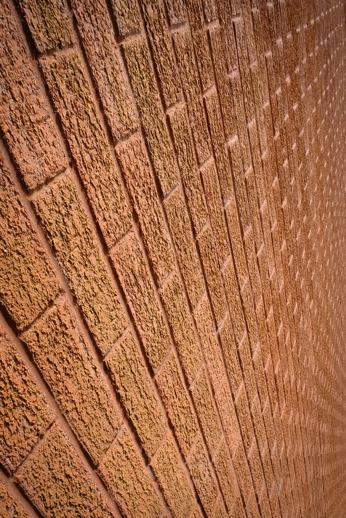 Rough1 by Simon P Hiscocks, on Flickr
Rough 2
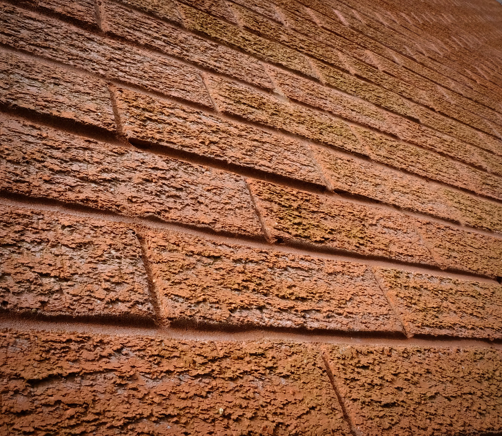 Rough2 by Simon P Hiscocks, on Flickr
Rough 3
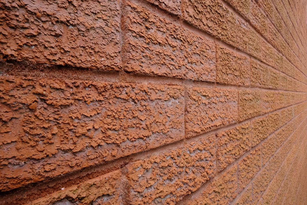 Rough3 by Simon P Hiscocks, on Flickr
These are shots of a wall on my house - the rough facing brick hopefully fits the theme. Rough 1 is taken at an angle looking up whilst Rough 2 is more face on (but not flat face on). I think the first image is more interesting as it shows up a nice patter in the vertical mortar joints, especially towards the lower right of the shot. Very slight vignette applied to both, which also enhances the joint pattern slightly.
Rough 3 was my originally intended shot with the lines disappearing into the right hand side of the frame, but I couldn't quite get it how I wanted.
Rough 1
 Rough1 by Simon P Hiscocks, on Flickr
Rough 2
 Rough2 by Simon P Hiscocks, on Flickr
Rough 3
 Rough3 by Simon P Hiscocks, on Flickr
Last edited:
I think you made the right selection from your choice. #1 really works for me; it's different and has a (surprising) amount of interest for a brick wall. Well done.
I find myself holding my head at an angle - did you try #1 as a landscape orientation?
I find myself holding my head at an angle - did you try #1 as a landscape orientation?
- Messages
- 3,772
- Name
- Simon
- Edit My Images
- Yes
Nice, came here to say I find the direction of the bricks distracting, I find 2 more pleasing to my eye. Fits the theme nicely.
Thanks - yes I knew I’d get some view in the direction of the bricks being weird/distracting but stuck with it because it’s unusual.
- Messages
- 3,772
- Name
- Simon
- Edit My Images
- Yes
I think you made the right selection from your choice. #1 really works for me; it's different and has a (surprising) amount of interest for a brick wall. Well done.
I find myself holding my head at an angle - did you try #1 as a landscape orientation?
Thanks [emoji106]. As above, it’s definitely an angle that isn’t going to work for everyone. I did fiddle around with it as landscape but it lost something in the process for me - I don’t think the swirl of the joints is as effective in landscape.
- Messages
- 8,304
- Name
- Ian
- Edit My Images
- No
Thanks - yes I knew I’d get some view in the direction of the bricks being weird/distracting but stuck with it because it’s unusual.
I think, given the nature of this challenge, when I first saw it, I thought you might have done it deliberately. Because of that, I like it. #3 is a much more classic view - and probably how I'd have done it, but you went a step further and tried something different. Works really well and is quite dramatic.
- Messages
- 294
- Edit My Images
- Yes
#1 makes me feel...uncomfortable, I guess? Not that I don’t like it, it’s just such an unusual angle.
#2 is more interesting and I like it, different enough but not as extreme as the first.
#3 is my favourite, perhaps it’s just the conventional angle and leading lines. It just works better for me.
#2 is more interesting and I like it, different enough but not as extreme as the first.
#3 is my favourite, perhaps it’s just the conventional angle and leading lines. It just works better for me.
- Messages
- 3,772
- Name
- Simon
- Edit My Images
- Yes
Nice, came here to say I find the direction of the bricks distracting, I find 2 more pleasing to my eye. Fits the theme nicely.
I think you made the right selection from your choice. #1 really works for me; it's different and has a (surprising) amount of interest for a brick wall. Well done.
I find myself holding my head at an angle - did you try #1 as a landscape orientation?
That certainly fits the theme, THB I find #2 more pleasing as it doesn't seem quite so cluttered. but that's just my opinion.
no 3 for me, the leading lines work better I think.
I think, given the nature of this challenge, when I first saw it, I thought you might have done it deliberately. Because of that, I like it. #3 is a much more classic view - and probably how I'd have done it, but you went a step further and tried something different. Works really well and is quite dramatic.
I think it’s #2 for me, I really like the angle how it fades into that top right corne, very nicely done.
Looks rough! I liked the first, now I don't know which is best.
I liked the first but now I've seen them all, I think I'll settle on the thirdWhen I go back and looks at the other two they make me feel a bit dizzy. On theme and an incredibly neat wall. I wish ours looked like that.
#1 makes me feel...uncomfortable, I guess? Not that I don’t like it, it’s just such an unusual angle.
#2 is more interesting and I like it, different enough but not as extreme as the first.
#3 is my favourite, perhaps it’s just the conventional angle and leading lines. It just works better for me.
Thanks everyone for your honest feedback! Some interesting differences of opinion in the comments, and all valid. Apologies for those I made feel queasy with the odd angles!

- Messages
- 8,304
- Name
- Ian
- Edit My Images
- No
Still learning about constructing an image rather than just shooting without thought, but I am, at least to myself (I hope) improving in this regard.
It's a good thing to learn, and experimentation will send you off down different visual rabbit holes. If you do the same stuff over and over again, you'll always get the same results. Variety is the spice of life as they say! Well done you.
- Messages
- 3,772
- Name
- Simon
- Edit My Images
- Yes
Ok, still struggling with week 11 (smooth), but have an idea, so hang on...
Meantime, week 12 - Alive
My though process was new plant life - hence the Alive 2 pic of the seedling, but then I spied Mr Snail (who was clearly alive), meandering along the path with a baby snail attached to his back. Couldn't resist. In the seedling shot, a couple of the bigger stones might be felt to be distracting from the image, but I think help the idea of a tiny seedling breaking through the hard ground.
Alive 1
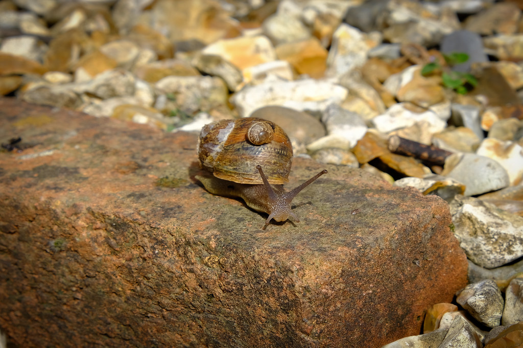 12-Alive1 by Simon P Hiscocks, on Flickr
Alive 2
 12-Alive2 by Simon P Hiscocks, on Flickr
Meantime, week 12 - Alive
My though process was new plant life - hence the Alive 2 pic of the seedling, but then I spied Mr Snail (who was clearly alive), meandering along the path with a baby snail attached to his back. Couldn't resist. In the seedling shot, a couple of the bigger stones might be felt to be distracting from the image, but I think help the idea of a tiny seedling breaking through the hard ground.
Alive 1
 12-Alive1 by Simon P Hiscocks, on Flickr
Alive 2
 12-Alive2 by Simon P Hiscocks, on Flickr
- Messages
- 7,130
- Edit My Images
- No
I was going to say alive and not kicking for the snail [emoji4] two on theme pics [emoji106]
By the way, did you know that you can link direct to the relevant post rather than the thread? You get the link by right clicking on the post number.
I only mention it, because it’s the third submission on the trot that I’ve clicked on that takes me to the front page [emoji4]
By the way, did you know that you can link direct to the relevant post rather than the thread? You get the link by right clicking on the post number.
I only mention it, because it’s the third submission on the trot that I’ve clicked on that takes me to the front page [emoji4]
- Messages
- 3,772
- Name
- Simon
- Edit My Images
- Yes
I was going to say alive and not kicking for the snail [emoji4] two on theme pics [emoji106]
By the way, did you know that you can link direct to the relevant post rather than the thread? You get the link by right clicking on the post number.
I only mention it, because it’s the third submission on the trot that I’ve clicked on that takes me to the front page [emoji4]
Thanks for the tip. That’s helpful
- Messages
- 7,130
- Edit My Images
- No
Thanks for the tip. That’s helpful
Actually it’s just happened twice more, so I’m wondering if it’s because I’m on the app on my iPad [emoji848] It could just be me!!
- Messages
- 8,304
- Name
- Ian
- Edit My Images
- No
I like both of these Simon. Perhaps a less central snail might have worked better, but thematically it's bob on.
The green shoot has some nice colour contrast going on too and the DoF separation works really well.
The green shoot has some nice colour contrast going on too and the DoF separation works really well.
- Messages
- 3,772
- Name
- Simon
- Edit My Images
- Yes
Might be - I was sure I'd used the #187 post link as I do every time.....Actually it’s just happened twice more, so I’m wondering if it’s because I’m on the app on my iPad [emoji848] It could just be me!!
- Messages
- 3,772
- Name
- Simon
- Edit My Images
- Yes
Thanks - I cropped the snail shot slightly squarer - never sure about whether to centre or not. My mind and OCD says yes, but I can see benefits in not doing so! I shot a few different angles but this was the best. Thinking about it, I could have waited until he started descending the brick - that might have given something a little different.I like both of these Simon. Perhaps a less central snail might have worked better, but thematically it's bob on.
The green shoot has some nice colour contrast going on too and the DoF separation works really well.
The seedling shot was awkward - where it was located , the angle of the sun and of course trying to ensure correct focus and get the DoF. I think the focus may be slightly off, but overall I'm please with how it turned out relative to the theme
- Messages
- 3,772
- Name
- Simon
- Edit My Images
- Yes
A double for me today as following my week 12 "Alive" shots above, I catch up with week 11 - Smooth, and use the low key technique
I had this idea in my head since "Smooth" first came out, but haven't been in a shop where they've sold the right beer until today!
This technique was a first for me. I've never done this before, so was a bit hit and miss trying to find the right place and bits in the house to get this shot done. I'm fairly pleased with it as a first attempt.
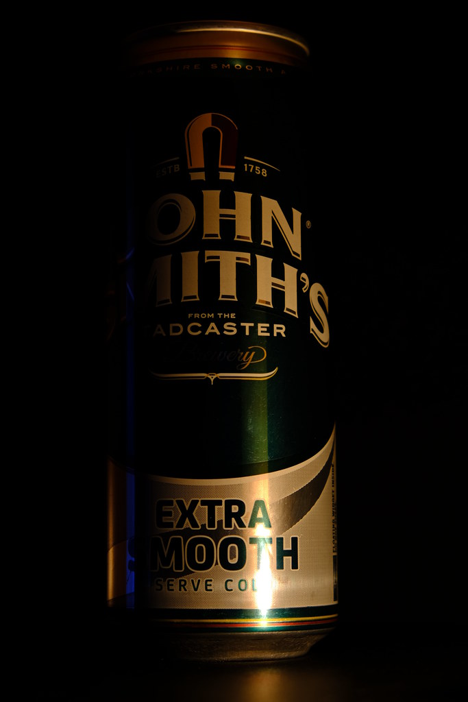 Smooth by Simon P Hiscocks, on Flickr
I had this idea in my head since "Smooth" first came out, but haven't been in a shop where they've sold the right beer until today!
This technique was a first for me. I've never done this before, so was a bit hit and miss trying to find the right place and bits in the house to get this shot done. I'm fairly pleased with it as a first attempt.
 Smooth by Simon P Hiscocks, on Flickr
- Messages
- 7,130
- Edit My Images
- No
Might be - I was sure I'd used the #187 post link as I do every time.....
Yes I think it must be a ‘feature’ of the app! Sorry about that.
- Messages
- 1,293
- Name
- Stuart
- Edit My Images
- Yes
Rough
All the wall images are interesting in their own way. Number 3 is my favourite, i like how the line are leading almost to a vanishing point.
Smooth
A drink I’ve never tried, i don’t know if with your choice of lighting you could have lost the highlight at the bottom
Alive
Well spotted snails, i agree the stone does take your focus slightly from the seedling image, but it does have nice light on it

