You are using an out of date browser. It may not display this or other websites correctly.
You should upgrade or use an alternative browser.
You should upgrade or use an alternative browser.
weekly Steve E's 2012 52- Sweet added +B/W
- Thread starter riu
- Start date
- Messages
- 998
- Name
- steve
- Edit My Images
- Yes
Nice Candid Steve,the only thing i would say is its a shame that you couln't get rid of the other guys back, think i prefer the B/W as well you can see his eyes better.Do gamekeepers have time to take photos or didn't you do it this year??
Liz, no what you mean about the "back", but there was 10 of them waiting to draw their pegs. The pic was shot yesterday on a 450D (dont take the 60D when picking up) looks as though the year is out, will check it out next time it comes out of the bag,(beaters day next week, opted to shoot with the camera and not the gun).
Last edited:
- Messages
- 2,820
- Name
- Mark
- Edit My Images
- Yes
Great candid shot! I like the colour one best I think; I think the guy could be smoking in the B&W one. It's a slight shame he didn't have a sigh on his face, but you did really well to capture it at all!
- Messages
- 998
- Name
- steve
- Edit My Images
- Yes
Great candid shot! I like the colour one best I think; I think the guy could be smoking in the B&W one. It's a slight shame he didn't have a sigh on his face, but you did really well to capture it at all!
Cheers Mark, the guy in question (hopes he's not a tp member
 ) does n't do any facial emotions. If he won the lottery i'd doubt he would smile.
D
Deleted member 3428
Guest
Mono shot is my preferred. 
- Messages
- 1,513
- Name
- Alex
- Edit My Images
- Yes
Good candid. Like the B&W, great atmosphere about it.
- Messages
- 478
- Name
- Phil
- Edit My Images
- Yes
B&W for me too Steve. That guy looks like a right character.
Taking pictures of people is something i'm really not confident with so I think I may have to make the effort during this 52.
Taking pictures of people is something i'm really not confident with so I think I may have to make the effort during this 52.
- Messages
- 234
- Name
- Chris
- Edit My Images
- No
It's the colour one for me as I think it give the pic more depth
I too need more practice at this phil
B&W for me too Steve. That guy looks like a right character.
Taking pictures of people is something i'm really not confident with so I think I may have to make the effort during this 52.
I too need more practice at this phil
- Messages
- 13,760
- Edit My Images
- Yes
Certainly some thought going in to these shots
Wk1 is a great shot, like the colour and dof
Wk2 With all the debate and the re-shoot... i'm not sure which one now myself, nice use of dof - i'm thinking possible the first one
Wk3 I prefer the colour shot, it gives more depth to the smoke imo - Nice shot
Only 49 to go... look forward to seeing what you come up with
- Messages
- 998
- Name
- steve
- Edit My Images
- Yes
Sigh, not really seeing sigh here but the narrative helps give context.
I'd like to see him isolated.
Cheers.
Not sure about him isolated, i'd like to see him sectioned!!!!!
But no where you are coming from, will see what i can do.
regards
- Messages
- 1,101
- Name
- Stephen
- Edit My Images
- No
Love the direction. Good idea and nice dof.
Not keen on the fear to be honest but its because it makes me feel a bit awkward. Maybe I should like it because it definitely hits home.
The sigh is really good. I prefer the colour one but both certainly give a good indication of how he feels.
Not keen on the fear to be honest but its because it makes me feel a bit awkward. Maybe I should like it because it definitely hits home.
The sigh is really good. I prefer the colour one but both certainly give a good indication of how he feels.
- Messages
- 998
- Name
- steve
- Edit My Images
- Yes
should[/I] like it because it definitely hits home.
Know how you feel about the fear shot, the idea came to me because i know someone that went down this road. Made me wonder when i was setting it up.
Thanks for the comments
- Messages
- 522
- Edit My Images
- Yes
I really like the Fear shots, a good interpretation shot well.
jgs001
Brian Cox
- Messages
- 12,646
- Name
- John
- Edit My Images
- Yes
Direction : Clearly on theme, it looks well lit... I just feel it's lacking in something to really make it. Perhaps one of the pieces on the corner of the square ?? Which one looks most dejected ??
Fear : I think the second works best... th elighting is better controlled and the focus is more appropriate for the image. A very dark take on the theme, but I think it works, although I think it probably needs the text to explain
Sigh : Not totally convinced for the theme, but it's a tough theme. A very nicely captured image, good strong detail, and bang on focus. I think it works better in mono.
- Messages
- 8,398
- Name
- Lynne
- Edit My Images
- Yes
Hi Steve
like the candids...prefer the mono....more atmosphere for me....difficul theme & a good interpretation
like the candids...prefer the mono....more atmosphere for me....difficul theme & a good interpretation
- Messages
- 998
- Name
- steve
- Edit My Images
- Yes
Difficult week for time, but better late than never.
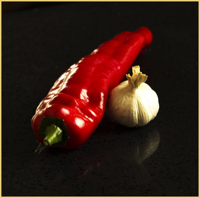
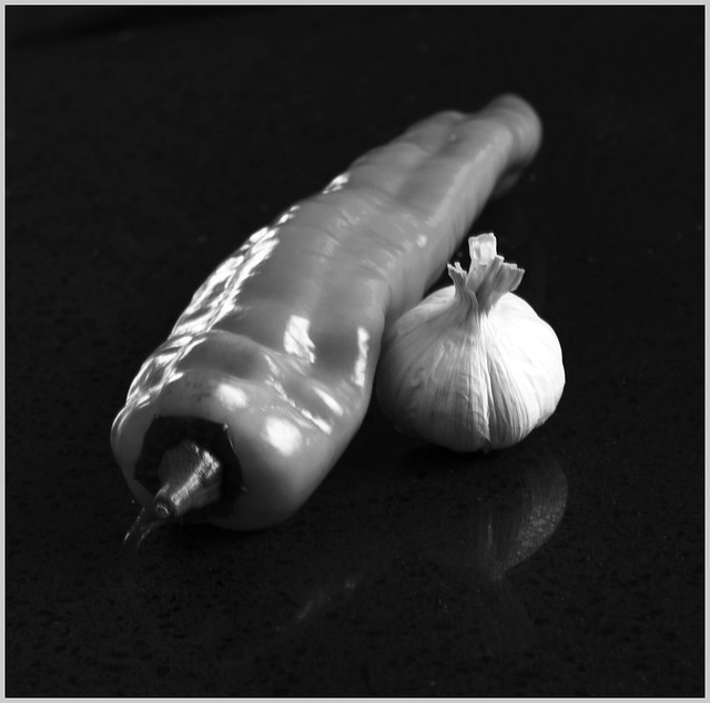
My favourite food "Sweet Chilli and Garlic"

Sweet Chilli and Garlic by steve/e, on Flickr

Sweet Chilli and Garlicbw by steve/e, on Flickr
My favourite food "Sweet Chilli and Garlic"

Sweet Chilli and Garlic by steve/e, on Flickr

Sweet Chilli and Garlicbw by steve/e, on Flickr
Last edited:
- Messages
- 478
- Name
- Phil
- Edit My Images
- Yes
Its the colour version for me too, great shot!!!
- Messages
- 4,828
- Name
- Alan
- Edit My Images
- Yes
Nice composition - simple and the reflection works well as it is subtle. Green stalk looks slightly oof to me (may be my eyes) whereas i think that it could be as sharp as the garlic. Lovely saturation of colours.
- Messages
- 999
- Name
- Roly
- Edit My Images
- Yes
Colour version for me as well, I love chillis and think the red really helps it stand out. Agree that the stalk looks a little OOF and maybe a slight crop so that it's not quite as central.
Good work
Good work
- Messages
- 6,632
- Name
- Paul
- Edit My Images
- No
Difficult week for time, but better late than never.
My favourite food "Sweet Chilli and Garlic"
Sweet Chilli and Garlic by steve/e, on Flickr
Sweet Chilli and Garlicbw by steve/e, on Flickr
The colour versions the better one but not sure its quite in focus to be honest?
- Messages
- 8,398
- Name
- Lynne
- Edit My Images
- Yes
HI Steve
color version of Sweet for me...like the angle ,the slight reflection, the colors look good , so for that a Was this a little bit of light painting ?
But , the whole image seems slighty oof.....was this hand held at slow shutter speed as that may account for it ? Or if on a tripod , did you have IS/VR switched on with low shutter speed ?
color version of Sweet for me...like the angle ,the slight reflection, the colors look good , so for that a
But , the whole image seems slighty oof.....was this hand held at slow shutter speed as that may account for it ? Or if on a tripod , did you have IS/VR switched on with low shutter speed ?

