weekly Steven's Photo 52 2012 - Week 48 Shadow Added! 04/12/12

Messages
1,531
Name
Steven
Edit My Images
Yes
Wow, talk about a late bloomer! Photo 6 is it?

I haven't been shooting enough recently and with the arrival of my lovely D90 today, I think it's time to get out and take some pictures.

I realise I only have two days left of this weeks topic, Art, so I'll get to work on it tomorrow.

I'm setting myself a further challenge by not looking at anyone's current week picture until I have taken my own. That way I should be coming up with my own ideas.

Current Theme:


Week 48- Shadow

8243360312_f57f724c2f_c.jpg
 
Last edited:
I had a good idea for this weeks theme "Art", but I'm going to have some think of something else. See bellow:

DSC_0035.jpg


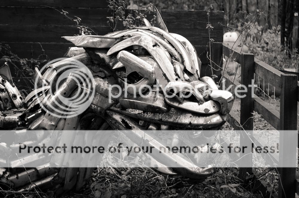
It's made entirely out of old car bumpers:

A SCULPTURE by celebrated Gourock artist George Wyllie has been unearthed in a children's play park in Ayrshire.

The large silver dragon, made from old car bumpers, was discovered in the undergrowth of Dean Castle Country Park in Kilmarnock.

It was made in the 70s and is thought to have been resident in the park for more than 20 years.

The unique creation was discovered after a public appeal was published in the Telegraph asking for information about the whereabouts of George's many creations ahead of a major exhibition of his work.

http://www.greenocktelegraph.co.uk/...10/19/438066-a-bumper-wyllie-find/?mode=print

Unfortunately there was no change of getting a decent picture of it! It's placed directly behind a small fence as pictured and someone has dumped a large quantity of wood along side it which would ruin the photo.

Thinking cap back on :thinking:
 
Hi Steven, good timing to settle in ready for 2013's 52!!!

Great shot too; works perfectly in B&W. The only thing that spoils it a tiny but for me is the plastic bin (I assume that's what it is) in the background, but it's not a big deal.
 
Southdowns said:
Hi Steven, good timing to settle in ready for 2013's 52!!!

Great shot too; works perfectly in B&W. The only thing that spoils it a tiny but for me is the plastic bin (I assume that's what it is) in the background, but it's not a big deal.

Thanks for taking the time to comment! The picture isn't a submission for this weeks theme. It was going to be, but due to the surrounding (fence and abandoned wood) it wasn't going to make a good picture. I just posted this as a reference ;)

Will get my proper one up when I get a decent idea!
 
Well, I like it regardless!!!!!!!!
 
It has taken me too long to get this shot! I had so many ideas but didn't get a chance to shoot them all, so tonight, I went ahead and shot two ideas I had, allowing me to get the "reshoot" for this weeks theme. The first attempt:

8212594802_d03862c9a6_c.jpg


I thought this was a bit basic and didn't lack much creativity. The next idea I've had since the theme was announced, I just never got around to taking the picture.

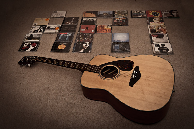
8211505327_f53f194237_c.jpg


Now all I need to do is shoot my week 47 image, then I can start commenting on others.
 
Hi Steven.

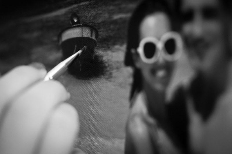
Art one is fantastic. You have the DoF spot on and the concept is great. I like the B&W.

Art two I'm not so keen on. The concept is good, but it just doesn't do it for me aesthetically I'm afraid.
 
Southdowns said:
Hi Steven.

Art one is fantastic. You have the DoF spot on and the concept is great. I like the B&W.

Art two I'm not so keen on. The concept is good, but it just doesn't do it for me aesthetically I'm afraid.

Thank you!

The second one was favourite, but now I'm not too sure! I did do a B&W version of image two, but preferred the de-saturated colour version.

Thanks for your comment! I will get around to commenting on others 52 project shortly, I just don't like seeing images before I've shot my own weeks theme (so I don't cheat and copy ideas!)
 
michael23 said:
Hi Steven, are you just doing the remainder of the themes and then taking on the full project next year?

A good start with these. art number 1 is siuperb. B+W was a great choice and I like the dof.
Number 2, like the concept, but not to sure on the bg in this one.

Thanks Michael. Yes I'm just doing the rest of this years themes and then starting properly in the New Year!

Thanks for your comment :) Looks like #1 has the most votes so far!
 
Hi Steven


Art....the guitar one , good idea but niot hitting the spot for me I'm afarid.

The 1st Art image....sruglin to make out exactly whats going on but think you're trying to make it look like you're painting a photograph ? B&W works well I'd just like to see a slightly bigger DOF & a smidge less of the hand. Great potential though & like the texture ....or is it really a canvas ?

Not taking a lot to confuse me at the moment :LOL:
 
blondie606 said:
Hi Steven

Art....the guitar one , good idea but niot hitting the spot for me I'm afarid.

The 1st Art image....sruglin to make out exactly whats going on but think you're trying to make it look like you're painting a photograph ? B&W works well I'd just like to see a slightly bigger DOF & a smidge less of the hand. Great potential though & like the texture ....or is it really a canvas ?

Not taking a lot to confuse me at the moment :LOL:

Hi Blondie. The first art image is supposed to represent someone painting a picture, the shallow DOF was used to concentrate on the bush. It is a canvas print :)

I'm a little disappointed with the guitar shot now, I likes the idea but not the reactions. Is it the background that ruins it? I did think the background was really poor but it's all I had available.

Hi ya

don't be disappointed with your shot , it's how we learn.... basically it's a good idea but just lacks a little something , can't nail what exactly though . The bg compliments the guitar & the artwork on the cases so for me it's not that....maybe a gritty B&W would add some punch ?

I've posted loads of images over the last 20 odd months that I've loved & they've been slated...but I learn from it ( well,thats the theory anyway)

& you can keep the idea in mind for a Reshoot week(y)
 
blondie606 said:
Hi ya

don't be disappointed with your shot , it's how we learn.... basically it's a good idea but just lacks a little something , can't nail what exactly though . The bg compliments the guitar & the artwork on the cases so for me it's not that....maybe a gritty B&W would add some punch ?

I've posted loads of images over the last 20 odd months that I've loved & they've been slated...but I learn from it ( well,thats the theory anyway)

& you can keep the idea in mind for a Reshoot week(y)

I tried a B&W but wasn't too fond of it, I'll have another play with it later. Thanks again for your comment. I now understand what you mean by the new system being easier to keep track of things! Post a link to your 52 and I'll have a look at it (I'll just try not look at the themes I've not completed yet!)

I'm off work tomorrow so I'll try catch up on colour and shadow!
 
Last edited:
Hi Steven, welcome to the 52 (y)
This should be a nice lead in to next years 52, good thinking.

Doing the 52 really changed how I look at my own images, I found myself critiquing them fully before posting and still others would notice little things I'd missed. It is a massive learning experience (well it was for me) and I am sure you will gain so much from it.
Your first image is a fantastic subject, one which I feel there is a lot to be had from. Its the background which is problematic, I feel its too busy. Maybe going for a really shallow depth of field would isolate the dragon from the BG. Perhaps a visit (if possible) when it is dark, then you could light paint the subject and have the background jet black?
Your first one for art is a creative idea, I like the thought processes behind it. For me it is just a wee bit off the mark, I think its because the canvas looks complete. I am not sure how you could convey that it is being freshly painted, somehow show a bit of blank canvas maybe by removing in pp some of the print?
Your second one for art, I like the desaturated feel to it but again I think it just needs a little something else. Maybe just a different composition, I don't think it necessarily needs the cd's spelling out art. I think letting the viewer 'work it out' maybe with the cd's stacked in the background would help.
None of this is intended to be harsh, these are purely my views and are genuinely offered to help. As you know, we are nearing the end of the year and the critique has evolved to a point where we are honest with one another in what we see/think without being rude with the intention to inspire each other. Iain
 
Hi, Steven, Art #1 is a cracker. At first I thought it was a composite, but I can now see it isn't. Great shallow DOF and a great interpretation.

Cheers.
 
Hi Steven, welcome to the 52 (y)
This should be a nice lead in to next years 52, good thinking.

Doing the 52 really changed how I look at my own images, I found myself critiquing them fully before posting and still others would notice little things I'd missed. It is a massive learning experience (well it was for me) and I am sure you will gain so much from it.
Your first image is a fantastic subject, one which I feel there is a lot to be had from. Its the background which is problematic, I feel its too busy. Maybe going for a really shallow depth of field would isolate the dragon from the BG. Perhaps a visit (if possible) when it is dark, then you could light paint the subject and have the background jet black?
Your first one for art is a creative idea, I like the thought processes behind it. For me it is just a wee bit off the mark, I think its because the canvas looks complete. I am not sure how you could convey that it is being freshly painted, somehow show a bit of blank canvas maybe by removing in pp some of the print?
Your second one for art, I like the desaturated feel to it but again I think it just needs a little something else. Maybe just a different composition, I don't think it necessarily needs the cd's spelling out art. I think letting the viewer 'work it out' maybe with the cd's stacked in the background would help.
None of this is intended to be harsh, these are purely my views and are genuinely offered to help. As you know, we are nearing the end of the year and the critique has evolved to a point where we are honest with one another in what we see/think without being rude with the intention to inspire each other. Iain

Hi Ian - thank for commenting. Glad to hear you've learned a lot from your own project, that's the joy in doing these, hopefully the same will happen with me. Like you said, I'm terrible at analysing my own images in detail, especially when the scene is set and I'm just about to take the image. That's something that should improve with time.

The Dragon isn't an entry to the project, it was meant as a snap shot to show the subject I intended to shoot.

I understand where you're coming from with the painting, it's obviously an already complete canvas. I wanted to portray the idea of touching up or finishing off the painting, ideally I would've had a blank section like you mentioned.

I don't think your views are harsh at all; it's exactly what I'm looking for! The only way I will improve is by receiving constructive criticism and learning from it. Thanks again for taking the time to comment. I'll catch up with my own commenting tomorrow!

Hi, Steven, Art #1 is a cracker. At first I thought it was a composite, but I can now see it isn't. Great shallow DOF and a great interpretation.

Cheers.

Thank you :)
 
8220050787_3c98aa87c7_c.jpg


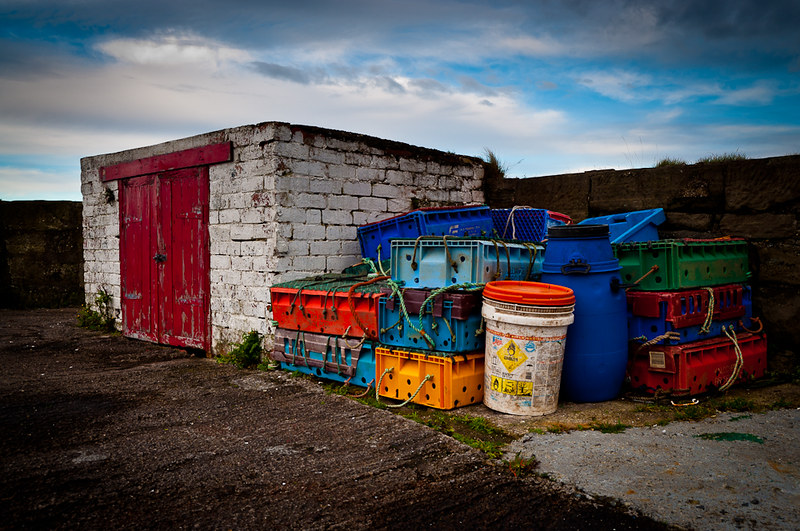
I went down to the beach early this morning to try and capture a lovely sunrise, but I was too late and missed it :bonk: I'm going back tonight to try and get some sunset photos, hopefully I wont miss it :)

Anyway... While I was down there I saw the scene above and thought it would this last weeks theme "colour" very well.
 
Last edited:
Good to see a new face in here and a good idea to start now before you get into a full 52 getting into thinking about the theme is always the hardest thing to do but you seem on course there well done and keep it up I think everyone improves as we go on
 
Colour is great Steven. Simple subject, but it fits the theme perfectly, and you have a nice sky as an added bonus!
 
alsjazzera said:
Good to see a new face in here and a good idea to start now before you get into a full 52 getting into thinking about the theme is always the hardest thing to do but you seem on course there well done and keep it up I think everyone improves as we go on

Thank you - hopefully ill stick around for 2013 :)

michael23 said:
Nice range of colours there, like the composition. It looks a little underexposed on my screen? Looks like the brightness or exposure just needs lifting a bit.

Hi Michael. It looks fine on my screen, maybe a little touch under exposed, I'll have a look in Lightroom.

Southdowns said:
Colour is great Steven. Simple subject, but it fits the theme perfectly, and you have a nice sky as an added bonus!

Thanks a lot! The sky is thanks to a graduated filter in Lightroom!
 
Welcome Steven.

Art - Good attempt although my eyes are drawn towards those bright sunglasses

Colour - Adding a vignette has helped bring focus to the subject which are certainly colourful without being over saturated.
 
Welcome Steven.

Art - Good attempt although my eyes are drawn towards those bright sunglasses

Colour - Adding a vignette has helped bring focus to the subject which are certainly colourful without being over saturated.

I never noticed it until you mentioned it, now all I see is the sunglasses when I look at the image :bonk:

Thanks for your comments.
 
I had a few ideas for shadow but I never got around to doing them :( This one is a bit cliche as it's been done a million times, but not by me! I've always wanted to try it and this weeks theme was a perfect excuse to give it a go. Unfortunately the lighting makes the ring look like a 20p piece of plastic, but it's actually a lovely ring "in real life".

8243360312_f57f724c2f_c.jpg


I'm so happy that I've finally got around to posting the image! I've been dying to see everyone's shadow attempts!
 
I don't think the ring looks cheap, and although you're right that this has been done a lot (including once more for this theme!), it is a classic, and you've made it your own with the lovely composition.
 
Last edited:
Art... whilst the dragon is not in the submissions, I think it's great... just the background...

Of the two, I prefer the first one... the DOF works great... and whilst it might be simple, it shows the building of the picture well, and the story comes through.

Not so keen on the second one... I'm not sure what it is...sorry

Colour, good strong colours, works really well... I'm led to the door, past all the coloured plastics...

Shadow, very nicely done... maybe cliched, but it works, doesn't look cheap either. I like the aged look and feel of the image too.
 
Southdowns said:
I don't think the ring looks cheap, and although you're right that this has been done a lot (including once more for this theme!), it is a classic, and you've made it your own with the lovely composition.

Thank you! :)

Haha I realised that after I had a look at some others last night.

jgs001 said:
Art... whilst the dragon is not in the submissions, I think it's great... just the background...

Of the two, I prefer the first one... the DOF works great... and whilst it might be simple, it shows the building of the picture well, and the story comes through.

Not so keen on the second one... I'm not sure what it is...sorry

Colour, good strong colours, works really well... I'm led to the door, past all the coloured plastics...

Shadow, very nicely done... maybe cliched, but it works, doesn't look cheap either. I like the aged look and feel of the image too.

Thanks for your comment!

When you say you prefer the first one, do you mean the dragon or guitar/cd shot?

Thanks again, I like the warmness and ageing feel the shadow image has to it.
 
Sorry, I meant the painting on canvas shot as the first one for art.
 
Hi, Steven, Colour is bang on theme and well spotted. I'd like it a bit closer. I know the red and white building has interest but, for me, the focus is the colourful crates.

Shadow, nowt at all wrong with doing something others have done. It's all about making the photograph your own. You've done a cracking job, sharp where needed, good depth, the vignette is about right but it's the muted and romantic colour that makes it for me.

Good show.

Cheers.
 
posiview said:
Hi, Steven, Colour is bang on theme and well spotted. I'd like it a bit closer. I know the red and white building has interest but, for me, the focus is the colourful crates.

Shadow, nowt at all wrong with doing something others have done. It's all about making the photograph your own. You've done a cracking job, sharp where needed, good depth, the vignette is about right but it's the muted and romantic colour that makes it for me.

Good show.

Cheers.

Thanks a lot for your comments. I can see what you mean about the colour image, but strangely my eye is drawn to the orange lid.

Appreciate it!

michael23 said:
Great colour in there, nice dof and good composition. Works very well.

Thanks Michael.

Delta Skies said:
Great shot for shadow. Yes it's been done before but the composition you've given this has made it better than the average ring/heart shot.

I wanted to try something that would be a little different from the normal shot, I'm glad it worked! Thanks for commenting.
 
Hi Steven

Shadow...thats exactly what I said to myself when I did my shadow...been done a million times before but not by me :LOL: Lovely warm feel to the shot , like the angle & a good shadow to boot (y)

Color....good range of colors , cracking sky , nice detail throughout (y)
 
blondie606 said:
Hi Steven

Shadow...thats exactly what I said to myself when I did my shadow...been done a million times before but not by me :LOL: Lovely warm feel to the shot , like the angle & a good shadow to boot (y)

Color....good range of colors , cracking sky , nice detail throughout (y)

Thank you! We can both cross that one of the list!

About time I had my glow image done!
 
Back
Top