weekly Thirsty_camels 52'ers for 2018 - Weeks 23 to 25 added.

Hi Nigel,

Juxtaposition - The larger lens, part of a telescope perhaps? Nicely controlled reflections and composition.
Oval - Good use of the shallow DoF to blur out the lid of the box and to ensure that there are no distractions in the BG.
Straight - Pretty much everything there is straight, except for the paintwork under the mags. I would have been tempted to photoshop that to add completeness of theme to the image.
Unattractive - I like the colours you've captured here. Any French viewer would be thinking lunch rather than unattractive ;)
 
A good catch up Nigel

The lenses are most interesting. The focus on the snail is nice. (y)
 
A nice set of shots to catch up Nigel, I like the focus on the snail and the out of focus leaf in the foreground
 
Juxta - would have preferred a straight version....but good idea
Oval - nice shot, but everyones used Eggs...
Straight - good idea and well shot, like the mono
Snail - nice shot, but doesnt really say Unattractive to me.....
 
Hi Nigel,

Juxtaposition - The larger lens, part of a telescope perhaps? Nicely controlled reflections and composition.
Oval - Good use of the shallow DoF to blur out the lid of the box and to ensure that there are no distractions in the BG.
Straight - Pretty much everything there is straight, except for the paintwork under the mags. I would have been tempted to photoshop that to add completeness of theme to the image.
Unattractive - I like the colours you've captured here. Any French viewer would be thinking lunch rather than unattractive ;)

Thanks for the comments Tim :).

A good catch up Nigel

The lenses are most interesting. The focus on the snail is nice. (y)

thanks David, good to be almost caught up and the snail was my favorite too :)

A nice set of shots to catch up Nigel, I like the focus on the snail and the out of focus leaf in the foreground

Thanks Tilly

Well done with catching up Nigel, favourite for me is your snail, perfect choice for the theme.

Thanks Susie.

Juxta - would have preferred a straight version....but good idea
Oval - nice shot, but everyones used Eggs...
Straight - good idea and well shot, like the mono
Snail - nice shot, but doesnt really say Unattractive to me.....

What can I say on Oval, when you need to catch up and only have limited time needs must :).
 
Juxtaposition - interesting subjects and good layout
Oval - no almost about it they are definitely egg shaped, nice simple composition it works well.
Straight - good composition lots of straight lines the b/w suits it
unattractive - lovely colours and nice focus on the snail
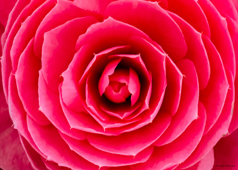
Shadow - the bloom for me lovely image
 
Nice shots for shadow Nigel, I like the flower most
 
Nigel

Wet, nice image, a little bit too dark, but the detail you can see it nice, looks better on flickr.
Juxaposition, Nice, I like the colours from the front elements.
Oval Eggs are eggs, but nice textures.
Straight - Background could be better, but all straight.
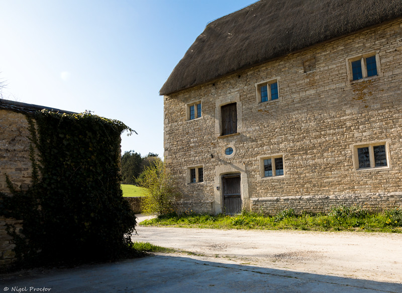
Shadow, nice image, but not much in the way of deep shadows with the rose. Shadows with the building are much stronger but not adding to the overall picture.

Pete
 
Shadow

It's the pink flower for me, lots of small individual shadow.
 
I am just on a bit of a catch up on peoples photos for the themes, a good set of images but im not to sure on your submissions for Shadow. However I do think the flower shot is nicely taken and is a beautiful colour, the images that stand out well for me. Are your submissions for week 12 and week 13 and your image for unattractive is bang on for the theme.
 
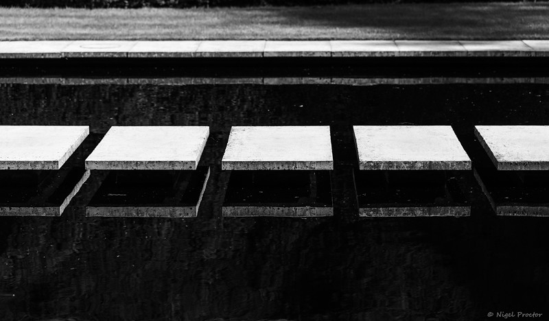
Nice set Nigel, Like the two lighting ones specially. Trying to figure out what the match one is; ?stepping stones:confused:
 
Excellent catch up they are all good but particularly like the purple flower
 
Hi Nigel.

Beautiful - I do like the blues of the sky between the leaves. The leaves feel autumnal, which is strange for May.
Low - Nice shot, but I don't feel I can comment more than that, as flora shots are not really my thing.
Match - Okay... I don't know what they are, but this is my pick of the three. Abstract, gritty and I love the processing. :clap:
 
Juxtaposition - interesting subjects and good layout
Oval - no almost about it they are definitely egg shaped, nice simple composition it works well.
Straight - good composition lots of straight lines the b/w suits it
unattractive - lovely colours and nice focus on the snail
Shadow - the bloom for me lovely image

Thanks for your comments :)

Nice shots for shadow Nigel, I like the flower most

Thanks Tilly, I think the flower is my favorite too.

Nigel

Wet, nice image, a little bit too dark, but the detail you can see it nice, looks better on flickr.
Juxaposition, Nice, I like the colours from the front elements.
Oval Eggs are eggs, but nice textures.
Straight - Background could be better, but all straight.

Shadow, nice image, but not much in the way of deep shadows with the rose. Shadows with the building are much stronger but not adding to the overall picture.

Pete

Thanks for your comments Pete, not some of my strongest images but had little time recently :).

Shadow

It's the pink flower for me, lots of small individual shadow.

Thanks


I do really like the first image for Shadow, Nigel; beautiful colours and the light and shadows show off the shapes and details of the petals (y)

Thanks was my fav too :).

Not sure either really shout shadow at me Nigel, but I do like the flower shot for the colour and simplicity.

I know Tim but when you need to catch up deploy the cobra rule :)

I am just on a bit of a catch up on peoples photos for the themes, a good set of images but im not to sure on your submissions for Shadow. However I do think the flower shot is nicely taken and is a beautiful colour, the images that stand out well for me. Are your submissions for week 12 and week 13 and your image for unattractive is bang on for the theme.

Thanks for your comments, I'm way behind on my comments to thank you for taking the time.
 
Nice set Nigel, Like the two lighting ones specially. Trying to figure out what the match one is; ?stepping stones:confused:

Thanks John, yup it's stepping stones which have the look of floating :).

Excellent catch up they are all good but particularly like the purple flower

Thanks Allan, I was pleased with that one.

Hi Nigel.

Beautiful - I do like the blues of the sky between the leaves. The leaves feel autumnal, which is strange for May.
Low - Nice shot, but I don't feel I can comment more than that, as flora shots are not really my thing.
Match - Okay... I don't know what they are, but this is my pick of the three. Abstract, gritty and I love the processing. :clap:

Thanks for your comments Tim, it is odd the colour but that's how they are till later in the season. I know flours aren't your thing so no worries :) Match is stepping stones...
 
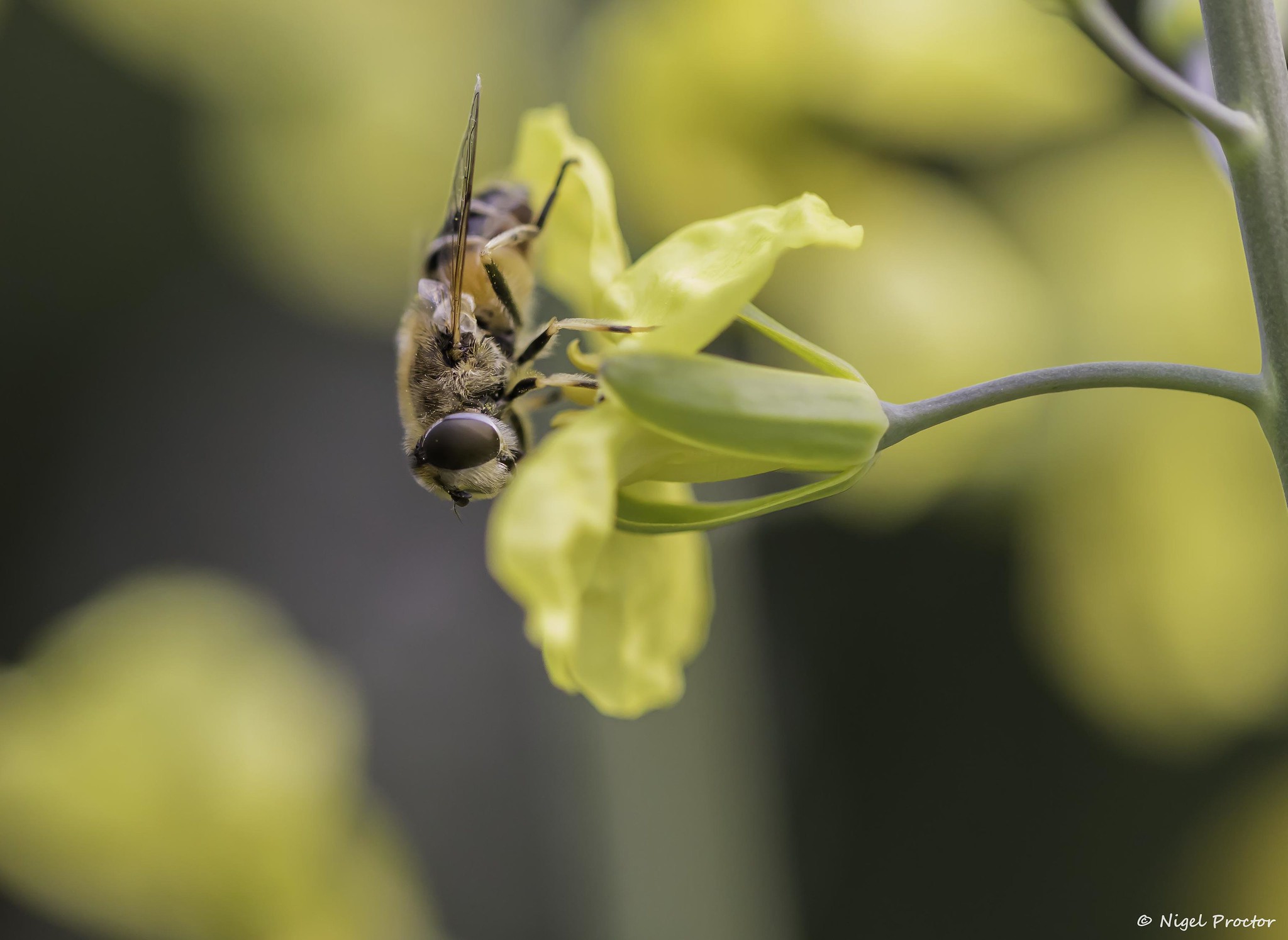
both the last two shots are very good indeed, but wouldnt the Bee be better with a 90 degree clockwise rotation ?
 
Hi Nigel,

Musical - It may be a cliche, but it's well executed, works well in mono and the DoF is great.
You've also got the verticals and horizontals spot on. No complaints here.
Hard - Pass.
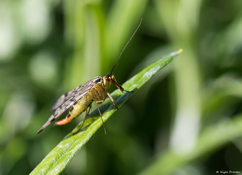
Creature - Pass.
 
Good work Nigel (y)

Re Hard ... my eye is drawn to the stem of the flower ... love the way it stands out.
 
both the last two shots are very good indeed, but wouldnt the Bee be better with a 90 degree clockwise rotation ?

Thanks, might have a play with the bee.

Hi Nigel,

Musical - It may be a cliche, but it's well executed, works well in mono and the DoF is great.
You've also got the verticals and horizontals spot on. No complaints here.
Hard - Pass.
Creature - Pass.

Thanks Tim, I know musical was a tad cliche but was short on time and ideas :).

Both Hard and Creature are brilliant shots. super sharp and clean.

Musical - I did a very similar shot for Stark earlier this year.

Thanks Ross was pleased with how hard and creature came out.

Good work Nigel (y)

Re Hard ... my eye is drawn to the stem of the flower ... love the way it stands out.

Thanks David, I might try rotating it and lose some of the stem.

2 well executed shots of the bee and scorpion fly Nigel,

Thanks

Well done on your latest catch-up, Nigel, and both the insect images are well taken and detailed. I agree with Mark that the bee could possibly benefit from a rotation.

Thanks Andrea, noted about the bee :).
 
Hi Nigel,

Synthetic - Quite a jumble there, and yes, it all looks synthetic. The close up works for me with just enough detail in the OOF parts.

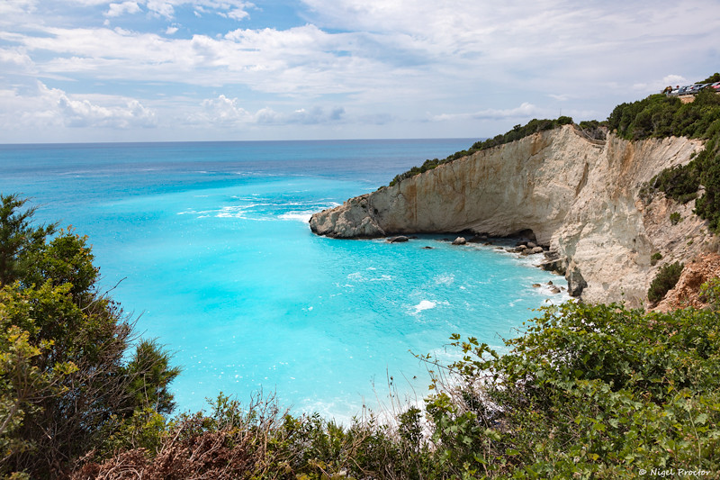
Rural - Drone shot? Or taken from up a tree?
The OOF green foreground isn't doing it any favours. It makes it look like the processing / colours have gone funny. Sorry, I don't think this one works.

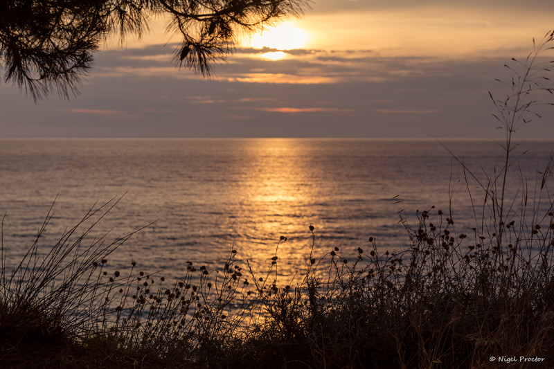
Bright - A classic goldern hour sunset shot :) Works really well imo. The foreground foliage really makes it (y)
The blue sea one though, no. The bright blue part seems to have lost all texture. It looks over smoothed.

By the way. No links to this thread from those images in the main thread.
 
Nigel

Beautiful - a nice image with good colours and contrast which highlights the theme well.

Low - Another nice and simple Image which works very well. Blue against the green gives good contrast.

Match - Flickr Image makes it a bit easier to see, another simple but it works Image.

Musical - I feel the area of focus should be more to the left as we europeans look at thinks left to right.

Hard - to capture but you have done a very good job with it. OOF yellow background makes the bee and its yellow flower stand out.

Creatures - This does not work as well as the bee shot, I think its a bit soft.

Synthetic - nice focus on the trinkets but I feel the angles of the box spoil it, you could have cropped it right out I think.

Rural - OOF foreground plants spoil the view.

Bright - a nice sunset, flickr Image has better contrast and colours. Blue sea is very nice, plenty of detail in the clouds and cliff face.

Pete
 
Last edited:
Synthetic, really like the jumble, personally I would of cropped out the bottom left hand corner of the box.

Rural, like this shot, I like the OOF foreground gives an here of spying on the goings on at the deserted farm(in my fevered imagination!):D

Bright, like the first shot best with the way you have framed it.
 
Back
Top