You are using an out of date browser. It may not display this or other websites correctly.
You should upgrade or use an alternative browser.
You should upgrade or use an alternative browser.
weekly Wornish's 52 2023 Week 52 added: Favourite 2023 Image
- Thread starter wornish
- Start date
- Messages
- 3,145
- Name
- bill
- Edit My Images
- Yes
Two great images David. I want lights like that in all my rooms!
- Messages
- 3,145
- Name
- bill
- Edit My Images
- Yes
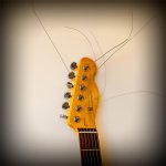
Very fast off the mark David. Good shot.
- Messages
- 4,348
- Name
- Martin
- Edit My Images
- Yes
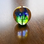
Very pretty. I saw a TV program showing how they were made; amazing things they can do with glass.
- Messages
- 3,145
- Name
- bill
- Edit My Images
- Yes
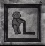
Nice image David, it has the feeling of a line drawing.
- Messages
- 11,087
- Name
- Allan
- Edit My Images
- No
I think the hand looks a little over processed but otherwise I like the grittiness of it,
not sure about the inclusion of the pot? in the top but I do like the reflection of the lettering, maybe crop out the pot.
Its a creative image and its good to try different things.
not sure about the inclusion of the pot? in the top but I do like the reflection of the lettering, maybe crop out the pot.
Its a creative image and its good to try different things.
- Messages
- 4,348
- Name
- Martin
- Edit My Images
- Yes
I disagree about the over-processing, I feel it adds an 'art' touch to the image that otherwise would merely be a picture of a hand in the light. If it had been cropped to show the reflection of the mug but none of the mug I think it might have been a little improved, but as it is. it is still an interesting and likeable picture.
- Messages
- 4,689
- Name
- Pete
- Edit My Images
- Yes
I think it works ok.
You gave it a good go, I struggle with snappers choice as well.
Pete
You gave it a good go, I struggle with snappers choice as well.
Pete
- Messages
- 4,088
- Name
- Graham
- Edit My Images
- Yes
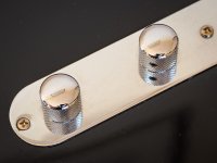
Good detail in the first - like the reflection of the photo frame on the wall in them, I bet you wiped the black surface just before you took the shot too!
Nicely composed with focus spot on, with the screw on the right falling out of focus nicely
Nicely composed with focus spot on, with the screw on the right falling out of focus nicely
- Messages
- 3,145
- Name
- bill
- Edit My Images
- Yes
Nice one David. I like your chosen image (a similar idea to my own).

