weekly Marsha's photo 52 2012 is complete. NSF Dieters!

Hi Marsha :wave:
Duo, Christmas chocolate on the shelves already? Seriously? :LOL:
I like it, technically very good, you have certainly mastered the light backgrounds. (y)
Compositionally, as mentioned perhaps more of the long side of the chocolate may be preferrable but its very subjective.

Flow, fantastic IMHO. I like the crisp edges of the glass and liquid. The backlighting effect is very professional looking. I particularly like the background, the textured look works well with the smooth liquid. All round good work Missus (as Lynne would say ;))
 
Hi Marsha


catch up time for me again !


Flow....love it...everything about it....sharp focus , great angle , muted color of the ribena , bg....beautiful work :clap::clap:

Duo ....never tried one of those...maybe this year I'll treat myself ! Like the positioning , great lighting , very sharp...nope ,no crit here :clap:
 
Thanks Lynne :)

Duo ....never tried one of those...maybe this year I'll treat myself !

WHAT? You're seriously telling me you've never ever eaten a Toblerone! OMG hit the supermarket now and get some! Word of advice don't keep them in the fridge and then try and bite one of the peaks off, it'll only wedge up you're nose :LOL:
 
I have two photos for this looking at friendship from two very different angles!

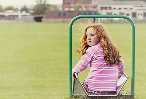
Firstly, lack of friendship! I was chatting with this girl dad and mentioned my theme, he said take a picture of her to show the opposite, she's feeling abandoned as her friends have left her! They had only gone home for lunch as it was cold! Anyhow he called her and she turned quickly, scowled, then turned away, I was lucky to catch her mid scowl!


F4, 1/1250 sec, ISO 400, 24-105mm lens,

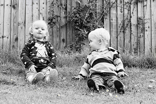
And the opposite, this is her sister, she's two months younger than my son who seemed rather pleased to have someone his own size to play with! Well, that was when he wasn't running away with her pram claiming it was his!


F6.3, 1/400 sec, ISO 400, 24-105mm lens.

I like the way he's looking at her, it's rather cute; but clearly they were never going to sit beside each other! I'm just happy that they sat still at all, the fact they're different distances away from me and they're both in focus is a first for me! They're actually sat at the top of quite a steep embankment contemplating rolling down it, so getting them sitting further away from the fence was also never going to happen!

C&C welcome as always!
 
Hi Alan, I wish people would take photography into account when they build kids parks! Alas this slide looks straight across the sports field to the school that you can see! They actually didn't bother me while I was editing this, maybe a bit of additional blur would help:thinking:

I quite like the fence in the second shot. The conversion to B&W helped blend in some of the shrubbery growing up it!

Thanks for dropping in.
 
Hi Marsha,

Two good shots. In #1, I like the pink shirt and the green bar framing the girl. She certainly does not look happy -- fits perfectly with the idea of her friends having abandoned her. #2 would be my pick though, because it is very cute and I love their facial expressions. I don't know what the colour version was like but B&W works very well.
 
....never tried one of those...maybe this year I'll treat myself ! ...
:eek:

Have you not read the Christmas snacks Manual :rules:

Thanks Lynne :)


WHAT? You're seriously telling me you've never ever eaten a Toblerone! OMG hit the supermarket now and get some! Word of advice don't keep them in the fridge and then try and bite one of the peaks off, it'll only wedge up you're nose :LOL:
:LOL:

I prefer them 'straight out of fridge' but damn they are hard :LOL:
 
Dark Knight said:
Have you not read the Christmas snacks Manual :rules:

:LOL:
I have the full years manual for scoffing chocolate. Chocolate is for life, not just for Christmas ;)

Dark Knight said:
I prefer them 'straight out of fridge' but damn they are hard :LOL:
Best option is to squeeze the peaks together to snap them off!

Cheers DK, glad you like my alternate to friendship!
 
A pair of excellent images... The Toblerones for Duo work really well, and I like it.

As for Flow, this is even better.. love it, although I dread to think how long it took you to remove that many bits of fluff in PP... surely giving the glass a wipe first would have been much easier :LOL:
 
Thanks John

jgs001 said:
although I dread to think how long it took you to remove that many bits of fluff in PP... surely giving the glass a wipe first would have been much easier :LOL:

You'd think wouldn't you? I spent a lot of time washing and wiping glasses, but the joy of quality macro lenses means they see more than the mark one eyeball!
 
Oops... missed Friendship... Sorry Marsha... Both are really good, love the framing of the girl in the first one by the bar. However, I think the second is spot on, and is my pick
 
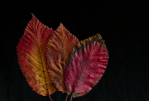
On Monday I started my resettlement to rejoin the normal workforce, on the way I found some very colourful leaves in full autumn change and I rescued a few. I was going to photograph one of my brochures about my upcoming career change but I just didn't get the chance!

Sh here's the first of change. Taken in the house using natural lighting up against a black background. Here's the SOOC:


And the PP'd version:

Not much done to it to be honest, just basic tweaks. Although trying to retain the natural colour was awkward!

And then on Thursday I went for a spin on my push bike and found this, not engineered at all!:


And very basic PP added:


Then I got up close with some decaying vegetation for a more abstract shot:


And PP'd:


I love photoshop, it should be compulsory :help:

No time to add extra details, I got these in just in time this week :nuts:

Oh these were all edited in a rush to be on time for once, C&C welcome.
 
Last edited:
Hi Marsha, #1 for change gets my vote. Lovely colour tones in both SOOC and edited. The pp has enhanced the lovely autumnal colour tones. My only small crit is that I would like to have seen the leaves central or at least with the bottom of the stalks too. Having them placed as they are seems to drop out the bottom of the frame IYSWIM. ;)

I do like number too also but not as much as #1.

#3 the oof front leaf I find a little distracting.

Iain
 

F8, 1/200sec, ISO 100, 100mm macro lens, reflector on the left bright sunlight on the right. It was very windy and the plant was waving around in the wind with me lying under it shooting up.

Hi Marsha,
Unbelievable to find myself so far behind with your 52.
Just a quick look through and there are some very good shots.
I'll make a start this evening and hopefully catch up throughout the coming week!!

"Mineral":

If I didn't know different i could be easily led to believe the orchid looked like this naturally....the earing blends in just perfectly.
The DOF perfectly blurs the flower whilst still maintaining enough detail to show that it is an orchid.
The way the light glissens on the left petal just adds to the shot imo.

"Dark"

Shots like this interest me greatly.......Love the way you have captured "snippets" of jets in the hangers along with enough detail of vehicles and equipment in the shadows to arouse curiosity as to what exactly is there along with it's uses.

The b&w conversion serves it well......makes the eye "see" the whole scene as against just focusing on bright colours as is often the case particularly with red.
 
Hi Iain, I can easily make number one central. I cropped it so it wasn't central :bonk: I couldn't include the stems as they were standing upright clamped onto my pen knife as it meant I could get the BG further away and use my reflector to shine a little light on the back of the leaves to highlight the edges!

I kind of liked the blurry leaf in the front of number 3, I liked how there was one brown leaf & one green leaf sharp!

Hi Asha, thanks for dropping in, this year is flying by soooooo fast:bonk:
 
Of the three it has to be the first for me Marsha... lovely tones and simple lines. The other two just don't have the same impact... good spot on the second one and nicely captured though. I see what you were aiming at for #3, but to me, it seems there's too much overlap between the foreground blur and the background leaf...

Ooh... I missed that one of the Orchid... lovely
 
Time:

I don't think you need much in the way of flash lessons Marsha with a result like this.

Quite envious as i never seem to obtain a good result when using flash hence why i avoid it!

Cracking use of Dof and the "dead" space at the side makes for a feeling of "time and space" imo


Body:

Much as I like b&w, in this instance I struggle to focus on any particular part of the scene where as with the colour version my eye is drawn to the bottom of the shot then led out by the fuselage to the sky so the building/trees don't pose too much of a distraction tbh.


Liquid:

You could have done with a little helper holding a brolly over you to give you more time over the shot! lol

You fell lucky with timing to capture this without any splashes.

I would be tempted to crop the black area from the bottom ......I think that has come about purely due to the low angle from which you took the shot.


Up:

The first colour version for me Marsha......Much simpler and less "busy" than the b&w shot.

The feeling of actually being "inside" the metalwork appeals more to me than the "approach" feel with the wider b&w shot.
 
Last edited:
Hi Marsha

Change - #1 for me in either of its forms, again hard to compare detail and colour because the crops are different. I agree with Iain that it would have been better to have see the bottom of the leaves.

#2 lacks a bit of the 'wow' factor

#3 - the oof leaf is too distracting for me to concentrate on the rest of the shot
 
Hi Marsha


cripes , I've fallen well behind with your thread...sorry :crying:

Friendship......#2 all the way for me....the little girls expression is priceless (y)

Change...OMG choices choices....#1 for ....the colors are fab ( both SOOC & edited ) , well cropped , simple but effective :clap:
#2 I like but not as much as #1...both #2's seem to have a hint of blue about them ?
#3...the oof leaf at the front bugs me but does wotk in an abstract kinda way
 
Last edited:
Duo: After giving some thought to the theme, I can see how you struggled to find an interesting subject.
Like other people, a different angle of the toblerones may have added more "umph" to the shot although the lighting is well worked out......as it is it's a little uninspiring but credit to you for searching something out and continuing strong with your challenge.

Flow: Now this I would have printed in my portfolio.
Tbh I wouldn't have a clue where to start to end up with a result like that, hence why I find it stunning.......regardless of it not being true red wine!! lol
 
The PP'd version of change with the three leaves is the better one the colours are so good

sorry but I seem to have missed a few too hopefully back on track now
 
Last edited:
Of the three it has to be the first for me Marsha... lovely tones and simple lines. The other two just don't have the same impact... good spot on the second one and nicely captured though. I see what you were aiming at for #3, but to me, it seems there's too much overlap between the foreground blur and the background leaf...

Ooh... I missed that one of the Orchid... lovely
Thanks John.

Time:I don't think you need much in the way of flash lessons Marsha with a result like this.

Quite envious as i never seem to obtain a good result when using flash hence why i avoid it!

Cracking use of Dof and the "dead" space at the side makes for a feeling of "time and space" imo

Hi Asha, I've learnt the only way to improve with flash is to use it! Oh, tips on here and asking everybody 'how they lit that' has helped too!

Body: Much as I like b&w, in this instance I struggle to focus on any particular part of the scene where as with the colour version my eye is drawn to the bottom of the shot then led out by the fuselage to the sky so the building/trees don't pose too much of a distraction tbh.

I think I prefer the colour version too!

Liquid: You could have done with a little helper holding a brolly over you to give you more time over the shot! lol

You fell lucky with timing to capture this without any splashes.

I would be tempted to crop the black area from the bottom ......I think that has come about purely due to the low angle from which you took the shot.
I like the black area, I think it gives it the look that the camera was submerged at the time, if that makes sense?

Up: The first colour version for me Marsha......Much simpler and less "busy" than the b&w shot.

The feeling of actually being "inside" the metalwork appeals more to me than the "approach" feel with the wider b&w shot.
Thank you for the feedback Asha, much appreciated.

Change - #1 for me in either of its forms, again hard to compare detail and colour because the crops are different. I agree with Iain that it would have been better to have see the bottom of the leaves.

#2 lacks a bit of the 'wow' factor

#3 - the oof leaf is too distracting for me to concentrate on the rest of the shot
Thanks, I'll have to figure out how to shoot them with the stalks :thinking:

Another vote for PP'd number 1... seeing shots side by side makes it hard for me to not choose the more vibrant/colourful images
Seeing the original pre PP is eye opening!

cripes , I've fallen well behind with your therad...sorry :crying:

Friendship......#2 all the way for me....the little girls expression is priceless (y)

Change...OMG choices choices....#1 for ....the colors are fab ( both SOOC & edited ) , well cropped , simple but effective :clap:
#2 I like but not as much as #1...both #2's seem to have a hint of blue about them ?
#3...the oof leaf at the front bugs me but does wotk in an abstract kinda way
Cheers Lynne, I'm nehind with everyone jist now :bonk:

Duo: After giving some thought to the theme, I can see how you struggled to find an interesting subject.
Like other people, a different angle of the toblerones may have added more "umph" to the shot although the lighting is well worked out......as it is it's a little uninspiring but credit to you for searching something out and continuing strong with your challenge.

Flow: Now this I would have printed in my portfolio.
Tbh I wouldn't have a clue where to start to end up with a result like that, hence why I find it stunning.......regardless of it not being true red wine!! lol
Thanks Asha, as the year progresses I am finding motivation hard to find, hence why duo was so difficult! Flow was a moment of inspiration and I was really pleased with it.

The PP'd version of change with the three leaves is the better one the colours are so good

sorry but I seem to have missed a few too hopefully back on track now
Cheers Allan, glad you could drop in. I'm hoping to find time to catch up with my photos and others sometimes in the next week!

Thank you everyone, the comments are greatly appreciated(y)
 
Last edited:
Better late than never!

I took my son for a walk and we stumbled on these brambles! Trying to get some shots whilst stopping him touching the nettles was challenging! I also photographed a weird spiders web but chose this one. That shot's on Flickr if you're interested!


I have got my age shot, just not sure on the editing yet, still working on it!
 
Last edited:
:wave: anybody?

I was at a party on Saturday and this boy and baby (not brother and sister) were fascinated with each other. I had a mare PP'ing it as the wall behind was luminous yellow :bonk:

Lesson I learnt, must remember hand holding at 1/30 sec around children = OOF shot:coat:


All C&C welcome.
 
Last edited:
The goblin said:
Better late than never!

I took my son for a walk and we stumbled on these brambles! Trying to get some shots whilst stopping him touching the nettles was challenging! I also photographed a weird spiders web but chose this one. That shot's on Flickr if you're interested!

http://www.flickr.com/photos/58189537@N02/8106599923/

I have got my age shot, just not sure on the editing yet, still working on it!

Hello, nice colours and some cracking broken, especially at bottom.

Slight skirt to the right, maybe so the berries weren't clipped.

Cheers and you can't beat free fruit :£
 
The goblin said:
:wave: anybody?

I was at a party on Saturday and this boy and baby (not brother and sister) were fascinated with each other. I had a mare PP'ing it as the wall behind was luminous yellow :bonk:

Lesson I learnt, must remember hand holding at 1/30 sec around children = OOF shot:coat:

http://www.flickr.com/photos/58189537@N02/8110356986/

All C&C welcome.

Hi, again. Photographing kids can be fun but aaarrrggghhh as well. They've no sense of how important focus is :)

You did well to catch such an intimate moment. Crit, well clipped ear on e left is the only one. Although the toddler on the right appears to be punching the boy in the eye...lol

Cheers.
 
Back
Top