Great pictures Marsha!
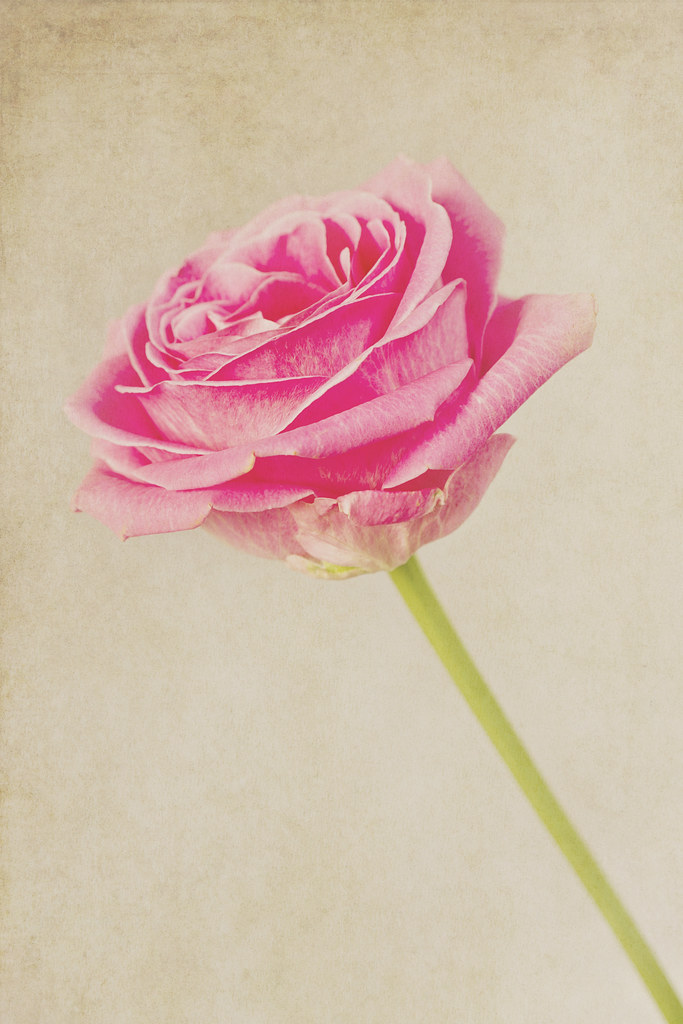
That rose is truly arty, really like and the pink has come out really well.
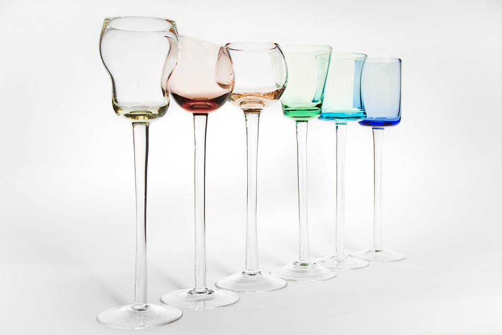
The glasses are well postioned and well taken. Really interesting items, thats the kind of thing I would love to have and just look at! Like this shot alot.
Win - fab
")
Cheers Alex, I wish I could look at those glasses more often, but I don't have a display cabinet and my family would destroy them, bull in a china shop and all that!
Good work Missus (as Lynne would say
)
Art - I really like this, it has a water colour painterly feel about it. Lovely soft colour tones. Nice simple composition with strong diagonal through the frame.
I am intrigued about your original plan about freezing the flower. I do hope you can re-visit this and show us the outcome

Colour like this too. You certainly don't make things easy for yourself photographing not one glass but multiples. You've handled this well Marsha, exposure/reflections/highlights I can imagine were a nightmare but you've smashed it (pun intended
)
Not much crit going on here to be honest because I would really have to nitpick.
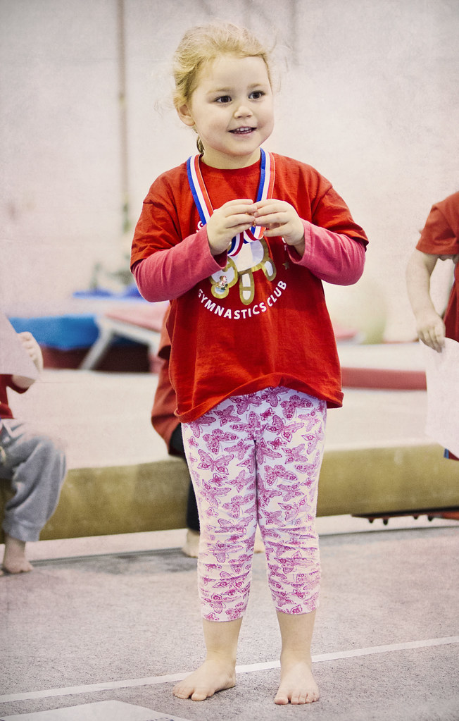
Win, as I have mentioned to Andy before, I do like it when 52'ers really add a personal touch to their weekly submissions. I feel little technicalities can be forgiven as it is a moment in time captured. Your little 'un looks rightly chuffed with her medal, a wonderful expression captured.
All round good work Marsha
Thanks Iain I did get a couple of shots of the frozen flower but it wasn't what I hoped for. I will definitely attempt it again, but keep the hubby well out of the way!
Yep, the glasses were a nightmare, if anything the biggest headache was the white balance, I have a lot of very yellow shots :bonk: And they nearly did get smashed!
It is nice to get decent shots of my daughter where she's smiling, this especially shows her slightly shy, under confident side as she was quite unsure but pleased with her medal (although probably still trying to figure out if it had chocolate hidden in it!) As opposed to the stroppy spirited scowl I get a lot of!
Thank you again for the kind words Iain.
Hi Marsha - I
love your take on art with the picture of the rose. The lighting is great, the processing is great. Well done

Hi Steven

Glad you like my art shot and thank you dropping in. I will get around to your thread at some point.
Art - lovely shot of rose. The PP is very effective. I shall have to look at the links that you have given for inspiration.
Colour - good idea, on theme. You have handled exposure well for a difficult subject.
Win re shoot - cute. High ISO not bad at all.
Many thanks Alan. I hope you got to look at those links, Sarah Gardner takes some lovely photos, plenty of inspiration on her website as well as the odd freebies!
Love the pp art shot lovely colours in there
Colour has some nice muted colour in the glass but maybe a closer shot there is a lot of bg there
Win is charming she looks very proud
Cheers Allan, I did take some closer shots of the glasses, just not had a chance to go through them all!
Art, love the effect you've got here Marsha, suits the flower perfectly and defo has a fine art type feel to it. Same with the second version.
Colour, interesting glasses... Might have been a major pain to sort out the reflections etc, but you've done a good job of it. Nicely composed and I like it.
Win reshoot... lovely... the background is just one of those things... nicer without it like that, but sometimes there's nothing at all you can do about it...
Hi John, I am rather liking using textures, but always wary of going too far with them!
I did clone out a lot of reflections! One day I'll learn how to shoot glass reflection free:bonk:
As a snap, I think the background adds to the shot of my daughter as you can see the gym equipment and other children, but for this I too would have liked it cleaner, oh well.
Hi Marsha, the art picture is just lovely. Can't fault it really. I can imagine it printed and on a wall somewhere.
Colour, very tricky subject and you appear to have done quite well. The colours show through nicely without being over exposed. The 3rd glass from left to right appears to be taller? If it's not a trick of the light I would swap this and the glass to the left of it around.
Win reshoot, like it, the noise is fine and doesnt take anything away from the image.
Thanks Michael, I may have to print that rose shot!
I think the glasses are all the same height (I'll have to get them out and check), the stem on the third glass is longer to account for the more bulbous glass at the top! I was actually tring to arrange them by colour initially, but now I look at that and think they should be rearranged!
The noise always looks worse on my pc than it does online, I guess there are disadvantages to a good monitor

That "clean" rose shot is nice, but you definitely did the right thing adding the texture.
Thank you Mark.