
You are using an out of date browser. It may not display this or other websites correctly.
You should upgrade or use an alternative browser.
You should upgrade or use an alternative browser.
weekly Cowboys 52 in 2013 Done and dusted
- Thread starter cowboy
- Start date
OP
cowboy
Guy Fawkes
- Messages
- 3,143
- Name
- Mark
- Edit My Images
- No
I though he was on skis
Like it, especially him facing away from the camera.
I did a crop left, right and top, and felt better to me.
Cheers.
Thanks.
I did try cropping a bit myself but I wasn't as happy with the results.
I really like your wild photo, nice colours and the lighting looks good
Work photo- you don't see that everyday")
Thanks.
Good capture, good WB and interesting subject.
Well done
Thanks.
Brian_of_Bozeat
Jeff
- Messages
- 3,235
- Name
- Brian (not Jeff)
- Edit My Images
- No
Love the work shot: If it wasn't for the hard hat and Hi vis this would be timeless, but I think that tells it's own story in a way doesn't it.
- Messages
- 8,398
- Name
- Lynne
- Edit My Images
- Yes
Hi ya
Space....good low POV , just needs a slight crop rhs as mentioned before
Work...I really like this , very different but the rear view works well....lovely scene
Space....good low POV , just needs a slight crop rhs as mentioned before
Work...I really like this , very different but the rear view works well....lovely scene
- Messages
- 13,760
- Edit My Images
- Yes
Hi Mark
A good subject for the theme, but would have much preferred a side on or front shot rather than a horses arse
A good subject for the theme, but would have much preferred a side on or front shot rather than a horses arse
OP
cowboy
Guy Fawkes
- Messages
- 3,143
- Name
- Mark
- Edit My Images
- No
Thanks all.
The work one was the only photo without trees, fences or people there.
The bloke is there for a few months thinning out the fallen trees as getting in a drag line or heavy machines would ruin the area and as it's a very public area the potential for injury would be quite high.
A very nice chap and he had loads of time for all the people that wanted to talk.
- Messages
- 1,353
- Name
- Chris
- Edit My Images
- Yes
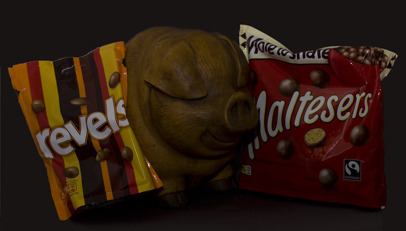
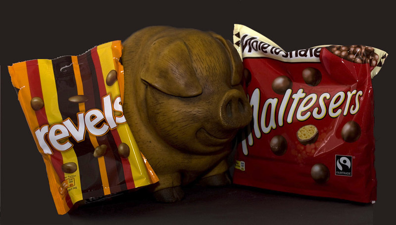
Nice idea and i like the cheeky looking pig, it's a bit under exposed though...
OP
cowboy
Guy Fawkes
- Messages
- 3,143
- Name
- Mark
- Edit My Images
- No
Nice idea and i like the cheeky looking pig, it's a bit under exposed though...
Cheers.
Looking again I think you're right.
M
Mad Hatter
Guest
A great composition, good colours but have to agree with exposure. Could be easily fixed!
- Messages
- 13,760
- Edit My Images
- Yes
Yep interesting idea... Revels my Fav too, a little tweak and it will be there
- Messages
- 8,398
- Name
- Lynne
- Edit My Images
- Yes
Hi Mark
good take on Gluttony & I just love that little piggy...sooo cute
Slight tweak in ps ( or whatever you use) with levels should sort the exposure
good take on Gluttony & I just love that little piggy...sooo cute
Slight tweak in ps ( or whatever you use) with levels should sort the exposure

- Messages
- 8,398
- Name
- Lynne
- Edit My Images
- Yes
Hi MArk
yup , Gluttony edit is much better , can see more of the piggies detail now
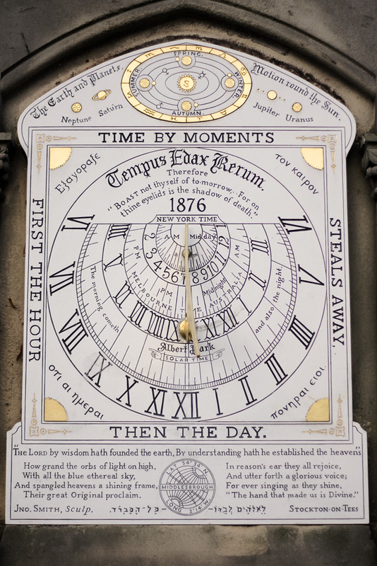
Time....thats a fab looking pocket watch , very elegant....lighting is good I think ( we both know about shiny things & light )Like the composition as well
Not sure if you could tweak the dark bits a little to lighten them a touch ? & is it possible to lower the lid a smidge more ? I don't want much do I
2nd Time image...jumps out at you , beautifully sharp, the detail is superb & the gold highlights are spot on
yup , Gluttony edit is much better , can see more of the piggies detail now
Time....thats a fab looking pocket watch , very elegant....lighting is good I think ( we both know about shiny things & light
)Like the composition as well Not sure if you could tweak the dark bits a little to lighten them a touch ? & is it possible to lower the lid a smidge more ? I don't want much do I
2nd Time image...jumps out at you , beautifully sharp, the detail is superb & the gold highlights are spot on
I think the first time works best for me; composition wise, it's clean, neat and has a certain purity to it. I also like the fact that the face is ever so slightly shadowed; it gives the image a slight mood which would be lacking if it it was lit flat. It could stand to be slightly lighter according to taste but not as much as the rim reflections.
M
Mad Hatter
Guest
Pocket watch for me also. Clean sharp composition on the watch face, good background colour although I find the reflection in the cover a little distracting. Nevertheless, really good shot.
- Messages
- 4,088
- Name
- Graham
- Edit My Images
- Yes
two great time images there Mark, great detail and love the DOF on the chain of the pocket watch. And the sundial is brilliantly captured, the pop of the gold bits is ace. And well framed and straight. (Might just like the tip of the top of the arch included, if you have it?)
OP
cowboy
Guy Fawkes
- Messages
- 3,143
- Name
- Mark
- Edit My Images
- No
Hi MArk
yup , Gluttony edit is much better , can see more of the piggies detail now
Time....thats a fab looking pocket watch , very elegant....lighting is good I think ( we both know about shiny things & light
Not sure if you could tweak the dark bits a little to lighten them a touch ? & is it possible to lower the lid a smidge more ? I don't want much do I
2nd Time image...jumps out at you , beautifully sharp, the detail is superb & the gold highlights are spot on
Thanks.
The watch doesn't open any further, it would be nice if it did so it would sit a bit better.
Again, thanks
OP
cowboy
Guy Fawkes
- Messages
- 3,143
- Name
- Mark
- Edit My Images
- No
I think the first time works best for me; composition wise, it's clean, neat and has a certain purity to it. I also like the fact that the face is ever so slightly shadowed; it gives the image a slight mood which would be lacking if it it was lit flat. It could stand to be slightly lighter according to taste but not as much as the rim reflections.
Thanks.
Pocket watch for me, very nice shot.
Thanks.
Pocket watch for me also. Clean sharp composition on the watch face, good background colour although I find the reflection in the cover a little distracting. Nevertheless, really good shot.
Thanks.
two great time images there Mark, great detail and love the DOF on the chain of the pocket watch. And the sundial is brilliantly captured, the pop of the gold bits is ace. And well framed and straight. (Might just like the tip of the top of the arch included, if you have it?)
Thanks.
No sorry, the top of the arch is missing in the photos I have. I should have noticed at the time
n1kcy
Special.....Extra Special
- Messages
- 2,174
- Name
- Nicky
- Edit My Images
- Yes
Novel idea for space.
Gluttony - second edit is much better but I would brighten it even more.
Time - The face of the pocket watch looks a bit dark and I'm not sure about having the case out of focus in the foreground, maybe a different angle would work better.
Gluttony - second edit is much better but I would brighten it even more.
Time - The face of the pocket watch looks a bit dark and I'm not sure about having the case out of focus in the foreground, maybe a different angle would work better.
OP
cowboy
Guy Fawkes
- Messages
- 3,143
- Name
- Mark
- Edit My Images
- No
Thanks for all the comments.
Juxtaposition
I had this idea for over a week but with it being dark after work and then non stop rain yesterday I went out this morning for these so I hope they are ok.
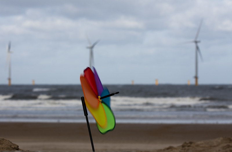
Windmills 1 by cowboy72, on Flickr
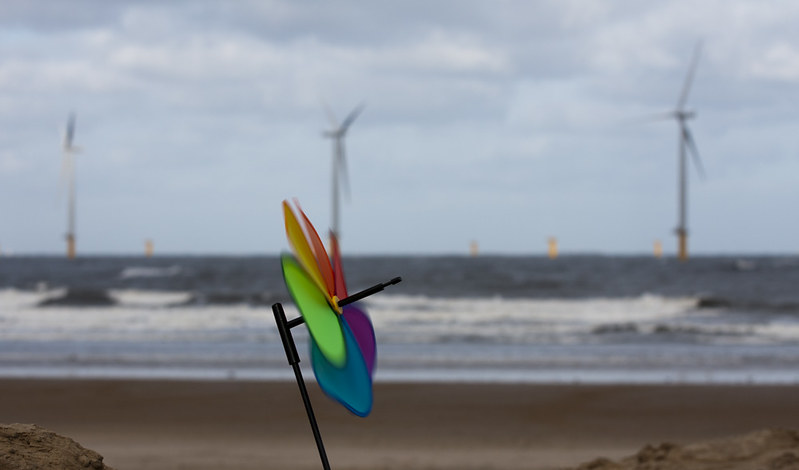
Windmills 2 by cowboy72, on Flickr
Juxtaposition
I had this idea for over a week but with it being dark after work and then non stop rain yesterday I went out this morning for these so I hope they are ok.
Windmills 1 by cowboy72, on Flickr
Windmills 2 by cowboy72, on Flickr
- Messages
- 19,461
- Name
- Andy
- Edit My Images
- Yes
Hi, mark, like Juxtaposition. It's #1 for me, it's more vibrant and I prefer the movement and angle of the spinning thing  Looks a tad dark.
I'd like to see if moved slightly left as it's obscuring part of the turbine.
Cheers and I do envy people who live close to the coast
Looks a tad dark.I'd like to see if moved slightly left as it's obscuring part of the turbine.
Cheers and I do envy people who live close to the coast
OP
cowboy
Guy Fawkes
- Messages
- 3,143
- Name
- Mark
- Edit My Images
- No
Hi, mark, like Juxtaposition. It's #1 for me, it's more vibrant and I prefer the movement and angle of the spinning thing
I'd like to see if moved slightly left as it's obscuring part of the turbine.
Cheers and I do envy people who live close to the coast
Cheers Andy, it might be a little dark, a few people have comment on my pics being on the dark side although they look fine on my screen
Maybe I need a calibration.
The spinny thing is a garden windmill, there are supposed to be two lots of spinners on the front but it was so windy one blew away
blakester
Shine On Harvest Moon
- Messages
- 6,679
- Name
- Iain
- Edit My Images
- No
Hi Mark
Your first time image would get my vote.
A lovely object to photograph, you've held the detail in there which isn't easy with it being so shiny. Just like to see a little more light on the face to highlight it but other than that
I like the idea behind your juxtaposition, I have these wind turbines close(ish) to where I live but they are further out in the water so not as accessible photography wise. This works well but feel as others, that your windmill is a little too close to the main turbines. Perhaps placing it in line with the larger ones and scaled in size to them would help the composition?
I also like the vivid colours, and lucky you seems like you had some decent weather where you are. Iain
- Messages
- 4,088
- Name
- Graham
- Edit My Images
- Yes
interesting one - well done for waiting for the conditions to be right, aside from the positioning of the little windmill, I'm thinking greater DOF might have helped - to have both items in focus. You can still tell what the big ones are, and the shutter speeed is good to get movement blur but retain the individual colours. So maybe up the ISO a bit to allow you close the aperture further.
The DOF is a minor point that doesnt detract from a good shot.
Doesnt look "too" dark to me, although you have some space at the right of the histogram.
The DOF is a minor point that doesnt detract from a good shot.
Doesnt look "too" dark to me, although you have some space at the right of the histogram.
- Messages
- 213
- Name
- Everton
- Edit My Images
- Yes
Hi Mark
This is a great shot and sit brilliant with the weeks theme
love the DOF and the sharpness on the Garden windhill, No1 for me
This is a great shot and sit brilliant with the weeks theme
love the DOF and the sharpness on the Garden windhill, No1 for me