
You are using an out of date browser. It may not display this or other websites correctly.
You should upgrade or use an alternative browser.
You should upgrade or use an alternative browser.
weekly ams99 - 52 Challenge - Week 52 Water
- Thread starter ams99
- Start date

- Messages
- 19,461
- Name
- Andy
- Edit My Images
- Yes
I think you need a new laptop Andy
I do, look bang on when viewing on iPad

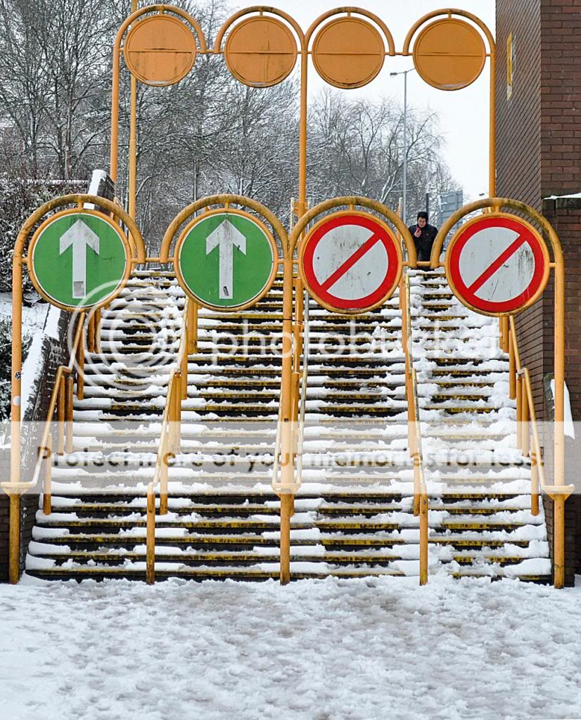
Direction #1 for me. Well spotted and composed. Now if you could have asked the guy top right to walk down the up stairs it would have taken it to a different level.
Cheers.
- Messages
- 213
- Name
- Everton
- Edit My Images
- Yes
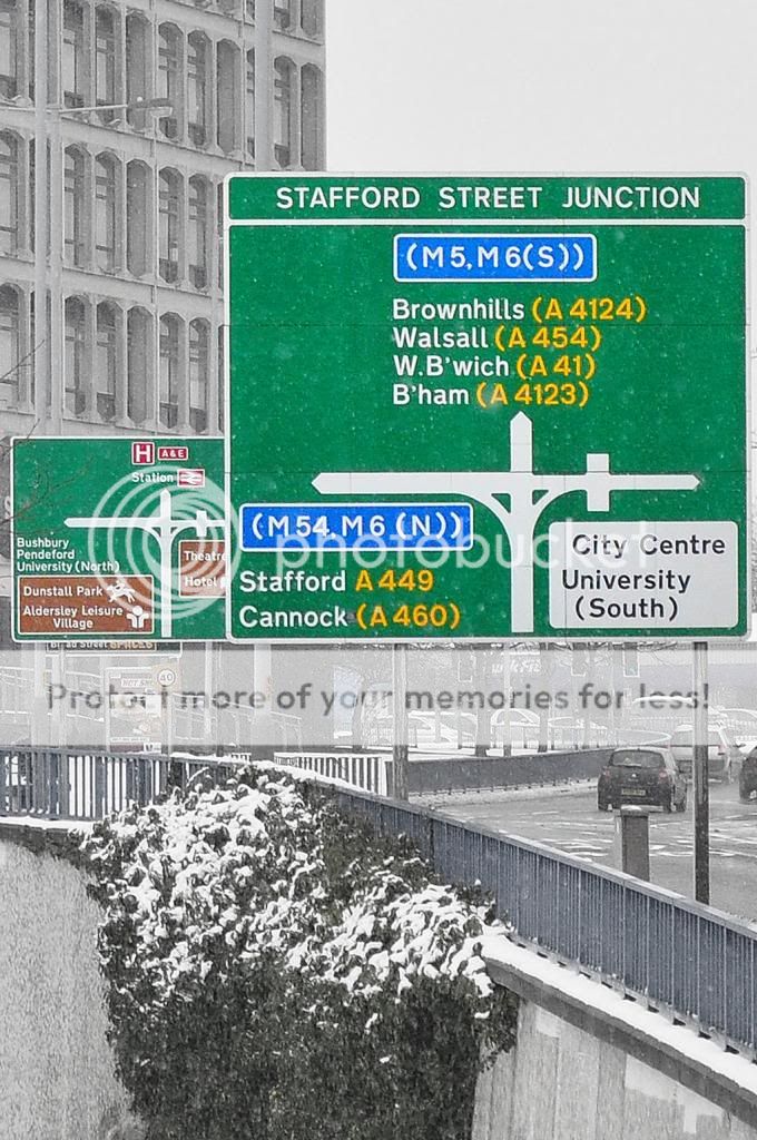
Quick of the mark this week, and great take on the theme on all three, (was thing about a version of No2 for my theme this week)
No2 take it for me, it has all the elements of needing to go somewhere
No2 take it for me, it has all the elements of needing to go somewhere
OP
- Messages
- 1,058
- Name
- Alan
- Edit My Images
- Yes
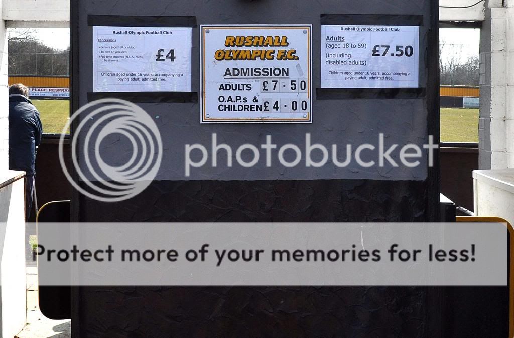
Number one for me, as it's so odd and shouts so much!
Anything around the Wolves ground is definitely "odd" Chris
I was going to do my direction shot as an image of the main stand with direction ......... "Going Down"

- Messages
- 2,167
- Name
- Nick
- Edit My Images
- Yes
Number one is a great spot, I'd have walk past it and never noticed. The only thing that gives me any difficulty is the variation in upright angles... I look at one upright and the pic is straight... I look at another and it isn't. More down to shoddy contractors than you though!
I really like the way you've caught the repeat of the same schematic on the 2 signs in number 2, and the fact that the bleakness of the day almost masks the selective colour.
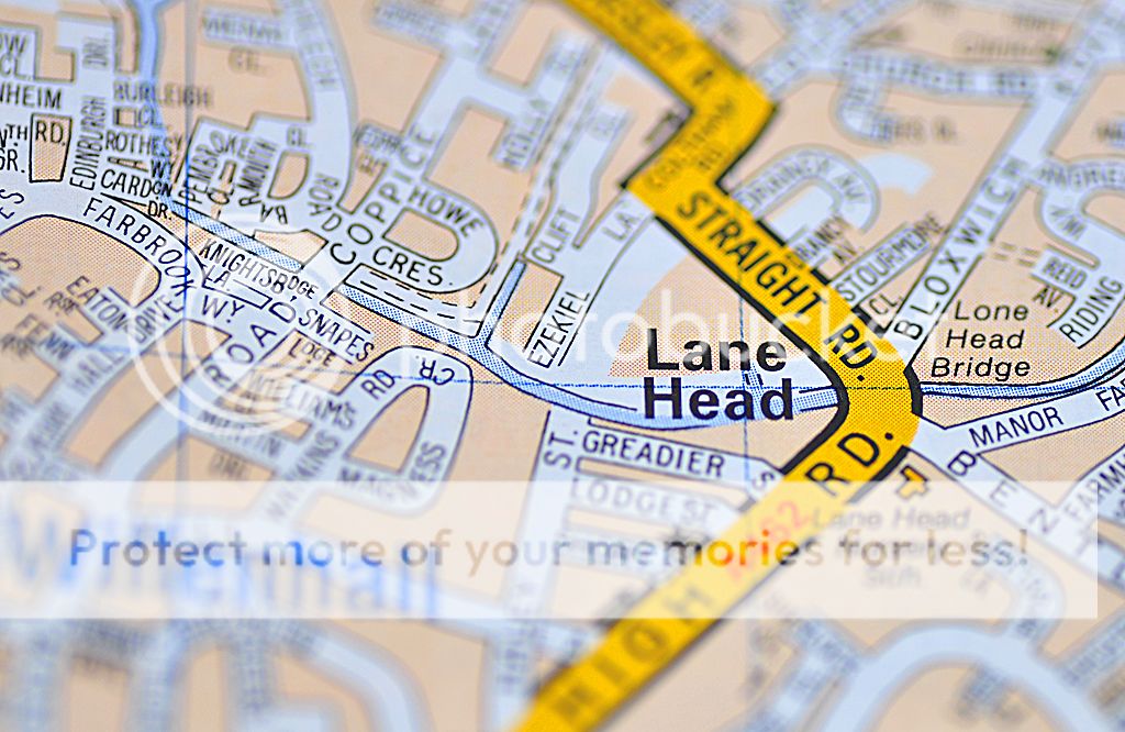
Really nice DOF and colours in number 3.
I really like the way you've caught the repeat of the same schematic on the 2 signs in number 2, and the fact that the bleakness of the day almost masks the selective colour.
Really nice DOF and colours in number 3.

- Messages
- 8,398
- Name
- Lynne
- Edit My Images
- Yes
Hi ya 
Direction... 3 great shots to choose from...my vote goes to...#3...love the shallow dof, pov & Straight being in focus
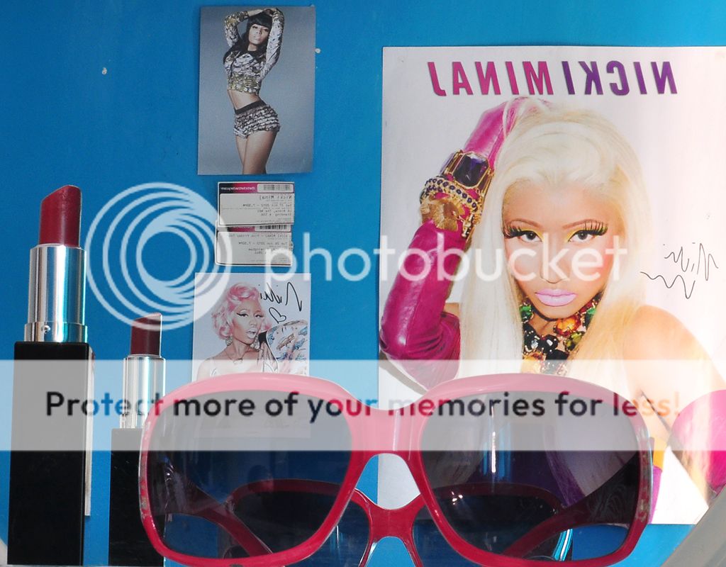
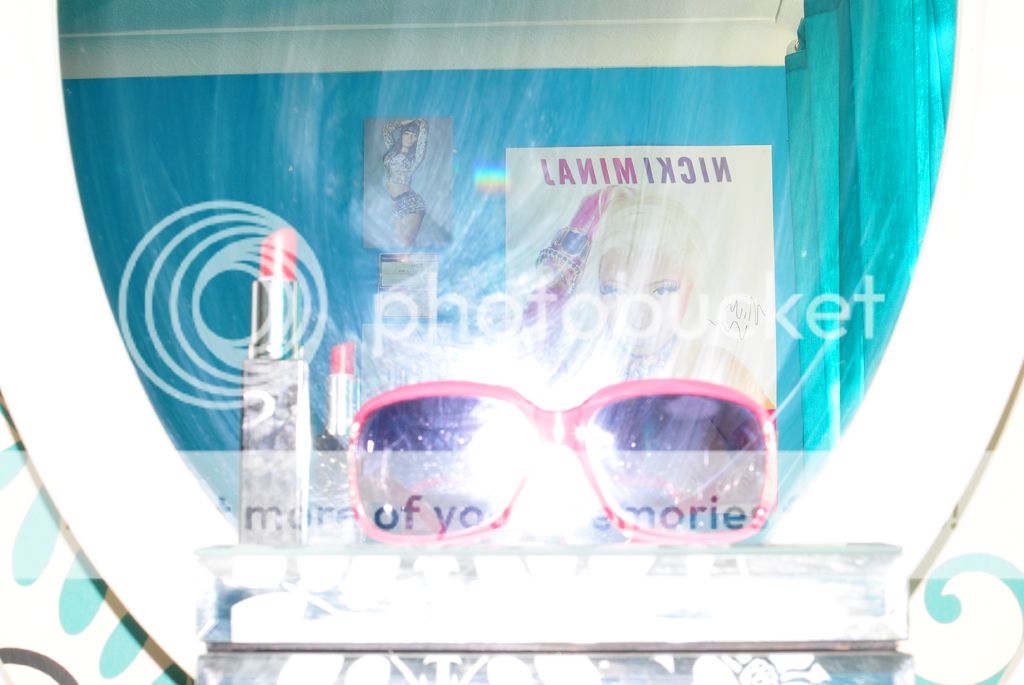
Tacky.....I'm really starting to think I need to hire a child for this theme....spot on for the theme x 3... for the simplicity of the shot I'm going with #1.......having said that Ms Minaj's eyelashes are also befitting of the theme
you do realise ....if your daughter see's the theme you've used these shots for that you're gonna be in mahoooosive trouble
Direction... 3 great shots to choose from...my vote goes to...#3...love the shallow dof, pov & Straight being in focus
Tacky.....I'm really starting to think I need to hire a child for this theme....spot on for the theme x 3... for the simplicity of the shot I'm going with #1.......having said that Ms Minaj's eyelashes are also befitting of the theme
you do realise ....if your daughter see's the theme you've used these shots for that you're gonna be in mahoooosive trouble
- Messages
- 13,760
- Edit My Images
- Yes
Hi Alan
I'm preferring the first shot myself... but would have liked to see the bottom of the frames, you have caught them very well, and I like the background against the bold glasses
Could do with a gap between each shot too... as they seem to merge together
I'm preferring the first shot myself... but would have liked to see the bottom of the frames, you have caught them very well, and I like the background against the bold glasses
Could do with a gap between each shot too... as they seem to merge together
M
Mad Hatter
Guest
Hi Allan
Direction: I like this shot with the tiers, foreground, steps and background. The coloured signs and signpost frame add a contrast to the snow. The angle is very well taken.
Tacky: Spot on theme and simple idea. Well executed.
Direction: I like this shot with the tiers, foreground, steps and background. The coloured signs and signpost frame add a contrast to the snow. The angle is very well taken.
Tacky: Spot on theme and simple idea. Well executed.
OP
- Messages
- 1,058
- Name
- Alan
- Edit My Images
- Yes
2nd tacky shot works best for me also there is more in the picture the last one just looks like something has gone wrong
Brilliant............. true though
OP
- Messages
- 1,058
- Name
- Alan
- Edit My Images
- Yes
Week 14 - Value
I'm afraid this was one of those weekends when good images simply refused to enter my lens. I'm putting it down to having a budget value entry level camera...... and Ken Rockwell will never convince me otherwise
Roll on next weeks theme
I'm afraid this was one of those weekends when good images simply refused to enter my lens. I'm putting it down to having a budget value entry level camera...... and Ken Rockwell will never convince me otherwise
Roll on next weeks theme
- Messages
- 13,760
- Edit My Images
- Yes
Hi Alan
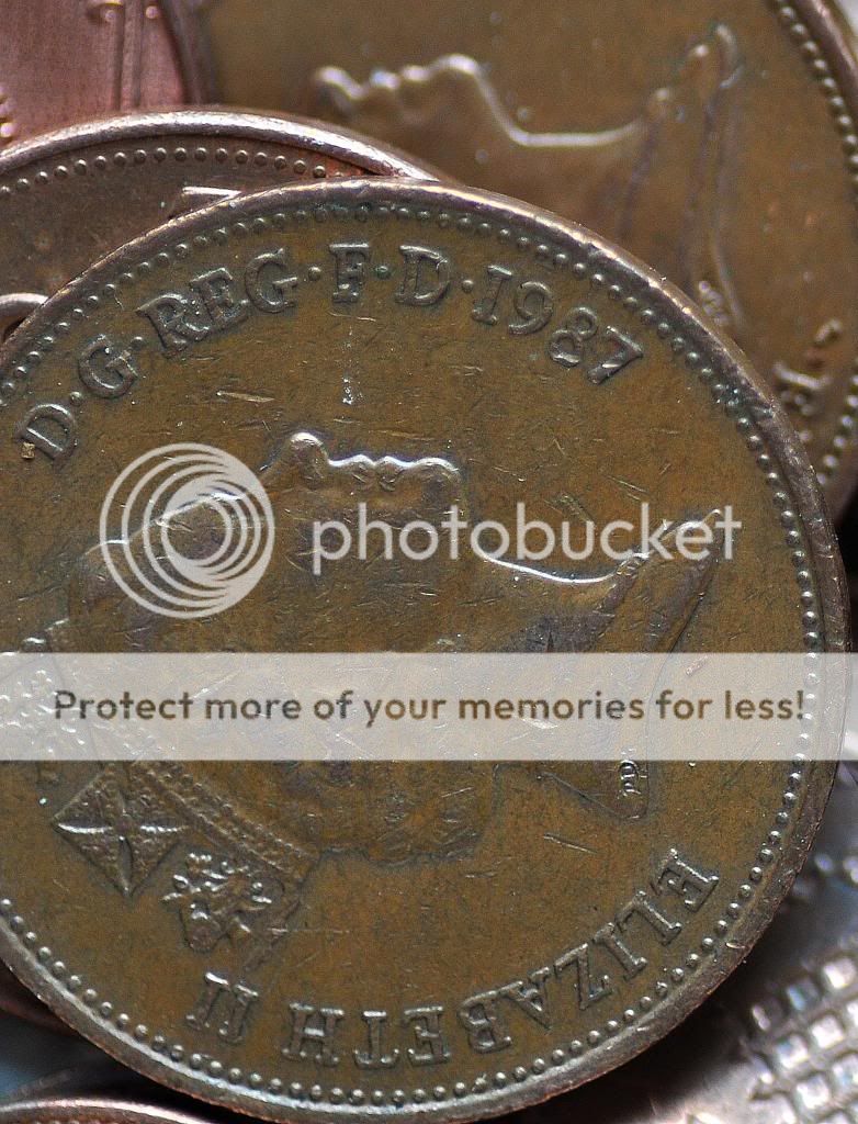
Value - Liking the macro coin shot, some nice detail caught there
Value - Liking the macro coin shot, some nice detail caught there
- Messages
- 2,167
- Name
- Nick
- Edit My Images
- Yes
I keep coming back to Tacky #1, love the low angle, and the simplicity of the subject. I think the shades are tacky enough without the reinforcement of the other articles. The light and reflections in #2 and #3 are a bit distracting for me, plus anything with that creature in it makes me want to look away!
I really like Value #1 too, the sharpness and detail lifts it from the ordinary.
I really like Value #1 too, the sharpness and detail lifts it from the ordinary.
Brian_of_Bozeat
Jeff
- Messages
- 3,235
- Name
- Brian (not Jeff)
- Edit My Images
- No
See - for me - #1 is a photograph, #2 is a snapshot and your submission would have been stronger without it.
So I'm going for #1. Nice detail, odd composition... kind of dirty... even a bit provocative perhaps?
So I'm going for #1. Nice detail, odd composition... kind of dirty... even a bit provocative perhaps?
OP
- Messages
- 1,058
- Name
- Alan
- Edit My Images
- Yes
Thanks for all your feedback guys. Certainly something for me to think about.
I like the photograph Vs snapshot comment from Brian. That has definitely got me thinking
For the coins i used the 90mm Tamron lens with a crop of around 50%
Thanks,
Alan
I like the photograph Vs snapshot comment from Brian. That has definitely got me thinking
For the coins i used the 90mm Tamron lens with a crop of around 50%
Thanks,
Alan
- Messages
- 8,330
- Name
- Ian
- Edit My Images
- No
Had a look through the last page, and Tacky really stands out for me. My wife did an iPhone panorama of our #2's bedroom last week and the only word to describe that would be "bomb site".
Also like the head alignment on the coins in "Value" though I wonder if a B&W conversion might work better. Just a thought!
Ian.
Also like the head alignment on the coins in "Value" though I wonder if a B&W conversion might work better. Just a thought!
Ian.

OP
- Messages
- 1,058
- Name
- Alan
- Edit My Images
- Yes
I had the same issues with Trojan Lisa / Allan and re-took the image several times all with the same result. Ive even had a magnifying glass over the logo and concluded that the excess stitching from the letters creates an out of focus look.
That's my excuse anyway
That's my excuse anyway
Last edited: