weekly ams99 - 52 Challenge - Week 52 Water

Hi Alan

can't beat a bit of macro...good detail in the coin & like that you didn't go for the whole of the coin...(y)

Greed...would never have thought of that for the theme but yup,you're right...people seem to need designer tags for some reason :thinking: Like the layout , focus is good as are the colors ..nice work mister (y)
 
Rather liking this one for greed - on theme and brilliant detail captured in the cloths of each of these, and working well together as a trio.
 
Week 16 - Angle.

Really struggled with this theme. Tried all sorts of ideas but failed miserably. My main problem was with the depth of field plane on the 90mm macro lens. With my camera at a 45 deg angle to my subject, using central focus point, the area i wanted in focus was in fact, not. The area above the central focus point was fine but the part of the image i wanted to be in focus wasn't.
Frustrating.

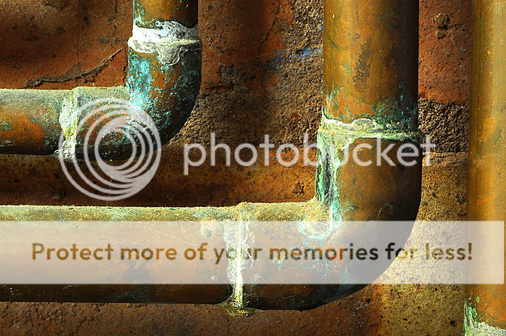
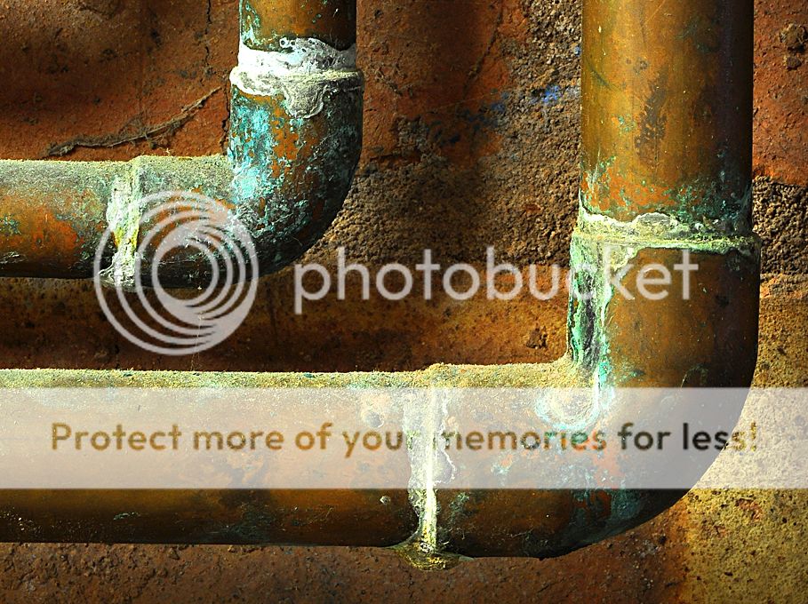
So, back to the pipes. Good angles but crap focus!

 
Hi, Alan, Greed, nice symmetry and good detail.

Angle, interesting take on the theme. Cracking detail and composition. I might have removed the RH vertical pipe. WB looks a bit orange on my iPad??

Cheers.
 
nice right angles the detail helps but as Andy as said i would remove the RH pipe, the focus looks fine to me
 
Great details on the corrosion there. Good idea and bang on theme. I'll have to disagree though and say the original looks better, i think the crop looks too cramped.
 
love the detail captured here - even down to the dust that sits atop the pipes, and the little bead of oxidised solder under each join. (y)

On theme too.
 
Greed: nice idea, and I didn't find the LHS out of focus! But I did find them all a bit too regulr; might have worked better with (say) the middle logo a bit lower? Might get a bit more flow around the image that way.

Angle is great, particularly the second version. Great colours and textures and bang on theme.
 
yep that would be the one
fortunately I wasn't eating breakfast at 1.30 in the morning ;)

I do like the clarity you have achieved in this shot, sharp as a pin, Was it a big zoom or close macro?
 
Yuck - that should come with a warning... I think you did a good job of it though. (y)
 
You should have saved vertical for below! :D

I think you have had a good idea for a great shot here but tbh in my opinion you fluffed it. The exposure looks spot on, she's an attractive model and I like the angle looking down but the chopped off toe, reflected flash (on her forehead) and central position are all letting it down. Sorry for the negative feedback I am trying to be constructive and so these are all things to think about for next time you are in a similar position.

You nailed the panning! (y)
 
Hi

Greed - minimal but very effective. Good colours and textures in the shot and the layout works well

Angle - like that a lot . (y) Good detail in all elements and good rich colours

Rustic - mmmm... more opulent than rustic :). Like the composition - many don't like tree limbs and branches but I like the way that the shot is framed. Perhaps a bit washed out in colour as sky does not add as much as it might

Patterns - good detail and on theme. The horizontal slash lines that go across are a bit disconcerting

Verical - nice capture in difficult lighting conditions. Cut off toe draws the attention. Like the framing of the stone and the handrail

Movement - well done on the panning. Still not crystal clear but as you say, very tough. Personally I think that I would have gone for a moving cart and a stationary b/g. it seems to me that the cart is the moving element rather than the b/g. Good comp in that the cart has some space in the shot to go into and the white markings add to an ordinary landscape element.
 
Hi, good catchup.

Rustic, lovely building and good detail. Not keen on the framing which I find a tad distracting.

Patterns, woah, took me by surprise :D too detail and shadows. Because of the nature of the theme, I'd like to see perfect symmetry.

Vertical yeah, best one for me. Cracking smile. Good eye contact and good lighting.

:clap: for the catchup.

Cheers.
 
Thanks for the feedback guys.

The toe issue really peed me off as i should have been more attentive. Regarding the flash reflection on the forehead (i was using the on camera flash) is the only way to prevent this (without carting around loads of gear) using -ve flash exposure compensation??

I must say i found using flash very difficult. Most of the day i was using Aperture priority (and discovered the Sunny 18 rule does bear truth) but the resultant people photos either ended up with too much flash in dull conditions or not enough fill in bright conditions. Hmm! I am missing something i think.

I found when i was pratting around in manual camera mode my family were getting rather impatient :) and i ended up with scowls as opposed to smiles
 
Week 22 - Below.

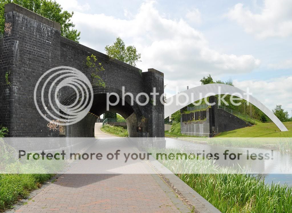
Really struggled today for both inspiration as well as dynamic range. I was under bridges, over bridges, over railway lines but nothing good would come out of the camera!! :)

Anyhow, an uninspiring bridge. Hey ho! Better luck next week.

 
Nice vertical pic it has its flaws but they have been pointed out, you have done a good job with the panning it is hard, I have tried a few times not really succeeded.
As for below I tried a few things myself, sometimes nothing seems to work right, but its always good to try things (y)
 
Hi Alan ,well done on the mega catch up (y)

Lovely Angle shot,amazing detail & doesn't look oof at all anywhere to me......(y)

Below.......yup , been doing the same thing today & can't come up with a shot ! Interesting angles of the bridge's , exposure looks good ,maybe a filter would have kept a little more detail in the sky ?

Rustic....hmmmm...very stately but rustic in it's own way

Patterns.......:eek:

Movement good 1st attempt at panning mister.....the trick is to keep practicing...then practice some more,start with a higher shutter speed till your happy with the focu point more often then not then start dropping the shutter speed...hope that helps if you're gonna try some more
 
Hi, Below, hmmm, first thing I thought as, 'he's not below the bridge'. However, I rather like it, especially how the bridge flows onto the sculpture to the right.

I agree with Lynne, bit more detail in the sky.

Cheers.
 
patterns is pretty gruesome, think we can say ugly as its not a real person,

vertical, think Brian summed it up, maybe better as a portrait orientation??

Movement on the kart is good, best bit for me is the timing of it going across the finish line. Not quite sharp as said, but it's not easy - and I think luck plays a part too. I was panning for movement and I found that if I took a burst of shots the first was always far better than the subsequent ones... so I just gave up and focussed on popping one off each time.

Below, good composition, the path leading in to the tunnel and the structure crossing the river..... I'd resort to a bit of HDR (even from a single RAW file), just to bring some life to the sky.

That's an interesting idea ive never tried. Thank you for the tip.
 
Below - really like that composition. The straight thro tunnel, the arch springing from the abutment, the brick structure framed by the arch and the genral lead in lines and the perspective. (y) I think that only with better lighting conditions could it be bettered, and then I would try to clone out the small chimney like structure above the arch.
 
Hi Alan,
A bit of a catch-up on comments from me.

Vertical, a little crowbar into theme perhaps but hey nowt wrong with that ;)
The clipped toes have been mentioned but not something that immediately struck me when first looking. Great eye contact from your lovely model, nice smile too. As Brian mentioned, perhaps a little play with the composition to put your model off centre would help but other than that (y)

Movement, bang on theme, no crowbar required ;)
Again, as Graham mentioned you've caught the cart at a great point crossing the line (y)

Below, I like the leading lines and the arch echoing the tunnel under the brige. Compositionally very good IMHO. Certainly a location with a lot of photographic potential in different light too.
 
I like the old and new aspect of below. Size, nice composition and sharp, bang on theme
 
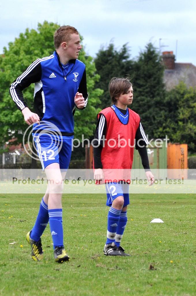
size made my chuckle, tops of the socks are at the same height - but from there on there's no comparison..... (y)
 
Back
Top