You are using an out of date browser. It may not display this or other websites correctly.
You should upgrade or use an alternative browser.
You should upgrade or use an alternative browser.
weekly Judi's 52 in 2014 week 33 and 34 added
- Thread starter Judi
- Start date
- Messages
- 9,095
- Name
- Mandy
- Edit My Images
- Yes
Rich - Two good images i like the closer version on the first image bang on theme for me.
Skill - Again good image and i can imagine that it would take some skill to produce good results like that in topiary not something i have ever tried or know much about.
Skill - Again good image and i can imagine that it would take some skill to produce good results like that in topiary not something i have ever tried or know much about.
- Messages
- 13,760
- Edit My Images
- Yes
Hey Judi 
Rich - Great minds think alike
A great setup you have there, sets a scene very nicely, and with just the one cup & plate, looks a wonderful afternoon planned for a quiet read
Skill - Certainly plenty of skill on show there, photography wise a bit plain for me, an odd low/wide angle on the rabbit would have been more interesting Etc... but I read you did some cloning and stuff so nice one and perfect for the theme
- Messages
- 4,182
- Name
- Paul
- Edit My Images
- Yes
Hi Judi... you definitely hit the theme with skill - well done you for crafting those, they look amazing!
For once, I feel your photography isn't as strong though - as Dean says, it's just a bit flat. For me, a few things jump out:
1. Perspective/angle of shot - I see sloping horizontals and it's a bit off-putting
2. Confused point of interest - I know what I should be looking at, but I'm distracted by things which are less interesting
3. Lighting - perhaps choosing a different time of day to shoot might rescue it? Longer shadows etc. could help, as could some zooming in and shallower DOF to really pinpoint just one of the bushes?
Sorry if this sounds a bit harsh, but I know you're a good photographer and I'm only being honest... please don't take it to heart! I love 99% your pictures and this is just the 1%...
- Messages
- 1,408
- Name
- Elaine
- Edit My Images
- Yes
Wow Judi, that IS skillful, especially the rabbit, I just wouldn't know where to start and he'd probably end up earless!
- Messages
- 8,398
- Name
- Lynne
- Edit My Images
- Yes
HI Judi
Topiary fascinates me....wouldn't know where to begin , the Rabbit is fab ...composition wise I get that you are limited so you've done well with what you had Might be worth a try for a low POV shot though...maybe for a reshoot card ?
Topiary fascinates me....wouldn't know where to begin , the Rabbit is fab ...composition wise I get that you are limited so you've done well with what you had
- Messages
- 1,417
- Name
- Judi
- Edit My Images
- Yes
Thank you CarolI can appreciate they would be heavy to move Judi, well done on the cloning nice bit of work and I won't tell my daughter the rabbit is coveted by your Great Grandson.
thank you MandyRich - Two good images i like the closer version on the first image bang on theme for me.
Skill - Again good image and i can imagine that it would take some skill to produce good results like that in topiary not something i have ever tried or know much about.
Thank you AllanHi Judi, i do like a bit of topiary, the pic looks a little busy but as you say not easily moved, but works for me.
Thanks DeanHey Judi
Rich - Great minds think alike
A great setup you have there, sets a scene very nicely, and with just the one cup & plate, looks a wonderful afternoon planned for a quiet read
Skill - Certainly plenty of skill on show there, photography wise a bit plain for me, an odd low/wide angle on the rabbit would have been more interesting Etc... but I read you did some cloning and stuff so nice one and perfect for the theme
Hi Paul.... the thought about the lighting hit me after i posted, I am a bit behind and was rushing to get something in. thanksHi Judi... you definitely hit the theme with skill - well done you for crafting those, they look amazing!
For once, I feel your photography isn't as strong though - as Dean says, it's just a bit flat. For me, a few things jump out:
1. Perspective/angle of shot - I see sloping horizontals and it's a bit off-putting
2. Confused point of interest - I know what I should be looking at, but I'm distracted by things which are less interesting
3. Lighting - perhaps choosing a different time of day to shoot might rescue it? Longer shadows etc. could help, as could some zooming in and shallower DOF to really pinpoint just one of the bushes?
Sorry if this sounds a bit harsh, but I know you're a good photographer and I'm only being honest... please don't take it to heart! I love 99% your pictures and this is just the 1%...
Thanks Susie, everyone likes the Rabbit, Harry would take it home if he couldHi Judi....well done with the topiary ...it can't be easy to do ....I love the rabbit (super pic with your great grandson) I agree the background is a bit distracting, but as you say it's sometimes unavoidable.
Thanks GrahamSuper subject, all very neatly clipped and good cloning.
Just the location as already mentioned.
Thanks Craig, yes I did enjoyHi Judi
Rich - That's a nice little set up you have there, its on theme and looks good hope you enjoyed
Skill - very skilful must take you long time?
thanks PhilHi Judi, topiary, very skilful
composition has been mentioned but I would like to see the rabbit against a lovely blue sky, it really would make it pop
Thanks ElaineWow Judi, that IS skillful, especially the rabbit, I just wouldn't know where to start and he'd probably end up earless!
HI Judi
Topiary fascinates me....wouldn't know where to begin , the Rabbit is fab ...composition wise I get that you are limited so you've done well with what you hadMight be worth a try for a low POV shot though...maybe for a reshoot card ?
Thanks Lynne
Thank you very much for looking everyone,
Rich really was my afternoon cuppa in the garden, had one of those moments grabbed the biscuits and took a quick picture for the theme
The topiary is very long term, the tall one with the balls on nearly 20 years, the chicken and Rabbit about 10, I usually look out for a bush with a shape that 'speaks' to me suggests something to start with.
- Messages
- 4,831
- Name
- Alan
- Edit My Images
- Yes
Hi Judi
Rich very English, quite rustic, very peaceful. I prefer the one with the pouring taking place. Nice subdued, washed out colours which suit the subject
Skill - aptly demonstrated. Perhaps need s more separation between the objects to gain their full impact. Lighting a bit flat. Super shot of your grandson - those are memories are made of - just imagine when he is older being able to refer to those little quirks of his character.
- Messages
- 4,182
- Name
- Paul
- Edit My Images
- Yes
Hi Judi... clever take. I like that it's different. Perhaps a different composition would have made it stronger... if you could have had the sugar bag OOF but still able to (just) read the "half spoon" text that would improve it for me. As it is, it's just looking a bit like a product shot for me, leaving me wondering what the product is... (not meaning to be harsh, btw!)
- Messages
- 9,095
- Name
- Mandy
- Edit My Images
- Yes
Half - a nice simple take on the theme, I think it would of been good to play about with some different angles as Andy suggested. And have the bag of sugar slightly oof.
- Messages
- 868
- Name
- Jason
- Edit My Images
- Yes
Half: For me simple striking image. I think the composition and arrangement works well. Perhaps a boost of contrast to give it a bit more punch, otherwise a solid submission this week.
Skill: I am impressed! that is a skill for sure!! Love the bunny. Think lighting is a bit harsh to show them off to their best but I know this cant be helped. Well done on your cloning efforts too. Keep up the good work...its a lovely skill to induldge!
Rich: Made me smile this did
- Messages
- 1,408
- Name
- Elaine
- Edit My Images
- Yes
Very clever Judi! A shot of the bag alone would have been on theme, but the addition of an actual half a teaspoon of sugar makes it a much more interesting composition
- Messages
- 4,831
- Name
- Alan
- Edit My Images
- Yes
Hi Judi
Half - cannot but agree with everyone else that you have taken a good shot - good exposure and colours - just that the bag has more prominence than it deserves - perhaps less of it and more oof
Half - cannot but agree with everyone else that you have taken a good shot - good exposure and colours - just that the bag has more prominence than it deserves - perhaps less of it and more oof
- Messages
- 13,760
- Edit My Images
- Yes
Hi Judi 
Half - Certainly, not sure what background you have used but on monitor there looks like there could be a lot of texture ?? the sugar is also blending a little too much into it for me... Well lit shot though and the perfect idea with the half spoon of sugar too
Half - Certainly, not sure what background you have used but on monitor there looks like there could be a lot of texture ?? the sugar is also blending a little too much into it for me... Well lit shot though and the perfect idea with the half spoon of sugar too
- Messages
- 6,502
- Name
- Peter
- Edit My Images
- Yes
Catch up time........
Rich - #2 for me. A lovely British summer garden image. I feel all the elements go together well. Even having the right title of book shows attention to detail. very nice.
Skill - Another from the garden - very clever stuff. As an image is feels a bit full of foliage. Maybe one (and the half one on the left) less pot would have worked better. They always say odd numbers of things attract the eye more. Looks like you did well with exposure given the brightness of the Sun.
Half - Good thinking and use of the spoon being half full of sugar. Maybe a different coloured surface would have shown the sugar up a little bit more.
- Messages
- 1,417
- Name
- Judi
- Edit My Images
- Yes
sorry very late with these, a few more to do to catch up
Architectural
St Mary's Church Beverley
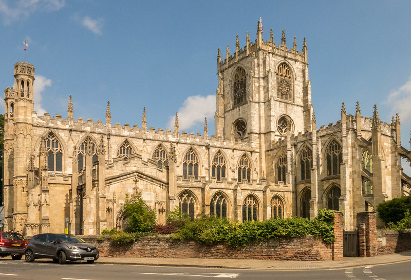 Architectural by 1 Jude, on Flickr
origonal, taken with Canon G15, from the back of the pavement.
View attachment 20954
Bandstand Beverley Market place
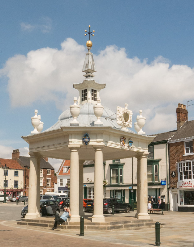 Architectural by 1 Jude, on Flickr
A bit of Tudor Beverley
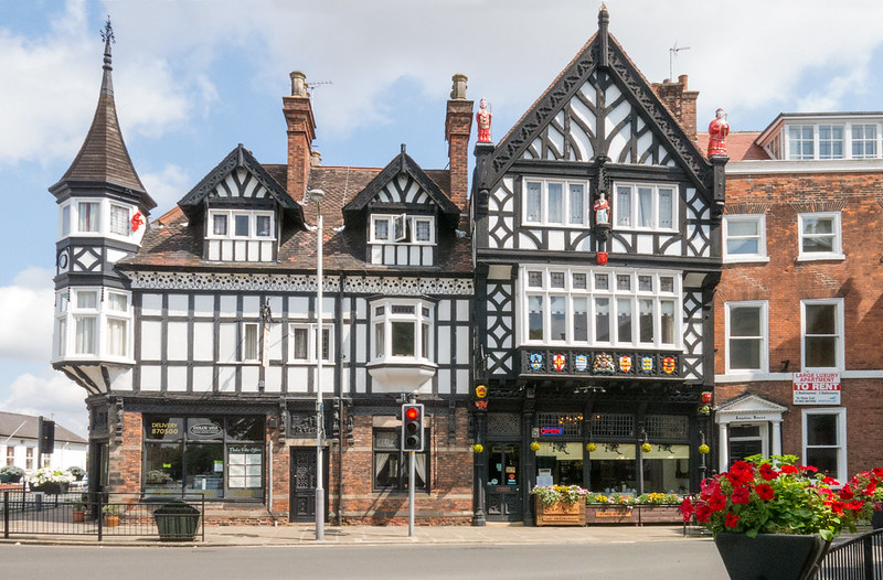 Architectural by 1 Jude, on Flickr
Architectural
St Mary's Church Beverley
 Architectural by 1 Jude, on Flickr
origonal, taken with Canon G15, from the back of the pavement.
View attachment 20954
Bandstand Beverley Market place
 Architectural by 1 Jude, on Flickr
A bit of Tudor Beverley
 Architectural by 1 Jude, on Flickr
Last edited:
SarahLee
TPer Emerita
- Messages
- 13,060
- Name
- Sarah
- Edit My Images
- No
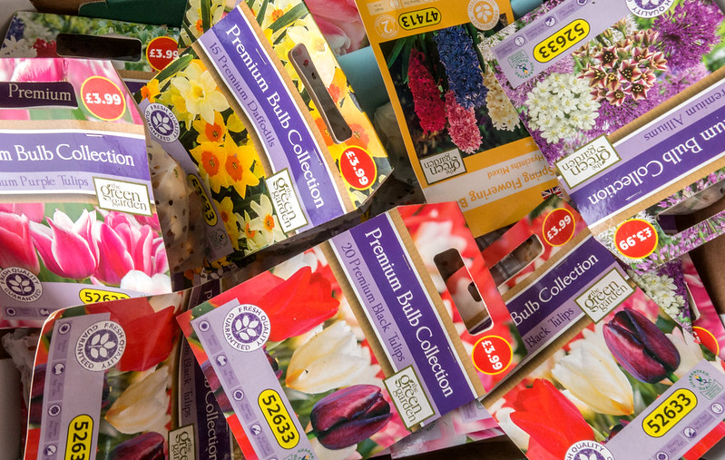
Absolutely no need for a crowbar either IMO for promise.
Suits the theme perfectly - and funnily enough it's exactly what I plan to be doing tomorrow.
Is this a shot of the shop display or do you have a lot of planting ahead of you?
I like it. Random, colourful and it actually really speaks to me.
I'd love to see this side by side with a photo of the end results come spring time.
- Messages
- 9,095
- Name
- Mandy
- Edit My Images
- Yes
Architectural - some lovely selection of images for the theme i find the first image my favourite one. My only crit would of been not to have the cars in the image and a wider angle so the church is not to tight in the frame. But that aside I think it's a pleasing image and the detail in the church is lovely.
Promise - a nice selection of bulbs, fingers crossed they all come out in bloom beautifully with no dramas. Works for the theme for me, so no crow bar required, I hope you manage to catch up soon.
Promise - a nice selection of bulbs, fingers crossed they all come out in bloom beautifully with no dramas. Works for the theme for me, so no crow bar required, I hope you manage to catch up soon.
- Messages
- 7,548
- Name
- susie
- Edit My Images
- Yes
Hi Judi ....lovely to see you back ....the church is the architecture shot for me ...it is a shame about the cars, but it certainly looks an amazing building.
Love the bulbs for promise ... great idea and a super bright and sharp shot to go with it.
Love the bulbs for promise ... great idea and a super bright and sharp shot to go with it.
- Messages
- 1,417
- Name
- Judi
- Edit My Images
- Yes
Thank you for your kind words DavidJudi, you are always busy commenting on everyone's work whilst bringing us your lovely, happy images. Thank you.
Hi Judi
Rich very English, quite rustic, very peaceful. I prefer the one with the pouring taking place. Nice subdued, washed out colours which suit the subject
Skill - aptly demonstrated. Perhaps need s more separation between the objects to gain their full impact. Lighting a bit flat. Super shot of your grandson - those are memories are made of - just imagine when he is older being able to refer to those little quirks of his character.
Thank you Alan
Hi Judy a nice simple take on the theme and I think you carried the sugar and spoon off really well. I prefer the bag of sugar were out of the Frame and maybe get a bit closer and try a few different angles with a spoon and sugar.
Cheers.
Thanks Andy I did try a few angles and positions, this one gave a little more definition round the spoon
Thanks Carol, I did try a lower one but it didn't show the sugar in the spoon very wellHalf - Very good take on the theme, might have got down lower on the spoon and sugar making it the prominent feature with the bag in the BG slightly oof. But hay that's just my opinion still like what you have done.
Thanks AllanHi Judi, have to agree with above concerning the spoon, making it more prominent, nicely exposed image and good colour though
Thanks PaulHi Judi... clever take. I like that it's different. Perhaps a different composition would have made it stronger... if you could have had the sugar bag OOF but still able to (just) read the "half spoon" text that would improve it for me. As it is, it's just looking a bit like a product shot for me, leaving me wondering what the product is... (not meaning to be harsh, btw!)
Thanks for commenting MandyHalf - a nice simple take on the theme, I think it would of been good to play about with some different angles as Andy suggested. And have the bag of sugar slightly oof.
Thanks Jason, everyone likes my bunny have to check that he hasn't crept into some peoples car boots
 Hi Judi,
Half: For me simple striking image. I think the composition and arrangement works well. Perhaps a boost of contrast to give it a bit more punch, otherwise a solid submission this week.
Skill: I am impressed! that is a skill for sure!! Love the bunny. Think lighting is a bit harsh to show them off to their best but I know this cant be helped. Well done on your cloning efforts too. Keep up the good work...its a lovely skill to induldge!
Rich: Made me smile this did. Wish we could all make time in our lives to relax like this. Number 1 for me....just feels more 'alive' and less static. This shows off your other skill too.....that is arranging complex sets with multiple props.....number 1 looks like its need of a slight rotation, though I think you know that already. Good stuff again and I like your style!


I enjoyed doing Rich, and did manage to get my cup of tea.. after i warmed it up!
Very clever Judi! A shot of the bag alone would have been on theme, but the addition of an actual half a teaspoon of sugar makes it a much more interesting composition
Thanks Elaine
Thank you CraigHI Judi - great idea composition is good the spoon adds interest colours are nice
Thank you SusieHi Judi ...I'm losing the plot a bit on what I have commented on and what I haven't
This is a really good idea for theme, I think a closer crop would work well, but the choice of product is spot on and half spoon really makes it...
Thanks AlanHi Judi
Half - cannot but agree with everyone else that you have taken a good shot - good exposure and colours - just that the bag has more prominence than it deserves - perhaps less of it and more oof
Hi Judi
Half - Certainly, not sure what background you have used but on monitor there looks like there could be a lot of texture ?? the sugar is also blending a little too much into it for me... Well lit shot though and the perfect idea with the half spoon of sugar too
Thank you Dean, it was shot on a textured table cloth outside on the garden table
Thanks GrahamNowt wrong with half for me, the fact you carefully created a half spoonful of sugar too goes a long way to making it for me. WB is spot on here too.
Thanks Peter, The plant pots were too heavy for me to move about, Perhaps when the heavy gang are here i can do a reshootCatch up time........
Rich - #2 for me. A lovely British summer garden image. I feel all the elements go together well. Even having the right title of book shows attention to detail. very nice.
Skill - Another from the garden - very clever stuff. As an image is feels a bit full of foliage. Maybe one (and the half one on the left) less pot would have worked better. They always say odd numbers of things attract the eye more. Looks like you did well with exposure given the brightness of the Sun.
Half - Good thinking and use of the spoon being half full of sugar. Maybe a different coloured surface would have shown the sugar up a little bit more.
Last edited:
- Messages
- 1,417
- Name
- Judi
- Edit My Images
- Yes
Good catch up Judi.
Absolutely no need for a crowbar either IMO for promise.
Suits the theme perfectly - and funnily enough it's exactly what I plan to be doing tomorrow.
Is this a shot of the shop display or do you have a lot of planting ahead of you?
I like it. Random, colourful and it actually really speaks to me.
I'd love to see this side by side with a photo of the end results come spring time.
Thank you sarah, yes the bulbs are an Aldi display
Thank you Mandy, Unfortunately there are always cars parked there in the daytime, I did clone out a bollard but the cars were a bit too complicatedArchitectural - some lovely selection of images for the theme i find the first image my favourite one. My only crit would of been not to have the cars in the image and a wider angle so the church is not to tight in the frame. But that aside I think it's a pleasing image and the detail in the church is lovely.
Promise - a nice selection of bulbs, fingers crossed they all come out in bloom beautifully with no dramas. Works for the theme for me, so no crow bar required, I hope you manage to catch up soon.
Thank you SusieHi Judi ....lovely to see you back ....the church is the architecture shot for me ...it is a shame about the cars, but it certainly looks an amazing building.
Love the bulbs for promise ... great idea and a super bright and sharp shot to go with it.
- Messages
- 1,084
- Name
- Craig
- Edit My Images
- Yes
Hey judi sounds like your having a similar problem to me with your 52
Architectural - some lovely images there again as the others have mentioned the church shot is the pick of the bunch just a shame about the cars / bollard but not much can be done about that
Promise - is that a promise to yourself? I was thinking about doing the same with a current motorcycle project I have started but went for a poor egg shot instead... I like what you have done the random positioning of the bulbs a bargain price too bonus
bonus
Architectural - some lovely images there again as the others have mentioned the church shot is the pick of the bunch just a shame about the cars / bollard but not much can be done about that
Promise - is that a promise to yourself? I was thinking about doing the same with a current motorcycle project I have started but went for a poor egg shot instead... I like what you have done the random positioning of the bulbs a bargain price too
- Messages
- 13,760
- Edit My Images
- Yes
Hey Judi 
Architectural - It's the church shot for me... Great job in the editing on this one, straightened up the verticals really well, cloned out the bollard nicely too, Losing the cars would have finished the image off beautifully, like the colours you have brought out of the sky and stonework
Promise - Now planting that lot would certainly brighten up any garden, I too like the randomness of the packs, again nice colours too
- Messages
- 4,182
- Name
- Paul
- Edit My Images
- Yes
Hi Judi
Architectural - #1 for me. Never mind about the cars - sometimes these things just get in the way. Good verticals and you've done well in post to enhance the image - just the right about of processing for me
Promise - I like it. Simple enough shot but theoretically simple shots can be difficult to get right. Colours, exposure and focusing all spot on. Composition and arrangement works too.
Well done!


 IMG_9655r
 Promise
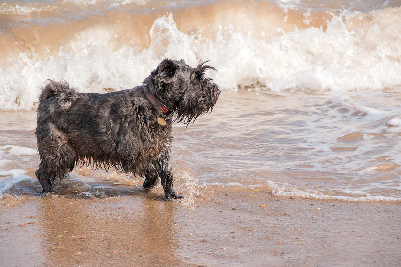 Sparkle
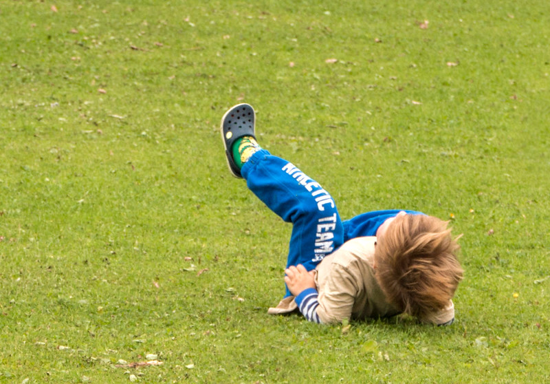 Fall
Fall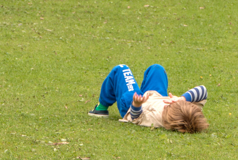 Fall
Fall