
- Messages
- 6,502
- Name
- Peter
- Edit My Images
- Yes
Absolutely on theme. I think I prefer the B&W version. You might even get away with adding some noise for a grittier shot.

Hmmmmm Noise... not tried thatAbsolutely on theme. I think I prefer the B&W version. You might even get away with adding some noise for a grittier shot.

Cheers MarshaHi DK. Another good idea for vice. Good DOF and composition. I think I prefer the colour version but I'd say in both (especially the B& W version) kthe 'powder' looks a little grey! Maybe a tweak needed to sort that.
")
Your welcome Carol... and Thank you for your time comparing the 2... that just helps to prove your as nuts as the rest of usHi DK,
Thanks very much for posting the B&W version, I've just been jumping back & forward between the B&W and coloured version on your flickr page and the B&W shot is the one for me love it
Carol
Cheers Nick'Vice' - Great interoperation of this weeks theme. I prefer the colour version. it's really interesting to see how everyones opinion varies. Nice work.
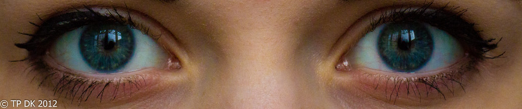
 ) & you've caught windows as catch lights so 2 for the theme & focus is spot on )right eye lower lash bent to the right , left eye slight miss with the eyeliner as can see eyeshadow peeking through & slight clumping on the outer top lash's......you can probably tell I'm having to work real hard to find any iffy bits.....
Hey Darren... Thanks mateEntrance
Great thinking and a great shot.
Like the crop, eyes are bang on focus.
Hi Lynne... Entrance was close thenHi DK
A cracking image for Entrance....it is said that "the eye's are the window to the soul " ( window is an entrance....especially if your a burglar
Thanks for the detailed commentI really can't find anything to crit on this image...love the smooth skin , the symetry...
only minor nitpick is the mascara ( apologies to your model
It reminds me a lot of some pictures I have from Athena ( showing my age here)
Really great image & hope your model doesn't get huffy me
my daughter really won't mind at all, that's very complimentary Cheers AlbyVice is hard hitting and love the thinking behind Entrance.
Hi Carol... Thanks for the complimentHI DK,
What a great image, I like this one alot, like the reflection too...and I'm not going to ask for a b&w version this time as the colour is great, especially if viewed in black on your flickr page....someone has beautiful eyes. In the spirit of honest critique my only suggestion would be to leave slighly more room at the top of the crop, just a mm or two to get the full effect of those eyelashes on the RHS.
Carol
I tried as much as I could, I did a bit more and her eyebrows kept creeping in too muchShhhhhLastminutedotcom Dean, that should be your signature
Cheers Iain, nice of you to sayIain said:To your entrance image, I like the thinking behind this. It was so easy to go with a literal take on this but you've avoided this with a bit of creative lateral thinking
Lovely eyes on your model but I think the crop is a little too tight to show them properly. I feel the inclusion of the eyebrows would frame the eyes better and give a little more room to the photograph.
Technically perfect, sharp and well lit, I particularly like the reflection in the eyes. Good work Dean.
Hi Neil... thanks, For me that was my opinionHi DK,
Clever thinking, for me without the brows. #1 just draws you into the eyes. great focus...
OOooooo Ian, you bugger.. got me thinking nowDefinitely 'with brows' gets my vote Dean, what is your preference as the author?

Well... if the first was opened up a bit on top I would prefer it now I see them side by side... butDefinitely 'with brows' gets my vote Dean, what is your preference as the author?
and nice eyes. Thanks Alex... I'll pass on the compliment to my daughter tooWith brows for me, another cracking shot from you DK
Good symmetry
right eye lower lash bent to the right , left eye slight miss with the eyeliner as can see eyeshadow peeking through & slight clumping on the outer top lash's..
) I think this is a great image and bang-on theme. Really nice focus and tones. Top work DK Thanks MarshaWhat lovely eyes! You've captured them well without capturing yourself in the reflections
I prefer without brows! I'm certainly not implying that your daughters eye brows are bushy or anything because they're not, but as you can't see her full face her eye brows look a little heavy for me!
Cheers Nick... your not wrong there'Entrance'
Only a women would spot this LOL (Appoligies Lynne
Nick
Thanks MichaelI like that, a very tricky subject and you seem to have done very well, out of the 2 version, I prefer with the eye brows.
Hey Allan... It sure does doesn't itwith brows for me but it does seem in my head anyway to be someone looking through a letter box letter box
Cheers MarkWithout eyebrows for me; she just looks surprised with, and I think your attention is taken away from the eyes! Without she looks mysterious, sexy, etc etc etc
Cheers RobertWith brows. I like it.
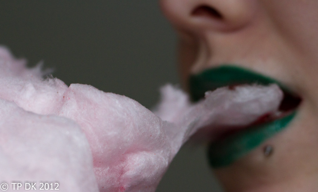 ) Well captured colour in the candy floss. Good work.
Cheers AlanHi DK
Vice - colour one preferred. Good composition, good story telling and spot on theme. Hard to fault
Alan said:Entrance - another eye shot only a pair this time. As I have said on the other thread, a really clever take on the theme. I like the idea of the eyes being an entrance for light into our senses. Good skin tones and the right amount of contrast between the various elements. Good crop. I prefer withut the brows as i think that this illustrates the theme better.[\Quote]Great in-depth comments... Really Appreciated
I was hoping for some interest in the lippyAlan Again..... said:Soft - maybe a touch more in focus but good neutral background , good skin tones ( green lipstick?
Hi Liz... ThanksHi DK
Entrance the one with the brows gets my vote, theres nothing really to crit on that one.
Soft - bang on theme, i would have liked to see the mouth in focus as well, and to be honest i find that green lippy a bit distracting, but thats just me
I went for OOF lips so that the object of the theme, the Candy Floss, was the main center of view
Cheers Paul... that certainly was the plan... I thought Red lippy would of been too expectedSoft is good, I like the focus and the green lippy, something "alternative" and sexy about it.
Nice One.. Thanks MichaelLike it. The green lipstick is interesting and adds to the pic I think.
Yay.. got my thoughts totally there mate.... Thanks MarkNice photo. I wondered about the focus to start with, but it's growing on me; it's the candy floss that's soft, not the face.
LOVE the green lipstick; off out to buy Mandy some of that!
Right... off to finish doing the pond and Chooks... then back in to comment on others - Cheers All