OP
- Messages
- 13,760
- Edit My Images
- Yes
Thanks MarshaLove the focus on the candy floss, I think you've got that spot on
Not quite so keen on the green lippy!
")
I thought you ladies would love the green lippy


Thanks MarshaLove the focus on the candy floss, I think you've got that spot on
Not quite so keen on the green lippy!
Cheers Simon for the comments... AppreciatedHey DK catch up time....
Magical - cracking shot.....love it.
Vice - just superb, bang on theme, great dof
Entrance - great take on the theme, and nice crisp shot on the eyes too, definitely with brows too.
Soft - again bang on theme, as others have said maybe a bit more focus round the mouth too. Colours great on this too.
Hi MattHi DK,
Vice, very striking image and brave of you to photograph,controversial but bang on theme.
Entrance, Really liking this one, eyes are nice and clear and detailed, something I've been struggling with.
Soft, candy floss, soft and fluffy, bang on theme but the green lippy on the model really puts me off, if it was pink however?
Matt
Hi NeilHi DK,
Candy floss!!...very soft
as for photo, works really well...the focus is on the floss(the soft)..as for green lippy...nothing wrong with that!!
HeyHi ya
Soft......candyfloss...oh yes...focus...oh yes...DOF ...oh yes....GREEN LIPPY.....no no no....pink or maybe red but not GREEN
Thanks Trevor... your the first to point that one outI for one like the green lippy its a great contrast from the pink candy floss I think the DOF is spot on I dont think you need to see any of the lips in focus, lovely background too.
Only distracting thing for me is the stud below her lip.
 I like the composition too.
 Delta Skies said:although it looks a little strange around the wrappers in the gap between them and the chocolate
think someone else mentioned getting all the bars in shot & the strange effect around the ends of the wrappers ? Hi Peter... cheers mate, Don't know what you mean about the bit in-betweenI like this take on the theme. It's nicely lit although it looks a little strange around the wrappers in the gap between them and the chocolate
Hahaaaa Thanks Marsha, but Chocolate doesn't last long in this hoseVery clever take on the theme, I like your thinking
I think the problem here is they look like they've been pasted in from another shot, but only in this small area, which is odd!
I like the bar chopped in half but I'm thinking the chocolate colour isn't quite right, maybe a touch too light? But I'm looking in my phone so could be wrong!!!
Now feel free to send me any bars you can't eat
Hey Allan... yep all goneI like it the left hand side needs the whole wrapper and yes its a bit light if you know what I mean. Hope you ate them all in one sitting I would have.
 the children and wife did help though :|
Hi LynneHi DK
Asda can be a bit like a jungle sometimes
Neat idea & well set out
Like the slight reflection as well...long time since I had a lion bar but from memory the chocolate was quite light anyway.....

 :nuts:
 for you outside the box thinking. iain
Hey Iain#2 gets my vote Dean, #1 the bars look as if they are floating, I think the inclusion of the shadow 'grounds' them.
A creative take on the theme, I am sure a pride of real lions are a bit thin on the ground even in deepest darkest Norfolk
I was going to save you one but thought better of itI can't believe you didn't share!
I prefer number two, the shadows add a bit more depth to the shot

Thanks NeilHi Dk..
yup #2, good idea. the shadows look better than #1...its definitely a jungle in ASDA!!!
Hey Nick... thanks'Pride' of lions - brilliant take on the theme DK love your choice of depth of field. Nice texture and lighting textures on the chocolate too.
Nick
Cheers Michael... I do try to be differentLove it! A great interpretation of the theme that, both versions work well, but the shadow adds something.
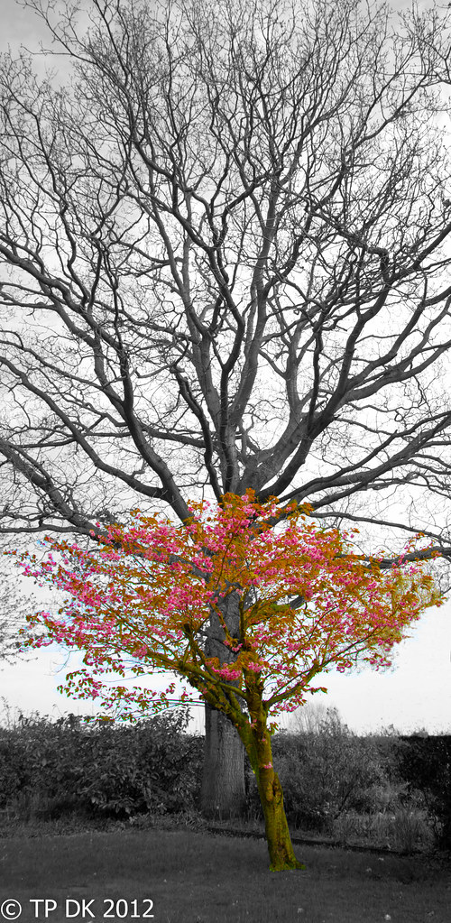
 It looks like you may have had a half decent sky with some blue in it & some nice clouds , the bigger tree appears to bare of leaves so maybe , just maybe , this would have worked in color ? Maybe a little desaturation on the bigger tree just to make the smaller one stand out even more , as the flowers show off quite nicely that the front tree is indeed Short.....hope this makes sense ?
Cheers MarshaNow that's one MASSIVE oak tree, or it just makes the tree in front look really short
I like the idea and I think you've definitely got the scale spot on, it certainly fits the theme
That is what I mean yes... first time doing SC, I have never been a big fan of seeing SC, now I have done some I like it even lessI'm just not sure the SC works here! Is that what you mean for 'this kind of image'?
YepI'm assuming you've done it to make to short tree stand out?
Well I did catch a sudden bit of good sky, but I couldn't get any narrow DOF, as they are quite close together, I had my 15-85 wide open at f3.5 but no luckPerhaps (if the weather allows a reshoot) it would work better with a more shallow DOF on the short tree as opposed to SC
Thanks RobertLove the pride shot & Short's a great idea.
Thanks LynneHi DK
great idea for Short & fits the theme.....for your 1st try at SC I think you've done really well with a difficult subject....very fiddly to get the leaves on the smaller tree all colored whislt not getting any sky or the bigger tree also colored
I agree... that's the trouble, seems I don't like SC much I am finding it hard to see it as successful - I just see it as 'Odd looking'Personally , though I have love SC'd images in general , I'm not so sure it works on this image
It sure does make sense... Here is a copy in colour, I'm new to PSE too so unsure how to do selective desaturation, working out SC on PSE6 was a fluke as it wasIt looks like you may have had a half decent sky with some blue in it & some nice clouds , the bigger tree appears to bare of leaves so maybe , just maybe , this would have worked in color ? Maybe a little desaturation on the bigger tree just to make the smaller one stand out even more , as the flowers show off quite nicely that the front tree is indeed Short.....hope this makes sense ?
No problems.
Just curious but have you heard of/ tried to use tilt and shift? It's what I used on my lifeboat picture to blur the background and make the boat stand out! During my 3.5year olds insomniac cuddles last night I tried it with your photo on my phone app, I think it could work with the colour version of this shot.
Apparently you can do it in PSE linky

Cheers MarkPride; excellent! Can't fault it!
Short, I like this, but although the SC works well in the branches, it clashes a bit at ground and trunk level I think. Not sure what could be done about that though!
I like the edit much more; I think the shorty stands out fine.
Great idea, and nice composition

Hi again MichaelHi Dk, I certainly prefer the full colour version of your tree, it does also look better when viewed on a a black background too.
Hi Mike... Thanks... and your welcomeShort - nice take on the theme. I think I prefer the full colour version. Thanks for sharing the PP details.
I think it stands out just fine!I prefer the full colour version.
OOoo I quite like that, I think it helps, Thanks for putting the work into itHi DK, I did a REALLY quick edit on my phone to show you how the tilt & shift would affect your shot, what do you think:
I couldn't fine tune it and this was about as far as I could reduce the blur. Please let me know and I'll remove it if you want. Marsha.
Cheers NeilHi DK....
Short...I like the colour version, it fits the theme well...that is one big oak tree!!