You are using an out of date browser. It may not display this or other websites correctly.
You should upgrade or use an alternative browser.
You should upgrade or use an alternative browser.
weekly DK's 52 in 2014 - Wk's 52 'Support' Added - AND FINISHED :)
- Thread starter Dark Knight
- Start date
- Messages
- 13,760
- Edit My Images
- Yes
I could tell it was a shell but the colours around the outside are a real bonus bringing a bit more interest to the pattern
Thanks Peter
Was tough trying to get an interesting shot from it, but must say enjoyed playing with my lights yet again, used my reflector to even it out too
- Messages
- 13,760
- Edit My Images
- Yes
Cheers AndySwirl. The colours make it for me.
Cheers.
- Messages
- 338
- Name
- Simon
- Edit My Images
- No
Oh no, your Rolex is going to put my watch to shame :arghh: lol. That's a great shot though, I like the lighting and interesting compo! 
Swirl has a nice pattern and some lovely colours, on theme - well done mate.
Swirl has a nice pattern and some lovely colours, on theme - well done mate.
- Messages
- 13,760
- Edit My Images
- Yes
lol Simon... cheers SimonOh no, your Rolex is going to put my watch to shame :arghh: lol. That's a great shot though, I like the lighting and interesting compo!
ThAnks againSwirl has a nice pattern and some lovely colours, on theme - well done mate.
- Messages
- 7,499
- Edit My Images
- Yes
- Messages
- 13,760
- Edit My Images
- Yes
To say the least mate
............

- Messages
- 13,760
- Edit My Images
- Yes
Maybe one or twoHi DK, has anyone mentioned how ugly that is

Cheers Allanyou have nailed the focus and the colours, lighting are good
looks ok to me
Thanks JudiSwirl... I like the reveal much better than the original a really pretty shell nice and sharp too
I like the shape of the shell, but thought it looked too much of a 'snapshot' so was trying for a close in and odd angle
Isn't it just... it matches my glittery shortsThat's an incredibly glam rock shell.
Thanks TonyI actually really like the close crop as it makes a nice abstract where you can't really tell what it is.
Cheers DavidNot your average shell by any means. Nice work.
- Messages
- 8,398
- Name
- Lynne
- Edit My Images
- Yes
Hi Dean
love the colors in that Shell & perfect for the theme.... the close up works well for me ( I am a bit partial to macro style) but I also like the reveal shot.......must get me some more shells
love the colors in that Shell & perfect for the theme....
- Messages
- 4,828
- Name
- Alan
- Edit My Images
- Yes
You know Iain too do you ???
Yes , but he is a Scot - at least you spend yours
- Messages
- 4,828
- Name
- Alan
- Edit My Images
- Yes
Swirl
Strange looking object, even knowing what it is. Focus good but wonder whether it would be better with the tip on one of the thirds?
Strange looking object, even knowing what it is. Focus good but wonder whether it would be better with the tip on one of the thirds?
- Messages
- 13,760
- Edit My Images
- Yes
Thanks LynneHi Dean
love the colors in that Shell & perfect for the theme....the close up works well for me ( I am a bit partial to macro style) but I also like the reveal shot.......must get me some more shells
I'm actually quite surprised how many shells we do have in our house and shell like candles I think they must still be breeding
lolYes , but he is a Scot - at least you spend yours

You ain't wrong there mate... you can't take it with you when you pop your clogs, or might get run over by a bus tomorrow :nailbiting:
Thanks Mate... and Hmmmmmm I wonderSwirl
Strange looking object, even knowing what it is. Focus good but wonder whether it would be better with the tip on one of the thirds?

blakester
Shine On Harvest Moon
- Messages
- 6,679
- Name
- Iain
- Edit My Images
- No
Yes , but he is a Scot - at least you spend yours
Anyway, enough of this stereotyping
As has been said above Dean, the colours really make it pop, and add more interest.
DOF is spot on here, showing all the detail in the shell, technically very good, so all round
- Messages
- 13,760
- Edit My Images
- Yes
Awwweee spoilsport
Anyway, enough of this stereotypingonto critique.
Nice one, thanks IainAs has been said above Dean, the colours really make it pop, and add more interest.
DOF is spot on here, showing all the detail in the shell, technically very good, so all round
- Messages
- 13,760
- Edit My Images
- Yes
Moving on... after my failed re-shoot of beginning I had another idea today...
So here, several different images for:
Wk 11 - Re-Shoot 'Bubble'
My idea was to take long exposures of the bubbles created in my pond by the air stones, Having taken rather a few, all handheld at different exposure lengths my thoughts again haven't really worked how I wanted them.
The long exposures although I really like them, seem to have got rid of any bubbles, so they do not really fitting the theme as they should, so my re-shoot image for me is the first one here as the bubbles still show (Other images for your thoughts please
  )
)
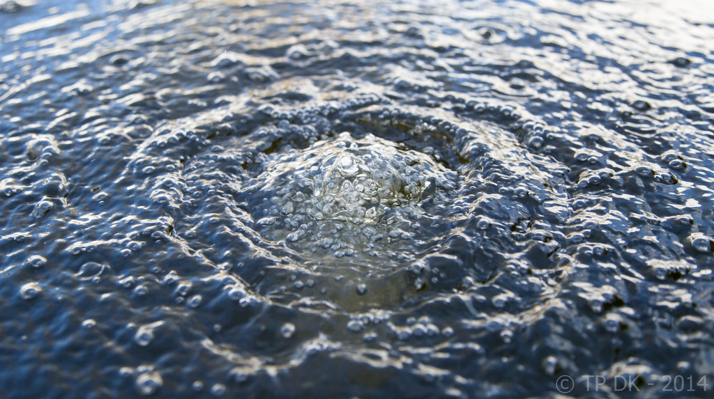
Wk 11 Re-Shoot 'Bubbles' 1 by TP DK, on Flickr
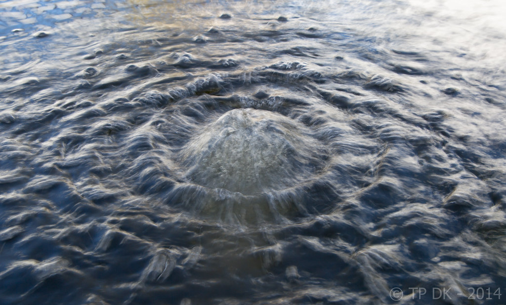
Wk 11 Re-Shoot 'Bubbles' 2 by TP DK, on Flickr
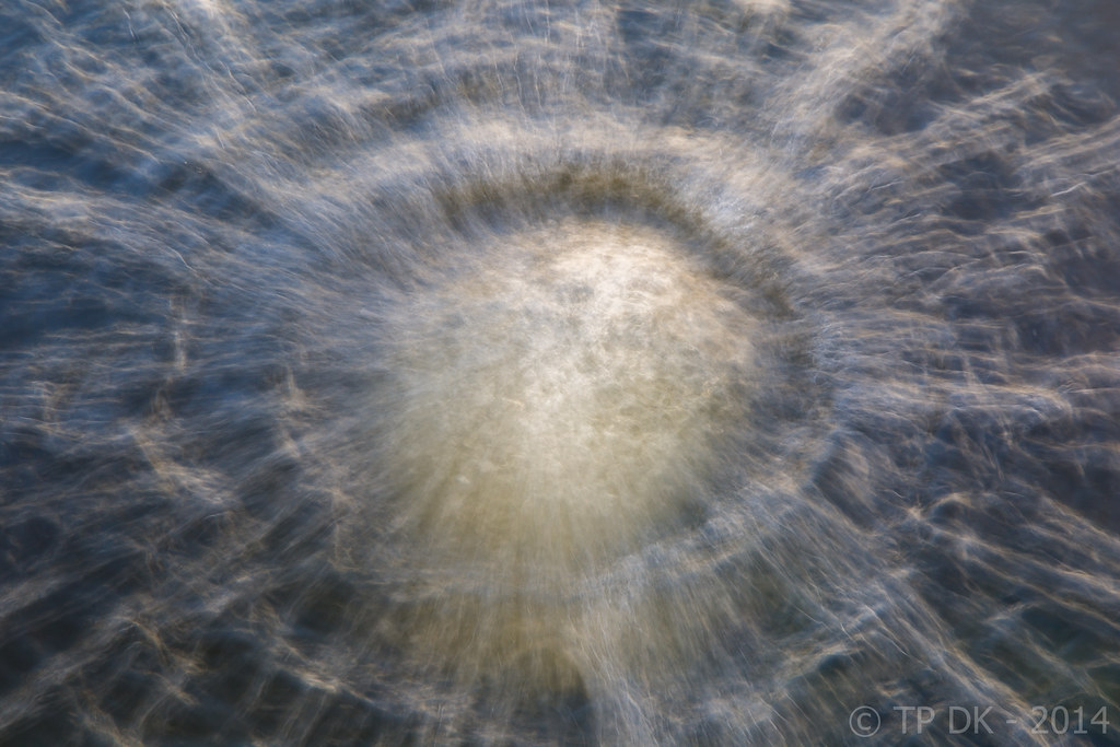
Wk 11 Re-Shoot 'Bubbles' 5 by TP DK, on Flickr
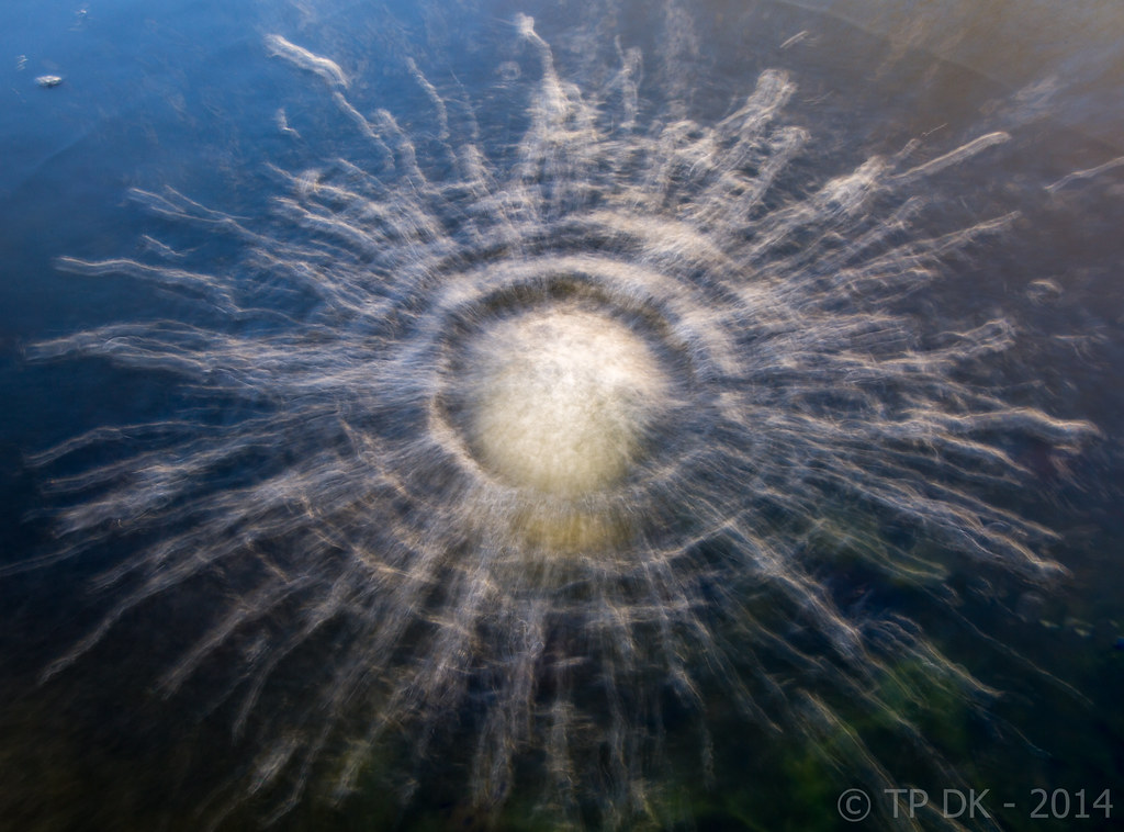
Wk 11 Re-Shoot 'Bubbles' 4 by TP DK, on Flickr
So here, several different images for:
Wk 11 - Re-Shoot 'Bubble'
My idea was to take long exposures of the bubbles created in my pond by the air stones, Having taken rather a few, all handheld at different exposure lengths my thoughts again haven't really worked how I wanted them.
The long exposures although I really like them, seem to have got rid of any bubbles, so they do not really fitting the theme as they should, so my re-shoot image for me is the first one here as the bubbles still show

Wk 11 Re-Shoot 'Bubbles' 1 by TP DK, on Flickr

Wk 11 Re-Shoot 'Bubbles' 2 by TP DK, on Flickr

Wk 11 Re-Shoot 'Bubbles' 5 by TP DK, on Flickr

Wk 11 Re-Shoot 'Bubbles' 4 by TP DK, on Flickr
Last edited:
- Messages
- 13,760
- Edit My Images
- Yes
Thanks JudiHi dean the first one has the most bubbled so I suppose that has to be the onebut I actually like #3 best love the colours the hint of green and yellow just a little bit of flare top left good idea

Was a tough one to decide for me too... as for me the better ones don't go with the theme - DOH :bang:
- Messages
- 9,095
- Name
- Mandy
- Edit My Images
- Yes
Interesting images I think the first 2 do it for me
- Messages
- 13,760
- Edit My Images
- Yes
Thanks MandyInteresting images I think the first 2 do it for me
- Messages
- 13,760
- Edit My Images
- Yes
Wk 12 - 'Linked'
- Messages
- 18,233
- Name
- David
- Edit My Images
- Yes
- Messages
- 13,760
- Edit My Images
- Yes
Hahaaaaa...
Saw it in the photo thread. I like it.
Best I put it here too...
My idea for Linked was the links on the chainsaw chain, I tried several different angles, several depth's of field, there are 3 I like for different reasons...
No: 3 - I really like the angle, but feel I needed a deeper DoF.... Maybe
No: 2 - I like the constant detail in the chain due to the side on view, but also I dislike it due to it being side on, boring angle
No: 1 - For me was the best compromise of the shots, although it would have been nice to have the other end in, the light had faded so was a problem...
Any way, here are my 3

Wk 12 - 'Linked' 1 by TP DK, on Flickr

Wk 12 - 'Linked' 2 by TP DK, on Flickr
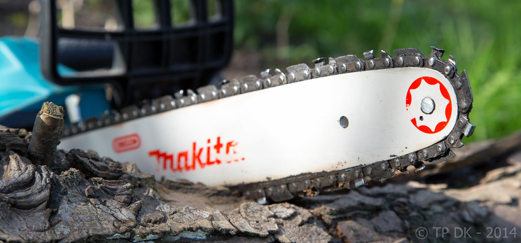
Wk 12 - 'Linked' 3 by TP DK, on Flickr
- Messages
- 9,095
- Name
- Mandy
- Edit My Images
- Yes
Linked - fits the theme but for me number one is to tight in the frame. The second I like fits nice in the frame the composition is good and I like the blurred background. I am not sure what I think about the third image.
- Messages
- 13,760
- Edit My Images
- Yes
Thanks DavidI prefer #3 if I'm honest mate. I like the dappled lighting.
Yeah the sun was coming through some trees at the time, a nice pleasing light... the next images were taken later and had direct but low light on them
Thanks MandyLinked - fits the theme but for me number one is to tight in the frame. The second I like fits nice in the frame the composition is good and I like the blurred background. I am not sure what I think about the third image.
I think you're right yeah, the top rh is a tad tight... I'll add a bit more room
- Messages
- 13,760
- Edit My Images
- Yes
Wider Crop - Certainly works better I think... cheers Mandy 

Wk 12 - 'Linked' Wider Crop by TP DK, on Flickr

Wk 12 - 'Linked' Wider Crop by TP DK, on Flickr
- Messages
- 9,095
- Name
- Mandy
- Edit My Images
- Yes
Wider Crop - Certainly works better I think... cheers Mandy
Wk 12 - 'Linked' Wider Crop by TP DK, on Flickr
Much better this has now moved to the top off my like list
- Messages
- 7,499
- Edit My Images
- Yes
3rd image for me DK, as mentioned by David (minnnt) the lighting looks good, also prefer the composition, like the fact you can see more of the chainsaw, good dof 
I might have been tempted to clone out that broken twig on the left though ( or cut it off with the chainsaw )
)
A wise man said something similar to me recently, it takes the mind of a genius to pick a chain for this theme


I might have been tempted to clone out that broken twig on the left though ( or cut it off with the chainsaw
A wise man said something similar to me recently, it takes the mind of a genius to pick a chain for this theme
- Messages
- 13,760
- Edit My Images
- Yes
Thanks Mandy... appreciated the suggestionMuch better this has now moved to the top off my like listI do like the composition on this now.
- Messages
- 7,548
- Name
- susie
- Edit My Images
- Yes
Hi DK....bubbles are difficult to capture aren't they, number one is the most bubbly, but as an image number two is the best to me....it still looks like water but has that lovely softness about it. The last one looks like a satellite image of a meteor landing in the ocean ( I do have a vivid imagination  )
)
The saws...hard to decide....but it has to be number three for me...it looks more natural and not so staged, I like the focus and I'm loving the bark on that tree, I'm sure it would make a great stand alone image.
The saws...hard to decide....but it has to be number three for me...it looks more natural and not so staged, I like the focus and I'm loving the bark on that tree, I'm sure it would make a great stand alone image.
- Messages
- 338
- Name
- Simon
- Edit My Images
- No
Hi DK,
I prefer the wider angle shot I can imagine seeing this in a brochure for the product itself.
Well done mate
I prefer the wider angle shot
Well done mate
- Messages
- 363
- Name
- Adam
- Edit My Images
- Yes
I like the first image of the reshoot for bubbles DK, some nice sharp bubbles and a nice pattern in the water. I also like the wider crop version of the first linked image, it shows some nice detail in the chain and I like seeing it in a 'working environment', complete with the product logo. could well be used as a good product shot.
- Messages
- 13,760
- Edit My Images
- Yes
Cheers Phil, Yeah I certainly like the dappled light rather than the full on, maybe I should have done something to soften it3rd image for me DK, as mentioned by David (minnnt) the lighting looks good, also prefer the composition, like the fact you can see more of the chainsaw, good dof

Blimey... didn't even notice thatI might have been tempted to clone out that broken twig on the left though ( or cut it off with the chainsaw)
HahaaaaaaA wise man said something similar to me recently, it takes the mind of a genius to pick a chain for this theme


- Messages
- 13,760
- Edit My Images
- Yes
Thanks Susie... I think you have summed it up the same as meHi DK....bubbles are difficult to capture aren't they, number one is the most bubbly, but as an image number two is the best to me....it still looks like water but has that lovely softness about it. The last one looks like a satellite image of a meteor landing in the ocean ( I do have a vivid imagination)
Thanks AgainThe saws...hard to decide....but it has to be number three for me...it looks more natural and not so staged, I like the focus and I'm loving the bark on that tree, I'm sure it would make a great stand alone image.
That third shot is getting more votes than I expected... but that always seems to be the case
Thanks a lot SimonHi DK,
I prefer the wider angle shotI can imagine seeing this in a brochure for the product itself.
Well done mate
Thanks JudiLinked... Like #1 and the wider crop is even better
That was my fav and still is, but number 3 certainly seems to be coming up the ranks
- Messages
- 13,760
- Edit My Images
- Yes
Cheers AdamI like the first image of the reshoot for bubbles DK, some nice sharp bubbles and a nice pattern in the water.
Damn... thanks againI also like the wider crop version of the first linked image, it shows some nice detail in the chain and I like seeing it in a 'working environment', complete with the product logo. could well be used as a good product shot.

