

You are using an out of date browser. It may not display this or other websites correctly.
You should upgrade or use an alternative browser.
You should upgrade or use an alternative browser.
weekly DK's 52 in 2014 - Wk's 52 'Support' Added - AND FINISHED :)
- Thread starter Dark Knight
- Start date
OP
- Messages
- 13,760
- Edit My Images
- Yes
Thanks Andy... and I think your spot on, there will be plenty for this themeI think time pieces of one sort or another will be quite common for this theme. But, if you're going to shoot one, a Rolex is the way to go")
Cheers PhilTwo great shots DK , focus, dof, detail and B&W works very well
I think I prefer the close up shot too, although I also like seeing the whole face

- Messages
- 4,344
- Name
- Martin
- Edit My Images
- Yes
I like the unusual angle taking the winder/adjuster rather than the watch face. Top one was the right one to enter on the 'no comments' page.
- Messages
- 4,088
- Name
- Graham
- Edit My Images
- Yes
oooh you flash sod you with your Rolex....
Second for me, if you're going to do it different - do it really different! Super detail and super DOF helping it along here.
I got a ticking second hand last year... but mine wasn't a sweeping one so it did stop every second, other way i thought would be flash in strobe mode, firing once a second??
- Messages
- 261
- Name
- Richard
- Edit My Images
- Yes
I prefer no 1. But both very sharp images and the b&w works well.
- Messages
- 6,502
- Name
- Peter
- Edit My Images
- Yes
Positive - To find the right letters in nature are always more difficult than you first think. This is nice and bright and I feel overlapping each of the images is a nice addition
Time - Both of these are super images. The lighting has been really well handled and the mono conversion also excellently done. I definitely like these. I think Rolex would as well. I could see them used as adverts
Time - Both of these are super images. The lighting has been really well handled and the mono conversion also excellently done. I definitely like these. I think Rolex would as well. I could see them used as adverts
OP
- Messages
- 13,760
- Edit My Images
- Yes
Thanks MartinI like the unusual angle taking the winder/adjuster rather than the watch face. Top one was the right one to enter on the 'no comments' page.
I was struggling between the two... both have their merits
That's my thought after my 'Time Passing By' second hand didn't workHi Dk, got to say the second one for me if you are going to do a watch you best make it different,
Cheers Matethats a good job, you have picked out something interesting other than the time
nice B+W too
.

that made me laugh
OP
- Messages
- 13,760
- Edit My Images
- Yes
oooh you flash sod you with your Rolex....
Cheers GrahamSecond for me, if you're going to do it different - do it really different! Super detail and super DOF helping it along here.
Ahhhhhhhh it was you was itI got a ticking second hand last year... but mine wasn't a sweeping one so it did stop every second, other way i thought would be flash in strobe mode, firing once a second??
I really liked that idea... I tried with studio lights but recycle rate is too slow, so tried with my speedlight, bounced off ceiling, diffused, moving in a circular motion etc to even the light out - all looked Crud
Thanks JudiePositive... just brilliant, beautifully done
Hahaaaaaa - thanks againTime...#2 for me love the way you have shot this but.... can you use a better class of watch next time
annnnnd erm No, I wish I could but can't unless I sold all my Camera Gear
OP
- Messages
- 13,760
- Edit My Images
- Yes
Thanks RichardI prefer no 1. But both very sharp images and the b&w works well.
The watch is Black and Stainless steel, so the B&W works out nicely, better than the colour in my opinion
Cheers PeterPositive - To find the right letters in nature are always more difficult than you first think. This is nice and bright and I feel overlapping each of the images is a nice addition
I have to agree... trying to find the right letters was a right pain !!!!
Damn... Thanks Peter, very nice of you to sayTime - Both of these are super images. The lighting has been really well handled and the mono conversion also excellently done. I definitely like these. I think Rolex would as well. I could see them used as adverts
Cheers ColinLike this, good focus on the winder and really like the shallow dof
OP
- Messages
- 13,760
- Edit My Images
- Yes
Thanks mercurius#1 for me is classier and you don't see the scratches on the edges so much. Nice b/w conversion and DoF.
Scratches... that is 'Character' ya know
Cheers Michael#2 for me. Nice lighting and something different.
Hahaaaaaa - Oooo that they do... picked this one up on a 1 for 7 dealI didn't know Crown paints made watches
- Messages
- 9,095
- Name
- Mandy
- Edit My Images
- Yes
Time - my bad I seemed to have overlooked you, nevertheless I like the composition of the first image, and where you have chosen to focus on. I feel it works very well, the detail on the edge of the watch is really pin sharp. Your second image is also nice and pin sharp but the composition just is not working for me sadly.
- Messages
- 363
- Name
- Adam
- Edit My Images
- Yes
Another vote for the first one, the focus and lighting are very good and the positioning of the watch is spot on too, just enough of the face showing. As for improvements, the only very picky thing I can point out would be to rotate the time adjuster so the rolex symbol is the right way, due to the focus being on that. itd be a perfect product shot then
OP
- Messages
- 13,760
- Edit My Images
- Yes
No Problem, we can never get around all entries, all of the timeTime - my bad I seemed to have overlooked you,
Thanksnevertheless I like the composition of the first image, and where you have chosen to focus on. I feel it works very well, the detail on the edge of the watch is really pin sharp.
No worriesYour second image is also nice and pin sharp but the composition just is not working for me sadly.
Cheers AndyWell composed, good angle and detail/DOF.
Could beeeee... or I may have overdone the blacks, my monitor is uncalibrated so god knowsLooks a little dark, but this, I suspect, is my work's PC.
If you're looking at my pic on it at work it must be... give it a poke, if your finger goes through it, your monitor must just be a figment of your imaginationIs it real
OP
- Messages
- 13,760
- Edit My Images
- Yes
Thanks KevI prefer the 1st watch. Good PoV and DoF and lots of sharp detail. Good tones in the conversion.
The opinions are getting a bit more even now !!!
Thanks AdamAnother vote for the first one, the focus and lighting are very good and the positioning of the watch is spot on too, just enough of the face showing.
Ahhh Haaaaa you bugger, your right it does need a bit of a twist looking back, I thought I had it - DohAs for improvements, the only very picky thing I can point out would be to rotate the time adjuster so the rolex symbol is the right way, due to the focus being on that. itd be a perfect product shot then
OP
- Messages
- 13,760
- Edit My Images
- Yes
Cheers JasonTime: A nice shot DK and another vote for no1. The DOF is spot on and the conversion crisp and clean. Good job man
Hhhhmmmm thanks for the suggestionNo 2 the angle just looks wrong to me. Has an abstract feel but perhaps a closer crop would be needed to pull this one off.
... I'll give that a go and put up for comparison
OP
- Messages
- 13,760
- Edit My Images
- Yes
Hmmmm not so sure now I have done it... it seems to be showing up the dust etc too much ???
After taking these shots, I treated it to a good scrub with an electric toothbrush... it sparkles now
anyway... your thoughts

Tighter Crop by TP DK, on Flickr
After taking these shots, I treated it to a good scrub with an electric toothbrush... it sparkles now
anyway... your thoughts
Tighter Crop by TP DK, on Flickr
- Messages
- 4,832
- Name
- Alan
- Edit My Images
- Yes
Hi DK
Time - good choice of comp on both. On first looking i preferred #2 but more thought has led me to #1. Enough dof to give clarity on the winder and yet show the face. Super b&w conversion - real depth to the tones.
I am honoured to have an ethereal connection with someone with so much money
Time - good choice of comp on both. On first looking i preferred #2 but more thought has led me to #1. Enough dof to give clarity on the winder and yet show the face. Super b&w conversion - real depth to the tones.
I am honoured to have an ethereal connection with someone with so much money
- Messages
- 8,398
- Name
- Lynne
- Edit My Images
- Yes
Hi Dean
Rolex huh..... like the different angle for your 1st image ,DOF just right to show enough of the face Minor niggle pointed out by Adam.......turn the windy thing the right way up then you have an image Rolex themselves might use
Rolex huh.....
like the different angle for your 1st image ,DOF just right to show enough of the face Minor niggle pointed out by Adam.......turn the windy thing the right way up then you have an image Rolex themselves might use
OP
- Messages
- 13,760
- Edit My Images
- Yes
Cheers Alan... quite glad you are torn between the two... as I wasHi DK
Time - good choice of comp on both. On first looking i preferred #2 but more thought has led me to #1. Enough dof to give clarity on the winder and yet show the face. Super b&w conversion - real depth to the tones.
You know Iain too do you ???I am honoured to have an ethereal connection with someone with so much money
Thanks LynneHi Dean
Rolex huh.....
I think it only needs a minute 1 or 2 degree counter clockwise turn... or am i missing somethingMinor niggle pointed out by Adam.......turn the windy thing the right way up then you have an image Rolex themselves might use
<EDIT>Hang on... Penny has dropped, it's the Dial Logo on the first image - Yep it does need a qtr turn
Last edited:
OP
- Messages
- 13,760
- Edit My Images
- Yes
Well moving on...
A tough one this week... well, a tough couple
Started off thinking of what re-shoot to do, thought I would try and improve the DoF on my 'Sense' of spring image, only to realise after taking and editing loads of shots from my garden again that the majority of flowers are buttercups, and weeds are NOT that spring like
So... a swirl, had a few ideas, one I wish to try later in the week if I get the time and the weather and the volunteer, but in the meantime, lets get a shot up
I give you a Shell with a 'Swirl'y bit on the end
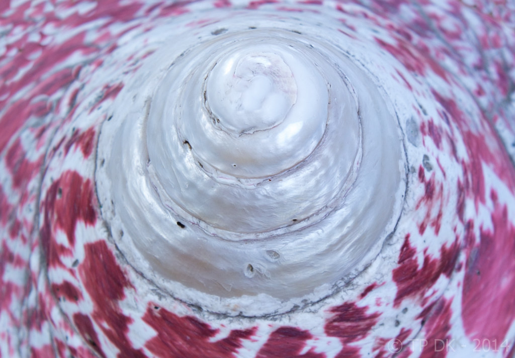
Wk 11 - Swirl by TP DK, on Flickr
A tough one this week... well, a tough couple
Started off thinking of what re-shoot to do, thought I would try and improve the DoF on my 'Sense' of spring image, only to realise after taking and editing loads of shots from my garden again that the majority of flowers are buttercups, and weeds are NOT that spring like
So... a swirl, had a few ideas, one I wish to try later in the week if I get the time and the weather and the volunteer, but in the meantime, lets get a shot up
I give you a Shell with a 'Swirl'y bit on the end
Wk 11 - Swirl by TP DK, on Flickr
OP
- Messages
- 13,760
- Edit My Images
- Yes
Hahhhaaaaa that is what I said to Mrs DKInteresting shot nice composition and DOF. Until I read your explanation it looked like a cone of some sort stitched on some fabric.....you sure its not from Madonna's wardrobe
Thanks Michael
Cheers CraigHI DK Time you 2nd image for me think the angle and focus area is great different to what i have seen done on this theme
- Messages
- 4,344
- Name
- Martin
- Edit My Images
- Yes
I have no idea what that is but I think you should have it surgically removed.
It's well-taken but a bit of an ugly object.
It's well-taken but a bit of an ugly object.
OP
- Messages
- 13,760
- Edit My Images
- Yes
Thanks MartinI have no idea what that is but I think you should have it surgically removed.
It's well-taken but a bit of an ugly object.
It is a shell... when its not such a tight crop it is more obvious but to me less interesting... when back in my PC tomorrow ill throw up a wider crop
- Messages
- 4,088
- Name
- Graham
- Edit My Images
- Yes
think you have just, and I mean just got the DOF and POV right, to just have the top edge of the spiral coming over, I think the whole spiral has to be visible (which it just is), and the DOF could be a tad deeper, but no shallower.
Actually looking again, the blur on the outer edges does almost give a movement feel, adding to the swirlyness.
And that there is a contender for the worst critique of the year so far i think! Hopefully you get the gist....
Actually looking again, the blur on the outer edges does almost give a movement feel, adding to the swirlyness.
And that there is a contender for the worst critique of the year so far i think! Hopefully you get the gist....
- Messages
- 9,095
- Name
- Mandy
- Edit My Images
- Yes
That's a very interesting swirl image indeed but for me it's lacking in something I am just not sure what that is at the moment.
OP
- Messages
- 13,760
- Edit My Images
- Yes
Hahaaaaa Cheers Graham... I think I know what you mean, and waaaaaay off worst critique of the yearthink you have just, and I mean just got the DOF and POV right, to just have the top edge of the spiral coming over, I think the whole spiral has to be visible (which it just is), and the DOF could be a tad deeper, but no shallower.
Actually looking again, the blur on the outer edges does almost give a movement feel, adding to the swirlyness.
And that there is a contender for the worst critique of the year so far i think! Hopefully you get the gist....
Thanks MandyThat's a very interesting swirl image indeed but for me it's lacking in something I am just not sure what that is at the moment.
.. I think the thing it lacks is interest, I was hoping I had got the best from the shell, but maybe not Hi DK
Thanks SusieI'm not too sure about the shell....it's really swirly so bang on for the theme, but I feel I want it to draw back a bit and show more of the shell.
I am putting a broader image up.... you may regret asking
Thanks indeed....I love that second image for time...what a great angle
OP
- Messages
- 13,760
- Edit My Images
- Yes
Here we go then.... the 'Reveal' of my shell I used for the theme...
Move along, move along... Nothing to see here

Wk 11 - my 'Swirl' object by TP DK, on Flickr
(I'll be marking this for a future re-shoot I think, If I get any inspiration for something)
Move along, move along... Nothing to see here
Wk 11 - my 'Swirl' object by TP DK, on Flickr
(I'll be marking this for a future re-shoot I think, If I get any inspiration for something)
- Messages
- 6,502
- Name
- Peter
- Edit My Images
- Yes
I could tell it was a shell but the colours around the outside are a real bonus bringing a bit more interest to the pattern