Hi DK...bit of a catchup for me too...
Rich: #1 for me - simple but effective. Like the row of highlights where the tea meets the biscuit and the curved shaped of the cup and biscuit works well together, seemingly bringing the composition together.
Skill: "Pixar smile" - that made me smile. I am a fan of decay type pictures and this one ticks the box for sure. Loads of rusty brown tones and flaking paint details to enjoy here. Like the the contrasting fluffly blue sky teasing the boat, as if some promise she'll set sail and see better days again.
Half: Works for me. Obviously splitting in half along the diaganol gives a nice leading line - top marks for that! Appears slightly over-saturated perhaps?
Architecture: I love piers....coming from SA where there are none, these are a real novelty for me. Thinking can these be classed as piers with no water in sight?

. Yup shame about the flat sky, but we know thats how it goes sometimes. I prefer # 1 - I like how the pictures shows off the lengh of the pier. Also like the little elements such as flags along the roof, clock tower and lone bird in the sky. Feel both pics would work well in mono as the garish colours are a little jarring on the eye (especially in the second)...lol
Pure: A beautiful flower like this is always going to be pleasing. I really like the 'pure' white and soft pink colours of this and the little pearls of water on it have been nicely captured. Like the position of the flower in the frame also the fact that we can see some of the flowers surroundings for added context. Nice pic DK
")
Sparkle: Oh yes, I can see the sparkles.....and feel them. Feels kind of exotic this and I can feel myself relaxing on a boat in the med somewhere with only the sound of water lapping against its sides. Like that theres some deep rich colour retained in the water and its not just a muddy expanse.
to be continued................

 sharpness issues aside, a nice shot that works well, the splashes adding a nice path through the shot and the droplets are beautifully frozen in mid air.

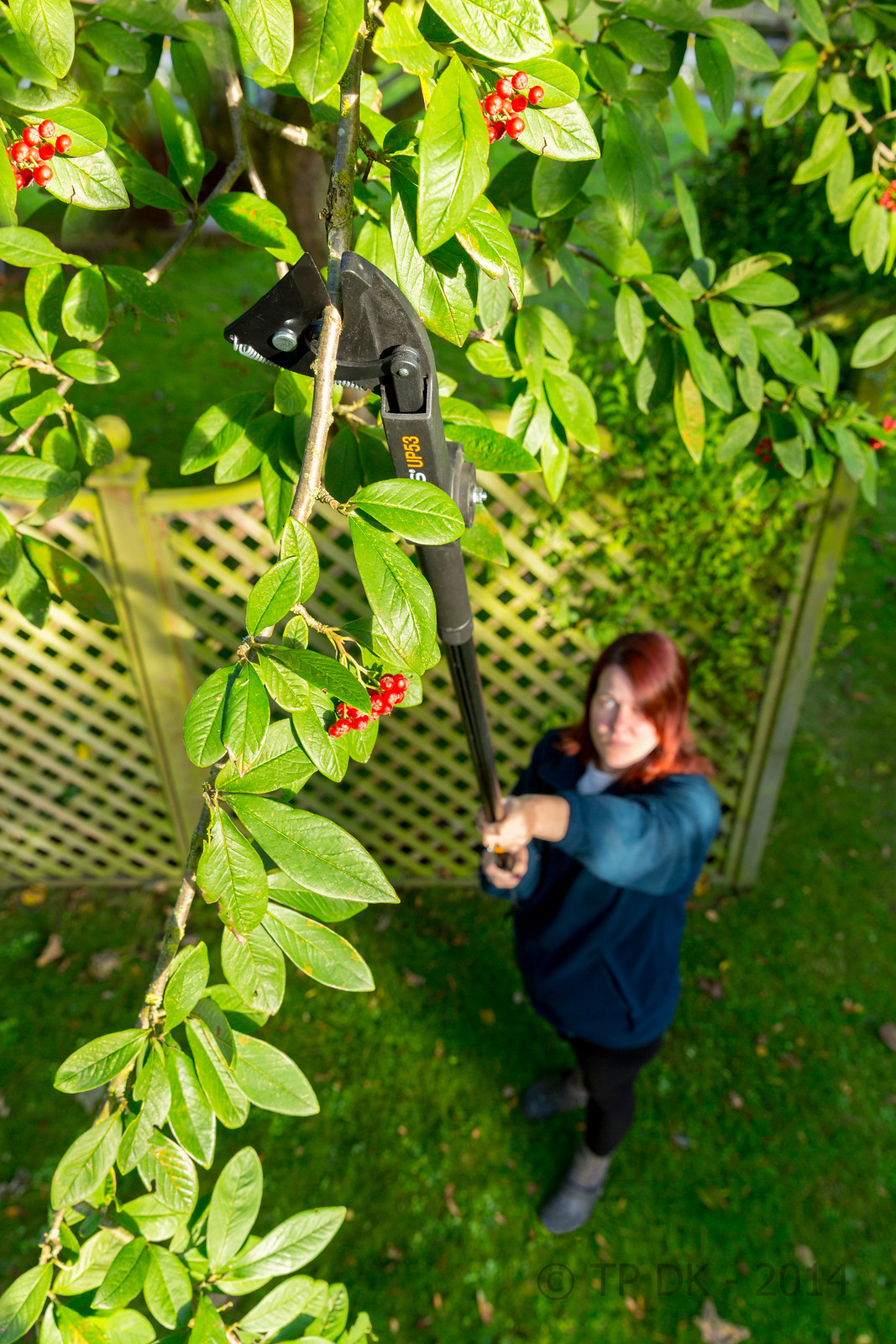 Wk 40 - Cut
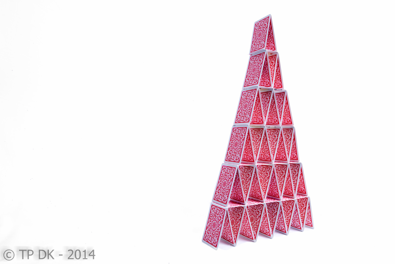 Wk 41 - Balance
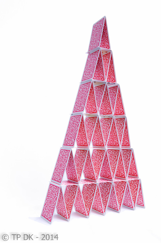 Wk 41 - Balance 2
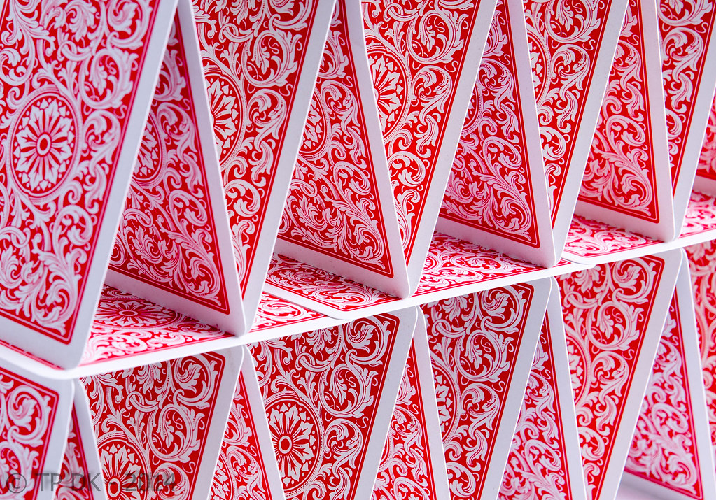 Wk 41 - Balance 3