weekly Higgeh's 52 for 2014 - Week 1 - Line

Messages
353
Name
Graeme
Edit My Images
Yes
Last edited:
Cheers for that. Dont know what that dark line is if im being honest. The whole thing was done using some a3 paper set on my laptop so might have to invest in an actual kit if i want to try this again.

minnnt dont know what you are saying?
 
Thanks for the replies guys. I think I have decided on a new rule for the year. All editing in my 52 will be done on my D5100 using its own touch up controls. This should be fun (these photos were edited on the D5100)
 
I don't know what you are all talking about, its got to be number 1 ;). I love the red and yellow contrast. It is subjective though and since you are the artist it is your decision. I do like number two, there is a spot of yellow below the sweet though, just need a little adjustment in PP. I really like the composition though, I feel bad for the poor yellow sweet living in a red sweet dominated world. A metaphor for equality I think, sometime's being a minority can make people feel left out. Anyway, thats enough sudo philosophy from me, I like the image (y).
 
All my photos will be edited using the tools built into my D5100 and my pc will only be used for uploading.

Interesting, I'm bowing out after completing my 2013, and just looking for a few interesting threads to follow for 2014.

I'll go with the odd sweet in yellow, although I do see the appeal of #1 where the yellow is sufficiently different to the red to make it odd.

D5100 in camera editing is fairly useful, although I think you might struggle for the whole year - but I'd love to see you make it. Looking forward to the tiltshift and fisheye weeks. (y)
 
I don't know what you are all talking about, its got to be number 1 ;). I love the red and yellow contrast. It is subjective though and since you are the artist it is your decision. I do like number two, there is a spot of yellow below the sweet though, just need a little adjustment in PP. I really like the composition though, I feel bad for the poor yellow sweet living in a red sweet dominated world. A metaphor for equality I think, sometime's being a minority can make people feel left out. Anyway, thats enough sudo philosophy from me, I like the image (y).

Thanks for the comment. Glad to see it wasn't me being stupid and im quite glad i put up all 3.

Interesting, I'm bowing out after completing my 2013, and just looking for a few interesting threads to follow for 2014.

I'll go with the odd sweet in yellow, although I do see the appeal of #1 where the yellow is sufficiently different to the red to make it odd.

D5100 in camera editing is fairly useful, although I think you might struggle for the whole year - but I'd love to see you make it. Looking forward to the tiltshift and fisheye weeks. (y)

Reason im sticking to the D5100 editing tools is that I used to do alot of PP for a wedding photographer I worked for. Kinda began to annoy me so I would like to keep it as RAW as possible. I may resort to PP at some point but I certainly hope i dont.
 
Hi ya higgeh ( & your real name is ?) cos thats gonna be a right mouthful for 52 weeks , Welcome to the madhouse of 52's ;)

Going against the grain I'm plumping for #3....not entirely sure why but the red color suits nicely to me eye with just the one in mono (y) Just need to remove the color from around the base of the mono sweet . Lighting has been mentioned ( I also struggle with this ) & sometimes pp is your friend

Good start , look forward to seeing your challenge progress :)
 
HI,
Number 2 for me as well, it just works better.
I wouldn't restrict myself with to many rules its a long slog
 
Hi ya higgeh ( & your real name is ?) cos thats gonna be a right mouthful for 52 weeks , Welcome to the madhouse of 52's ;)

Going against the grain I'm plumping for #3....not entirely sure why but the red color suits nicely to me eye with just the one in mono (y) Just need to remove the color from around the base of the mono sweet . Lighting has been mentioned ( I also struggle with this ) & sometimes pp is your friend

Good start , look forward to seeing your challenge progress :)

Thanks went and bought some new stuff today incase i have to do this again (Light tent and remote flash cord).

Real name is Graeme BTW
Another vote for no:2 here, an easy choice for me :)

Your being very brave only using in camera processing, I don't know what I would do without LR spot removal :D

Oh and welcome to the 52 (y)

I just want to try to avoid over editing. Will see how i go
HI,
Number 2 for me as well, it just works better.
I wouldn't restrict myself with to many rules its a long slog
I like number 2, but regardless of the different versions, I like the clever contrast between smooth shiny round sweet and square matt rough sweets.

Thanks for the replies
 
Looking at it i think it could be a bit brighter but i think thats also a monitor problem for me. Not really sure what white is white. Might have to get the monitors calibrated again.
 
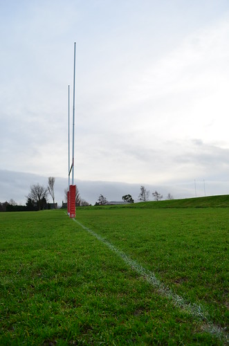
Good image Graeme (y) but I want the line to come from the left :thinking:
 
Ho, on theme in several aspects. Leading lone and good DOF.

Not much detail in the sky, and I suspect it was there. If you had Lightroom you could fix this.

Nice start.

Cheers.
 
Hi
agree about the line coming from the left, seems a little dark for me but the sky needs more definition as has been mentioned,
so maybe a lift to the shadows and a darkening of the highlights may help
 
I like your first image for week 0 the S/C just doesn't do it for me in either of these.

Week 1 Line certainly fits the criteria in more ways than one. Yes the sky has blown a bit, but should be easily recovered and I probably agree with the comment about the line leading in from the left too.
 
Well on theme, recover the sky and it may well work beteer
 
Odd - My vote is for #1 although Posiview has already pointed out the lighting that needs some slight attention
Linear/Line - You've kept the verticals vertical and I like how you've put the line into the bottom right corner.
 
I can't add much more than already said, spot on theme.

I keep think there should be more space around the posts on this one but the necessary use of a portrait view has resulted in the posts seeming to be close to the edges of the frame, maybe a wider lens is required but not too wide that it distorts the view ?
 
Odd - No 2 for me also, nice simple take on theme agree that lighting not quite there. (Something I have problems with)
Line - Nice verticals and like the line is fine coming from the right. The sky needs some work though but that's not always easy this time of year.
 
Back
Top