You are using an out of date browser. It may not display this or other websites correctly.
You should upgrade or use an alternative browser.
You should upgrade or use an alternative browser.
weekly Beckyboy's 52 for 2014 - Week 12 Linked added
- Thread starter beckyboy1
- Start date
- Messages
- 9,095
- Name
- Mandy
- Edit My Images
- Yes
Hello and welcome along to the nutty corner. Good luck with your challenge I look forward to following you.
- Messages
- 8,398
- Name
- Lynne
- Edit My Images
- Yes
Hi Michael & welcome aboard .....life has a habit of getting in the way of photography but don't fret it , catch up as & when you can....look forward to seeing your images 
- Messages
- 646
- Name
- Michael
- Edit My Images
- Yes
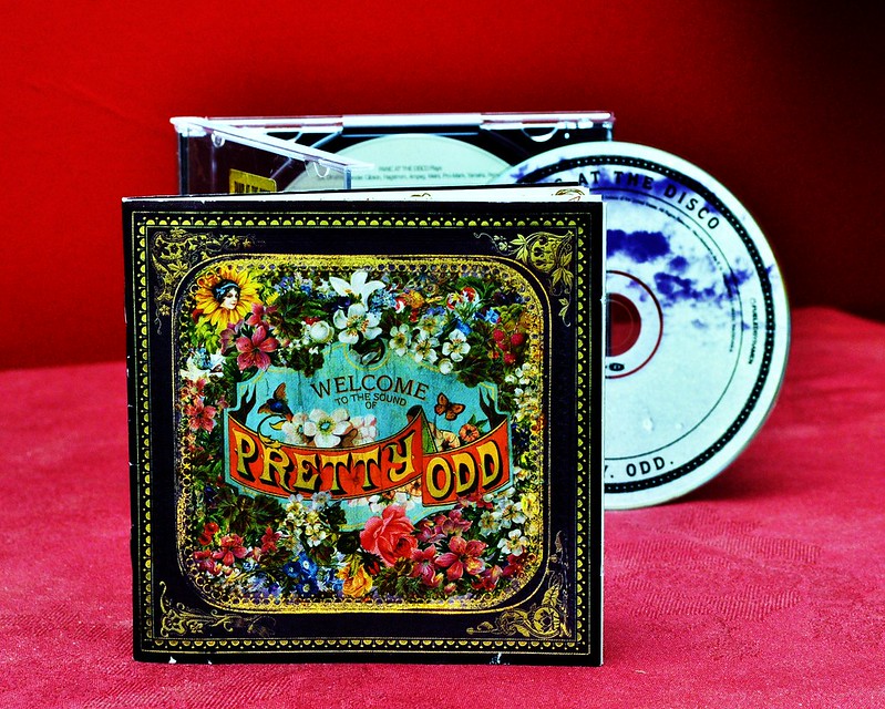
Here is my submission for ODD. I'll hopefully catch up with week 1 tomorrow.

Pretty Odd by beckyboy101, on Flickr

Pretty Odd by beckyboy101, on Flickr
- Messages
- 9,095
- Name
- Mandy
- Edit My Images
- Yes
Nice odd picture I like it plenty off bright colours good start.
- Messages
- 13,760
- Edit My Images
- Yes
A nice idea for odd, well lit and nice and bright - Welcome to the 52 Michael 
- Messages
- 8,398
- Name
- Lynne
- Edit My Images
- Yes
Hi Michael & welcome 
Good start , nice n sharp , great colors .......a little pick is the BG ( though I know how difficult they can be ! )......maybe a large sheet of paper to create an infinity curve might work to lose the darker area rhs ?
Great start & I look forward to seeing more from you

Good start , nice n sharp , great colors .......a little pick is the BG ( though I know how difficult they can be ! )......maybe a large sheet of paper to create an infinity curve might work to lose the darker area rhs ?
Great start & I look forward to seeing more from you
- Messages
- 646
- Name
- Michael
- Edit My Images
- Yes
Week 1 Line
Struggled a bit with this getting the focus and exposure right. Not entirely happy even now

Week 1 Line by beckyboy101, on Flickr
Struggled a bit with this getting the focus and exposure right. Not entirely happy even now

Week 1 Line by beckyboy101, on Flickr
- Messages
- 646
- Name
- Michael
- Edit My Images
- Yes
Odd indeed. Nice composition and bright link.
My eye is drawn to the slight line on the all near the the top LH corner of the CD.
Thanks. There is a flaw in the wall and I didn't have time to re-plaster and paint
Hi Michael & welcome
Good start , nice n sharp , great colors .......a little pick is the BG ( though I know how difficult they can be ! )......maybe a large sheet of paper to create an infinity curve might work to lose the darker area rhs ?
Great start & I look forward to seeing more from you
Thanks. I agree about the background I do need to go and get some background materials etc
Very nice odd picture nice and bright and the composition is good.
Nice picture, bang on theme, and I like the colours too!
Good take on the theme. Really like the colours.
A nice idea for odd, well lit and nice and bright - Welcome to the 52 Michael
Thank you for all your comments
- Messages
- 9,095
- Name
- Mandy
- Edit My Images
- Yes
Like your take on the line theme nice and sharp focus and good composition.
- Messages
- 646
- Name
- Michael
- Edit My Images
- Yes
Thank youtwo good pictures that fit the themes well, good start
Thank youLike your take on the line theme nice and sharp focus and good composition.
Thank youI really like your choice for the line theme....very clear and crisp
Not quite sure on this one, would it be better without the ruler?
I put the ruler to the side so It didn't impose to much on the shot but felt it was needed as It'd be rather hard to get the line without a ruler.
- Messages
- 6,502
- Name
- Peter
- Edit My Images
- Yes
Odd - Good shot of the CD case/cover. Background has been mentioned
Line - Nice idea. I don't mind the ruler as it was needed to draw the line. The line appears to almost have a shadow effect which makes it look a little strange though. Was there another line drawn on the paper underneath?
Line - Nice idea. I don't mind the ruler as it was needed to draw the line. The line appears to almost have a shadow effect which makes it look a little strange though. Was there another line drawn on the paper underneath?
- Messages
- 646
- Name
- Michael
- Edit My Images
- Yes
There's something not quite right about the pencil - it looks convex - but apart from that good compo and idea.
Not seeing the convex but that could be my laptop screen (seen better days)
Good image Michael
I have no idea why, but I want to clone out the very small reflection of the drawn pencil line on the side of the pencil
Hadn't noticed the reflection. That's the sort of thing I miss
Odd - nice idea and good colours / lighting.
Line - for me the ruler doesn't add anything, but it's a good on theme take.
The Idea was my daughters as its her CD and as soon as I mention the theme was Odd and was struggling for ideas she produced the CD.
liking line - that is the definitition of a straight line you have there. nice and bright, good choice of aperture to have it all in focus, and sharpness doesn;t seem to have suffered as a result.
I did try a few with different apertures but this just seemed to fit better.
Odd - Good shot of the CD case/cover. Background has been mentioned
Line - Nice idea. I don't mind the ruler as it was needed to draw the line. The line appears to almost have a shadow effect which makes it look a little strange though. Was there another line drawn on the paper underneath?
Having looked I had 2 or 3 pieces of paper and I think that line is the indent on the sheet below from when I drew the line and the top sheet has moved ever so slightly
A literal and quite novel interpretation of the first theme.
Gerry
Most of the shots I've seen on this theme are of objects etc with lines be they fences, building shutters and the like so I decided to be literal and draw a line
Line, on theme and nicely composed. A nice simple interpretation.
Cheers.
Simple was what i was aiming for
Line: I like playing with pencil, ruler and stuff ... and like your image very much.
 for all your comments
- Messages
- 13,760
- Edit My Images
- Yes
Just what I was thinking, looks like it is floating...... The line appears to almost have a shadow effect which makes it look a little strange though. Was there another line drawn on the paper underneath?
A nice bright image, works very well for me
- Messages
- 8,398
- Name
- Lynne
- Edit My Images
- Yes
Hi Michael
sometimes simple & obvious is the way to go & your image for Line proves that point...plenty of lines going on , nicely sharp ,good focus & a slight shadow under the pencil to add some reality to the image....nicely done mister
sometimes simple & obvious is the way to go & your image for Line proves that point...plenty of lines going on , nicely sharp ,good focus & a slight shadow under the pencil to add some reality to the image....nicely done mister
- Messages
- 646
- Name
- Michael
- Edit My Images
- Yes
Hi Michael
line - I like the composition of this, its a good clean shot! Well done!
Just what I was thinking, looks like it is floating
A nice bright image, works very well for me
Thank youLine: Nice Michael...Many line on show...and I like the Technical / Architectural feel this has.
2 very good shots, I like them. Line is a nice idea.
Hi Michael
sometimes simple & obvious is the way to go & your image for Line proves that point...plenty of lines going on , nicely sharp ,good focus & a slight shadow under the pencil to add some reality to the image....nicely done mister
Thanks for your comments much appreciated and glad you all like it.
- Messages
- 646
- Name
- Michael
- Edit My Images
- Yes
- Messages
- 9,095
- Name
- Mandy
- Edit My Images
- Yes
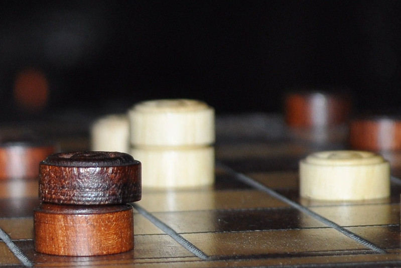
Another classic take on the theme play, fits well nicely done, does look a little noisy tho when viewed on flickr.
- Messages
- 646
- Name
- Michael
- Edit My Images
- Yes
Another classic take on the theme play, fits well nicely done, does look a little noisy tho when viewed on flickr.
Was quite a tight crop on the original which certainly hasn't helped with the noise.
- Messages
- 5,432
- Name
- Andrea
- Edit My Images
- Yes
Hi Michael, and welcome to the 52. I've just had a first look through your thread:
Odd - lovely bright image. The slight crease on the left of the background has already been mentioned, but this is an original take on the theme.
Line - another bright, clean image and a clear interpretation of the theme. Nicely lit, too.
Play - I like the dark tones and texture of the wood in the foreground, and it's well lit. It looks like a little dust on the board to the right, but it doesn't detract from the theme and it's the sort of thing you notice after the shot is taken.
You're off to a great start and I look forward to following your thread


