
You are using an out of date browser. It may not display this or other websites correctly.
You should upgrade or use an alternative browser.
You should upgrade or use an alternative browser.
weekly Marsha's 2013 52 - Finally finished!
- Thread starter The goblin
- Start date
OP
The goblin
<span class="poty">POTY Winner 2015</span></br>
- Messages
- 4,407
- Name
- Marsha
- Edit My Images
- Yes
Alan I did crop the first value shot, but I'll look at going in closer. I liked the window on the left, it also adds a bit more quality to this shop over Primark! Oh and nearly EVERYONE around had a Primark bag, how I didn't get one in number two is beyond me!Value - Primark certainly has value associated with it and #1 typifies what i always see - that no-one leaves without a bag or two. i like the shot but would try cropping the bottom along the line of the dark/light paving stones. Then I might consider the left hand window - but that does add good colour. You did well with #2 to avoid anyone with a bag!! Like the colours
Angles - #1 is decent but other 2 standout. #3 is well framed and would be better with a more uniform sky. #2 is my choice cos good colours, contrast, sky and comp. Floaty and movement feel to it
PS your avatar reminded me so much of a b&wshot of my wife with her father - looking over the shoulder, hair up, smile. But surely you are too young for b&w
As for my avatar. We chose the colour version like this for our album. My photographer did both. So not that old, it was 2004 so still shot on film
Cheers Brian.Hi Marsha, Number 3 is my favourite "Angle" I love the composition and the sky looks ok to me.
Number three needed some tweaking to get the lines straight! Shooting up does nothing for ones verticals! And yes I got a few odd looks. I did feel awkward photographing strangers though and didn't hang around too long!Hi Marsha
Your primark shots are bang on theme, if cheap and cheerful is value then this shop ticks the box. Your photos are a good bit of social commentary, I like them and well done you sticking with it
I think all of your angles images are bang on theme too but if I had to choose, I think it would be a toss up between #2 & #3.
I like the composition of #2, the diagonals through the frame are very appealing to the eye.
#3 has an abstract feel to it for me and quite a geometric look too. We as photographers must attract some strange looks from passers-by getting some of these type of shots
Good work all round Marsha, keep smiling
Yes I'm still smiling, not always, but always trying
Hi allan, a posh exterior but still the same junk inside!Hi Marsha hope you are ok, love all three angle shots wouldn't want to pick one
Primark definitely says value though thats one upmarket looking primark
Last edited:
OP
The goblin
<span class="poty">POTY Winner 2015</span></br>
- Messages
- 4,407
- Name
- Marsha
- Edit My Images
- Yes
This was too close to gluttony for me and I found it difficult coming up with something interesting!
Then I went to Millets farm near Abingdon yesterday.

Greedy = greedy pig = bacon = yum!
Tenuous I know!
Then I went to Millets farm near Abingdon yesterday.
Greedy = greedy pig = bacon = yum!
Tenuous I know!
- Messages
- 19,461
- Name
- Andy
- Edit My Images
- Yes
Hi, Marsha, let"s with bacon love bacon . Pigs are said to be greedy. An on theme there. Lovely colours and even eye contact. A third would be good..I like things in odd numbers.
Value #1 for me with their ooffing great bags full of stuff. Only been in there once and the clothes were just strewn all over he place.
Some cracking Angles their. I do like a good abstract. Of the set, it's #1 for me. The inclusion of the cloud really adds to it.
Cheers and welcome back.
love bacon . Pigs are said to be greedy. An on theme there. Lovely colours and even eye contact. A third would be good..I like things in odd numbers.Value #1 for me with their ooffing great bags full of stuff. Only been in there once and the clothes were just strewn all over he place.
Some cracking Angles their. I do like a good abstract. Of the set, it's #1 for me. The inclusion of the cloud really adds to it.
Cheers and welcome back.
blakester
Shine On Harvest Moon
- Messages
- 6,679
- Name
- Iain
- Edit My Images
- No
Not tenuous at all Missus, bang on theme IMHO.
The first thing that struck me with your image was the lovely rich and deep colour tones, both in the pigs and the background.
Great eye contact as Andy mentioned makes for a simple yet very effective take on the theme.
Being a vegetarian, I couldn't possibly comment on bacon
The first thing that struck me with your image was the lovely rich and deep colour tones, both in the pigs and the background.
Great eye contact as Andy mentioned makes for a simple yet very effective take on the theme.
Being a vegetarian, I couldn't possibly comment on bacon
Brian_of_Bozeat
Jeff
- Messages
- 3,235
- Name
- Brian (not Jeff)
- Edit My Images
- No
Oh, I went looking for a pig too! - Lovely shot, they look very happy greedy little pigs!
- Messages
- 532
- Name
- Ray
- Edit My Images
- Yes
Howdy Marsha, hopefully things are well at such a tough time. On to the photos!
Value, very much on theme, but as you say, inspiration a bit low. You got out and got to work though. First one I actually quite like.
Angle - all work, nice and abstract. They get better as you go along, ending in #3 which I think is fantastic! The colours look fine to me, but if they still bother you, have a play around with adding some saturation.
Greed, lovely shot of some cute little pigs. They've always seemed magical to me - turning grass into tasty bacon!
- Messages
- 4,088
- Name
- Graham
- Edit My Images
- Yes
think I prefer the first of the primark shots, they're all holding their bags with the logo on, and I think it says value, maybe not quality, but certainly value.....
I'm also p[refering the first and third of the angle ones, not many (any) others went with right angles, but they're just as good as any other sort of angle. great composition on teh third - with the shadows making it for me.
for the ickle piggy wiggies, face on and side on in the same shot works really well, and +1 on the colour tones comments , and great POV. Maybe a crop off the right to the other side of the fence post if we're being picky....
I'm also p[refering the first and third of the angle ones, not many (any) others went with right angles, but they're just as good as any other sort of angle. great composition on teh third - with the shadows making it for me.
for the ickle piggy wiggies, face on and side on in the same shot works really well, and +1 on the colour tones comments , and great POV. Maybe a crop off the right to the other side of the fence post if we're being picky....- Messages
- 13,760
- Edit My Images
- Yes
Hey Marsha
Value - Ooo liking that idea, a combination of the 2 shots would be ideal, as I love the youngsters crowded outside with the bags but also love the bright entrance on the second shot - choice of the 2 if forced... the youngsters
Angle - Again a tough one... liking all three a lot, but pick of the bunch is the second shot for me, love the angle and the colours against the sky
I hope things are going ok for you and your loved ones
- Messages
- 4,836
- Name
- Alan
- Edit My Images
- Yes
Hi Marsha
Greed - very good colours on LH pig but RH one looks a little washed out by comparison. I too would crop a little tighter.
Greed - very good colours on LH pig but RH one looks a little washed out by comparison. I too would crop a little tighter.
OP
The goblin
<span class="poty">POTY Winner 2015</span></br>
- Messages
- 4,407
- Name
- Marsha
- Edit My Images
- Yes
Hi Andy, and thank you for the welcome back.Hi, Marsha, let"s with bacon
Value #1 for me with their ooffing great bags full of stuff. Only been in there once and the clothes were just strewn all over he place.
Some cracking Angles their. I do like a good abstract. Of the set, it's #1 for me. The inclusion of the cloud really adds to it.
Cheers and welcome back.
Alas there were only two little piggies in this pen. And they were never alone so it had to be the pair. I do have a shot of the bigger piggy next door on his own.
I like number one as well for the clouds, I just prefer the blue sky in the second one.
I do rather dislike everything about Primark. I like the clothes I'm looking to purchase to be in one piece and preferably on a shelf or hanger, not dumped in a pile!
Cheers Iain. I did the usual basic tweaks in ACR and CS5 which really helped add some depth to the colours.Not tenuous at all Missus, bang on theme IMHO.
The first thing that struck me with your image was the lovely rich and deep colour tones, both in the pigs and the background.
Great eye contact as Andy mentioned makes for a simple yet very effective take on the theme.
Being a vegetarian, I couldn't possibly comment on bacon
And are you seriously a veggie? So you don't drink or eat bacon sarnies?

Hi Brian, they were quite jolly little piggies, one of them was running and snuffling around merrily.Oh, I went looking for a pig too! - Lovely shot, they look very happy greedy little pigs!
Howdy Marsha, hopefully things are well at such a tough time. On to the photos!
Value, very much on theme, but as you say, inspiration a bit low. You got out and got to work though. First one I actually quite like.
Angle - all work, nice and abstract. They get better as you go along, ending in #3 which I think is fantastic! The colours look fine to me, but if they still bother you, have a play around with adding some saturation.
Greed, lovely shot of some cute little pigs. They've always seemed magical to me - turning grass into tasty bacon!
Ray.And thank you I'm doing ok just now. Back to work so keeping nice and busy for a few days which takes my mind off things. I didn't have much inspiration for value as I did a shot for the POTY entry and that's all I was thinking of. I didn't want to reuse that as it's a but of a cop out.
I'll leave the third angle shot as it is for now. It doesn't bother me too much, just wish I could have got it blue properly at the time but the sun wasn't playing ball around there.
Thanks Grahamthink I prefer the first of the primark shots, they're all holding their bags with the logo on, and I think it says value, maybe not quality, but certainly value.....
I'm also p[refering the first and third of the angle ones, not many (any) others went with right angles, but they're just as good as any other sort of angle. great composition on teh third - with the shadows making it for me.
Many thanks DK.Value - Ooo liking that idea, a combination of the 2 shots would be ideal, as I love the youngsters crowded outside with the bags but also love the bright entrance on the second shot - choice of the 2 if forced... the youngsters
Angle - Again a tough one... liking all three a lot, but pick of the bunch is the second shot for me, love the angle and the colours against the sky
I hope things are going ok for you and your loved ones
Thanks Alan, I think it's just the bright light on the piggies coat making it look lighter. They were right over the other side of the pen so this is already cropped a fair bit. I don't like chopping too much off!Greed - very good colours on LH pig but RH one looks a little washed out by comparison. I too would crop a little tighter.
- Messages
- 8,398
- Name
- Lynne
- Edit My Images
- Yes
Hi Hun
good to have you back & with a cracking catch up to boot
Angle......liking all 3 images but #2 is my fave...lovely colors & great angles..almost twisted
AS for Primark....cheap n cheerful so fits the bill nicely
& I love the little piggies , eye contact lifts it , nice n sharp
Well done for sticking with it missus
OP
The goblin
<span class="poty">POTY Winner 2015</span></br>
- Messages
- 4,407
- Name
- Marsha
- Edit My Images
- Yes
Thank you Lisa. Greed works on both countsValue: Great thinking and well took.
Angles: Love all 3 of these but think number 3 wins it for me.
Greed: Another great way of thinking on the theme. Is it greed that we eat them or greed as in greedy pig or both
Even better that it fits it twice!Cheers Lynne. The sun shade in number two was twisted, don't know why but I think it added to the shot, not sure on its effectiveness as a shade mind!Hi Hun
good to have you back & with a cracking catch up to boot
Angle......liking all 3 images but #2 is my fave...lovely colors & great angles..almost twisted
AS for Primark....cheap n cheerful so fits the bill nicely
& I love the little piggies , eye contact lifts it , nice n sharp
Well done for sticking with it missus
Well I'm at work just now and managed to catch some shots for kind this morning. It was what I had planned, and it seems to have worked! I'll check tonight when the monsters are asleep.
I am starting back on the commenting now. For those I've never visited yet, I promise to get there by Christmas!!!!!
OP
The goblin
<span class="poty">POTY Winner 2015</span></br>
- Messages
- 4,407
- Name
- Marsha
- Edit My Images
- Yes
The London Air Ambulance, otherwise known as HEMS (Helicopter Emergency Medical Services) now resides overnight at RAF Northolt. It goes off every morning and stays at the Royal London Hospital for the day. I originally thought of this as the crew on board do an amazingly kind job, dealing with the most critical traumas in London. Then I discovered it's actually the only air ambulance that operates in London so it is actually one of a kind! Well, for now it is, as they're fund raising for another aircraft!
I like number one as it shows the number of missions on the tail. Alas I had to shoot at F8 (with the polariser on) to reduce the shutter speed and get movement in the blades, this has resulted in too much clutter in the background. I have cloned out the biggest eyesore. I left the three transmitters as I know Andy likes things in threes

As the aircraft did it's pre take off checks I was left looking straight up it's tail pipe (ooer missus) and not in the best place for a good shot, but the best for the lighting. I think the pilot knew I was there and kindly did a 360 before he flew away, this gives a nice shot of the crew!

This one I took as it taxiied past me to park for it's pre take off checks. This is definitely the best of the aircraft but being shot at F2.8 and a shutter speed of 1250 (shot in AV) there isn't enough movement in the blades for me.

All C&C welcome.
I like number one as it shows the number of missions on the tail. Alas I had to shoot at F8 (with the polariser on) to reduce the shutter speed and get movement in the blades, this has resulted in too much clutter in the background. I have cloned out the biggest eyesore. I left the three transmitters as I know Andy likes things in threes
As the aircraft did it's pre take off checks I was left looking straight up it's tail pipe (ooer missus) and not in the best place for a good shot, but the best for the lighting. I think the pilot knew I was there and kindly did a 360 before he flew away, this gives a nice shot of the crew!
This one I took as it taxiied past me to park for it's pre take off checks. This is definitely the best of the aircraft but being shot at F2.8 and a shutter speed of 1250 (shot in AV) there isn't enough movement in the blades for me.
All C&C welcome.
OP
The goblin
<span class="poty">POTY Winner 2015</span></br>
- Messages
- 4,407
- Name
- Marsha
- Edit My Images
- Yes
Hi Allan, I'm doing ok thank you.
These were only taken at 8am but the sun was shining (for once) It was quite bright but the polariser helped, without it the colour was rather wishy washy!
These were only taken at 8am but the sun was shining (for once) It was quite bright but the polariser helped, without it the colour was rather wishy washy!
blakester
Shine On Harvest Moon
- Messages
- 6,679
- Name
- Iain
- Edit My Images
- No
Good work Marsha
Nice gentle use of the crowbar
Kidding, I think this works well, I enjoyed your backstory, it adds something to the images. I do like them all, your use of the polariser has brought out some lovely vivid colours.
Oh, and in answer to your question above, yes I am a teetotal, non-smoking vegetarian Jock, some would say I have brought shame on my race
- Messages
- 13,760
- Edit My Images
- Yes
And another for number 2... well worth the wait, really like the angle and captured motion, really looks like it zooming in and across the frame, a great set you have there
I really must get some polarizers.... and come to think of it a 5d3
I really must get some polarizers.... and come to think of it a 5d3
OP
The goblin
<span class="poty">POTY Winner 2015</span></br>
- Messages
- 4,407
- Name
- Marsha
- Edit My Images
- Yes
Iain you're a disappointment to the Scots, how can you be a veggie as well? The Scottish have the fine square sausages, how can you not eat such things?Good work Marsha
Nice gentle use of the crowbar
Kidding, I think this works well, I enjoyed your backstory, it adds something to the images. I do like them all, your use of the polariser has brought out some lovely vivid colours.
Oh, and in answer to your question above, yes I am a teetotal, non-smoking vegetarian Jock, some would say I have brought shame on my race
Thank you for the comments.Thank you Mark. I thin we all do really. How can you not when they do such an amazing job?Number 2 for me, I do have a soft spot for the air ambulance service
Cheers Andy#2 for me as well. Well composed and the 'copter really stands out from the sky. Nice bit of motion blur and good detail.
And another for number 2... well worth the wait, really like the angle and captured motion, really looks like it zooming in and across the frame, a great set you have there
Many thanks DK.
Polarisers are a basic must have if you ask me and as for the 5D3, oh you have to do it! I used to love my 7D, I had a play with it at the weekend and realised I'll probably never use it again! It will remain my back up camera though.I really must get some polarizers.... and come to think of it a 5d3
Well I'm off this week and the weather looks utter garbage :razz: Today wasn't bad but I was thwarted by my wisdom tooth extraction and subsequent rest whilst the pain killers did their thing! Fingers crossed I can catch up towards the end of the week!
- Messages
- 4,088
- Name
- Graham
- Edit My Images
- Yes
helicopters... yay.....
poorly Marsha... boooo......
Helicopters are great for the colours against the blue of the sky, I'd agree that the shutter speed is too high for the third!
first is my fave for the aircraft in its surroundings, good cloning of distractions again, but 2 works super done well as a frame filling crop - even taking off some of the rotor blade to the right!
poorly Marsha... boooo......
Helicopters are great for the colours against the blue of the sky, I'd agree that the shutter speed is too high for the third!
first is my fave for the aircraft in its surroundings, good cloning of distractions again
, but 2 works super done well as a frame filling crop - even taking off some of the rotor blade to the right!
OP
The goblin
<span class="poty">POTY Winner 2015</span></br>
- Messages
- 4,407
- Name
- Marsha
- Edit My Images
- Yes
I live on a helicopter unit that has military helicopters, the Chiltern Air Support Unit (Copper chopper) and the Thames Valley Air Ambulance, so I wait until I go to work to catch the HEMS that we hardly see :bonk:helicopters... yay.....
poorly Marsha... boooo......
As for poorly, I'm AMAZED at how good my gob is today
Eating is a challenge, but chocolate is still ok to eat I am hoping to get out with my camera later this morning Helicopters are great for the colours against the blue of the sky, I'd agree that the shutter speed is too high for the third!
first is my fave for the aircraft in its surroundings, good cloning of distractions again
Thanks Graham, are you saying I should maybe crop closer in number two?
Last edited:
- Messages
- 4,088
- Name
- Graham
- Edit My Images
- Yes
but 2 works super done well as a frame filling crop
re-arrange my words to make a sentence
I'll try again, Number 2 works super-well, when cropped so the heli fills the frame, even if it means losing the rightmost rotor blade.
my logic, its in just (lovely) blue sky, there's no frame of reference for it, it's in a hover, so needs nowhere to move into, lets see the maximum detail from your shiny (hopefully still) new camera.
Last edited:
OP
The goblin
<span class="poty">POTY Winner 2015</span></br>
- Messages
- 4,407
- Name
- Marsha
- Edit My Images
- Yes
I get it! How about these:
I'm a bit reluctant to chop bits off, here's the first crop:

And as you suggested, a much tighter crop:

I was alarmed to see what looked like dust bunnies in this shot (obviously cloned) Thankfully it appears to be my rather grubby polariser!
I'm a bit reluctant to chop bits off, here's the first crop:
And as you suggested, a much tighter crop:
I was alarmed to see what looked like dust bunnies in this shot (obviously cloned) Thankfully it appears to be my rather grubby polariser!
- Messages
- 8,398
- Name
- Lynne
- Edit My Images
- Yes
Hi hun 
So many to choose from but think the 1st of your original images takes top spot for me.....the tops of the tree's & the pylons add context to the shot & good motion in the blades Good on the pilot for indulging you....hope you've sent them the images girlie
So many to choose from but think the 1st of your original images takes top spot for me.....the tops of the tree's & the pylons add context to the shot & good motion in the blades
Good on the pilot for indulging you....hope you've sent them the images girlie
OP
The goblin
<span class="poty">POTY Winner 2015</span></br>
- Messages
- 4,407
- Name
- Marsha
- Edit My Images
- Yes
My reason for loosing the RH blade off was to get the helicopter off centre. Works for me, wait for the line of comments about how the original (uncropped) version is better though. :nuts:
Graham. Hi hun
So many to choose from but think the 1st of your original images takes top spot for me.....the tops of the tree's & the pylons add context to the shot & good motion in the blades
Hi Lynne, thank you. I've been off with since I took these but I will soak to the crew when I get back. I'll probably send them number one prior to cloning out the radar head!
I've taken loads of photos this week, I'm hoping I've got my rustic, vertical and reshoot sorted, just no time to get in the pc due to baking and decorating my son's Lightning Mcqueen birthday cake, hopefully I'll get them on tomorrow night
OP
The goblin
<span class="poty">POTY Winner 2015</span></br>
- Messages
- 4,407
- Name
- Marsha
- Edit My Images
- Yes
Better late than never!
I spent ages driving around pretty little villages looking for thatched cottages, ever since then I see them everywhere I go :bonk: Any in the village of Chalgrove, Oxfordshire there is this pretty pub:

Yes the sky is rubbish and yes the wires are annoying but they were too difficult to clone out across the thatching! Oh and yes the verticals are not all well, vertical! But I was squashed up against the little hedgerow along the road and this was the only angle I could get without getting annoying signs and things in!
Then I drove through the village and found this pretty scene:

Again I was limited for angles as it was bin day and they were EVERYWHERE! I did consider cropping/ cloning out the tree top left but I quite like it!
Any comments appreciated but not expected!
I spent ages driving around pretty little villages looking for thatched cottages, ever since then I see them everywhere I go :bonk: Any in the village of Chalgrove, Oxfordshire there is this pretty pub:
Yes the sky is rubbish and yes the wires are annoying but they were too difficult to clone out across the thatching! Oh and yes the verticals are not all well, vertical! But I was squashed up against the little hedgerow along the road and this was the only angle I could get without getting annoying signs and things in!
Then I drove through the village and found this pretty scene:
Again I was limited for angles as it was bin day and they were EVERYWHERE! I did consider cropping/ cloning out the tree top left but I quite like it!
Any comments appreciated but not expected!
OP
The goblin
<span class="poty">POTY Winner 2015</span></br>
- Messages
- 4,407
- Name
- Marsha
- Edit My Images
- Yes
ALERT THE MEDIA, I have evidence of blue sky in May! I found this willow and shot straight up, who knew how difficult that is on your neck 

Again comments welcome but not expected!
I'm off out to stalk some patterns now, I know exactly what I want as I have already done these before, it's just whether my subjects is willing!
Again comments welcome but not expected!
I'm off out to stalk some patterns now, I know exactly what I want as I have already done these before, it's just whether my subjects is willing!
Last edited:
- Messages
- 4,088
- Name
- Graham
- Edit My Images
- Yes
Looks like rather a nice day out captured there Marsha.
Nice shot of the pub, like the angle and the perspective, wouldn;t worry 'bout the verticals, they're probably not in reality either! Probably best not to try to clone the wires out - the smoothly graduated skies are almost impossible to match.
The village scene really captured the theme of a rustic village, the village green, tulips not been kicked over by local yoofs, gravel tracks, and thatched cottages with chimneys. Like this one.
Snail is too small to be of much interest to me, too little DOF, stump a bit too much in the foreground. (sorry).
But the willow works well - good (especially as it sounds quite awkward) composition, branches(?) leading up from both corners, blue sky squeezing between the greenery, with fluffy clouds for a bonus.
OP
The goblin
<span class="poty">POTY Winner 2015</span></br>
- Messages
- 4,407
- Name
- Marsha
- Edit My Images
- Yes
Looks like rather a nice day out captured there Marsha.
Nice shot of the pub, like the angle and the perspective, wouldn;t worry 'bout the verticals, they're probably not in reality either! Probably best not to try to clone the wires out - the smoothly graduated skies are almost impossible to match.
The village scene really captured the theme of a rustic village, the village green, tulips not been kicked over by local yoofs, gravel tracks, and thatched cottages with chimneys. Like this one.
Snail is too small to be of much interest to me, too little DOF, stump a bit too much in the foreground. (sorry).
But the willow works well - good (especially as it sounds quite awkward) composition, branches(?) leading up from both corners, blue sky squeezing between the greenery, with fluffy clouds for a bonus.
Hi Graham, it's amazing how difficult it is to clone something against the grey sky, I tried and like yo say it's impossible to match!
Yoofs, love it, that is my word of the day! That village was soooooo pretty, but I did feel awkward wandering around with my camera!
The snail is rather dinky, It does look bigger at home:bonk: But yes the stump is annoying!
That willow was very impressive and thankfully not over water so I could get up close and personal with it! I always have Iain in my head 'it's better to go from the left corner' so that's what I went for here, I actually hadn't noticed the right corner as well. The weather was on the change at this point, the clouds were building and the sun was in and out. When itwent in the lovely blue colour vanished, Actually after this shot they all look washed out!
I have some photos from my three hour trip out yesterday, but about 100+ shots need sorting through! I have too many pattern shots to choose from! Also need to pick my reshoot shot! Then I will be all up to date.
But whilst I am at work I shall try and catch up with some commenting!
- Messages
- 4,836
- Name
- Alan
- Edit My Images
- Yes
Hi Masha
Good to see you back on track - some lovely colourful shots recently
Kind - some super shots of the helicopter. Good back story. Beautiful colour rendition. So many to choose from but I think that the last edit with the full frame is the best as it shows more detail of the crew and the copter seems more dynamic with the angle and blades more emphasised by the crop.
Rustic - nice shot of the pub. Again well handled colour. Angle helps in my view because sloping verticals and looming thatched roof all add to the theme. Wires don't bother me too much.
#2 doesn't really grab me because there are too many signs of gentrification of modern stuff in the shot. Also does not have the impact of #1
Vertical - #1 - snail - not sure that the connection to the theme is there for me cos I see it more as a horizontal But again , i just love the colour that you are getting and good focus. Bit at front may be a tad dominant
#2 - willow tree is well captured - real feeling of verticality, maybe even vertigo. Colours again
Thanks for comments on my thread. Yes we had a great time in Spain - I hope to post some shots on Flickr of the Feria at which the police horses were taken which you might be interestered in.
Also, I don't know what you think, but I am impressed with the updated Flickr site - I took the trouble of looking at yours and I think that the Wannabee Beckham shot is top notch - concentration, movement , happiness. And those shots of gerberas are excellent - subtle but concentrated colour and excellent povs. I haven't seen those before have I ??
Good to see you back on track - some lovely colourful shots recently
Kind - some super shots of the helicopter. Good back story. Beautiful colour rendition. So many to choose from but I think that the last edit with the full frame is the best as it shows more detail of the crew and the copter seems more dynamic with the angle and blades more emphasised by the crop.
Rustic - nice shot of the pub. Again well handled colour. Angle helps in my view because sloping verticals and looming thatched roof all add to the theme. Wires don't bother me too much.
#2 doesn't really grab me because there are too many signs of gentrification of modern stuff in the shot. Also does not have the impact of #1
Vertical - #1 - snail - not sure that the connection to the theme is there for me cos I see it more as a horizontal
But again , i just love the colour that you are getting and good focus. Bit at front may be a tad dominant#2 - willow tree is well captured - real feeling of verticality, maybe even vertigo. Colours again
Thanks for comments on my thread. Yes we had a great time in Spain - I hope to post some shots on Flickr of the Feria at which the police horses were taken which you might be interestered in.
Also, I don't know what you think, but I am impressed with the updated Flickr site - I took the trouble of looking at yours and I think that the Wannabee Beckham shot is top notch - concentration, movement , happiness. And those shots of gerberas are excellent - subtle but concentrated colour and excellent povs. I haven't seen those before have I ??
OP
The goblin
<span class="poty">POTY Winner 2015</span></br>
- Messages
- 4,407
- Name
- Marsha
- Edit My Images
- Yes
Many thanks Alan, all comments appreciated.
Ooooo yes I do like the knew Flickr, it looks like they've taken tips from other websites and amalgamated the best bits.
Yep I'd love to see the police horse shots, I've not noticed you on Flickr before so I've added you as a contact.
Glad you like my Wannabe Beckham shot, he's got all the makings of a sportsman, he's got a proper throwing arm as well as skill with a football! And no I don't think I posted the Gerbera shots anywhere else. They were done of my first shots with my knew camera. I was amazed by the way they turned out!
Thanks for comments on my thread. Yes we had a great time in Spain - I hope to post some shots on Flickr of the Feria at which the police horses were taken which you might be interestered in.
Also, I don't know what you think, but I am impressed with the updated Flickr site - I took the trouble of looking at yours and I think that the Wannabee Beckham shot is top notch - concentration, movement , happiness. And those shots of gerberas are excellent - subtle but concentrated colour and excellent povs. I haven't seen those before have I ??
Ooooo yes I do like the knew Flickr, it looks like they've taken tips from other websites and amalgamated the best bits.
Yep I'd love to see the police horse shots, I've not noticed you on Flickr before so I've added you as a contact.
Glad you like my Wannabe Beckham shot, he's got all the makings of a sportsman, he's got a proper throwing arm as well as skill with a football! And no I don't think I posted the Gerbera shots anywhere else. They were done of my first shots with my knew camera. I was amazed by the way they turned out!
Last edited:
blakester
Shine On Harvest Moon
- Messages
- 6,679
- Name
- Iain
- Edit My Images
- No
hi Marsha
Great work on your catch-up, I feel you've done especially well considering the various trials that life has thrown you recently
Your second image for rustic gets my vote, a lovely peaceful scene, technically very good. I particularly like the leading line of the path drawing me into the scene. Nice splash of colour in there too with the flowers.
Vertical, I am undecided on the snail image. I do like the colour tones and general feel of the image but am unsure about the compositition
Your willow tree works well though. I do like this perspective, looking up drawing my eye in and through to the splash of blue sky. Perfect Marsha
OP
The goblin
<span class="poty">POTY Winner 2015</span></br>
- Messages
- 4,407
- Name
- Marsha
- Edit My Images
- Yes
hi Marsha
Great work on your catch-up, I feel you've done especially well considering the various trials that life has thrown you recently
Your second image for rustic gets my vote, a lovely peaceful scene, technically very good. I particularly like the leading line of the path drawing me into the scene. Nice splash of colour in there too with the flowers.
Vertical, I am undecided on the snail image. I do like the colour tones and general feel of the image but am unsure about the compositition
Your willow tree works well though. I do like this perspective, looking up drawing my eye in and through to the splash of blue sky. Perfect Marsha
Hi Iain, I thought last year was difficult, this one has excelled itself so far :shake: But I have taken the oppinion that you have to relax when you can and getting out with the camera is quite theraputic, if not a little frustrating!
The village of Chalgrove is very peaceful, I'm quite sure they were suspicious of a stranger loitering wih a camera! The willow shot worked better than I had hoped
The snail shot has had to go, I agree and although I liked it to start the more I looked the worse it got! It's still on Flickr for now just in case anyone else is curious!Now to tackle my phone (can't access Flickr from here) and upload my latest shots.
OP
The goblin
<span class="poty">POTY Winner 2015</span></br>
- Messages
- 4,407
- Name
- Marsha
- Edit My Images
- Yes
Did Spring happen? Did we blink and miss it? Well I caught this tree in full blossom against the lovely blue sky, both of which have since vanished
I look at this and dream of warmer weather:
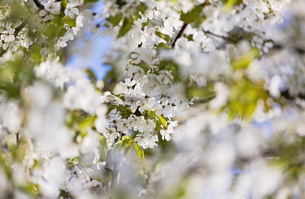
And comments greatly appreciated.
I look at this and dream of warmer weather:
And comments greatly appreciated.
Last edited:
OP
The goblin
<span class="poty">POTY Winner 2015</span></br>
- Messages
- 4,407
- Name
- Marsha
- Edit My Images
- Yes
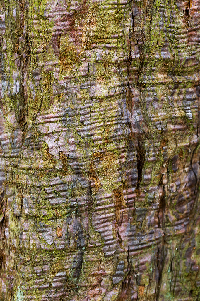
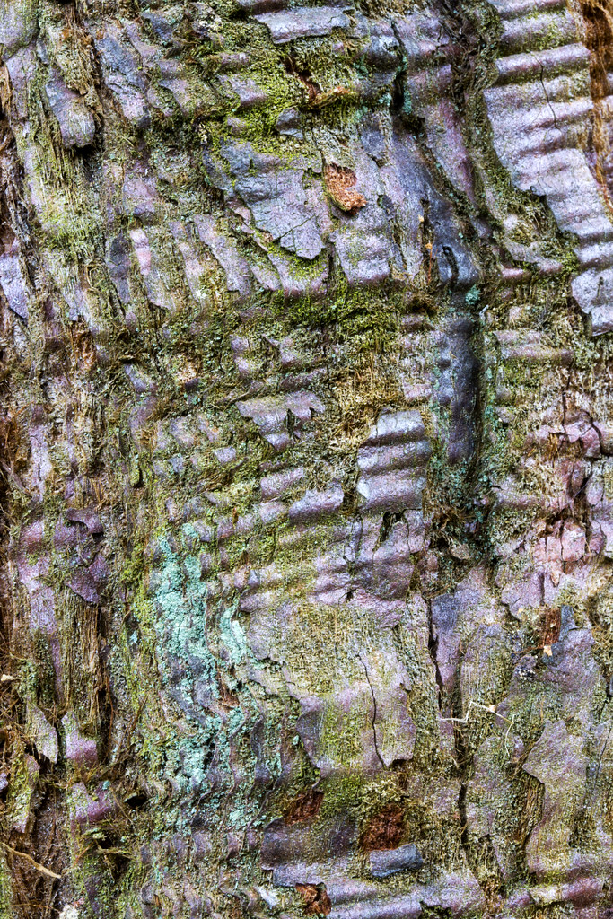
So I may have got carried away wth this week, but there is just too much beauty and amazing things in nature. Only two subjects but two shots of each!
I went to the Harcourt Arboretum to photograph a peacock, but this tree grabbed my attention with its almost corrugated bark and amazing colours:
1,
This is a Sequoiadendron Giganteum (Giant Sequoia)
2,
And my original subject matter, this chap wouldn't sit still initially, then he jumped up on a bench and cracked a pose:
3,
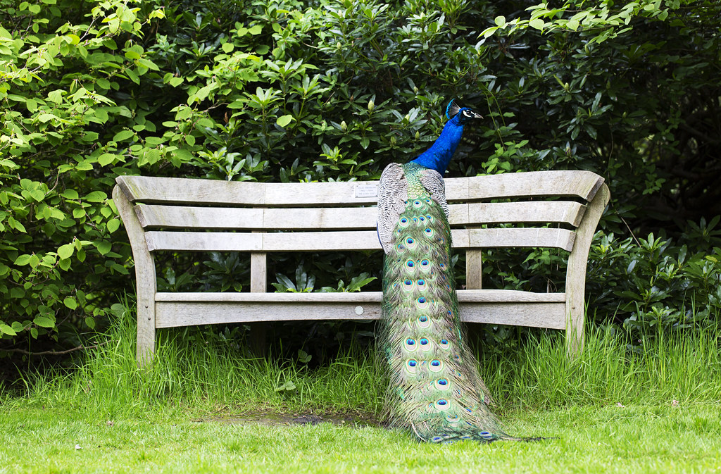
Thankfully he let me get right up close to his tail feathers, in fact so close I think I trod on them! He was still quite twitchy and moved constantly so focus is missed in a few places, but the colours make such a beautiful pattern:
4,
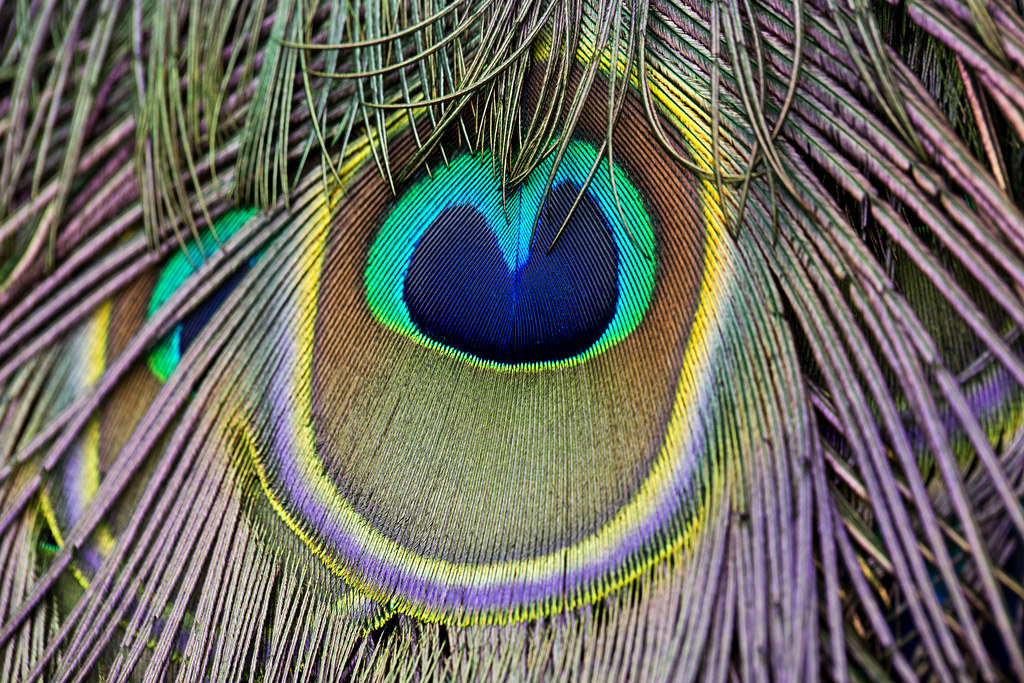
If colour comes up on Saturday I may hit someone:bonk:
All C&C welcome.
I'm finally up to date with my photos, now to look at others!
I went to the Harcourt Arboretum to photograph a peacock, but this tree grabbed my attention with its almost corrugated bark and amazing colours:
1,
This is a Sequoiadendron Giganteum (Giant Sequoia)
2,
And my original subject matter, this chap wouldn't sit still initially, then he jumped up on a bench and cracked a pose:
3,
Thankfully he let me get right up close to his tail feathers, in fact so close I think I trod on them! He was still quite twitchy and moved constantly so focus is missed in a few places, but the colours make such a beautiful pattern:
4,
If colour comes up on Saturday I may hit someone:bonk:
All C&C welcome.
I'm finally up to date with my photos, now to look at others!
Last edited:
Brian_of_Bozeat
Jeff
- Messages
- 3,235
- Name
- Brian (not Jeff)
- Edit My Images
- No
Hi Marsha, I go away for a few days and you post a gazillion shots...
Glad to see you up to date, maybe you can post just 1 next week so I know where to start!
B.
Glad to see you up to date, maybe you can post just 1 next week so I know where to start!
B.