weekly Michael23, A 4th 52 wk project 2014, finished!

Excellent effort on trying to catch up mineral fits the theme but lacks interest for me. The Vulcan shot I love brilliant capture of a superb plane, strong great choice again for the theme and fits it perfectly. Numbers your first image of the train the people in the ground are a bit distracting for me but can't be helped in these circumstances. Wild is simply perfect for me and fits the theme beautifully.
 
Thank you Mandy.

A bit more of a catch up once again

Week 11, Swirl

Week 11, swirl by scilly puffin, on Flickr

Week 22, Texture. Think this might have needed more dof, its the foot of a statue which I think has got lost a bit.

Week 22,texture by scilly puffin, on Flickr

Week 24, Dream. Was I dreaming or was it really there?

week 24 dream/dreamy by scilly puffin, on Flickr

Week 25 , Vertical

Week 25, vertical by scilly puffin, on Flickr

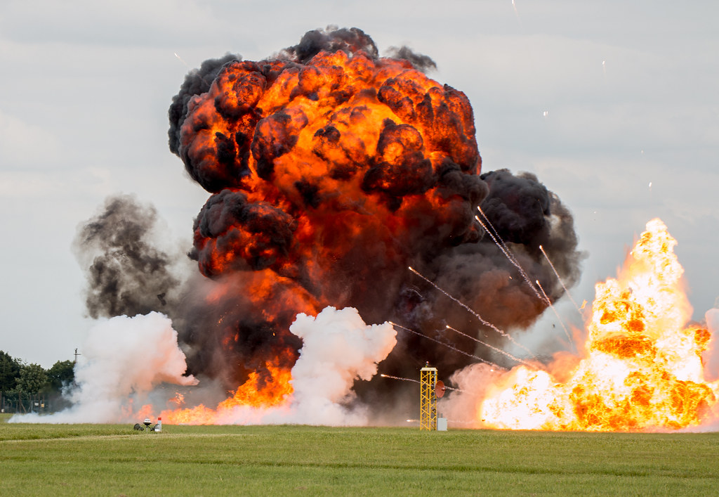
Week 27, Loud

Week 27,loud by scilly puffin, on Flickr

Themes left to do
week 11,reshoot (positive)
week 17,twisted
week 18,fresh
week 20,reshoot (linked)
week 26,yum/yummy
week 28,reshoot (probably texture) and rich
 
Verticals a great one, straight up there, nice prop blur and a pleasing blue sky. (y)

Loud certainly would have been, nicely captured including all of the smoke cloud, and well exposed too, for can feel the heat as well.... just clone out the lights and the post lower left and its there.
 
Swirl - it is, but I'm put off slightly by the vertical line of the wall behind it (which isn't btw!)

Texture - I like this! I like the "texture" of the colour as well as the stone/moss contrast. Nice. Desaturating the greens might help though??

Dream - interesting effect but not sure the torch helps. I quite like it overall, though!

Vertical - super... nice sky, good focus. Perhaps move from centre slightly right and down a touch?

Loud - yes it must have been! The white centre of the flames on the right look blown and "rescued" but not sure what else you could have done other than underexpose by 5 stops and lose detail everywhere else! Great capture and would definitely benefit from a touch of cloning per Graham's suggestion...
 
Mineral - Good record shot of a goods train. Maybe a slight CCW rotation is needed.

Shape - Well executed aircraft shot. Shame about the sky but you've handled the exposure well nonetheless

Numbers - Too many people getting in the way (grrrrr) for this shot to work for the theme I'm afraid

Strong - That Antonov is one heck of an aircraft isn't it. I like the close up of the wheels as that emphasises the strength they must have to cope with

Wild - A super natural history shot. Exposure appears to be spot on as does the focus

Swirl - Certainly fits the theme and you've controlled the exposure well so that there is still detail in the metalwork

Texture - Nice yellow colours in this one without being too saturated

Dream - Not sure about this one but you've definitely achieved what you were after

Vertical - Another well exposed aircraft shot giving a sense of it going vertical

Loud - Great idea for the theme. I can hear it from here.
 
HI Michael

Love that Loud shot....the litle bits to clone out I can't even see cos I'm drawn to the explosion & smoke...really well caught :clap:

Dream.... is this PP or a chalk type painting on a wall ? either way it works (y)
 
Swirl - simple but fits the theme.

Texture - fits the theme, could use a bit dof.

Dream - great image works very well good use off pp skills if it was done in photoshop.

Vertical - wonderful image no crit needed from me.

Loud - that explosion certainly looks as if it would have been loud, nicely captured. Keep up the good work, I look forward to your next set of images.
 
Hi Michael, stand outs for me vertical nicely caught, and loud that is one hell of an explosion you have done well with the exposure there
 
HI Michael

Love that Loud shot....the litle bits to clone out I can't even see cos I'm drawn to the explosion & smoke...really well caught :clap:

Dream.... is this PP or a chalk type painting on a wall ? either way it works (y)
Swirl - simple but fits the theme.

Texture - fits the theme, could use a bit dof.

Dream - great image works very well good use off pp skills if it was done in photoshop.

Vertical - wonderful image no crit needed from me.

Loud - that explosion certainly looks as if it would have been loud, nicely captured. Keep up the good work, I look forward to your next set of images.

Hi Michael, stand outs for me vertical nicely caught, and loud that is one hell of an explosion you have done well with the exposure there

Thanks for the comments there, the dream image was actually a projection straight on to the walls

Now for a bit more of a catch up once again

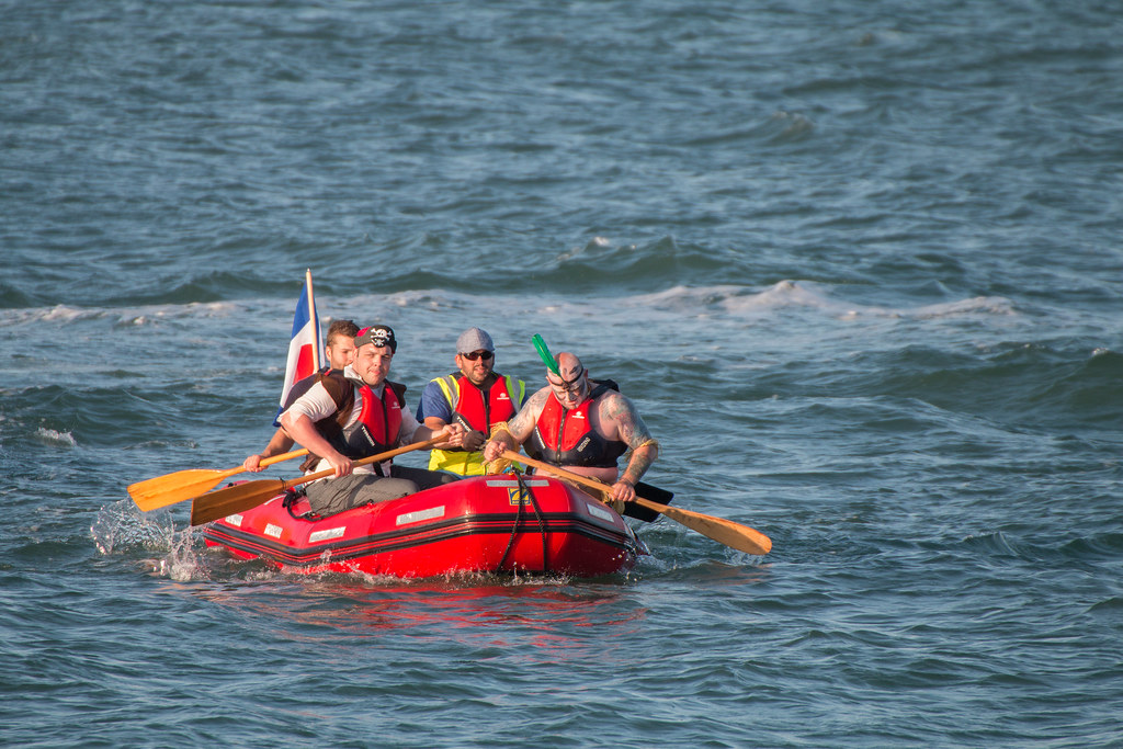
Week 11. Re shoot of positive. These guyshad rowed all the way from portsmouth to the isle of wight, raising money for the insure rescue team

portsmouth to iow rowers by scilly puffin, on Flickr

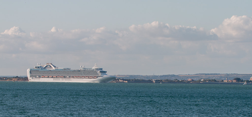
Week 28, rich

Ruby Princess by scilly puffin, on Flickr

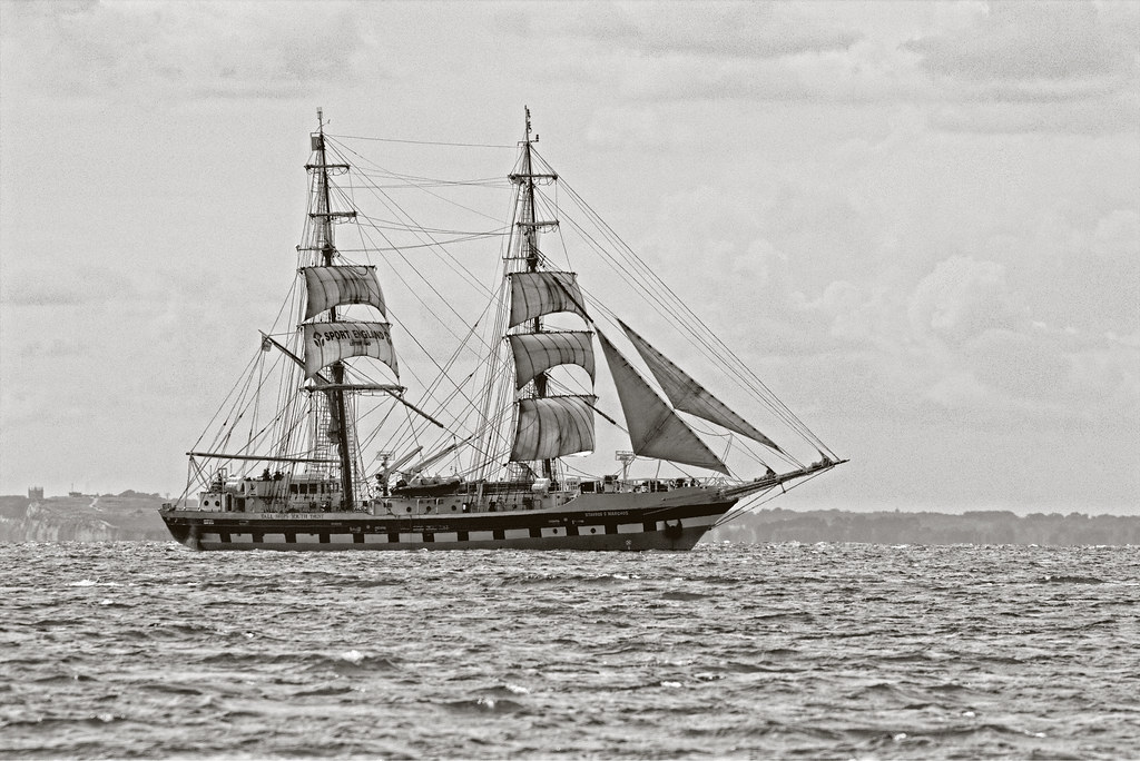
Week 29, skill

stavros s niarchos by scilly puffin, on Flickr

Week 31, architectural

osbourne house by scilly puffin, on Flickr
 
Hi Michael, couple of issues with straightening 2nd and 4th pic positive is a nice shot and skill would be improved with a little more exposure
 
Hi, Michael, I struggle with comments on catch ups so ill comment on my favourites.

Swirl works for me, I feel black-and-white be better in my opinion of course.

Vertical good detail nice motion blur in the propeller. Nice and vivid and bang on theme I'd like a little more space in front of the plane that said I like this one.

Loud well another cracker, you've really captured the loudness of this one because the frozen action and well composed, a little tight at the right maybe but that's a minor point.

Architecture what a wonderful building, the black-and-white works for me maybe not an easy one to photograph, as I feel a little too much space at the bottom. Maybe you didn't have the right lens to get any closer and still keep the building in the frame.

Cheers.
 
Some good shots here, Michael...

Week 11. Re shoot of positive... pretty on theme for me, but composition could be strengthened by having more water to row into. Saturation is good (not too much red) and focus is spot in with nice DOF blurring the water in the far background.

Week 28, rich... sloping waterline might not equal a sloping horizon but it looks off to me! Composition is fine but the subject is the boat so I'd probable prefer a closer crop. Nice detail on the water.

Week 29, skill... lovely boat and I like the conversion on the boat. Not quite so convinced on the conversion for the sea or sky - I'd prefer to see more detail in both, I think (perhaps more contrast/clarity required selectively there?) It's a good take of the ship though and composition/placement is spot on for me.

Week 31, architectural... that's a superb building, I love it. Is there some pincushion distortion going on or is it sloping? My eyes are playing tricks, but it doesn't look particularly straight (which is important for architecture, obviously!). Slight lack of foreground interest for me (to which the response will be, "that's negative space" but it might benefit from something in the FG). The conversion works very well to bring out the detail on both the building and the grass... nice.
 
Hi Michael, couple of issues with straightening 2nd and 4th pic positive is a nice shot and skill would be improved with a little more exposure

Hi, Michael, I struggle with comments on catch ups so ill comment on my favourites.

Swirl works for me, I feel black-and-white be better in my opinion of course.

Vertical good detail nice motion blur in the propeller. Nice and vivid and bang on theme I'd like a little more space in front of the plane that said I like this one.

Loud well another cracker, you've really captured the loudness of this one because the frozen action and well composed, a little tight at the right maybe but that's a minor point.

Architecture what a wonderful building, the black-and-white works for me maybe not an easy one to photograph, as I feel a little too much space at the bottom. Maybe you didn't have the right lens to get any closer and still keep the building in the frame.

Cheers.

Some good shots here, Michael...

Week 11. Re shoot of positive... pretty on theme for me, but composition could be strengthened by having more water to row into. Saturation is good (not too much red) and focus is spot in with nice DOF blurring the water in the far background.

Week 28, rich... sloping waterline might not equal a sloping horizon but it looks off to me! Composition is fine but the subject is the boat so I'd probable prefer a closer crop. Nice detail on the water.

Week 29, skill... lovely boat and I like the conversion on the boat. Not quite so convinced on the conversion for the sea or sky - I'd prefer to see more detail in both, I think (perhaps more contrast/clarity required selectively there?) It's a good take of the ship though and composition/placement is spot on for me.

Week 31, architectural... that's a superb building, I love it. Is there some pincushion distortion going on or is it sloping? My eyes are playing tricks, but it doesn't look particularly straight (which is important for architecture, obviously!). Slight lack of foreground interest for me (to which the response will be, "that's negative space" but it might benefit from something in the FG). The conversion works very well to bring out the detail on both the building and the grass... nice.

Great catch up from you

Thanks all for the comments, much appreciated especially as I posted so many at one go again!

I have adjusted the couple which need strightening, so hopefully they are better.

I really wanted to do osbourne house properly, but we got there a bit late, plus massive grounds to walk round and 2 children that wanted to go to the beach made it a little awkward! There was so much I missed photographically on the isle of wight.

SO below are the starightened pics and an alternative perspective/composition for positive

stavros s niarchos edit by scilly puffin, on Flickr

osbourne house_edited-1 by scilly puffin, on Flickr

edit by scilly puffin, on Flickr

:)
 
Some smashing shots of boats Michael and I think the second version of the galleon-type one looks much better with the extra brightness.
 
Of those 5, I really rather like twisted and half........ how anyone can dislike selective colour is beyond me. :)

The modern train juxtaposed with the older steamy is an entirely suitable image to use it on and it works really well.

Sure not everyone will agree though. :)

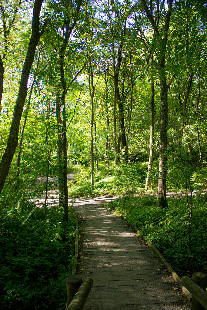
Fresh is quite ordinary. Maybe a lower POV to make more of the path??

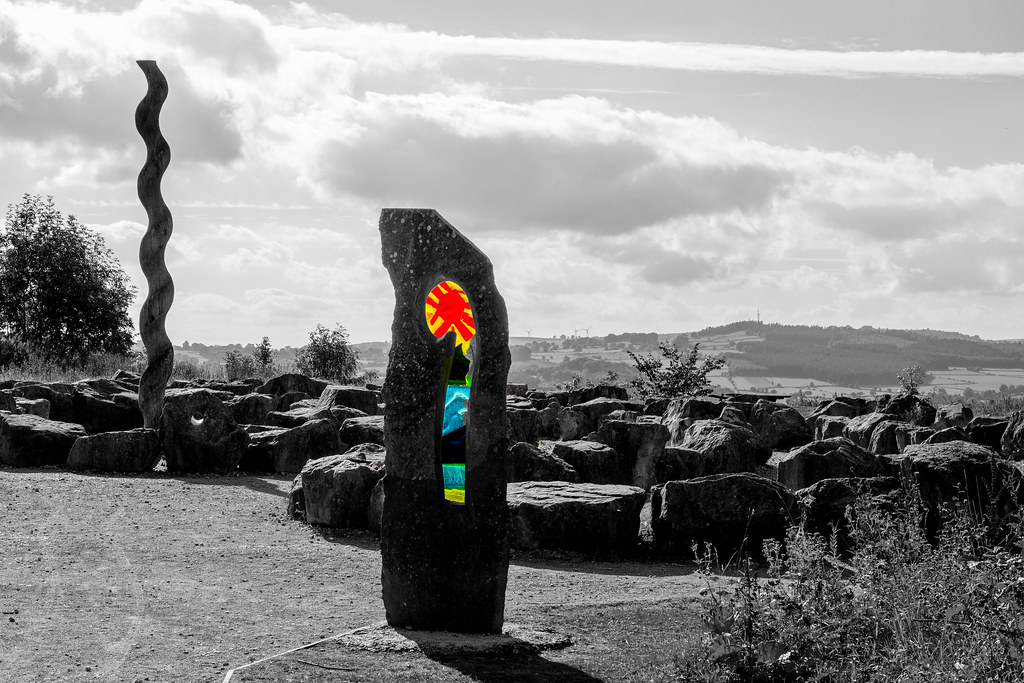
And the sculpture seems rather lost (at first look anyway), looking further seems to be actually carved into a tree stump.

The Danish(?) tram is a nice capture, but the link to the theme is spot on, the sky backs up the wires nicely.

Thanks Graham, really like the sc ones myself, thanks for taking a look and for the comments.
 
Hi Michael

Twisted I like but more focus toward the twisted totem would have lifted it

Texture is a tad to dark with everything blending in too much to really see the carving clearly

Half...partial to SC so works for me but maybe colors need a little boost or some more contrast as feels a little flat somehow ?

Thanks Lynne for your thoughts, much appreciated.

Was back at the same location and I seemed to foget about doing the twisted one again! But I did take another of the sculpture in texture, in light which was no where as harsh as the other one. I might push the colours a little more on half if I get the chance,
 
Should be up to date completely with this catch up!

Week 26, yum/yummy

week 26, yum or yummy by scilly puffin, on Flickr

Week 32, Promise (to remember)

Week 32, promise by scilly puffin, on Flickr

Week 33, Sharp

week 33. sharp by scilly puffin, on Flickr

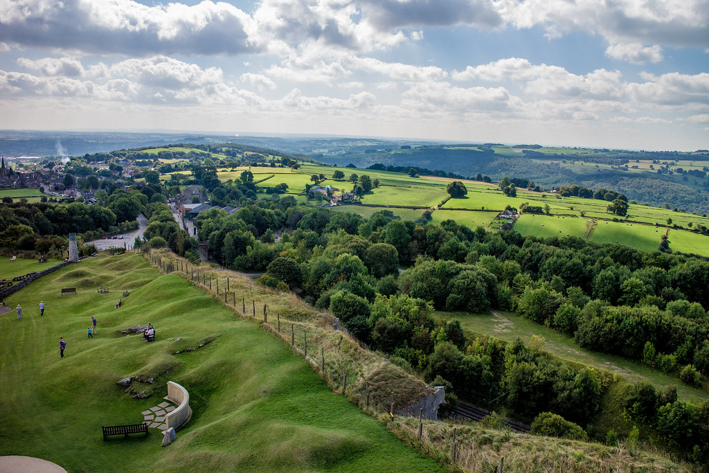
Week 34, Pure, photographed from thetop of my picture for week 37

crich stand view (week 34 pure #2) by scilly puffin, on Flickr

Week 35, sparkle

week 35, sparkle by scilly puffin, on Flickr

Week 36, fall

week 36, fall by scilly puffin, on Flickr

Week 37, communicate/communication. This is crich stand, perhaps a bit of a crow bar for the theme, but it fits for me. History here if anyone fancies a read

Week 37, communicate by scilly puffin, on Flickr
 
Hi Michael

Promise - nice sentimental and moving shot. Well captured and worth a second or third look because it works.

But, for me the standout "picture", despite perhaps not being the most technically perfect of the ones you've just posted, is Fall! I just like the story - the fact you've shot it from "in" the embankment and it makes it look like you've suffered a fall and you're looking back up. Even the tone of the the image and the B&W conversion seems to lend more weight to the story. Well done, it is just a very good image for me. (y)

Thanks Paul, very much appreciated, I'm very pleased with the positive comment on fall, I wasn't sure how well it had had worked.
 
Hi sorry I haven't popp in for a while, I had some issues with my broadband. You have some very good takes on the themes well done. I am still sadly massively behind on my challenge so my apologies for not criting on every image separately.
 
Hi sorry I haven't popp in for a while, I had some issues with my broadband. You have some very good takes on the themes well done. I am still sadly massively behind on my challenge so my apologies for not criting on every image separately.

Thanks for taking a look Mandy, no worries on not doing full blown crit,
 
Lovely images Michael ... I particularly like yummy, nice idea, simple but eye-catching colour. And fall: nice idea again, including lots of BG, and, unlike some, I do like the use of SC occasionally ... works well here. (y)
 
Well done Michael, SHarp is the pick of the bunch for me, what a great moustache, super sharp with shallow enough DOF to blur the BG, the blue awning and the chap in the top hat nearly distract, but the character of the chap keeps bringing you back.

I like cakes too. :D
 
Blimey mate... you have done a lot of catch-ups this year, not like the previous couple of years, glad your keeping in here :)

Twisted - Now that's odd, I'm not so sure with this one, liking the rocks in the foreground and the odd shapes, not so sure about the background and SC

Fresh - crowbar... Nahhhh that's a nice fresh summers day !!!! nice colours and good to be reminded of that blue stuff in the sky !!!

Linked re-shoot - Now that is a wonderful old tram, I'd be tempted to clone out the lad at the front other than that liking the angle and the twisting road/track beyond it (y)

Re-shoot of texture - Not sure the conversion works mate, really hard to distinguish the elements on my monitor... Sorry :)

Half - Half colour, I would have liked it the other way around with the old engine in it's bright glory, can't work out if they were stationary, but I like it :)

Yum/yummy - A bit central but it works well, really liking the olive colours against the light render :)

Promise (to remember) - One I am struggling with, had a couple of idea's but not managed them yet, yours works well, a bit tight on the big numbers but nicely lit

Sharp - Ha haaaaa like that one, cracking capture, good DoF and a great expression caught (y)

Pure - Lovely high PoV, nice colours and liking the undulating ground, I'd lose more of the sky and have more of that !!

Sparkle - OOoooooooo I'd be out polishing that every day, I bet it does roar too

Great catch up mate... or was it me catching up :LOL:
 
Lovely images Michael ... I particularly like yummy, nice idea, simple but eye-catching colour. And fall: nice idea again, including lots of BG, and, unlike some, I do like the use of SC occasionally ... works well here. (y)

Thanks David, comments much appreciated

Another good catch up.

I do like Sharp, sharp dressed man :)

Cracking vista for Pure.

Communicate would have looked great as a long exposure B&W.

Cheers.

Thanks Andy, might have to dig the piece of welding glass out, thanks for looking in.

Well done Michael, SHarp is the pick of the bunch for me, what a great moustache, super sharp with shallow enough DOF to blur the BG, the blue awning and the chap in the top hat nearly distract, but the character of the chap keeps bringing you back.

I like cakes too. :D

Thanks Graham, the bg's that day were a royal pain! Pleased you like it,

Blimey mate... you have done a lot of catch-ups this year, not like the previous couple of years, glad your keeping in here :)

Twisted - Now that's odd, I'm not so sure with this one, liking the rocks in the foreground and the odd shapes, not so sure about the background and SC

Fresh - crowbar... Nahhhh that's a nice fresh summers day !!!! nice colours and good to be reminded of that blue stuff in the sky !!!

Linked re-shoot - Now that is a wonderful old tram, I'd be tempted to clone out the lad at the front other than that liking the angle and the twisting road/track beyond it (y)

Re-shoot of texture - Not sure the conversion works mate, really hard to distinguish the elements on my monitor... Sorry :)

Half - Half colour, I would have liked it the other way around with the old engine in it's bright glory, can't work out if they were stationary, but I like it :)

Yum/yummy - A bit central but it works well, really liking the olive colours against the light render :)

Promise (to remember) - One I am struggling with, had a couple of idea's but not managed them yet, yours works well, a bit tight on the big numbers but nicely lit

Sharp - Ha haaaaa like that one, cracking capture, good DoF and a great expression caught (y)

Pure - Lovely high PoV, nice colours and liking the undulating ground, I'd lose more of the sky and have more of that !!

Sparkle - OOoooooooo I'd be out polishing that every day, I bet it does roar too

Great catch up mate... or was it me catching up :LOL:

Core! Thats a mega catch up! Thank you! Texture was tricky that day, Ihave other pics of it in better light but mot got round to doing anything with., half didnt think about doing it the other way round, i wonder how the green of ducjess would work with the sc? The 222 was just leaving the station whilst duchess was still stationary. Want to try doing a 360 shot from the location I did pure. Thanks again for taking the time to comment on them all.
 
Hi Michael, another good catch up particularly like "yum" though could do with a little crop at the top,
"sharp" he looks like a character
"pure" nice enough landscape though horizon needs to be straightened
"fall" nice use of selective colour
"communicate" very interesting building and a really well exposed pic
 
Time for a ctach up as it looks like you've been busy....

Reshoot - Good shot of these guys rowing ashore. The image has just enough water in it to give it a sense of scale against the large expanse of sea they're rowing across

Rich - These ships are absolutely massive aren't they. A quick straighten of the horizon would help this one.

Skill - A good record photo of the old ship. It's well positioned moving into the spave on the righ hand side

Architectural - The BB&W apprach works well with this subject. Can't help but want a croquet set in the foreground LOL

Twisted - Interesting shapes in the image. Not sure about the selective colours in the centre though but that can be down to my taste

Fresh - That's a nice woodland scene with the eye being drawn along the path into the image

Linked reshoot - Great shot of the old tram. The bright front of the tram works well with the imposing looking dark sky

Texture reshoot - definitely lots of textures in here so hits the theme. I wonder what the colour original looks like

Half - Again my tastes around selective colours are being tested on this one. It works better though as it accentuates the new against the old

Yum - Nice detail of an interesting doorway.

Promise - A poignant image to which the mono conversion suits it well

Sharp - A sharp dressed man who I guess you captured at a steam punk event. The exposure of the face under the hat has been well handled

Pure - I'm not immediately getting the link with the theme but it is a nice scene with some lovely greens

Sparkle - If I enough money to spend on a Bentley I would not get one in these colours. Ghastly. Apologies if this is yours Michael.

Fall - After all I've said again the selective colour works on this one. Was the post bent or is a bit of barrel distortion adjustment needed?

Communicate - Lovely saturated colours and the symmetry of the image is its strength.
 
HI Michael

another mega catch up.....
Yum I really like for the boldness of the unusual olive green paint work against the stark white walls......with a little work I reckon that would make a great framed image for the wall of a cafe :clap: Clone the wire & grate ( bottom right) , boost the colors a smidge & maybe even give it a water color painted finish.......
 
Back
Top