weekly Mike-A: 52 4 2014 (Week Five - Smoke)

Hi Mike & :welcome:

Look forward to seeing your shots :)
 
Thanks for the encouragement everyone :wave:
Updated first post with this weeks picture.
 
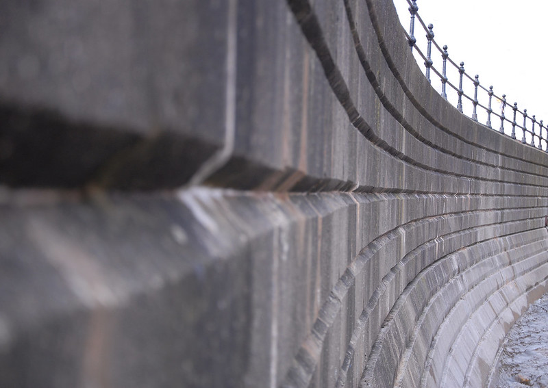
Who says lines have to be straight? Really like the way the lines draw your eye right along the wall.
 
Liking the way the lines draw the eye into the photo.

My eye keeps getting drawn to the bit of something just past the halfway point on the centre line though.

Good start.
 
:clap: Excellent Mike, love the illusion this image produces (y)
 
Well shot, not sure if I wouldn't have tried to crop it tighter, find the beach on the bottom right a tad distracting
 
Thanks for the feedback everyone :)
Did think about shopping the bit of metal out half way along but I've already cloned out a bit of a pub wall behind the railings. Luckily it was a whitewashed wall against a white sky so not too much effort to do.

I nearly submitted this version to the main thread:

Seawall (tight crop)
by MJA1975, on Flickr

but I just prefer the wider crop.

Nikon D200, f/4.8 1/40, ISO 200.
 
Nah Mike, I much prefer the wider crop. It loses its affect like that to me:)
 
I've cloned out the bit of metal and updated this thread and the main picture thread.
Still learning with Photoshop and indeed photography in general, I only got my first DSLR at the end of 2012.

Very much appreciate all your comments and opinions. :)
 
Hi,
have to agree wider shot and with everyone else nice start(y)
 
Nice take on the theme. The curve adds some impact but unfortunately the plain sky hasn't helped. Still prefer it to the cropped version though
 
my eye is drawn to the end of the wall wonder what is beyond, but nevertheless the lines are perfect.
 
my eye is drawn to the end of the wall wonder what is beyond, but nevertheless the lines are perfect.

What lies beyond......
by MJA1975, on Flickr
Shot was taken at the bottom of the steps facing the bridge which is immediately out of the right of the frame in my 'Lines' picture.


Great job. I prefer the wider view and actually would prefer it even wider personally
My widest lens (which this was shot with) is 18mm but on a DX format body.
I'd like to try it with a fish eye converter and see how the lines come out.
 
Hi Mike

perfect curved lines that draw your eye through the image nicely.....as usual I'll go against the majority & opt for the letterbox crop version , not sure why but it has more impact for me(y) ....still be inclind to lose a little of the oof section to the lhs
 

play3
by MJA1975, on Flickr

Bit of a busy week so didn't have much chance to get the camera out. This is my youngest playing Fruit Towers this morning. f/1.8 with a 50mm prime to give a shallow dof. Boosted the brightness a touch in cs6 and cropped in close to the tower.
 
Last edited:
Like this a lot the wall line lead nicely the photo (y)

thanks for the feedback (y)

Hi Mike

perfect curved lines that draw your eye through the image nicely.....as usual I'll go against the majority & opt for the letterbox crop version , not sure why but it has more impact for me(y) ....still be inclind to lose a little of the oof section to the lhs
thanks (y). think the close cropped version would indeed look better with more depth of focus, it'd help give it more impact I think.
 
There's not much cropped off TBH, you could see more of her arm and that was about it.
There'll be more 'play' to be had tomorrow at her birthday party but it's been a busy week!
 
Would also like to have seen a bit more of her arm, but the dof and colours are great
 
Liking both the Lines and the Play images. I think I prefer the crop version of the Play, and as others have said, would prefer more arm in the Play image.
 
nice curvy lines and DOF in the first,

Play i really like, has a real sense of the tower being as tall as the child building it. Nice use of DOF again here too. (y)
 
Back
Top