weekly overbez's 52 in 2014... Week 52 - SUPPORT added... *** FINISHED ***

Week 12 - Linked

Revisit to an Airship Hangar frame I shot for curve last year, shot with the intention of B&W conversion and bringing out the connections and links between the various parts of the frame. Only thing I noticed when I got it on screen, is I wasn't quite underneath it, and it won't pull out either.

Thoughts on the processing much appreciated this week... (y) as always, SOOC image linked below.


Week 12 - SOOC

.
 
Last edited:
Very fast off the mark for the second week(y)
Excellent idea for the theme - spot on.
I think PP is good but hard to work on it I think. because of variation in the sky - light to right and dark to left. But you have managed to reduce the 'shine' on the upper arch to some extent but not wholly matched with bottom arch. Sits well within the frame. Out of interest, why did you invert it from the SOOC shot?
 
Thanks Alan... I'm pushed for time during the week, so if I can get in early, it works better for me at the moment.

I am directly below, looking straight up here, the light (sun for once), was from the top (left) of the SOOC shot (bottom right of the posted) so is only falling on one visible edge of the arch. Central one we only see the bottom, bottom one (on posted shot) the light is on the far side.

Was thinking that the lighter parts of the frame draw the eye most (generally), (in the absence of anything red), so felt the dark on the left, letting the light draw attention across worked better. I also liked the regimented look of the cross wires, against the 'mottled' varaition in the sky.

Cheers.
 
Last edited:
Minor niggle, it looks like you weren't quite central under the beam as the right hand side is a smidge out.

It's a nice symmetrical thing :) and the processing works well with it.
 
Sorry Graham, getting to your thread a little late but just to say your swirl image is inspired (y)
on first look, I wrongly assumed this was done in pp but your explanation corrected my assumption.
I can't add any crit, simply to say I think its a great piece of work, lovely colour tones against the bright white background, well done (y)
 
I like this picture, it is simple and well-observed. The pedant in me notices that although each arch spar touches the corners of the frame exactly, the central spar is not central in the picture (yes, I took a ruler to it, how sad is that?). This fact would prevent commercial use but otherwise I personally love it. Nice (y)
 
Interesting , its like an optical illusion, if you stare at it long enough, the centre no longer appears square, both left and right sides start to bow out ( well they did for me anyways :confused: ) :D, I like it Graham (y)

I also think I prefer the the image in colour, like the white cloud leading to blue sky gradually through the image (y)
 
......just to say your swirl image is inspired (y)
on first look, I wrongly assumed this was done in pp but your explanation corrected my assumption..

Hmm - you know me well! Funny just as I'm swaying gently away from PP'd effects and composites, other 52'ers are making great efforts towards them. Keeps everyone on their toes and makes for some top images.


Minor niggle, it looks like you weren't quite central under the beam as the right hand side is a smidge out.

Correct Mark - I was damn close.... but not quite.

the central spar is not central in the picture

Cheers Martin - it also curves upwards so I was slightly out in 2 dimensions. I did have a dog and a little boy with me, and it were cold so I have more excuses than errors. :D

I also think I prefer the the image in colour, like the white cloud leading to blue sky gradually through the image (y)

Fair enough Phil - as said I did envision this being a B&W, I really need to keep banging away at B&W as I am getting closer to 'getting' it. And also to try not to get dragged into Selective Colour which happens far too easily to me. :)
 
Last edited:
Nice take on the theme and well composed to get the curves going off into the corners. I have to agree with Phil though, that I prefer the original blue sky and also the sunshine highlights on the arches. It just looks a little depressing to me with the grey sky - I've seen enough real ones of those lately :(
 
I can agree with you about the too many grey skies of late. And yes, the colour version does have an appeal.

It was the sharp lines of the steelwork with the texture of the clouds that drew me to the shot and felt the colour diluted that contrast.

Valid point well made, and very much appreciated. Thank you Elaine.
 
Hi Graham, I like the B+W one myself, its very minimal but a strong interesting pattern
I have no problem with the apparent lack of symmetry it works how it is
I think the sky works better in B+W but the metal work is a bit more defined in the SOOC version
works perfect for the theme (y)
 
Hey Graham :)

Linked - I really like that, not sure on your processing, for me the Colour version is nicer and gives a better contrast between the sky/steel, and also think it would look great with the same crop and the blacks darked a bit, such a great structure though, a great find (y)
 
that's a nice shot Graham, I like the symmetry and the detail in the ironwork. processing wise id like a little more contrast in the metalwork/sky but that's just personal taste. very well composed too.(y)
 
Hi Graham, I like the B+W one myself, its very minimal but a strong interesting pattern
I have no problem with the apparent lack of symmetry it works how it is
I think the sky works better in B+W but the metal work is a bit more defined in the SOOC version
works perfect for the theme (y)

Thanks Allan, apprciate the comments... Certainly are some interesting patterns within the structure. You don;t need to be far out though, to not be in the right place.

think it would look great with the same crop and the blacks darked a bit,

needs more contrast as its more grey and white as apposed to black and white.

. processing wise id like a little more contrast in the metalwork/sky but that's just personal taste.

Cheers guys - blacker blacks it seems. Bear that in mind for a re-edit... I did have really dark sky at one stage of the processing... but felt it a bit too dark and foreboding, maybe I backed off a bit too much.

Good mono image. The exposure has been really well handled. Both sky and metalwork contain detail.

Thanks Peter

Hi Graham...I think like the original with the blue sky best, I think it adds that extra bit of contrast against the grey of the steel. I think the angle and the composition are great...perfect for the theme.

Linked... I like the colour version much better (y)

Think it was a split between the blue sky and the grey sky... wondering now if I should have put a desaturated SOOC image up instead of the colour!
 
Last edited:
Symmetry is ever so slightly off but this one really works for me. Great perspective and goo detail. B&W a works really well.

Yup, link this one (y)

Cheers.
 
Linked: A Nice image there Graham. As you've said before, I really like the balance between darker left and lighter right, really adds an extra dimension to this. If symmetry is off, then so be it, I wont even check......I dont think this is a concern really as the focus here is on the lines and diaganals etc......I think we should just enjoy this for what it is and not getted bogged down in such fine critiqing detail (y)
 
Linked - good pattern shot. Think the metal work could do with more contrast to stand out more against that sky.
 
Hi Ya


Like that....mono works really well , you've done a great job with pp to minimise the sun & bright area's , symetry is out a smidge as you acknowledge but it doesn't bug me to much as there's so many lines & curves I find myself continually looking around the image.....yeah...like it (y)
 
Hi guys - thats very much to you all. B&W seeming to make a resurgence for preference in the later comments. :), and the symmetry / POV will definitely be a lesson learned.

Week 13 - Step.

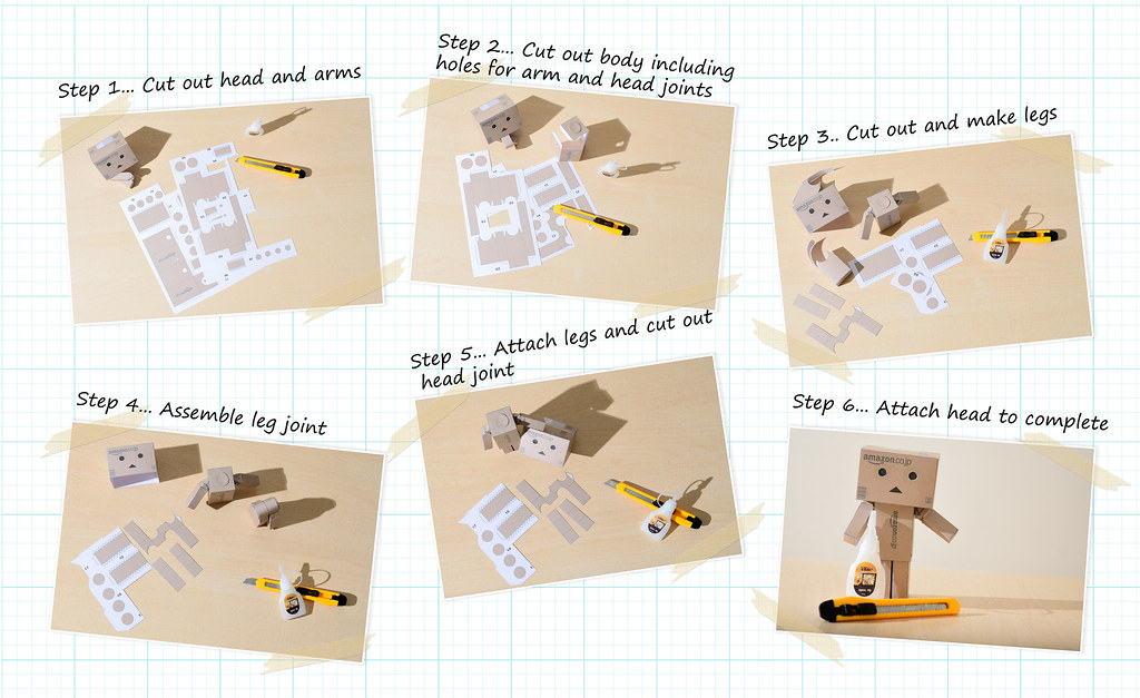
After steps last year, was determined to stay away from anything stair related..... And I've been wanting a Danbo for a while!

Step-by-step


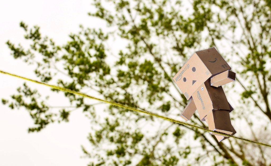
And Step carefully Danbo
[url=https://flic.kr/p/mHJ6bW][/URL]


Week 13 - SOOC
 
Last edited:
Very good Graham (y), certainly brings a smile :) Just one small thing I thought, possibly a different coloured bit of 'tightrope' might have just stood out a little more :thinking: :)
 
step... clever stuff , #1 beautifully done, love the way you have set it out on the graph paper :clap::clap:
#2 just brilliant, nice and sharp, he's a clever Danbo balancing up there(y):clap::clap:

Had just the white BG to start with, but thought it needed something else. Don;t look at the full res too closely (esp round step1), as the thick lines have gone away from the thin ones somewhow. It's 2 layers (one thin evry 1cm, and thick every 5cm), but seems they dont quite stay in allignment.

You've obv not looked at the SOOC shot if you think he's balancing. :D

Maybe a very slight over exp on the 2nd shot -

Possibly.. Was a very grey sky, used flash to light his front as well, applied a slight Orton effect on the tree after as well so this may have brightened it too.

possibly a different coloured bit of 'tightrope'

100℅ right there Phil.. I did have some white string but not a long enough piece.

Have to see where he ends up next. :)
 
Last edited:
#2 for me, although #1 is very clever.

Great perspective and his/her face made me chuckle.

Don't mind the sky and SOOC deserves. :clap:

Divert rope perhaps the separate more?

Good show.

Cheers.
 
Hi Graham both shots work well but I am going for the first one, had a similar idea myself but scrapped it as I couldn't get it right, you have done a brilliant job on it
 
Back
Top