weekly Posiview's TP52 for 2014 Week 52 Support added and FINISHED :)

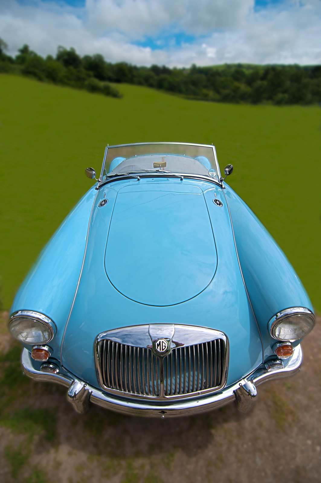
What a cracking photo, Andy! Lovely car, nice colour and well looked after. You've captured it brilliantly and the wide angle distortion really suits it.

A brilliant choice to suit the theme! (btw, an E-type would have looked even better... but now I'm being picky!)
 
Ooh yay, I like :)

Colours, sky, wide angle effect, even the cheeky elbow reflection in the grille. ;)

Shallow dof and wide angle (effect (?)) suit, as does the close crop to the sides, the blurring of the BG has been done pretty well, and had me searching for a definite clue for a while... ;)
 
What a cracking photo, Andy! Lovely car, nice colour and well looked after. You've captured it brilliantly and the wide angle distortion really suits it.

A brilliant choice to suit the theme! (btw, an E-type would have looked even better... but now I'm being picky!)

I will also echo Paul's comments, excellent take for the theme.

Ooh yay, I like :)

Colours, sky, wide angle effect, even the cheeky elbow reflection in the grille. ;)

Shallow dof and wide angle (effect (?)) suit, as does the close crop to the sides, the blurring of the BG has been done pretty well, and had me searching for a definite clue for a while... ;)

Thanks, all.

When I saw the car there was a oooffing great people carrier next to it so I had to do a bit of pruning in post :whistle:

One of my weaknesses with PPing is it have a tendency to rush at times. With this one, although far from perfect, I really took my time.

Chers.
 
I like this. Some nice colours that haven't been over saturated but are still strong enough to make the subject pop. The use of a T&S style effect suits the wide angle shot. A minor crit is your reflection in the chrome - easily fixed I would imagine
 
I like this. Some nice colours that haven't been over saturated but are still strong enough to make the subject pop. The use of a T&S style effect suits the wide angle shot. A minor crit is your reflection in the chrome - easily fixed I would imagine

Cheers, Peter. Missed my reflection :whistle:
 
Hi ya

well, as I was there when you took the shot I can't believe the top job you've done on cloning out the various bits n pieces :clap:The angle the car I love ,the sky & tree's I love but I'm not so sure on the grass....seems far to unreal for me & not suiting the very real car? Sorry if that's harsh:hug:

Couldn't agree more about the grass, it does look very surreal. No option I'm afraid without trying to composite a whole new area in and ATM this behind by skill level (y)

Cheers.
 
Hi Andy .... I like the idea for dream, the angle gives the car a slightly surreal look ... I agree about the grass, but it is dream ..... so maybe it doesn't need to look too real. Good choice for the theme.

Hi Andy,
I agree with Susie we have to remember it not real its a dream, I had one of these in the long distant past, I hated it, felt like my bum was on the road O/H liked it tho'(y)

It's a nice central image, good colours and a nicely blurred background.

Cheers all (y)
 
Hey Andy :)

Dreamy - Well, having seen this car in the carpark, I'm really impressed with what you have done to it, really like the distorted perspective, yet the landscape/sky keeps a nice even flow... Crit, well the only thing for me is a tad picky, your reflection on the grill. Other than that love the bold colours, a good sky (was a cracking day) and the mega effort put in to PP to get the rest of the carpark out, and the way the cars lines also add to the effect - A dreamy image for sure :clap:
 
Hi Andy, love the view of the car the distorted perspective is perfect, however I do feel the BG is a little OTT the foreground and the trees i can live with but the grass looks almost painted in
As a picture of a car though superb :clap:
 
Dreamy: That looks dreamy yeah.... looks like the car is about take off in flight. Colour of the car and soft surroundings add to the dreamy surreal feel. Portrait format works well but perhaps a little more room to the side of the car?
 
Hey Andy :)

Dreamy - Well, having seen this car in the carpark, I'm really impressed with what you have done to it, really like the distorted perspective, yet the landscape/sky keeps a nice even flow... Crit, well the only thing for me is a tad picky, your reflection on the grill. Other than that love the bold colours, a good sky (was a cracking day) and the mega effort put in to PP to get the rest of the carpark out, and the way the cars lines also add to the effect - A dreamy image for sure :clap:

Cheers, Dean. Reflection....grrrrrrr, missed that :)

Hi Andy, love the view of the car the distorted perspective is perfect, however I do feel the BG is a little OTT the foreground and the trees i can live with but the grass looks almost painted in
As a picture of a car though superb :clap:

Cheers, I couldn't agree more about the processing.

Dreamy: That looks dreamy yeah.... looks like the car is about take off in flight. Colour of the car and soft surroundings add to the dreamy surreal feel. Portrait format works well but perhaps a little more room to the side of the car?

Yeah, it is a little tight.

I might add the origional tonight for comparison.

Cheers all.
 
Great car and lovely focus on it. I agree that the grass and the background in general is almost too smooth and surreal as others have said. Still, the subject is neat, albeit tightly cropped at the sides unless that's deliberate in that it's your dream and so you're soley focussed on it and nothing else...?
 
Great car and lovely focus on it. I agree that the grass and the background in general is almost too smooth and surreal as others have said. Still, the subject is neat, albeit tightly cropped at the sides unless that's deliberate in that it's your dream and so you're soley focussed on it and nothing else...?

I had to go this tight as a large people carrier a foot away :bat:

Appreciate the FB (y)

Cheers.
 
Blimey... and there is more :D

I like this different take on the theme, with the vertical down rather than up, a good odd number, not much crit wise, not sure if I would prefer a horizontal crop :thinking: but still, either way it/they stand out nicely on the solid black... was dark in your garden then ??
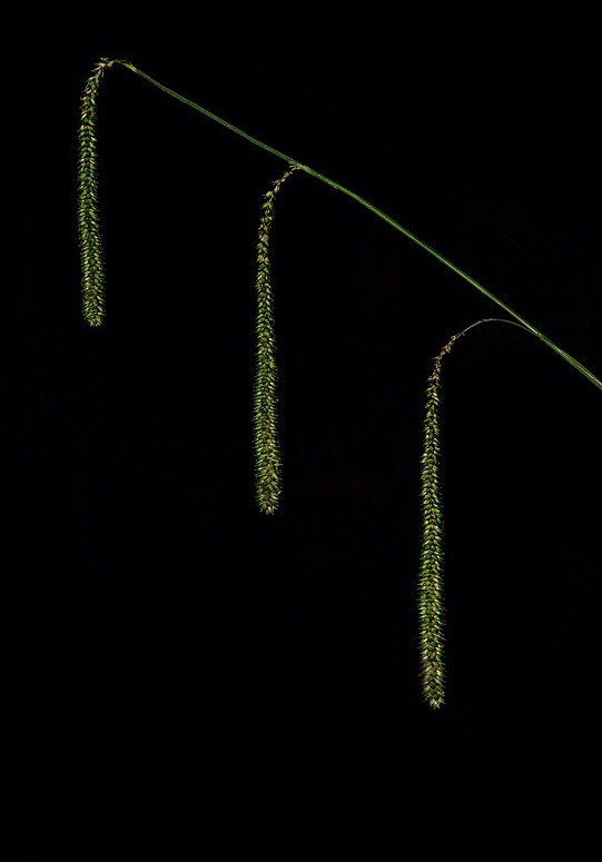
 
Vertical - nice and simple fits the theme, but I feel the subject looks lost in all that blackness.

Thanks, they 'pop' at lot more on my laptop :thinking:.

Blimey... and there is more :D

I like this different take on the theme, with the vertical down rather than up, a good odd number, not much crit wise, not sure if I would prefer a horizontal crop :thinking: but still, either way it/they stand out nicely on the solid black... was dark in your garden then ??

Cheers, Dean, OCF in my garden @ around 18:00 wioth black card at back :)

I might try a crop but I liked the idea of them apearing to fall into a void.

Cheers.
 
I like it. They pop out of the blackness well on the screen I'm looking at, so that's good. I always like a bit of green on black. Take from that what you will, but I'm a geek.
Simple but effective and I agree with DK regarding the downwards vertical
 
I like that car shot. I don't normally do crit but ... it might be nice to make it more ... erm ... teletubbies, maybe more green covering the stone in the foreground and somehow simplifying the horizon. Just a thought, just to amuse me. :eek:
 
Great car shot Andy, love the perspective (y) I did think a little tightly cropped, but you've explained why :)

Yep, vertical works, as you say, simple but effective (y)
 
I like it. They pop out of the blackness well on the screen I'm looking at, so that's good. I always like a bit of green on black. Take from that what you will, but I'm a geek.
Simple but effective and I agree with DK regarding the downwards vertical

Cheers, green on black :)

I like that car shot. I don't normally do crit but ... it might be nice to make it more ... erm ... teletubbies, maybe more green covering the stone in the foreground and somehow simplifying the horizon. Just a thought, just to amuse me. :eek:

Simplify the horizon, good idea, I'll give it a try.

Great car shot Andy, love the perspective (y) I did think a little tightly cropped, but you've explained why :)

Yep, vertical works, as you say, simple but effective (y)

Cheers, it really was a cracking car.
 
Hi Andy, first one for me its an unusual place in the frame which I like, nice light and good detail
it looks simple but the composition is avoiding the obvious :clap:
 
Hi Andy -
Wild - like the comp and the way that you have handled the light to make the eyes pop. Not sure whether i would want the other ear stud to show but on balance have decided that i like the way that the LHS disappears slightly.
Dreamy- Good subject and the pov and perspective add to that dream/surreal feeling
vertical - looks better on Flickr where the colours really shine and the light is good. Looks a little flat on the thread site.
 
Love the dream shot Andy. :clapping:

Vertical lacks something for me, a bit flat somehow?

:cow:
 
Hi Andy, first one for me its an unusual place in the frame which I like, nice light and good detail
it looks simple but the composition is avoiding the obvious :clap:

Cheers, simple was my aim and I do try to avoid the obvious.

Hi Andy -
Wild - like the comp and the way that you have handled the light to make the eyes pop. Not sure whether i would want the other ear stud to show but on balance have decided that i like the way that the LHS disappears slightly.
Dreamy- Good subject and the pov and perspective add to that dream/surreal feeling
vertical - looks better on Flickr where the colours really shine and the light is good. Looks a little flat on the thread site.

Yeah, I missed the LHS lighting wise.

I must get my laptop calibrated as it does look better via Flickr.

Hi Andy,
vertical.. Nice and simple, fits the theme well, the edit works best for me it doesn't look quite such a big black space with a bit of green :)

Thanks,Judi, appreciate the FB.

Love the dream shot Andy. :clapping:

Vertical lacks something for me, a bit flat somehow?

:cow:

'Ello, as above, must get my screen calibrated as it has plenty of detail and colour on my screen :thinking:

Chests all.
 
Hi Andy

Vertical is a nicely taken shot but on my screen (looking at flickr) it looks quite processed in terms of saturation etc. It definitely doesn't look flat to me - if anything, slightly too far the other way.

Nice idea and nicely taken shot though. Love the pop from the background. The only other point which could lead to flatness is that the subject is quite thin - which means it doesn't stand out as much as something fatter. But that's all!
 
must admit, I'm in the "lacking something" camp on this one... the crop is an improvement for me, but somewhere along the way seems to have lost some of the colour... original possibly had a wee bit too much colour, but at least that made it stand out.


edit..... having looked at these on my tablet, the colour issue isn't there.... (both appear saturated). But looking deeper, the crop image has no colourspace associated with it, the "original" has Prophoto RGB.

This could explain the "flat" comments?
 
Last edited:
Hi Andy
Dream, having been there when you were shooting this car, I know the difficulties presented in composition by having other cars nearby. You've done a great job in cleaning up the scene.(y)
I am with Lynne on this one though, the grass appears just a little too surreal for my taste but again it is your creative choice so good work.

Vertical, i will go with the cropped version, it just seems to work better having the plant larger in the frame.
I am also in the "needing something else" camp though. It just seems a little stark against the black background, maybe thats what it is, the background. Perhaps if it had a more complimentary colour it would lift it a little.:thinking:
 
Back
Top