

You are using an out of date browser. It may not display this or other websites correctly.
You should upgrade or use an alternative browser.
You should upgrade or use an alternative browser.
weekly Summer's 52 - week 51 negative
- Thread starter sturisoma
- Start date
- Messages
- 13,760
- Edit My Images
- Yes
That's a very striking image Summer, without reading it, it gave me a bit of a shiver !!!
With the description it works ok - really like it")
With the description it works ok - really like it
The goblin
<span class="poty">POTY Winner 2015</span></br>
- Messages
- 4,407
- Name
- Marsha
- Edit My Images
- Yes
Oooo that is a little spooky I like the silhouette and the composition. My only issue is the dog is a little lost on the horizon especially beside the mound of grass to the left.
I like the silhouette and the composition. My only issue is the dog is a little lost on the horizon especially beside the mound of grass to the left.- Messages
- 4,832
- Name
- Alan
- Edit My Images
- Yes
Hi Summer.
Quite a chilling image. I like th black border and the silhouette treatment and the grimy sky which all add to the sinister feel that i get.
To illustrate the theme I think that the dog should be better defined.
Really good image for me, with or without the theme.
Quite a chilling image. I like th black border and the silhouette treatment and the grimy sky which all add to the sinister feel that i get.
To illustrate the theme I think that the dog should be better defined.
Really good image for me, with or without the theme.
- Messages
- 6,502
- Name
- Peter
- Edit My Images
- Yes
A dog that doesn't pose. Hmmmm we've got two of those  . I like the image. The darkness has been captured well and I think the border really helps.
. I like the image. The darkness has been captured well and I think the border really helps.- Messages
- 19,461
- Name
- Andy
- Edit My Images
- Yes
Hi, Allan, I saw this on my phone but wanted to view bigger.
It is quite a chilling sight. B&W silhouette was the way to go here so well done. You've got cracking blacks here and the composition is good. Tad more drama in the sky maybe?
Built in 1676 - yikes!
Cheers.
It is quite a chilling sight. B&W silhouette was the way to go here so well done. You've got cracking blacks here and the composition is good. Tad more drama in the sky maybe?
Built in 1676 - yikes!
Cheers.
blakester
Shine On Harvest Moon
- Messages
- 6,679
- Name
- Iain
- Edit My Images
- No
Oooo that is a little spooky
What Marsha said Summer but I do understand about how unwilling some models are, especially ones with a leg in each corner
- Messages
- 683
- Name
- Mike
- Edit My Images
- Yes
Hi Summer, really like your together. Silhouettes are really difficult and you have done really well and captured the moody sky. Only crit is that you can't really see the dog. But that doesn't detract form the photo at all - just the theme bit of it, so I shouldn't worry about that at all!
The real challenge this week is to come up with an interesting subject?
The real challenge this week is to come up with an interesting subject?
OP
- Messages
- 2,908
- Name
- Summer
- Edit My Images
- Yes
thanks Mike, but the theme is also the double gibbet - gibbeted together
anyway - onto this week
once again I have been impeded by lack or props/models - this is a big problem for me within this challenge, but my 'normal' choice of photography would be wildlife or landscapes, so I guess I am being taken out of my comfort zone
week 45 - pack
last PACK of cigarettes - about to PACK in the habit? (this is why the pack is crumpled)
edit - just noticed the border is blue - this is something flickr has done because it's cream on my PC

week 45 - pack by moominmama, on Flickr
anyway - onto this week
once again I have been impeded by lack or props/models - this is a big problem for me within this challenge, but my 'normal' choice of photography would be wildlife or landscapes, so I guess I am being taken out of my comfort zone
week 45 - pack
last PACK of cigarettes - about to PACK in the habit? (this is why the pack is crumpled)
edit - just noticed the border is blue - this is something flickr has done because it's cream on my PC
week 45 - pack by moominmama, on Flickr
Last edited:
- Messages
- 4,832
- Name
- Alan
- Edit My Images
- Yes
Hi Summer
Pack - that fits the theme very well - if i had thought of cigarettes i would probably have gone for just a pack but i really like your idea of screwing it up - much more original. Bit of glare in parts of the lighting but shadows give depth to the shot.
Funny about colours - you say that the border is cream on your pc but that flickr has turned it blue. On my monitor it is a good neutral light grey.
Pack - that fits the theme very well - if i had thought of cigarettes i would probably have gone for just a pack but i really like your idea of screwing it up - much more original.
Bit of glare in parts of the lighting but shadows give depth to the shot.Funny about colours - you say that the border is cream on your pc but that flickr has turned it blue. On my monitor it is a good neutral light grey.
blakester
Shine On Harvest Moon
- Messages
- 6,679
- Name
- Iain
- Edit My Images
- No
Nice one Summer
As Alan mentioned above, the crumpled pack adds depth and texture to the image. Against a jet black background, the metallic feel to the pack really stands out. Well lit, with simple composition works. Good work iain
As Alan mentioned above, the crumpled pack adds depth and texture to the image. Against a jet black background, the metallic feel to the pack really stands out. Well lit, with simple composition works. Good work iain
- Messages
- 19,461
- Name
- Andy
- Edit My Images
- Yes
'Ello, good on you for stopping smoking
Great blacks here and as Iain said this contrasts well with the metallic cigarette packet. It's screwed up as you would having finished the last cigarette.
I'd like to see a bit more aggression, for want of a better word, a really screwed up empty packet.
Good show.
Great blacks here and as Iain said this contrasts well with the metallic cigarette packet. It's screwed up as you would having finished the last cigarette.
I'd like to see a bit more aggression, for want of a better word, a really screwed up empty packet.
Good show.
- Messages
- 8,398
- Name
- Lynne
- Edit My Images
- Yes
Hi Summer
love the silhoette shot for Together....nice n dark n brooding, pooch a little lost but can't be helped , overall yup , wins for me
Pack....have you stopped smoking or was this just a prop ? only curious, .
Border is grey on my monitor ? can't help wondering if the shot needs something else but not sure what ? maybe the pack screwed up in an ashtray ? Like the processing , little too central maybe ? Crikey...I'm being really decisive tonight
OP
- Messages
- 2,908
- Name
- Summer
- Edit My Images
- Yes
thanks for your comments Lynne, although I think central was the way to go
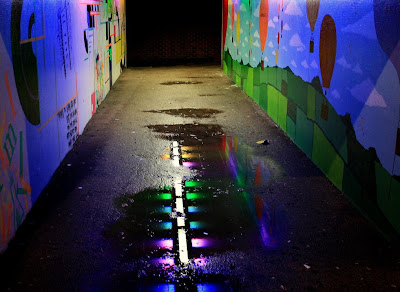
anyway, art, sounded easy. My first thought was public art - a lil fave of mine, except there is none in Basingstoke. Well none worth photographing anyway. They do like to let the kids do paintings in the subways though, and some of them are quite good. In time for Remembrance Day they did this lil gem (topical too). I have added a couple more just to give you an idea (the 3rd one was taken in Jan so not part of this challenge )

week 46 - art by moominmama, on Flickr

week 46 - art part 2 by moominmama, on Flickr

subway lights by moominmama, on Flickr
anyway, art, sounded easy. My first thought was public art - a lil fave of mine, except there is none in Basingstoke. Well none worth photographing anyway. They do like to let the kids do paintings in the subways though, and some of them are quite good. In time for Remembrance Day they did this lil gem (topical too). I have added a couple more just to give you an idea (the 3rd one was taken in Jan so not part of this challenge
)week 46 - art by moominmama, on Flickr
week 46 - art part 2 by moominmama, on Flickr
subway lights by moominmama, on Flickr
- Messages
- 683
- Name
- Mike
- Edit My Images
- Yes
Hi Summer - great idea for Art. Difficult shooting circumstances - the lighting I mean. I especially like the reflection in the last one. I did a crop by scrolling up my screen and the bottom half of that pic without the lights looks great!? Mike
- Messages
- 6,502
- Name
- Peter
- Edit My Images
- Yes
Pack - Nice image which you've greatly improved by scrunching up the pack.
Art - Whilst I prefer the colourful graffiti of #2, I think I have to opt for #1 especially given we have had Remembrance Sunday this weekend.
Art - Whilst I prefer the colourful graffiti of #2, I think I have to opt for #1 especially given we have had Remembrance Sunday this weekend.
- Messages
- 13,760
- Edit My Images
- Yes
Hi Summer
Pack - I like that idea, nice black background and the lighting looks ok on my monitor
Art - Agree the lights are a bit overpowering on one and two, I really like the lights in 3 and the reflections in the water, some cracking Art images
Pack - I like that idea, nice black background and the lighting looks ok on my monitor
Art - Agree the lights are a bit overpowering on one and two, I really like the lights in 3 and the reflections in the water, some cracking Art images
OP
- Messages
- 2,908
- Name
- Summer
- Edit My Images
- Yes
afraid I couldn't do anything about the lights guys, and there's not much room in a subway These images are better taken at night so the lights are on. I will try for a better angle at the weekend during the day. I have now decided to capture all of Basingstoke's subway art 
These images are better taken at night so the lights are on. I will try for a better angle at the weekend during the day. I have now decided to capture all of Basingstoke's subway art - Messages
- 13,760
- Edit My Images
- Yes
Look forward to seeing them
- Messages
- 683
- Name
- Mike
- Edit My Images
- Yes
Hi Summer, I was thinking of something likethanks Mike, I tried a reshoot of the last one and it turned out completely different (no reflections) so it just goes to show how all the elements come together to make the image stand out
Works for me. Hope you don't object to the edit - feel free to remove if you do.
The goblin
<span class="poty">POTY Winner 2015</span></br>
- Messages
- 4,407
- Name
- Marsha
- Edit My Images
- Yes
Hi Summer,
Pack, great idea to crumple it and well done for giving up, I hope it's going ok? Nice composition and black background too.
Art, number one is better for the theme being topical for Remembrance Day but it looks a little soft, or is that the art work? Number two wins it for me with better detail and I really like the composition.
- Messages
- 1,513
- Name
- Alex
- Edit My Images
- Yes
Hi, great find and well captured. Looks like really detailed artwork.
I think I like #2 and #3, especially the lights in the #3.
Nice work!
I think I like #2 and #3, especially the lights in the #3.
Nice work!
- Messages
- 2,861
- Name
- Bob
- Edit My Images
- Yes
Good idea for the ART theme, it also occured to me but I had a feeling someone else would do it. (There's so much of it about these days!!)
I like the one with the reflections but I would choose art part 2 with the off-centre vanishing point. They are all suitable for that dutch angle type of shot, too.
I like the one with the reflections but I would choose art part 2 with the off-centre vanishing point. They are all suitable for that dutch angle type of shot, too.
- Messages
- 2,820
- Name
- Mark
- Edit My Images
- Yes
Hi Summer, sorry if I've missed a few of yours; I hope not.
Age, I actually prefer the first version for its abstract nature. Very nice.
Spread is a nice shot; I know nothing about taro so wouldn't have known it fitted the theme!
Together is a very moody shot, and bang on theme. Nice composition, though I only saw the dog there once you'd pointed it out.
Pack is nicely shot; great exposure. Not a nice subject, but bang on theme
Art; all three are good and on theme, but number three is my favourite for its vivid colours and reflections. I love it!