weekly Superpippo's 52 in 2014 Week 52 - Support added and FINISHED

saw this on Flickr this morning and loved it then, as I do now. (y)

Cracking colour on the needles, and with the glut of airshow pics there's been, the blue sky makes it very much like a red arrows formation flying effect. (I'm presuming that is an actual sky..:thinking:)

Super sharp, as they would have to be, and well composed to boot. :)
Thanks Graham
yes it is an actual sky.
Most pleased with the way that the needles have been arranged. - took ages cos there are 3 different sizes there and with my eyesight I went cross eyed trying to arrange them.
When the theme came up Mrs SP immediately knew what I should use as props. In this house no one walks around in bare feet :)
 
.....

Thx DK - similar comments to Andy.
Creepy... I am trying to multi-quote lately on all shots before reading others comments, so I may repeat what others say, but want to put my opinion over without being lead by others... doesn't always work :)

Sharp - Ooooo VERY pointy, I did see you said it was sky, what a great idea, really well lit needles, nice shine and love the composition :thumbs

Pure - Like how you have done that, the tight crop really suits, my eye is drawn to the 'Pure' straight away due to your highlighting, very effective way as there is lots of other text, well lit - Perfect for the theme, another (y) from me :)

Thanks DK
No crit meant about some of your points being like Andy's - it just means that if I reply to one then the replies are apt to the other IYSWIM - being a bit lazy on my part. :) Also when comments are similar that indicates something to me that I might want to address.
 
Hi Alan, two great pictures! Sharp is definitely that and I really like the red arrow take... very original and clever. Looking at it zoomed in on Flickr, you can really see the focus is nailed - well done. Lighting is also good which can be difficult for shiny metallic things!

Pure - again, super clever here. For a PABD shot, it's exceptional (i.e. it most certainly isn't a PABD shot for me) and the only tiny crit I could offer is that the reflections in the LCD display are very slightly distracting. Otherwise lighting is perfect and the sun on the Pure really makes that shot.

:clap: all round, Alan.
 
Hi Alan, very nice shot for sharp I first saw it on my phone and like Graham thought red arrows, excellent composition,
nice to know you also live in a house where your feet are in constant danger. :eek:
Pure works for me, good idea to highlight the name, station not available whats all that about, take it back its broken :)
 
I just love this one Alan ... ...each point is so perfectly placed, and for some reason (not sure why) the sky really works as a background...a simple but striking image :clap:

Ooops I missed Pure, that was for Sharp :) super little highlight there on the Pure...and bang on theme.
 
Last edited:
Hi Alan

my god ,so far behind .........I really do apologise :crying:

In no particular order :

Sharp.......brilliant idea.....a 1st quick glance had me thinking it was actually the Red Arrows or similar ! Lovely blue sky,needles look sharp & focused perfectly, splash of gold contrasts well & like the composition :clap: No crit from me

Promise.......have to confess it looked a little snappish to me as well, your words add context & then it kinda works , but possibly not one of your best

Architectural.......well framed , good lead in line with the not quite central frame & everything sharp (y) The only niggle for me & it maybe the fault of my netbook , is the whites seem to have aslight blue cast.....as I say , this could be my netbook screen

Half......like this, good composition , great focus & use of DOFplus a hint of sgadow to help ground the back item (y) Again , the netbook may be misleading me but there seems to be a lighter area around both items which detracts from a nice dark bg ?

Skill....mono works though I also wonder what a slightly destaurated color version would look like ? Slight blur to the hand/axe to show movement & a hint of vignette to concentrate the eye....PABD maybe but you got a lot of elements working well together (y)

Rich........quirky angle I'm not sure of but don't dislike , my OCD is happy with al the coins pointing almost the same direction, ray of light coming down & continuing in to the slight reflection....yeah think I like this one(y)
 
Hi, Sharp, cracking idea, made me chuckle. Pure, PABD, we all need them sometimes. I do like the irony of Pure and 'station cannot be found' :)

Cheers.
 
Hi Alan, two great pictures! Sharp is definitely that and I really like the red arrow take... very original and clever. Looking at it zoomed in on Flickr, you can really see the focus is nailed - well done. Lighting is also good which can be difficult for shiny metallic things!

Pure - again, super clever here. For a PABD shot, it's exceptional (i.e. it most certainly isn't a PABD shot for me) and the only tiny crit I could offer is that the reflections in the LCD display are very slightly distracting. Otherwise lighting is perfect and the sun on the Pure really makes that shot.

:clap: all round, Alan.

Thanks Paul - agree that reflections in LCD are annoying- best that I could do at the time

Hi Alan, very nice shot for sharp I first saw it on my phone and like Graham thought red arrows, excellent composition,
nice to know you also live in a house where your feet are in constant danger. :eek:
Pure works for me, good idea to highlight the name, station not available whats all that about, take it back its broken :)

Thx Allan. Pins, needles, buttons, beads - you name it - nut those stitch ripper things are the worst:eek:
The DABs are temperamental without the aerial up!

I just love this one Alan ... ...each point is so perfectly placed, and for some reason (not sure why) the sky really works as a background...a simple but striking image :clap:

Ooops I missed Pure, that was for Sharp :) super little highlight there on the Pure...and bang on theme.

Thx Susie

Hi Alan

my god ,so far behind .........I really do apologise :crying:

In no particular order :

Sharp.......brilliant idea.....a 1st quick glance had me thinking it was actually the Red Arrows or similar ! Lovely blue sky,needles look sharp & focused perfectly, splash of gold contrasts well & like the composition :clap: No crit from me

Promise.......have to confess it looked a little snappish to me as well, your words add context & then it kinda works , but possibly not one of your best

Architectural.......well framed , good lead in line with the not quite central frame & everything sharp (y) The only niggle for me & it maybe the fault of my netbook , is the whites seem to have aslight blue cast.....as I say , this could be my netbook screen

Half......like this, good composition , great focus & use of DOFplus a hint of sgadow to help ground the back item (y) Again , the netbook may be misleading me but there seems to be a lighter area around both items which detracts from a nice dark bg ?

Skill....mono works though I also wonder what a slightly destaurated color version would look like ? Slight blur to the hand/axe to show movement & a hint of vignette to concentrate the eye....PABD maybe but you got a lot of elements working well together (y)

Rich........quirky angle I'm not sure of but don't dislike , my OCD is happy with al the coins pointing almost the same direction, ray of light coming down & continuing in to the slight reflection....yeah think I like this one(y)

Thx for the detailed comments Lynne. Take your point about the slightly lighter areas around the cat items , but on the stately house, whites look ok on my screen.

Hi, Sharp, cracking idea, made me chuckle. Pure, PABD, we all need them sometimes. I do like the irony of Pure and 'station cannot be found' :)

Cheers.

Thx Andy - I did not see the irony re the info on screen - just that I put down the aerial to make it a cleaner shot - but you are dead right and it makes me smile now.(y)
 
Alan ... I can't keep up with all this commenting I'm afraid, but I just want to say I agree with all that's been said about your SHARP shot. (y)
 
Pure is sharp, clear and clean, wonder if the light on the "PURE" is necessary or not.

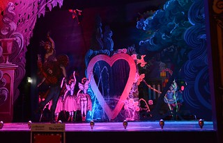
Sparkle... WOWZERS! there is an image full of sparkle.. Hard to know where the photo starts and where any embellishments take over. Love the shadow formed behind the fairy.

In the absence of any confession to using Photoshop brushes here... I am going to stick my neck out and say fantastic job producing this. Wondrous stuff.

If it is indeed all managed in-camera, then you have even more admiration from me!
 
Hi Alan, no idea what that is a painting maybe? very bright and bold colour and the fairy really stands out almost 3D ish, it is very kitsch as you say and nothing wrong with that
fits perfectly with the theme
I am just very intrigued as to what it is :thinking:
 
Pure is sharp, clear and clean, wonder if the light on the "PURE" is necessary or not.

Sparkle... WOWZERS! there is an image full of sparkle.. Hard to know where the photo starts and where any embellishments take over. Love the shadow formed behind the fairy.

In the absence of any confession to using Photoshop brushes here... I am going to stick my neck out and say fantastic job producing this. Wondrous stuff.

If it is indeed all managed in-camera, then you have even more admiration from me!

Thanks Graham. All done in camera but with the addition of a cross screen filter in the D7k. wider shot without the filter below

Hi Alan, no idea what that is a painting maybe? very bright and bold colour and the fairy really stands out almost 3D ish, it is very kitsch as you say and nothing wrong with that
fits perfectly with the theme
I am just very intrigued as to what it is :thinking:
Thanks Allan.

It is a tableau on Blackpool front. Consists of moving and spinning figures across the stage. The figures in the shot are life size. Various water fountains, neon lights and the fairy rises slowly up. All to a Kylie tune - told you it was Kitsch :LOL:

DSC_8836 by Superpippo0547, on Flickr
 
[QUOTE="


Thanks Allan.

It is a tableau on Blackpool front. Consists of moving and spinning figures across the stage. The figures in the shot are life size. Various water fountains, neon lights and the fairy rises slowly up. All to a Kylie tune - told you it was Kitsch :LOL:

DSC_8836 by Superpippo0547, on Flickr[/QUOTE]

Thanks for the explanation, I must get to Blackpool this year for the lights have not been for years
 
Thanks for the explanation. Sparkly indeed with nice detail and colours in the fairy.

I might have been tempted to desaturated the lower right circle to draw more attention to the fairly, minor crit, though.

Cheers.
 
[QUOTE="


....... I must get to Blackpool this year for the lights have not been for years

Yes they are surprisingly good in parts. Unfortunately The Tower still has sheeting half way up (about 2 years now) for the painting etc.

Next 2 Friday nights there are also fireworks - see http://www.liveblackpool.info/recre...nt/events/blackpool-firework-championship.php

We went down last night and got some shots from the beach. I have posted one at here which is not too hot but it was an experiment on my part - def needed the tripod
 
Only in Blackpool eh.. :)

All makes sense now seeing the wider shot. But still only a small amount of work post-capture. :clap:
 
Well, I was also very confused Alan, but after reading and seeing that it was "real" and you've shot it in camera, I don't think you could be more on-theme. It's utterly ghastly and you've captured it perfectly :) Sparkly, tacky, bright and plasticky! Superb take for the theme and well caught (y)
 
Sharp - This reminded me of a shot of the red arrows with the smoke coming out of the back. Forgive the pun but those needle definitely appear pin sharp LOL

Pure - Nice clean shot. The lighting works for this image. Adding the bright area suits the theme but I feel distracts from the photo if you know what I mean

Sparkle - Loads of sparkles in this one. I guess they been added in PP but that's not a problem. I certainly feel they add to the image without being too over the top.
 
Sharp- Great idea Alan, love the composition, I didn't see it until I read Graham's reply but yes, Red arrows (y)

Pure- good clean image, touch of light on the word 'Pure' is very clever (y)

Sparkle- I had to Google kitsch :LOL:.....Well I though you'd done it in PP :confused: :)........ Well spotted, its certainly sparkly, good colours and crop (y)
 
Hi Alan sorry for falling so far behind with your thread

Skill - he looks rather afraid than skilful :) and my god do they really have to wear those socks and shorts together?

Half - like it lovely colours and the lighting is spot on

Architecture - what a fine house would not like the maintenance costs mind... its a nice photo the trees on the left are a tad distracting but not much you can do about that I suppose

Promise - your description adds more to the photo than the photo itself if that makes any sense - its a great take on theme very thoughtful

Sharp - excellent the colour and detail on the needles is superb and the sky really adds to it

Pure - that's good could have been cut from a magazine - the tight crop works and like on the word pure catches your eye

Sparkle - lots of sparkles in there the shadow is really strong lots of detail nicely done
 
:LOL: I don't think you could get any more sparkly than that if you tried!

Really well captured and you've succeeded in blending reality, fantasy and all sense of perspective so that I also was confused about whether I was looking at something real, Photoshopped or a blend of the two.
In my mind that makes it a complete success.

Shhhhh . . . don't tell anyone but . . . I like a bit of kitsch now and then too.
I mean, I wouldn't install that in my living room or anything but I'd kind of secretly enjoy looking at it if I saw it in the flesh :oops: :$
 
Hi Alan,

Another catch up person on commenting!

Skill - Yes indeed. I'd be interested in a colour version of this shot. Good motion in the axe whilst not spoiled anywhere else
Half - Nice composition but it weirds me out! (I think it's the face). Very clear - nicely focussed and good black bg
Architectural - I like this very much. Its well framed and the subject is superb. Great colours and so nicely chosen for the theme.
Promise - yes, fitting for the theme, well exposed I think, did you use flash at all for the foreground interest? I can see what some say regarding the thought that it'"snap"
Pure - Yep that's good for me. Fits the theme, the background and object being very simple and clean also makes it feel pure.
Sparkle - not my favourite subject-wise but I think it's well taken with true colours and nice sparkly stars in there, so theme fitting too.
 
Sharp - This reminded me of a shot of the red arrows with the smoke coming out of the back. Forgive the pun but those needle definitely appear pin sharp LOL

Pure - Nice clean shot. The lighting works for this image. Adding the bright area suits the theme but I feel distracts from the photo if you know what I mean

Sparkle - Loads of sparkles in this one. I guess they been added in PP but that's not a problem. I certainly feel they add to the image without being too over the top.

Thanks Peter. wasn't sure myself about the highlight in Pure but thought that it differentiated the shot from one of just a radio

Sharp- Great idea Alan, love the composition, I didn't see it until I read Graham's reply but yes, Red arrows (y)

Pure- good clean image, touch of light on the word 'Pure' is very clever (y)

Sparkle- I had to Google kitsch :LOL:.....Well I though you'd done it in PP :confused: :)........ Well spotted, its certainly sparkly, good colours and crop (y)

Thanks Phil

Hi Alan sorry for falling so far behind with your thread

Skill - he looks rather afraid than skilful :) and my god do they really have to wear those socks and shorts together?

Half - like it lovely colours and the lighting is spot on

Architecture - what a fine house would not like the maintenance costs mind... its a nice photo the trees on the left are a tad distracting but not much you can do about that I suppose

Promise - your description adds more to the photo than the photo itself if that makes any sense - its a great take on theme very thoughtful

Sharp - excellent the colour and detail on the needles is superb and the sky really adds to it

Pure - that's good could have been cut from a magazine - the tight crop works and like on the word pure catches your eye

Sparkle - lots of sparkles in there the shadow is really strong lots of detail nicely done

Thanks for the detailed comments Craig
:LOL: I don't think you could get any more sparkly than that if you tried!

Really well captured and you've succeeded in blending reality, fantasy and all sense of perspective so that I also was confused about whether I was looking at something real, Photoshopped or a blend of the two.
In my mind that makes it a complete success.

Shhhhh . . . don't tell anyone but . . . I like a bit of kitsch now and then too.
I mean, I wouldn't install that in my living room or anything but I'd kind of secretly enjoy looking at it if I saw it in the flesh :oops: :$

Thanks Sarah - it is certainly a bit arresting in the flesh

Hi Alan,

Another catch up person on commenting!

Skill - Yes indeed. I'd be interested in a colour version of this shot. Good motion in the axe whilst not spoiled anywhere else
Half - Nice composition but it weirds me out! (I think it's the face). Very clear - nicely focussed and good black bg
Architectural - I like this very much. Its well framed and the subject is superb. Great colours and so nicely chosen for the theme.
Promise - yes, fitting for the theme, well exposed I think, did you use flash at all for the foreground interest? I can see what some say regarding the thought that it'"snap"
Pure - Yep that's good for me. Fits the theme, the background and object being very simple and clean also makes it feel pure.
Sparkle - not my favourite subject-wise but I think it's well taken with true colours and nice sparkly stars in there, so theme fitting too.

Thanks for the catch up and detailed comments

Hi Alan

Sparkle in deed......love the colors in this...spent quite some time looking & wondering how much was real & how much th result of pp so really nice to see the original whole image(y)

Thanks Lynne. With all that colour etc going on its hard to PP any more wow. :)

Hey Alan :)

Sparkle - A very nice bright image, loads of sparkle, wasn't so sure on the elements popping in the bottom of shot, but now having seen the wider image I think you have given a good compromise, like all the starbursts (y)

Cheers DK
 
Week 37 - Communicate

#1
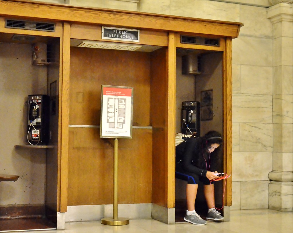
Taken in a public library as well. This looks a bit yellow mellow but I have not been able to tone it down without it looking a funny shade of another colour. The skin tones of the girl and her clothes and shoes are as they were - it was just a bit (lot) dark and bringing it up may have affected the colours


DSC_0466 - Comm 1 by Superpippo0547, on Flickr

#2

DSCF3449- Comm 2 by Superpippo0547, on Flickr

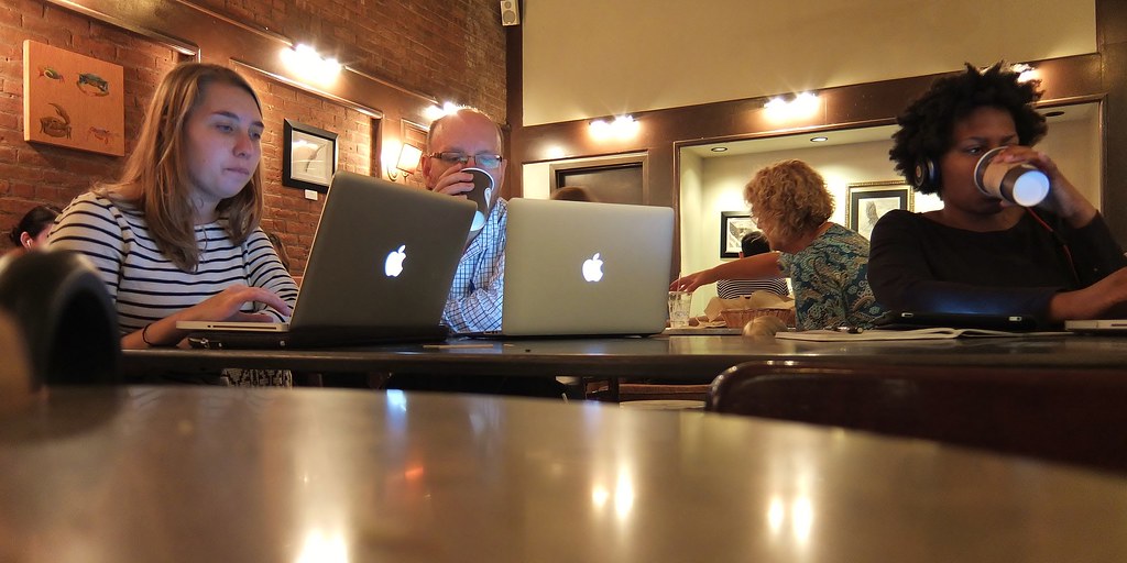
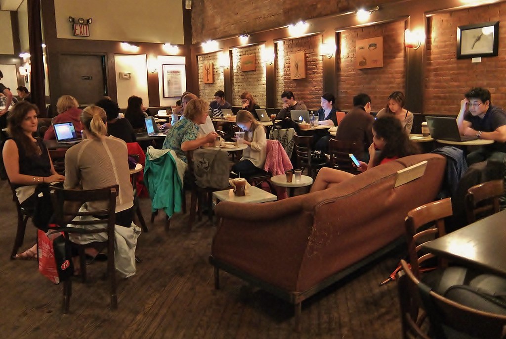
Whilst in New York, apparently it was the 20th anniversary of the beginning of the series Friends on TV and near where we stayed they had temporarily converted a coffee shop to part of the tv set and folks queued around the block to be able to go in and have photos taken on the famous sofa. Our experience of today's New York coffee shops was as below and it struck us that Friends could not be conceived today as nobody would believe that young people sat around in coffee shops and talked. Even the young girl inn the middle is looking at her phone whilst her mom tries to talk to her. The 2 on the left are right out of place

DSCF3451 by Superpippo0547, on Flickr
 
Last edited:
Hi Alan... a monster catch up for you (and for me in commenting)... welcome back!

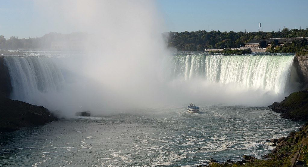
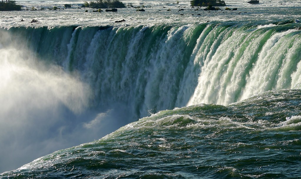
Fall - I really like that shot but it simply isn't on theme at all. Sorry, only kidding ;) Super! For me shot 2 is the better one and the only thing I'd perhaps have tried is stopping down further and perhaps hyperfocusing to get the entire shot front-to-back in focus. But a great capture of something which must have been amazing to see.

Communicate - for me, the story that wins is the first one. A girl on her phone (albeit perhaps using it to play music) whilst taking up a seat in a payphone booth. How communication has moved on. You were clearly dealing with some difficult photography conditions so well done on the capture which is brilliantly on theme and amusing.

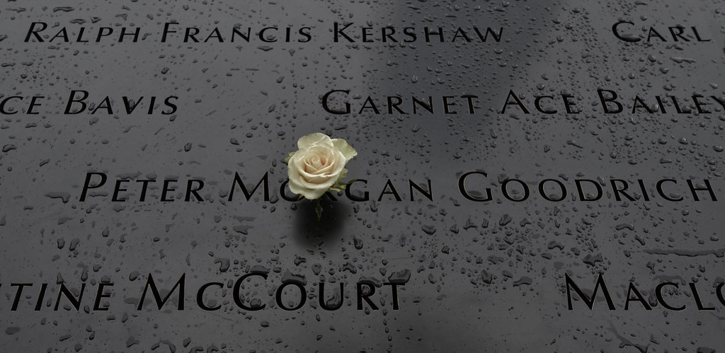
Dark - a brilliantly executed photograph. Full of (sombre) meaning and acutely on theme. No improvement required on that one :clap:

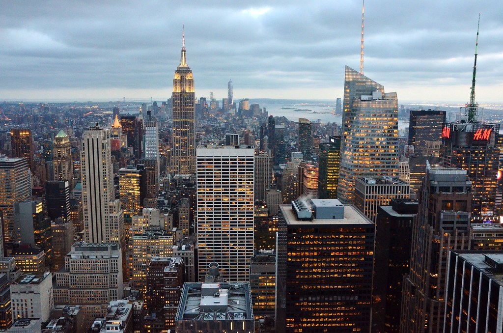
Big - well taken again, nicely processed (not obviously so) and a great time of the evening to capture it. Again, no improvement imaginable (apart from not slicing off the top of the aerial thingie!)

Thanks Paul
Fall - yes #2 is my actual submission but could not leave out #1 as it is so awesome. I can't say that i was looking forward that much to Niagara as I had heard so much about the town (neon, casinos, fast food etc) - but we were more than pleasantly surprised as the town is higher and the escarpment is clothed with trees and the Canadians have made such a tasteful job of making the whole thing into a national park. We were in Buffalo about 20 miles away earlier the previous day and from up a tower we could see that spray of mist that is over the falls. Understand about focus - I think that the Flickr version is slightly sharper

Big - that aerial thingie finished just there - don't know what you are talking about:whistle:
 
Hi Alan, nice to see you back looks like you had a really good holiday

Fall, I think I prefer the 1st one as the boat gives an idea of the scale, did you not have a go in a barrel, that would have been an awesome shot.

Communicate, thats a modern thing, going out to a cafe/bar whatever and staring at a screen either one of the pics would work, a nice idea.

Dark, can't really fault that and the rain is a nice touch adds a bleakness to it.

Big, what could be bigger than the big apple, another nice pic love the lights and I can forgive you for the aerial.

Excellent catch up :clap:
 
Back
Top