weekly susiejb 52 /2014 Support

Hi susie, I knew you had a Raynox and you take some great pics with it. I've never had much luck with mine, would never attempt to focus on something like a frog in a pond with it. I've now just realised mine is a 250, yours is a 150. Hmmmm

I've got the Raynox 250 too d00d .... much harder to do hand held ..... but obviously depends what lens you have it on. Macro is just fascinating to me ....I have to remind myself to take a 'proper pic' occasionally :)
 
Hi Susie, excellent image for big (y), makes mi :D, great colour, the eyes really pop, love the square crop but the frame/borders not for me.......but I even prefer images on walls in plain glass frames with no surround
shrug2.gif
:)
 
Hi Susie, excellent image for big (y), makes mi :D, great colour, the eyes really pop, love the square crop but the frame/borders not for me.......but I even prefer images on walls in plain glass frames with no surround
shrug2.gif
:)

Hi Phil...thanks for taking the time to hop in :) no probs about the frame, I've saw on the internet somewhere that you can have your photos printed and put on glass (or something like it) with no frame and they seem to look very effective.
 
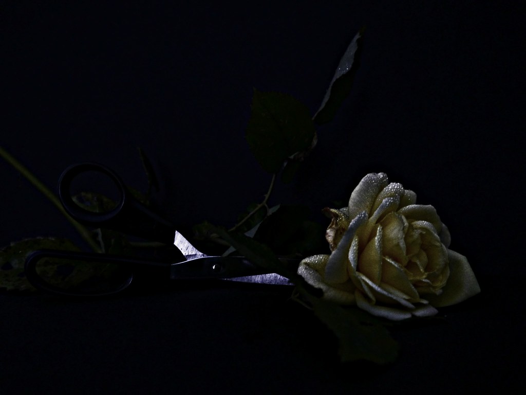
Hi Susie, I have to agree with it being too dark. I do like the idea and the gritty nature of the flower, but overall the darkness thing has let it down.
 
Hi Susie,
Another thread that I haven't managed to get around to yet this year!

Like Simon, I really do like the gritty nature of the flower and I LOVE the sparkle on the petals.
Great concept too, with the chioce of going low-key giving it a dramatic almost sinister feel.
As above though, it's just too dark to really work.
I think you can almost get away with it on the flowerhead, but the scissors are just disappearing into the background too much. Perhaps if they'd been metal handled scissors and you could have got that light reflected all across them it would have been more the image that you'd envisaged.
 
Hi Susie, I have to agree with it being too dark. I do like the idea and the gritty nature of the flower, but overall the darkness thing has let it down.


Thanks for looking Simon ...appreciated as always. Yes it's one of those annoying shots really .... I decided to try it again but the petals fell off my rose and there's not another out in flower out at the moment. Hopefully I may get a chance if one emerges later in the week.
 
Hi Susie,
Another thread that I haven't managed to get around to yet this year!

Like Simon, I really do like the gritty nature of the flower and I LOVE the sparkle on the petals.
Great concept too, with the chioce of going low-key giving it a dramatic almost sinister feel.
As above though, it's just too dark to really work.
I think you can almost get away with it on the flowerhead, but the scissors are just disappearing into the background too much. Perhaps if they'd been metal handled scissors and you could have got that light reflected all across them it would have been more the image that you'd envisaged.

Thanks for looking in Sarah....Yes, I should definitely have had all metal scissors ....you live and learn :) hopefully I may get a change for another go later in the week.
 
Hi Susie, I really like the processing on this the flower head is superb love the colour and the drops of water on it, couldn't quite make out the scissors until the edited version
but that could well be my monitor, but it does work as it kept my interest just trying to figure it out, I do like it though (y)

Hi Allan ...yes the monitors do vary don't they but I think it's me this time :(
Shame I had to put the scissors in as I like the flower too :)
 
Big - Great image - I love the big googly eyes of the frog. The gold colour is nice as well. A great find. I prefer the original as it shows more of the frog's surroundings

Cut - #2 is better but I still feel it's too dark. A shame as I think the composition may work.
 
Love the muted colour of the flower and the bright water droplets, but I have to agree that it could do with a bit more light in the bg to see what's going on.

OT: Roses in October? Is this another of your OH's horticultural achievements?
 
the light on the rose isn;t the problem for me, its the fact that there are other things in the BG that I can;t quite make out what they are, and that distracts from the rose head itself.
 
Big - Great image - I love the big googly eyes of the frog. The gold colour is nice as well. A great find. I prefer the original as it shows more of the frog's surroundings

Cut - #2 is better but I still feel it's too dark. A shame as I think the composition may work.

Thanks Peter ...I was really pleased with the frog ...yes I knew what I wanted from the cut flower but didn't quite manage it.
 
Love the muted colour of the flower and the bright water droplets, but I have to agree that it could do with a bit more light in the bg to see what's going on.

OT: Roses in October? Is this another of your OH's horticultural achievements?

the light on the rose isn;t the problem for me, its the fact that there are other things in the BG that I can;t quite make out what they are, and that distracts from the rose head itself.

Hi Susie - I'm not going to go on about this one, personally liking the flower head, but i'd like to see the sharp scissors cutting into the stem :) the idea was there and you know what to do to improve it (y)

Hi Susie

super idea , love the processing on the rose head ,the sparkles really lift it (y) As others have mentioned, just a tad too dark & the scissors actually cutting the stems would have added to it

Thanks folks ...I'm annoyed with myself really as I knew it wasn't right ...hopefully I'll get chance to do another later in the week ....I know in my mind how I want it to look o_O

Elaine ....hopefully I will still get another rose this week .... not bad for October is it:)
 
CUT #2 another beautiful image Susie ... it seems maybe a bit of a shame you had to include the scissors for the sake of the theme.
 
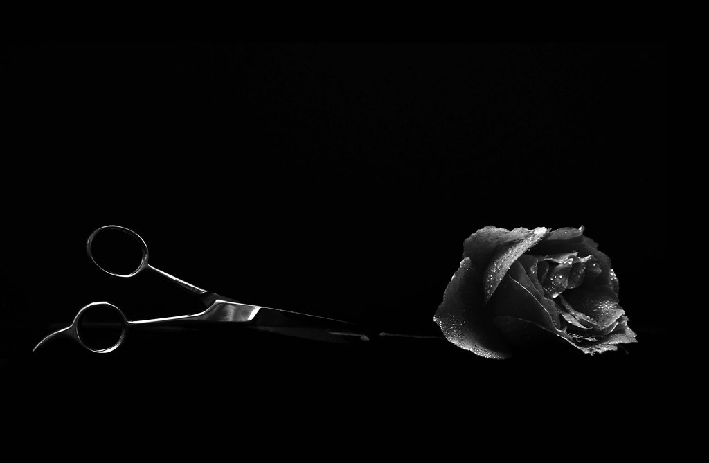
I like the 3rd one. The composition works for me as does the B&W conversion. I'd like a little more detail on the scissor blades, but minor point.

Cheers.
 
Hi Susie

Sparkle - spot on - well executed for such a difficult exposure

Fall -#2 for me - Fall as in the American meaning is how I read this. Good comp and reallly like the light

Communicate - excellent unique idea. Still a bit dark for me , altho that does not spoil the shot - just makes it hard to see if that horizon is level :)

Dark - best for me is the ivy shaped leaf with the light passing thro, showing the veins. also a good bit of web.

Big - - focus, pov, dof, colour, crop, border all combine to give a superb image :clap:

Cut - rally like the lighting on the rose in the first shot but as with others, the b/g is too dark - i could not see the scissors until someone commented on them. The rose in the edit does not seem to have the same quality as the first and like Andy @posiview I think that more blade at the point of cut should show. Kind of minor points really, but would make it perfect I think

Have fallen behind because of long holiday and catching up like this is hard work but one benefit is that it is nice to see a group of photos from each person and see how they approach the themes.
 
Hi Susie, bit of a catchup here...sorry I have not visited recently

Pure: I really like them both though probably # 1 best. Like the how the honey is twisting and knotting as it hits the stick. Honey is super sharp and the lighting really accentuates the warm pure glow of this natrual product :clap:. On number 2 I like the flare which is a nice creative touch and you've caught the dripping honey in a way which is nicely to scale in relation to the composition as a whole.

Sparkle (boats): A nice nautical theme, representative of you where you live which I like. Sparkly indeed and I like the blue of the ocean (not sure if this is SOOC colour?) As everyone has said the spacing of the boats is pleasing and their square on positions show off the shape of the sails which is a massive plus +

Fall: Two very nice pictures. #1) Nice use of shallow DOF. Love the idea that this has been caught as it falls by the spiderweb. The soft bokeh background give this almost a motion blur feel which adds to the falling them. #2) Really like this one. Has an almost abstract feel to it with the mix of straight lines and round (ish) leaves. Reminds me of a contempary stained glass window of sorts. Of course none of this would be possible without the glorious backlighting. (y)

Communicate: A beautiful picture - Period. Like how the landscape (mts and rocks) are in darkness, but the central elements (water and bottle) have some sparkle, some life to them which draws my attention in. A restrained but powerful piece. We always used to send these out to sea as kids...I miss those days and wonder if kids still do these things - Im guessing they'd get slated for polluting if they did....lol

Dark: Oh la la.....For me, forget number 1, its all about number 2. That flare being natural is almost saintly....in fact it gives meaning to the cliche "a moment in time" Like everything about it so no crit.

Big: I do like both versions you've posted, but its all about the frog, so crops and frames are just a side issue. What I really like is the frogs shimmering sheen in all is mottled golden glory. Your macro setup has delivered solid performance once again (y)

Cut:
I would choose edit number 2 but still some way off your usual high standard....sorry :(. Feel like the low key lighting has not worked for some reason and there just isnt enough balance of vibrant light and deep dark to create interest. Of course the idea is a good one though needs rethinking in terms of execution. Would like to see you reshoot this one on an appropriate week.
 
Last edited:
Hi Susie

Sparkle - spot on - well executed for such a difficult exposure

Fall -#2 for me - Fall as in the American meaning is how I read this. Good comp and reallly like the light

Communicate - excellent unique idea. Still a bit dark for me , altho that does not spoil the shot - just makes it hard to see if that horizon is level :)

Dark - best for me is the ivy shaped leaf with the light passing thro, showing the veins. also a good bit of web.

Big - - focus, pov, dof, colour, crop, border all combine to give a superb image :clap:

Cut - rally like the lighting on the rose in the first shot but as with others, the b/g is too dark - i could not see the scissors until someone commented on them. The rose in the edit does not seem to have the same quality as the first and like Andy @posiview I think that more blade at the point of cut should show. Kind of minor points really, but would make it perfect I think

Have fallen behind because of long holiday and catching up like this is hard work but one benefit is that it is nice to see a group of photos from each person and see how they approach the themes.


Hi Alan thank you for taking the time with such detailed comments ...I do really appreciate them....hope you enjoyed your long holiday :)
 
Hi Susie, bit of a catchup here...sorry I have not visited recently

Pure: I really like them both though probably # 1 best. Like the how the honey is twisting and knotting as it hits the stick. Honey is super sharp and the lighting really accentuates the warm pure glow of this natrual product :clap:. On number 2 I like the flare which is a nice creative touch and you've caught the dripping honey in a way which is nicely to scale in relation to the composition as a whole.

Sparkle (boats): A nice nautical theme, representative of you where you live which I like. Sparkly indeed and I like the blue of the ocean (not sure if this is SOOC colour?) As everyone has said the spacing of the boats is pleasing and their square on positions show off the shape of the sails which is a massive plus +

Fall: Two very nice pictures. #1) Nice use of shallow DOF. Love the idea that this has been caught as it falls by the spiderweb. The soft bokeh background give this almost a motion blur feel which adds to the falling them. #2) Really like this one. Has an almost abstract feel to it with the mix of straight lines and round (ish) leaves. Reminds me of a contempary stained glass window of sorts. Of course none of this would be possible without the glorious backlighting. (y)

Communicate: A beautiful picture - Period. Like how the landscape (mts and rocks) are in darkness, but the central elements (water and bottle) have some sparkle, some life to them which draws my attention in. A restrained but powerful piece. We always used to send these out to sea as kids...I miss those days and wonder if kids still do these things - Im guessing they'd get slated for polluting if they did....lol

Dark: Oh la la.....For me, forget number 1, its all about number 2. That flare being natural is almost saintly....in fact it gives meaning to the cliche "a moment in time" Like everything about it so no crit.

Big: I do like both versions you've posted, but its all about the frog, so crops and frames are just a side issue. What I really like is the frogs shimmering sheen in all is mottled golden glory. Your macro setup has delivered solid performance once again (y)

Cut:
I would choose edit number 2 but still some way off your usual high standard....sorry :(. Feel like the low key lighting has not worked for some reason and there just isnt enough balance of vibrant light and deep dark to create interest. Of course the idea is a good one though needs rethinking in terms of execution. Would like to see you reshoot this one on an appropriate week.

Hi Jason ...as I just said above ...a big thank you for taking time to write such a detailed comment, especially when your time is so limited. I think I've had a fairly good run except for last week...I just couldn't nail that one for some reason. It's good to see that you're still here on the thread :)
 
Hi Susie... monster catch up from me - on yours and pretty much everyone else's!

Dark: the rim lighting on the holly is beautiful. DOF choice is spot on for me and the dark background fab. It's just brilliant! Your second dark shot is just as good and the sunglow/flare is lovely, as are the highlights from the web. Two absolutely stonking shots! :clap:

Big: another great shot. Being hyper critical, the OOF area at the bottom and twig at the top are a bit distracting, so I'd be tempted to crop landscape and lose both - really just capturing the eyes and perhaps mouth. Focus and lighting absolutely top notch, although I might bump the EV up half a stop if it can take it without blowing? Having just scrolled down and seen your second version - it's great, although I might lose even more of the oof (or darken it slightly?) Super shot (y)

Cut: really like the rose in the first. The second shot is the one for me though, as there is still some of the picture which is left to the imagination, but it's clear what it's a picture of and what the "story" is. I love the lighting, the droplets and basically everything about it! It really works for me, which just goes to show that we find different things in photos which click for each of us :banana:


Thanks Paul...your comments are extremely encouraging as always and very much appreciated.
 
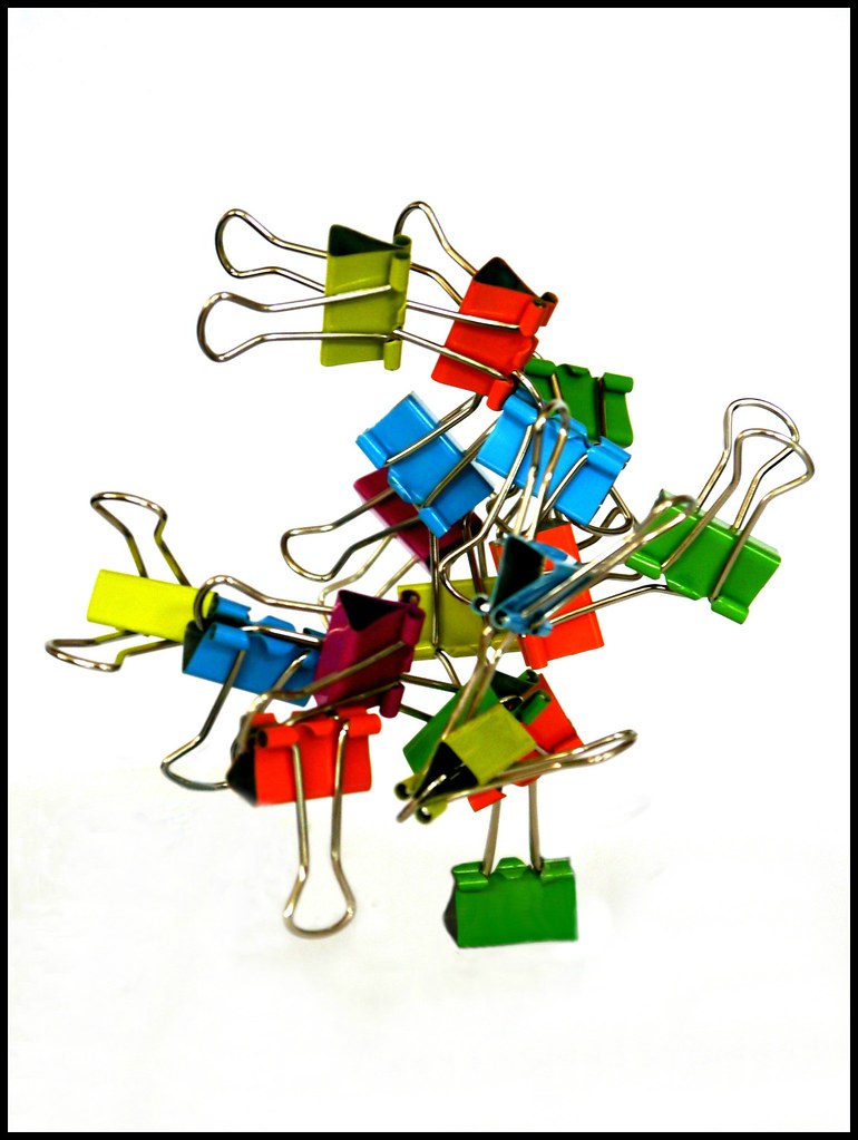
I wasn't quite sure what to do this week, I wandered around the beach last weekend and did some stacked stones and other shots, but I wasn't too thrilled with them, so I came home and decided to try out a white background ... I'm really not sure about it, but I'll put it on so that I can get any tips on how to do better next time ... they were all stacked on the bottom clip but I think it looks flat ...should I have a shadow or something to make it look more obvious. I've just put the frame around it as it looked rather strange on the page without it.

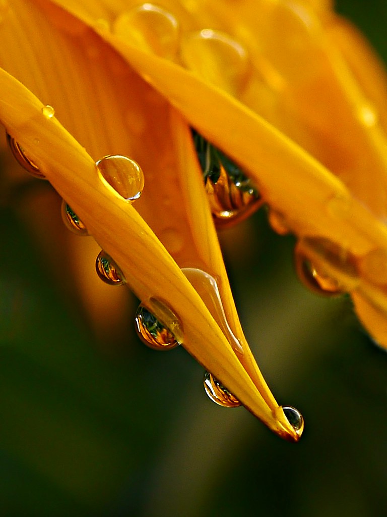
I reverted in the end to my comfort zone and did a nature shot ...raindrops balanced on a leaf ...so here they are:

BALANCE

15400230990_7db6964388_b.jpg


15525494746_406e74fd69_b.jpg
 
Last edited:
Hi Susie, white BG's can be a real pain, you are right it should have some kind of shadow and you seem to have something there, but looks like a lot of cloning or something going on.
I tend to light the BG separately which is the way we used to do it the theatre, so I have to use two light sources and could probably do with more, its difficult a lot of trial and mostly error
but if you can get it right it's worth it.
The nature shot is great, you are good at spotting these little things, nice colour and super sharp on the water drops (y)


Hi Allan ....thank you for those comments....much appreciated, I did that one one my desktop computer and obviously missed those bits ...they really show up on this laptop :( I almost didn't put it on ...well I put it on, took it off, and put it on again o_O I thought well I'll never learn if I don't ask. I've always thought white backgrounds should be pure white but now I'm not so sure. I will perhaps try it again, it would be a good one to do on a reshoot week.

I suppose my love of nature seeps through into my photo's .... it's where I'm happiest :)
 
hi Susie
Balance - #1 all been said by you and Allan @alsjazzera I partic agree with Allan re the two light sources and the trail an error method.
#2 is superb - so much to like - oof b/g in good greens, beautiful vibrant yellow/orange, spot on focus and detail. fascinating to look into the little droplets. When you go into your comfort zone you really get it right:clap:
 
#1 fab idea, I love the thought of a bulldog clip tree growing somewhere.

Understand why you tried it, but I'm super glad you put #2 up as well. Fantastic detail, focus, DOF, colour, raindrops evrything wonderful. :clap:

FWIW, maybe the bulldog clip tree could have worked in a more "natural" setting, a lawn or somewhere. Really go to town on the "man made tree" aspect.... :thinking:
 
hi Susie
Balance - #1 all been said by you and Allan @alsjazzera I partic agree with Allan re the two light sources and the trail an error method.
#2 is superb - so much to like - oof b/g in good greens, beautiful vibrant yellow/orange, spot on focus and detail. fascinating to look into the little droplets. When you go into your comfort zone you really get it right:clap:

Thanks Alan ..glad you liked my raindrops one :)...quite fascinating how they capture so much in one tiny drop
 
#1 fab idea, I love the thought of a bulldog clip tree growing somewhere.

Understand why you tried it, but I'm super glad you put #2 up as well. Fantastic detail, focus, DOF, colour, raindrops evrything wonderful. :clap:

FWIW, maybe the bulldog clip tree could have worked in a more "natural" setting, a lawn or somewhere. Really go to town on the "man made tree" aspect.... :thinking:


Thanks Graham, yes the clips are definitely on for another try ...it took me ages to balance that though ...I had to clone out loads of duct tape ....probably why I made such a mess of that bottom bit, perhaps try for a bonsai tree type image o_O

At least the raindrops worked ....one success out of two isn't bad :)
 
Last edited:
Back
Top