weekly Tango 32's 2014 52 challenge Week 39 -44 added

the first of the 2 bottles is pretty uninspiring tbh, could also be a fair bit brighter too.

Liking the second though, an interesting POV, with a really striking use of DOF, with the focus point spot on for this. Would like to have the top of the bottle in the shot though.
 
Hi Ya

2nd image for me as well , super DOF with focus in just the right place :clap:it is a bit on the squiff though...needs a slight ccw rotation....:exit:
 
the first of the 2 bottles is pretty uninspiring tbh, could also be a fair bit brighter too.

Liking the second though, an interesting POV, with a really striking use of DOF, with the focus point spot on for this. Would like to have the top of the bottle in the shot though.
No2 for me also, makes me want to go buy a couple of Hobgoblins now :)
Hi Ya

2nd image for me as well , super DOF with focus in just the right place :clap:it is a bit on the squiff though...needs a slight ccw rotation....:exit:
Strong - great take on the theme, I think I like the simplicity of the first image works well for me.


Thanks all for the comments and advice do feel im learning lots this year :)
 
Week 22 Texture

This is a plant in a garden a few doors down from me not sure what its all but the wife calls it Lambs ear due to the texture, I placed the leaf onto the ipad with the torch on to try and lighten it up a bit and bring out more detail but what I found out was my ipad screen is scratched to hell... so decided to have a play in photoshop and change the back ground to black not very inspiring im afraid but really looking forward to week 23 Wild

texture by Craigw1978, on Flickr
 
Last edited:
Wow that IS weird! I actually thought it was made of fabric when I first looked, because the edge looks like it's been over-stitched. Nice take on the theme, but I think I would have been tempted to rotate it a bit to bring the bottom point towards the corner of the frame and create more of a diagonal.
 
Hi, very furry leaf indeed I agree with Elaine above about the diagonal
 
good subject, the focus on the tip of the leaf contrasts sharply with the OOF rear, good job.

ALso if you hadnt've said about teh black BG, I wouldnt have noticed it, so a good job selecting the leaf and doing that. (y)
 
Hi, looks like some weird alien tongue :)

Nice clean BG and on theme.

Slightly wider DOF for me as I'd like it all in focus.

Cheers.
Wow that IS weird! I actually thought it was made of fabric when I first looked, because the edge looks like it's been over-stitched. Nice take on the theme, but I think I would have been tempted to rotate it a bit to bring the bottom point towards the corner of the frame and create more of a diagonal.
Hi, very furry leaf indeed I agree with Elaine above about the diagonal
good subject, the focus on the tip of the leaf contrasts sharply with the OOF rear, good job.

ALso if you hadnt've said about teh black BG, I wouldnt have noticed it, so a good job selecting the leaf and doing that. (y)
Hi Craig,
I agree that a different composition would be better but its a lovely texture:)

Thanks all for looking in and commenting
 
Hi, I like crows so a good subject matter for me, I think it really needs a crop it seem a little lost maybe portrait rather than landscape
 
Hi Craig

Texture......fab black bg and plenty of detail possibly a little wider DOF to really see the furry bits

Wild.....nice n sharp on the eye with a little catch light , the blue sky really sets of the black plumage (y) Crop niggles me as too far to the right in the frame...maybe crop so the branch comes in bottom rh corner ?
 
Hi Craig :)

Shape - A great sculpture, feel it needs more space to the left, the sky isn't the best but works with the colours of the timber for me, nice detail in the wood, no shadows that are too dark - Like It :)

Numbers - That is a fantastic cake, agree with others that the only thing amiss for me is the lighting, Lynne's suggestion of a cheap reflector, with a window, or a table lamp/even an LED torch may help if no flashgun, framing and backgrounds are just fine (y)

Strength/Strong - Has to be the crop for me, love your unusual angle, the two bottles are lit well, but for me have no impact/interest on their own, the other shot mind you, is very striking, great DoF, well lit and nice colours (y)

Wild - Pic won't load... will pop back on this one :)
 
Strength - The second shot with the shallow DoF on the %age is certainly (forgive the pun) the stronger of the two. The colours have been nicely held as well. I like how the edges of the bottle almost blend into the background

Texture - I'm not sure the DoF and black background is totally working for me on this one I'm afraid

Wild - Nice portrait of the bird. There's some detail in the blacks which would have been easy to lose on what looks like quite a bright day
 
I'm liking the idea Craig, it has loads of potential, there's plenty of detail in the highlights when viewed large on flickr (y) possibly a little dark every where else? .....:thinking: something doesn't quite look right though,front of the front wheel and above skull with horns......I'm guessing you've done this in layers.....if you have I can't say a great deal as I have no idea how layers are done :rolleyes::D
 
I'm liking the idea Craig, it has loads of potential, there's plenty of detail in the highlights when viewed large on flickr (y) possibly a little dark every where else? .....:thinking: something doesn't quite look right though,front of the front wheel and above skull with horns......I'm guessing you've done this in layers.....if you have I can't say a great deal as I have no idea how layers are done :rolleyes::D


I cloned it mate and can see where I have missed now will get back in there and have another play if I get chance well spotted :clap:
 
thats a prettty interesting looking dragon on a bike, I reckon there could be a good shot in there somewhere, nice one getting teh glitter to come out so well, often that sort of thing looks great to the eye, but somehow the caraera just doenst pick it up.

detail in the bright bits is great - just needs a bit more light into the darker areas, and maybe a less central composiion / placement would heklp??
 
Hi Craig - bit of catch up from me, sorry.

Strength - definitely the second and love the creative DOF. I don't mind missing the top of the bottle as you also have the bottom missing so I see that as symmetrical which works - for me. Focus spot on.

Texture - lovely detail and would like to know whether a broader DOF would have allowed you to get all of it in focus (and it still work as well). Great black background really makes it pop. If you wanted, a touch more saturation might work as well and help "lift" it but a great shot overall.

Wild - I'm afraid this isn't doing it for me. Maybe because I'm not a massive wildlife photo fan, but it's not as exciting/interesting as your other shots.

Dream - I like it. I'd probably rather see more detail in the darks, especially with the background but it's a great idea and pretty well executed. Lighting is spot on for me. The more I look at it, the more I'm liking it as well!
 
HI Craig

top idea for Dream with potential to bring out a great shot as per Phil D . Don't think flickr's doing it to many favours...just viewed it full screen & only the front mudguard & the skull below the wheel appear sharp :thinking: Like how you used a glittery card as a bg...
 
Hi Craig...well done for thinking of that one. It's certainly an original idea...maybe more like a nightmare :) well done with cloning it, that can't have been easy.
LIke it, a great idea,works very well, even better with a bit more pp.
thats a prettty interesting looking dragon on a bike, I reckon there could be a good shot in there somewhere, nice one getting teh glitter to come out so well, often that sort of thing looks great to the eye, but somehow the caraera just doenst pick it up.

detail in the bright bits is great - just needs a bit more light into the darker areas, and maybe a less central composiion / placement would heklp??
Hi Craig - bit of catch up from me, sorry.

Strength - definitely the second and love the creative DOF. I don't mind missing the top of the bottle as you also have the bottom missing so I see that as symmetrical which works - for me. Focus spot on.

Texture - lovely detail and would like to know whether a broader DOF would have allowed you to get all of it in focus (and it still work as well). Great black background really makes it pop. If you wanted, a touch more saturation might work as well and help "lift" it but a great shot overall.

Wild - I'm afraid this isn't doing it for me. Maybe because I'm not a massive wildlife photo fan, but it's not as exciting/interesting as your other shots.

Dream - I like it. I'd probably rather see more detail in the darks, especially with the background but it's a great idea and pretty well executed. Lighting is spot on for me. The more I look at it, the more I'm liking it as well!
Hi Craig,
Dream... definitely looks better on flikr perhaps if you could brighten the words on the base it would help, good idea tho' :)
HI Craig

top idea for Dream with potential to bring out a great shot as per Phil D . Don't think flickr's doing it to many favours...just viewed it full screen & only the front mudguard & the skull below the wheel appear sharp :thinking: Like how you used a glittery card as a bg...


Thanks all, it did not work out quite how I hoped but I got to the point where it was post it or bin it and id worked too long to bin it
 
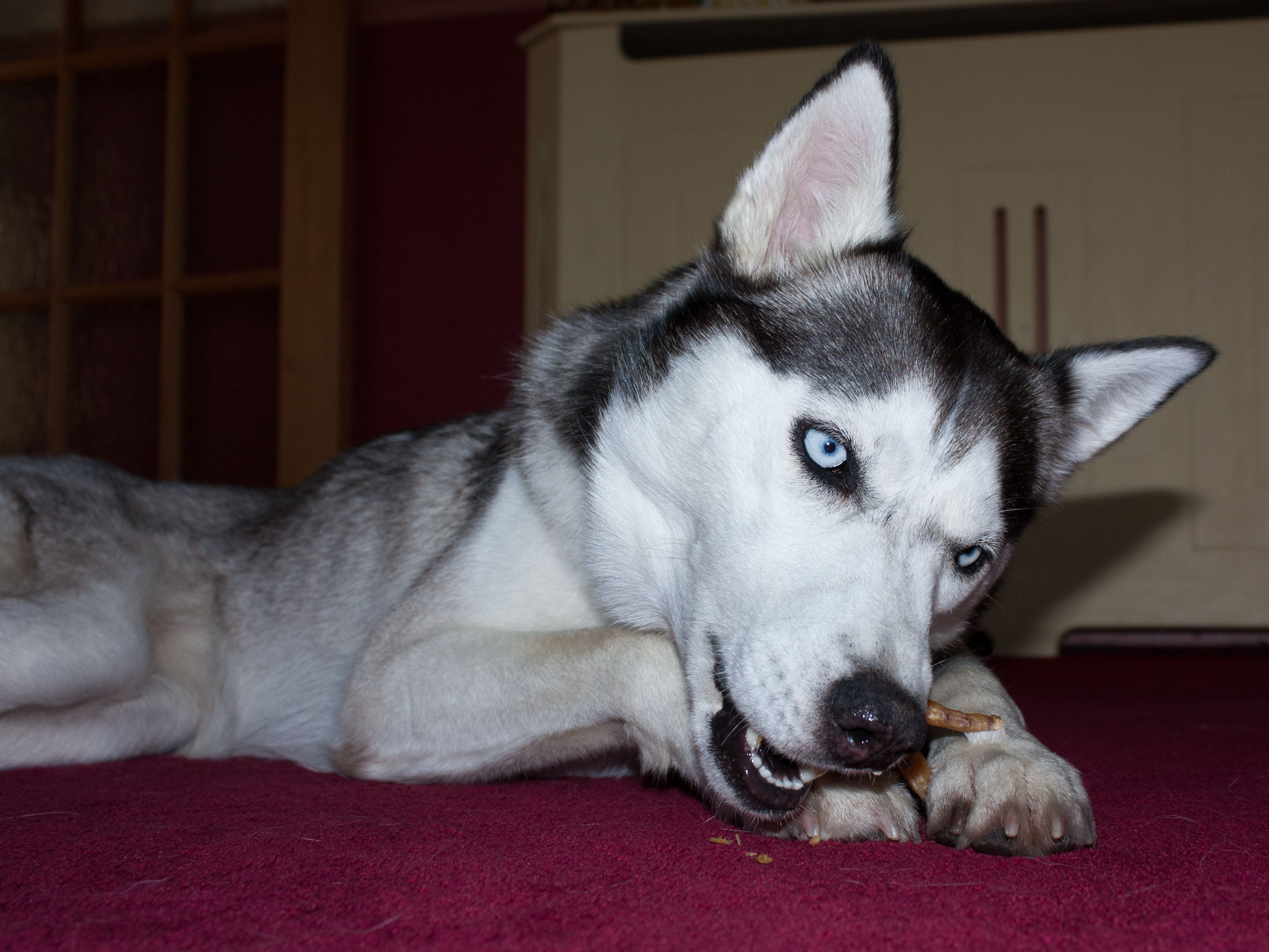
Vertical - really struggled with this theme and not doing much better with Yum

so post a be dammed again im afraid could not get the the shadow to bugger off on the top

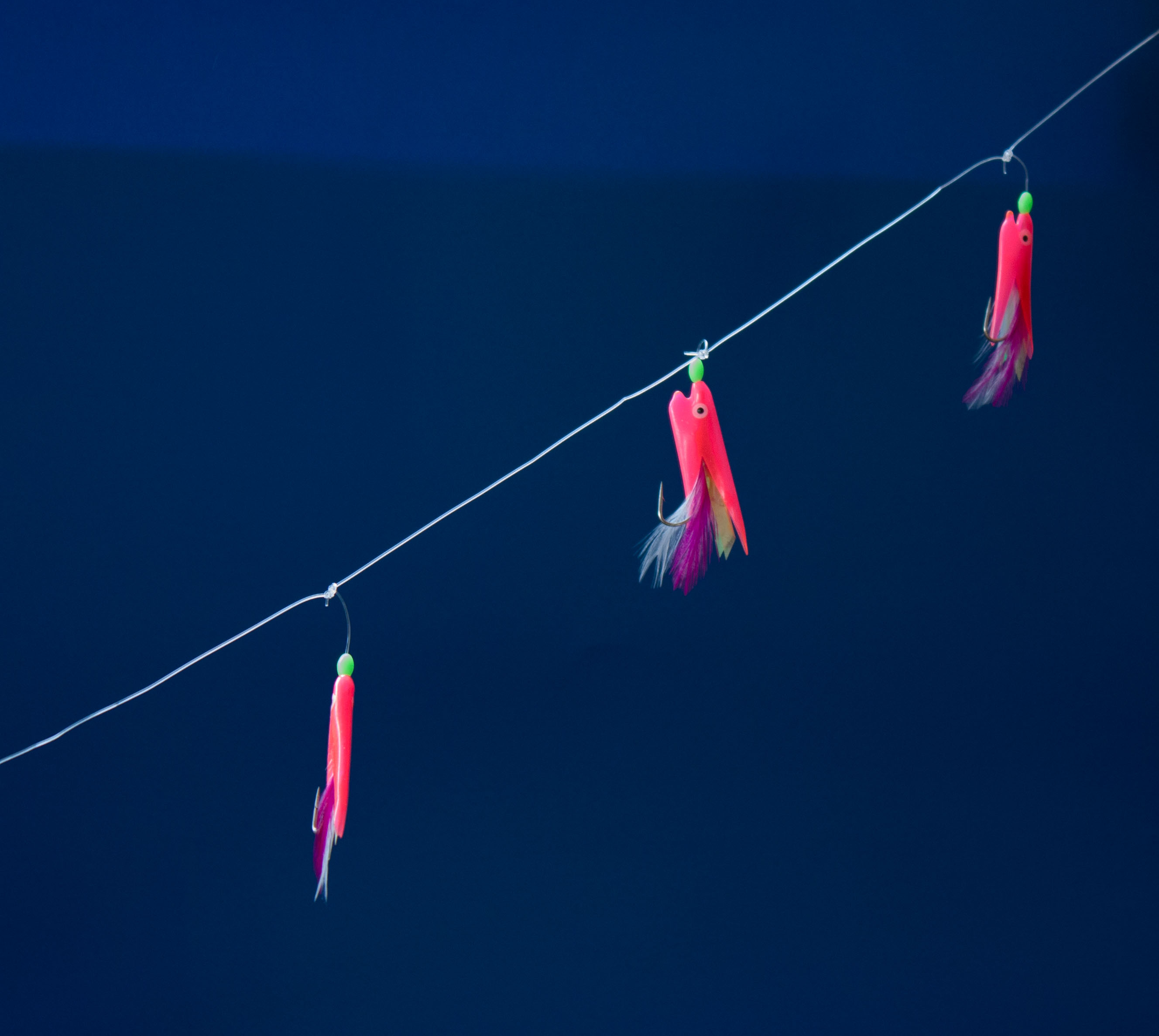
got the idea from after seeing Posiviews post for vertical and got me thinking what I had in the house that may work the same, fishing gear!!


vertical by Craigw1978, on Flickr
 
HI Craig

Yum.......perfect focus on your beautiful girl....love those blue eye's........shame about the background...maybe try somewhere less cluttered ?

Vertical........pretty colors in the fly's(?) contrasts well against the blue background :) I suspect the lighter area would clone out fairly easily.......positioning could be a smidge better.....top of the line coming in from the top rh corner >
 
HI Craig... Vertical - Why the difference in blue in the background ? Nice clean image and no clutter which is nice...
Yum - Love the focus on the dogs eyes... nice looking pooch...
 
Craig... I'll be brief! Vertical is a nice idea but I'm a bit put off as well by the change in background colour? I think the lures would be stronger if they all faced the same way, but that may be difficult.

Yum - I'd probably prefer less DOF to draw you in to the head. I also think a cleaner background would really make the photo. But a good shot of a lovely dog.
 
Dream - like the idea behind the image and the use of the glittery card. I feel the image is a little bit dark for my tastes.

Vertical - fits the theme, but lacks excitement.

Yum - great shot of your dog enjoying her fav treat, fits the theme and gets my vote.
 
Vertical, PABD, sometimes the themes do not click.

Yummy, year the eyes are supper and she looks lovely. Crowded BG is an issue as if on camera flash?

Nice low POV as well.

Cheers.
 
Back
Top