
You are using an out of date browser. It may not display this or other websites correctly.
You should upgrade or use an alternative browser.
You should upgrade or use an alternative browser.
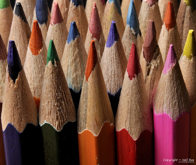
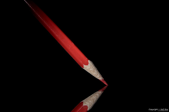
101 Ways to Photogragh Pencils - Complete!
- Thread starter Mentalblock
- Start date

OP
- Messages
- 2,175
- Name
- Neil
- Edit My Images
- No
Nice Neil good to see you had a go at my inspiration with #22, I used glycerine to get the drop bigger, great to see fab idea #20 thats brill
I was going to hold off usin it, but as I had the water out I thought why not.
The zip is still in the bank for a difficult day!
And thanks for the glycerine tip.
Just Dave
In Memoriam
- Messages
- 29,876
- Name
- Dave
- Edit My Images
- Yes
I was going to hold off usin it, but as I had the water out I thought why not.
The zip is still in the bank for a difficult day!
And thanks for the glycerine tip.
") look forward to seeing more your doing great so far
look forward to seeing more your doing great so far - Messages
- 884
- Name
- Matt
- Edit My Images
- Yes
Fantastic photos! I look forward to seeing the rest!
May I ask what lens you are using?
May I ask what lens you are using?
OP
- Messages
- 2,175
- Name
- Neil
- Edit My Images
- No
Fantastic photos! I look forward to seeing the rest!
May I ask what lens you are using?
Hi Matt,
They've all been done with my Tamron 28-75 f2.8
I've had an extension tube on for some of them.
Thanks for looking.
OP
- Messages
- 2,175
- Name
- Neil
- Edit My Images
- No
Well here is the next installment.
#23

Pencil 023 by HaplessClicker (aka MentalBlock), on Flickr
#24

Pencil 024 by HaplessClicker (aka MentalBlock), on Flickr
#25

Pencil 25 by HaplessClicker (aka MentalBlock), on Flickr
#26

Pencil 26 by HaplessClicker (aka MentalBlock), on Flickr
#27

Pencil 27 by HaplessClicker (aka MentalBlock), on Flickr
Hopefully I'll put a few more up this evening!
#23
Pencil 023 by HaplessClicker (aka MentalBlock), on Flickr
#24
Pencil 024 by HaplessClicker (aka MentalBlock), on Flickr
#25
Pencil 25 by HaplessClicker (aka MentalBlock), on Flickr
#26
Pencil 26 by HaplessClicker (aka MentalBlock), on Flickr
#27
Pencil 27 by HaplessClicker (aka MentalBlock), on Flickr
Hopefully I'll put a few more up this evening!
OP
- Messages
- 2,175
- Name
- Neil
- Edit My Images
- No
Think you'll be hard pushed to beat #22. Awesome pic
That would be the one that's copying someone else's pencil shot :shake:
I bet I only beet it with the other suggestion Just Dave gave me!
I have to say I'm loving the ideas you've had since my last visit into this thread
Matt
Thanks Matt
Hi, Bud, of the latest set it's #25 for me. The shadows really add depth and dimension to the photograph. I'd like to see the red pencil perpendicular...think it would really boost the symmetry.
Reminds me of this place..linky.
Cheers.
Been there, and yes, it has a similar look.
I could do the full 101 with just variations of shadows, but there's no fun in that!
Thanks for looking everyone.
One more for this evening...............
OP
- Messages
- 2,175
- Name
- Neil
- Edit My Images
- No

SarahLee
TPer Emerita
- Messages
- 13,060
- Name
- Sarah
- Edit My Images
- No
Brilliant idea Neil.I tried something similar with apples last year, but ran out of steam and inspiration when life started to get too busy. Good luck in making it to 101.
Some cracking shots so far. No.13 is the stand out one for me at this point though - superb lighting
OP
- Messages
- 2,175
- Name
- Neil
- Edit My Images
- No
I tried something similar with apples last year, but ran out of steam and inspiration when life started to get too busy. Good luck in making it to 101.
Some cracking shots so far. No.13 is the stand out one for me at this point though - superb lighting
Thanks Sarah.
I remember seeing your apples last year.
The ideas are not coming to me as easy now, although I still have a few ideas yet to shoot.
OP
- Messages
- 2,175
- Name
- Neil
- Edit My Images
- No
A few more for you all.................
#29

Pencil 029 by HaplessClicker (aka MentalBlock), on Flickr
#30
Pencil 030 by HaplessClicker (aka MentalBlock), on Flickr
#31

Pencil 031 by HaplessClicker (aka MentalBlock), on Flickr
I think #31 is my fav out of these, but it needs a little work.
I was hungry (take out Chinese has now arrived and is being served as I type!) and rushing a bit, so the light painting has suffered a little!
Thanks for looking and feel free to comment.
Neil
#29
Pencil 029 by HaplessClicker (aka MentalBlock), on Flickr
#30
Pencil 030 by HaplessClicker (aka MentalBlock), on Flickr
#31
Pencil 031 by HaplessClicker (aka MentalBlock), on Flickr
I think #31 is my fav out of these, but it needs a little work.
I was hungry (take out Chinese has now arrived and is being served as I type!) and rushing a bit, so the light painting has suffered a little!
Thanks for looking and feel free to comment.
Neil
- Messages
- 586
- Edit My Images
- Yes
Ace this, i wish i had this much imagination lol keep up the good work
- Messages
- 1,314
- Name
- Mick
- Edit My Images
- Yes
Loving these shots!!
No 13 reminds me of this Queen album cover
http://www.google.co.uk/imgres?q=queen+album+cover&hl=en&biw=1441&bih=751&gbv=2&tbm=isch&tbnid=dcVO_FdNOSRUUM:&imgrefurl=http://www.queencollector.com/Qeurope/queen22.htm&docid=TSiOanDTPCmOuM&imgurl=http://www.queencollector.com/Qeurope/queen2.jpg&w=480&h=480&ei=Ojw1T-eCJeey0QXjhcWiCA&zoom=1&iact=rc&dur=280&sig=107980130424048856922&page=1&tbnh=162&tbnw=161&start=0&ndsp=21&ved=1t:429,r:0,s:0&tx=61&ty=114
Mick
OP
- Messages
- 2,175
- Name
- Neil
- Edit My Images
- No
LOL, looks like a tepee. I'd like to see the top of the smoke and there appears to be a wisp of white smoke in front of the top of the yellow pencil.
Not easy is it
Plenty more ideas though....
This was my fav of the smoke shots, but ye, I wish I'd got the smoke in the top!
Not seen the last few, brilliant, well explored just gotta hand it to you Neil
More with the water over the weekend!
Good work Neil
I really like your ideas and the simplicity of the shots (note I didn't say easy!
Looking forward to seeing it through to 101.
Thanks Adrian
I hope I get there for you!
Enjoying this project of yours immensely Neil and from the latest efforts I have selected the random effect of #27 as my favourite
Thanks Mal.
Things are slowing a little bit, but not out yet!
The shadows certainly give it a little something#25 is great. I like how you have got the shadows aswell as the pencils.
OP
- Messages
- 2,175
- Name
- Neil
- Edit My Images
- No
Hiya Neil, a great set since my last visit. Good to see it is going well. Really like number 28, that is an excellent idea.
Thanks Michael
Ace this, i wish i had this much imagination lol keep up the good work
I hope I have enough, got a long way to go yet!
Loving these shots!!
No 13 reminds me of this Queen album cover
http://www.google.co.uk/imgres?q=queen+album+cover&hl=en&biw=1441&bih=751&gbv=2&tbm=isch&tbnid=dcVO_FdNOSRUUM:&imgrefurl=http://www.queencollector.com/Qeurope/queen22.htm&docid=TSiOanDTPCmOuM&imgurl=http://www.queencollector.com/Qeurope/queen2.jpg&w=480&h=480&ei=Ojw1T-eCJeey0QXjhcWiCA&zoom=1&iact=rc&dur=280&sig=107980130424048856922&page=1&tbnh=162&tbnw=161&start=0&ndsp=21&ved=1t:429,r:0,s:0&tx=61&ty=114
Mick
Thanks Mick, everyone has noted that about that shot.
I didn't see it at first.
I may have to look at more albums if I get stuck!
OP
- Messages
- 2,175
- Name
- Neil
- Edit My Images
- No
Managed to think up a few more compositions without getting the water out!
Water fun will have to be tomorrow!!
#32

Pencil 032 by HaplessClicker (aka MentalBlock), on Flickr
#33

Pencil 033 by HaplessClicker (aka MentalBlock), on Flickr
#34

Pencil 034 by HaplessClicker (aka MentalBlock), on Flickr
#35

Pencil 035 by HaplessClicker (aka MentalBlock), on Flickr
#36

Pencil 036 by HaplessClicker (aka MentalBlock), on Flickr
#37

Pencil 037 by HaplessClicker (aka MentalBlock), on Flickr
Water fun will have to be tomorrow!!
#32
Pencil 032 by HaplessClicker (aka MentalBlock), on Flickr
#33
Pencil 033 by HaplessClicker (aka MentalBlock), on Flickr
#34
Pencil 034 by HaplessClicker (aka MentalBlock), on Flickr
#35
Pencil 035 by HaplessClicker (aka MentalBlock), on Flickr
#36
Pencil 036 by HaplessClicker (aka MentalBlock), on Flickr
#37
Pencil 037 by HaplessClicker (aka MentalBlock), on Flickr
- Messages
- 884
- Name
- Matt
- Edit My Images
- Yes
Those last set are stunning really inspiring!
- Messages
- 392
- Name
- Stuart
- Edit My Images
- Yes
36 is amazing, i was bored on thursday and the weather was rubbish and thought id have a go but really could do anything like what you have achieved!
- Messages
- 8,398
- Name
- Lynne
- Edit My Images
- Yes
HI matey....good to see you're still going.......
#32......love the shape you've created , must have taken a while
#32......love the shape you've created , must have taken a while
- Messages
- 19,461
- Name
- Andy
- Edit My Images
- Yes
#32 is a cracker, really nice flowing lines. I rotated my laptop clockwise 90 degrees and angled it down so I was looking across the pencils...liked it. **I won't mention the lower left **
#36 is also another great idea. I really like the depth, colours and exposure of this one. Being very picky the top layer is slightly OOF, unless that's what you were after.
Keep it up and I can see sssooo many more ideas here.
Cheers.
**#36 is also another great idea. I really like the depth, colours and exposure of this one. Being very picky the top layer is slightly OOF, unless that's what you were after.
Keep it up and I can see sssooo many more ideas here.
Cheers.
OP
- Messages
- 2,175
- Name
- Neil
- Edit My Images
- No
Thanks for all the latest comments.
I realise it's been over a week since a new image was posted, and it may be another week yet, but the challenge is still on and once work/ family permit I will get around to doing some more shots.
Thanks everyone.
I realise it's been over a week since a new image was posted, and it may be another week yet, but the challenge is still on and once work/ family permit I will get around to doing some more shots.
Thanks everyone.
OP
- Messages
- 2,175
- Name
- Neil
- Edit My Images
- No
It's been a couple of weeks since my last shots, mainly due to a few days hols and work!
Hopefully I'll get a few more done tomorrow, but until then hopefully these will please.
#38

Pencil 038 by HaplessClicker (aka MentalBlock), on Flickr
#39
Pencil 039 by HaplessClicker (aka MentalBlock), on Flickr
#40

Pencil 040 by HaplessClicker (aka MentalBlock), on Flickr
#41

Pencil 041 by HaplessClicker (aka MentalBlock), on Flickr
#42

Pencil 042 by HaplessClicker (aka MentalBlock), on Flickr
#43

Pencil 043 by HaplessClicker (aka MentalBlock), on Flickr
Thanks for looking and feel free to C&C
Neil
Hopefully I'll get a few more done tomorrow, but until then hopefully these will please.
#38
Pencil 038 by HaplessClicker (aka MentalBlock), on Flickr
#39
Pencil 039 by HaplessClicker (aka MentalBlock), on Flickr
#40
Pencil 040 by HaplessClicker (aka MentalBlock), on Flickr
#41
Pencil 041 by HaplessClicker (aka MentalBlock), on Flickr
#42
Pencil 042 by HaplessClicker (aka MentalBlock), on Flickr
#43
Pencil 043 by HaplessClicker (aka MentalBlock), on Flickr
Thanks for looking and feel free to C&C
Neil
- Messages
- 307
- Edit My Images
- Yes
Great idea. Really nice collection.
A couple things. #6 doesn't have a tip that is in focus, just the edge of the first pencil. Also as I look through them, I keep being drawn to the quality of the pencils rather than the composition. Some tips are quite shabby. I might have used a better quality pencil with less imperfections if I was to invest this much time in the project.
A couple things. #6 doesn't have a tip that is in focus, just the edge of the first pencil. Also as I look through them, I keep being drawn to the quality of the pencils rather than the composition. Some tips are quite shabby. I might have used a better quality pencil with less imperfections if I was to invest this much time in the project.
OP
- Messages
- 2,175
- Name
- Neil
- Edit My Images
- No
Great idea. Really nice collection.
A couple things. #6 doesn't have a tip that is in focus, just the edge of the first pencil. Also as I look through them, I keep being drawn to the quality of the pencils rather than the composition. Some tips are quite shabby. I might have used a better quality pencil with less imperfections if I was to invest this much time in the project.
One of the things I like about the project is tat it's being done with cheap props, 45p per pack of pencils!
I want to focus on the different compositions, lighting etc., but I take your point.
If any really catch my eye when I finish, I may invest in a quality set of pencils and do a reshoot.
Thanks for looking, and the comments.
OP
- Messages
- 2,175
- Name
- Neil
- Edit My Images
- No
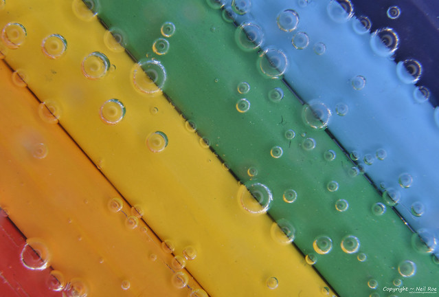
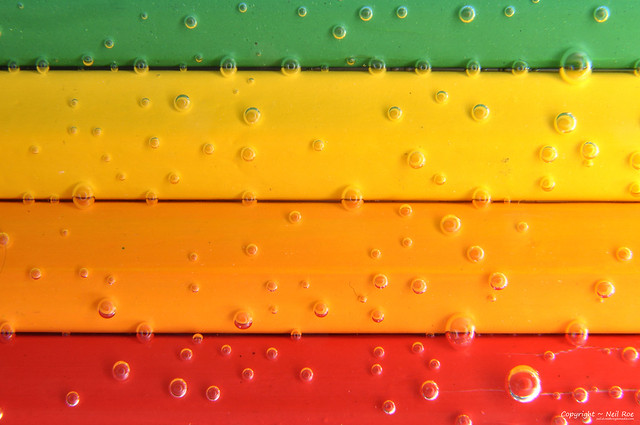
I eventually got around to trying our the shot I saw in a magazine that gave me some inspiration for this - submersing the pencils in sparkling water!
#44
Pencil 044 by HaplessClicker (aka MentalBlock), on Flickr
#45

Pencil 045 by HaplessClicker (aka MentalBlock), on Flickr
#46

Pencil 046 by HaplessClicker (aka MentalBlock), on Flickr
#47

Pencil 047 by HaplessClicker (aka MentalBlock), on Flickr
#48
Pencil 048 by HaplessClicker (aka MentalBlock), on Flickr
#49

Pencil 049 by HaplessClicker (aka MentalBlock), on Flickr
#44
Pencil 044 by HaplessClicker (aka MentalBlock), on Flickr
#45
Pencil 045 by HaplessClicker (aka MentalBlock), on Flickr
#46
Pencil 046 by HaplessClicker (aka MentalBlock), on Flickr
#47
Pencil 047 by HaplessClicker (aka MentalBlock), on Flickr
#48
Pencil 048 by HaplessClicker (aka MentalBlock), on Flickr
#49
Pencil 049 by HaplessClicker (aka MentalBlock), on Flickr
OP
- Messages
- 2,175
- Name
- Neil
- Edit My Images
- No
#50

Pencil 050 by HaplessClicker (aka MentalBlock), on Flickr
#51
Pencil 051 by HaplessClicker (aka MentalBlock), on Flickr
Pencil 050 by HaplessClicker (aka MentalBlock), on Flickr
#51
Pencil 051 by HaplessClicker (aka MentalBlock), on Flickr