
You are using an out of date browser. It may not display this or other websites correctly.
You should upgrade or use an alternative browser.
You should upgrade or use an alternative browser.
weekly DK's 52 of 2016 - Week 52 'Celebrate" added and COMPLETED
- Thread starter Dark Knight
- Start date
- Messages
- 7,412
- Name
- susie
- Edit My Images
- Yes
I don't think I could choose a favorite DK because I love them all. The square certainly does look Vast, but the ceiling in the Vatican is stunning shot at that angle. The Coliseum, I think you've done really well to get so much of it in the photo, fascinating place isn't it, we felt it had the most amazing atmosphere when we were there. The hot air balloon so simple but I love it.
Super staircase too")
Super staircase too
- Messages
- 19,304
- Name
- Andy
- Edit My Images
- Yes
[/QUOTE]UN-Edited staircase by TP DK, on Flickr
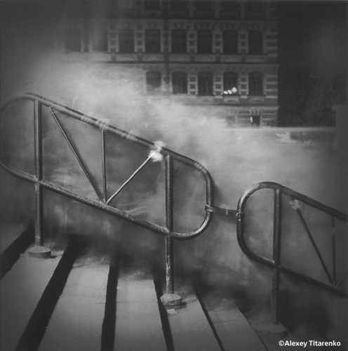
That would make a belting long exposure to get the people to Ghost like Alexey Titarenko's work....superb photographer.
Cheers.
Last edited:
OP
- Messages
- 13,393
- Edit My Images
- Yes
Thanks DavidHi DK
Great holiday snaps.")
I have no idea mate, I wanted to crop it out but the building would be too long... no consideration for photographers these ItaliansI love your pano stitch job, rich colour. Shame about the FG fence, that's not normally there is it?

Yeah a never ending stream, when at the Colosseum with our guide we asked about visitors there, she said they get circa 10,000 per day, but the Vatican gets double that, 20,000 footfall a day is mind boggling for me :OAnd those people on the stairs. wow.
Thanks Chris, nice idea the TSI'd definitely try a tilt, shift with the staircase. Just my opinion but nice shot. Really like the ballon for vast

Aweeeee thanks SusieI don't think I could choose a favorite DK because I love them all.
Thank you again, there were lots of choices, I took plenty of shots but had no idea which was going to work wellThe square certainly does look Vast, but the ceiling in the Vatican is stunning shot at that angle.
Yeah we love it there, a teriffic atmosphere, we were even lucky enough that we chose the day when they had the streets closed off and had a parade of dressed up re-enactment stuff going on, some great characters, but not very photography friendly due to the crowds, but great to seeThe Coliseum, I think you've done really well to get so much of it in the photo, fascinating place isn't it, we felt it had the most amazing atmosphere when we were there. The hot air balloon so simple but I love it.
Annnnnd thanks too... did you visit the Vatican on your visit ??Super staircase too
Oooo andy what a GREAT idea, typical I have left now, would have loved to have tried that !!!That would make a belting long exposure to get the people to Ghost like Alexey Titarenko's work....superb photographer.
Cheers.
I sure did, well we did I should say, thanks AllanHi, I do like the unedited version of the stairs also the ceiling pic is pretty Impressive looks like you had a superb holiday
- Messages
- 677
- Name
- Sheylara
- Edit My Images
- Yes
Vast - My pick would be the colosseum. I think it’s a really gorgeous shot and definitely conveys a sense of vastness! Since you mentioned it’s not the best of views, I did a quick Google image search to see what you meant, and I’d definitely pick yours over the ones out there (if that's what you meant)! I like that you’ve shot it from a lower point of view, which makes the curves and lines of the walls form a more interesting and intricate pattern.
Rough - Another gorgeous shot, looks perfectly composed to me. A bit mesmerising to look at!
Rough - Another gorgeous shot, looks perfectly composed to me. A bit mesmerising to look at!
OP
- Messages
- 13,393
- Edit My Images
- Yes
Thank you very much SheylaraVast - My pick would be the colosseum. I think it’s a really gorgeous shot and definitely conveys a sense of vastness! Since you mentioned it’s not the best of views, I did a quick Google image search to see what you meant, and I’d definitely pick yours over the ones out there (if that's what you meant)! I like that you’ve shot it from a lower point of view, which makes the curves and lines of the walls form a more interesting and intricate pattern.
Thanks againRough - Another gorgeous shot, looks perfectly composed to me. A bit mesmerising to look at!
OP
- Messages
- 13,393
- Edit My Images
- Yes
Right... a lovely weekend weather-wise, today I have been out trying to catch up on my photo's...
Here is my first one, I went out for a couple of hours with my daughter looking for a shot for covered, and after a couple of hours of walking on one of the local sea-fronts (looking for people sheltering from the heat) and not finding anything that I felt had anything of interest, I decided to take a shot of my daughter in the garden when we got home... so here we have, Jasmine covered in our flower covered arch, with her eyes covered from the sun, and her arms slowly getting covered in tattoos... sort of
Wk 18 - Covered
 Wk 18 - Covered by TP DK, on Flickr
Here is my first one, I went out for a couple of hours with my daughter looking for a shot for covered, and after a couple of hours of walking on one of the local sea-fronts (looking for people sheltering from the heat) and not finding anything that I felt had anything of interest, I decided to take a shot of my daughter in the garden when we got home... so here we have, Jasmine covered in our flower covered arch, with her eyes covered from the sun, and her arms slowly getting covered in tattoos... sort of
Wk 18 - Covered
Wk 18 - Covered by TP DK, on Flickr
Last edited:
OP
- Messages
- 13,393
- Edit My Images
- Yes
And onto this weeks to get me up to date photo wise... again!!!
Not the most exciting, and again may re-shoot this one, but this will do for the moment... Local seaside, colourful tat
Wk 19 - Colourful
 Wk 19 - Colourful by TP DK, on Flickr
Not the most exciting, and again may re-shoot this one, but this will do for the moment... Local seaside, colourful tat
Wk 19 - Colourful
Wk 19 - Colourful by TP DK, on Flickr
Last edited:
- Messages
- 105,761
- Name
- The other Chris
- Edit My Images
- Yes
Nicely done, the rose arch and dappled light on the grass really compliment your lovely daughter.
BTW your link in the "Post your images here" thread isn't working.
<edit> crossed with your colourful post, which certainly is colourful!
BTW your link in the "Post your images here" thread isn't working.
<edit> crossed with your colourful post, which certainly is colourful!
Last edited:
OP
- Messages
- 13,393
- Edit My Images
- Yes
Thanks ChrisNicely done, the rose arch and dappled light on the grass really compliment your lovely daughter.
Oooo thanks again... FixedBTW your link in the "Post your images here" thread isn't working.
Haaa just you just hate that when it happens<edit> crossed with your colourful post, which certainly is colourful!
D
Deleted member 78683
Guest
Beautifully modelled for Covered and very nicely taken compositionally. Love the ink ... plus the reflection in the shades.
Very Colourful indeed - wish they were whizzing around to give movement too.
Very Colourful indeed - wish they were whizzing around to give movement too.
OP
- Messages
- 13,393
- Edit My Images
- Yes
Me too... it's getting there slowlyCovered, loving the ink
Yeah I knowWorks really well. Crit, just Jasmine's wrists being cut off.
 I took loads but for some odd reason I got her posed correctly slight side on looking back into the camera, but somehow her body facing out of the frame, I didn't notice until editing then it was too late
 Anyway, this was the best pose, a bit too straight on for my liking and as you rightly say chopped hands, I did think about cropping more but wanted to keep the tats in
ThanksOverall, nice light, well composed and nice detail.
You sure cant beat it, thanks AndyColourful, on theme. Think I'd like them all in focus. Can't beat seaside tat
Cheers.
Well... I picked the narrow DoF to try and lose the people and crap behind them, I was hoping to have enough to see a bit of the beach/sea... but nope it didn't work and as rightly said the f4 wasn't enough to get much in focus
OP
- Messages
- 13,393
- Edit My Images
- Yes
Thanks CarlBeautifully modelled for Covered and very nicely taken compositionally. Love the ink ... plus the reflection in the shades.
It wasn't until I started editing that I noticed I was in 75% of the shots... I really was not paying attention today
Yes, now that would have been nice, amazingly there was very little wind so they were all still, thinking back, I should have purchased one and put it in the sand, I would have got the image I was afterVery Colourful indeed - wish they were whizzing around to give movement too.
- Messages
- 4,155
- Name
- Paul
- Edit My Images
- Yes
Hi Dean, you have some really tremendous images here 
Your first stitched pano is brilliant You've done really well (and I assume it's a bit of good old fashioned hard graft) to get the verticals properly vertical throughout. Well done - a great and engaging image!
Second vast is also a good'un - lovely subject but I'm not sure the POV works quite as feel for me here? Still a great shot, but slightly less of the wow factor than the first.
Colliseum is good but it doesn't really feel round enough, so loses something for me there?
The balloon is fine, but I feel the shots have pretty much been posted in order of "wow-ness" and I just can get past the first one
Rough works, and it's a classic "must shoot" composition but it feels as if the bright skylight dominates too much and detracts from the great stairwell. I much prefer the shot looking down, even though it's far more "ordinary"... I love @posiview 's idea though - that'd be brilliant!
Covered - that's a beautiful image and a great capture of your daughter. Very odd juxtaposition of the pretty arch, very glamorous model and then ... erm... tattoos! Are they added in post, perhaps?
Colourful works well - it's quite busy and I wonder if getting them blurred in motion would make for an even stronger image? Good shot though.
Well done!
Your first stitched pano is brilliant
You've done really well (and I assume it's a bit of good old fashioned hard graft) to get the verticals properly vertical throughout. Well done - a great and engaging image!Second vast is also a good'un - lovely subject but I'm not sure the POV works quite as feel for me here? Still a great shot, but slightly less of the wow factor than the first.
Colliseum is good but it doesn't really feel round enough, so loses something for me there?
The balloon is fine, but I feel the shots have pretty much been posted in order of "wow-ness" and I just can get past the first one
Rough works, and it's a classic "must shoot" composition but it feels as if the bright skylight dominates too much and detracts from the great stairwell. I much prefer the shot looking down, even though it's far more "ordinary"... I love @posiview 's idea though - that'd be brilliant!
Covered - that's a beautiful image and a great capture of your daughter. Very odd juxtaposition of the pretty arch, very glamorous model and then ... erm... tattoos! Are they added in post, perhaps?
Colourful works well - it's quite busy and I wonder if getting them blurred in motion would make for an even stronger image? Good shot though.
Well done!
- Messages
- 11,218
- Name
- Tim
- Edit My Images
- Yes
Agree with Allan, good use of hte frame and then shallowish DoF on the shot of your daughter. I assumed the tattoos were the 'covered' in the shot.
Great vibrant colours in colourful and an interesting choice of subject. A good spot.
Great vibrant colours in colourful and an interesting choice of subject. A good spot.
OP
- Messages
- 13,393
- Edit My Images
- Yes
Thanks PaulHi Dean, you have some really tremendous images here
LR did the stitching, I just tried to adjust the uprights a bit more with Horizontal and vertical sliders to get the best combination, the centre seemed okay on my left hand monitor that I have lightroom on, but on my right hand one it does look miles out... I need to angle them towards me moreYour first stitched pano is brilliant
Haaa ... well you see the PoV is above the heads of hundreds of people in the corridor, the shot looked messy with any heads in, so I tried to exploit the ceiling converging with the walls at the bottomSecond vast is also a good'un - lovely subject but I'm not sure the POV works quite as feel for me here? Still a great shot, but slightly less of the wow factor than the first.
Agree mate, not round at all, but have no idea how to cure that, I think the lens used may not have helped ??Colliseum is good but it doesn't really feel round enough, so loses something for me there?
Cheers PaulThe balloon is fine, but I feel the shots have pretty much been posted in order of "wow-ness" and I just can get past the first one
Both good points mate... But I will not be going back as my 'To visit' list is getting HUGE, so if you have not been, please do and get the shot for meRough works, and it's a classic "must shoot" composition but it feels as if the bright skylight dominates too much and detracts from the great stairwell. I much prefer the shot looking down, even though it's far more "ordinary"... I love @posiview 's idea though - that'd be brilliant!
Ha Haaa now Jazzy would be very pleased with your comment but also a tad upset, as they are real, it's just work in progressCovered - that's a beautiful image and a great capture of your daughter. Very odd juxtaposition of the pretty arch, very glamorous model and then ... erm... tattoos! Are they added in post, perhaps?
Yes very busy, I do feel I should have maybe brought one to get swirly movement in a gust of wind... or blowing on themColourful works well - it's quite busy and I wonder if getting them blurred in motion would make for an even stronger image? Good shot though.
CheersWell done!
Ha haaaaa yes mate agreedColourful tat indeed as you say there is so much going on behind you have done well with the DoF to lose it all and now I am off to rest my eyes
OP
- Messages
- 13,393
- Edit My Images
- Yes
Thanks Tim... yes the DoF was picked to try and keep the flowers and Arch in focus adding some framing, not via the f-stop but by being in closer and using the zoom less, as at full zoom and moving in the f2.8 is way too narrowAgree with Allan, good use of hte frame and then shallowish DoF on the shot of your daughter. I assumed the tattoos were the 'covered' in the shot.
Yes the tattoos were the mian 'covered' element, I was tempted to crop in more, but much of them is outline and yet to be filled in with dots
Cheers again TimGreat vibrant colours in colourful and an interesting choice of subject. A good spot.
- Messages
- 4,155
- Name
- Paul
- Edit My Images
- Yes
Oops sorry Dean! It was the fact everything looked so serene and "classical" I just assumed you'd added them in as a counterpoint with some masterful photoshop trickery... Fair play though - they're mighty fine works in progress even though I can't say I'm a massive tat fan myself!
- Messages
- 7,412
- Name
- susie
- Edit My Images
- Yes
Hi DK super shot of your daughter for covered .....there's such a lovely light on it. Love those windmills for colourful but I think I agree with Andy, a full on, in focus shot would work well too. I'm always tempted by brightly stacked buckets and spades and can never resist taking a photo
- Messages
- 4,523
- Name
- Mark Gameson
- Edit My Images
- Yes
Great image for Covered Dean really like the DOF and composition.
Nice bright image for Colourful lots of colour in that. The DOF works really like and I like the reflections in the windmills
Nice bright image for Colourful lots of colour in that. The DOF works really like and I like the reflections in the windmills
- Messages
- 114,434
- Name
- The real Chris
- Edit My Images
- No
Covered, She's a very pretty girl Dean (are you sure she's yours?  )
)
Lovely portrait but I think on reflection I'd have preferred a full length image.
Colourful, ah yes I remember those
clever idea and it fits the theme
)Lovely portrait but I think on reflection I'd have preferred a full length image.
Colourful, ah yes I remember those
clever idea and it fits the theme
SamuelSlade007
RENEGADE!!!!!!
- Messages
- 7,655
- Name
- Frank
- Edit My Images
- No
..........pppfftttt........... ahem...... compose......covered... I first thought archway..... but hardly tats do fit theme too...and yes..full length would be idealCovered, She's a very pretty girl Dean (are you sure she's yours?
Lovely portrait but I think on reflection I'd have preferred a full length image.
Colourful, ah yes I remember those
clever idea and it fits the theme
") ...
... ..but I'm confused by ur numbering... week 17 becomes week 18 in the photo..and same again for the next week...
Colourful is very that... though u could have gone in close on the tats I wonder
- Messages
- 9,096
- Name
- David
- Edit My Images
- Yes
Hi DK
Really like the tattoo angle for Covered but I find the flower-covered arch - as lovely as it is - and the inclusion of shades - for theme purposes - a bit OTT. How about one of Jasmine arm wrestling? ... Anyway, still a lovely image.
Colourful ... it doesn't get much more colourful than that.
Really like the tattoo angle for Covered but I find the flower-covered arch - as lovely as it is - and the inclusion of shades - for theme purposes - a bit OTT. How about one of Jasmine arm wrestling?
... Anyway, still a lovely image.Colourful ... it doesn't get much more colourful than that.
OP
- Messages
- 13,393
- Edit My Images
- Yes
Hahaaaa no worries mate, no offence takedOops sorry Dean! It was the fact everything looked so serene and "classical" I just assumed you'd added them in as a counterpoint with some masterful photoshop trickery... Fair play though - they're mighty fine works in progress even though I can't say I'm a massive tat fan myself!
Thanks SusieHi DK super shot of your daughter for covered .....there's such a lovely light on it.
Me too... they normally look like tat tooLove those windmills for colourful but I think I agree with Andy, a full on, in focus shot would work well too. I'm always tempted by brightly stacked buckets and spades and can never resist taking a photo
Thanks MarkGreat image for Covered Dean really like the DOF and composition.
Thanks againNice bright image for Colourful lots of colour in that. The DOF works really like and I like the reflections in the windmills
Now how did I guess that would come from youCovered, She's a very pretty girl Dean (are you sure she's yours?

Hmmmmm not sure if I did one to be honestLovely portrait but I think on reflection I'd have preferred a full length image.
What do you mean... remember, I bet you still have oneColourful, ah yes I remember those
clever idea and it fits the theme
Haaaaaa ;P..........pppfftttt........... ahem...... compose......covered... I first thought archway..... but hardly tats do fit theme too...and yes..full length would be ideal
Don't know what you mean..but I'm confused by ur numbering... week 17 becomes week 18 in the photo..and same again for the next week...

lolColourful is very that... though u could have gone in close on the tats I wonder
HeyHi DK
Eating Spinage to by any chanceReally like the tattoo angle for Covered but I find the flower-covered arch - as lovely as it is - and the inclusion of shades - for theme purposes - a bit OTT. How about one of Jasmine arm wrestling?
Oh yes... was hoping the glaring colour would hide the lack of depthColourful ... it doesn't get much more colourful than that.
- Messages
- 114,434
- Name
- The real Chris
- Edit My Images
- No
Someone was bound to say it, it may as well have been meNow how did I guess that would come from you
OP
- Messages
- 13,393
- Edit My Images
- Yes
Someone was bound to say it, it may as well have been me
OP
- Messages
- 13,393
- Edit My Images
- Yes
Well... lovely morning today out with my camera, visited a couple of ruins with my daughter on the way to dropping her off at her car, I stopped at several places to get an 'Entrance' image and there was soooooo many options, Sorry but I have 3 here as I like them all for different reasons
As usual I am not expecting comments on all of them but would love you to pick your favorite of them - Thanks
Wk 20 - Entrance
Firstly I like this one because it is soo simple but very effective I think, I was lucky enough to have a chat with the warden at the entrance of Norwich Cathedral, when he saw me taking pictures of this door, he offered to unlock it for me which to me has made a massive difference to the feel
 Wk 20 - Entrance by TP DK, on Flickr
Next up is another From the Cathedral Grounds, I like this because of the street lamp and the general symmetrical look of this cloister entrance...
 Wk 20 - Entrance 2 by TP DK, on Flickr
And last of all, this entrance is not good, but it is the writing on this multi-storey carpark that just outstands me, no idea who done this (but it did stop it getting demolished) but it is very unusual !!!
 Entrance 3 - Writing on the wall by TP DK, on Flickr
Thanks All
As usual I am not expecting comments on all of them but would love you to pick your favorite of them - Thanks
Wk 20 - Entrance
Firstly I like this one because it is soo simple but very effective I think, I was lucky enough to have a chat with the warden at the entrance of Norwich Cathedral, when he saw me taking pictures of this door, he offered to unlock it for me which to me has made a massive difference to the feel
Wk 20 - Entrance by TP DK, on FlickrNext up is another From the Cathedral Grounds, I like this because of the street lamp and the general symmetrical look of this cloister entrance...
Wk 20 - Entrance 2 by TP DK, on FlickrAnd last of all, this entrance is not good, but it is the writing on this multi-storey carpark that just outstands me, no idea who done this (but it did stop it getting demolished) but it is very unusual !!!
Entrance 3 - Writing on the wall by TP DK, on FlickrThanks All
D
Deleted member 78683
Guest
I can relate to your dilemma Dean; Nice though the architecture is and the position of the streetlamp in #2, my fave lies between the other two. The multi-storey is very unusual and a work of art to my mind; the words "Grant me an easy death" on the platform adds to the mystery of the meaning and purpose of the art. It's certainly a very interesting image - just the brickwork with the writing would make a very fine abstract. Anyway, that means for me #1 takes pride of place for Entrance. It has lovely lighting, a mix of textures, age and the open door lends an air of mystery. Great set Dean.
- Messages
- 11,218
- Name
- Tim
- Edit My Images
- Yes
#1 - Good shot DK. That must have been a b****r to frame / straighten with none of the verticals or horizontals being parrallel with each other.
Glad you kept it in colour, some may have been tempted to go B&W, but keeping the colours of the wood & wall works well
#3 - OMG!
Glad you kept it in colour, some may have been tempted to go B&W, but keeping the colours of the wood & wall works well
#3 - OMG!
- Messages
- 19,304
- Name
- Andy
- Edit My Images
- Yes
Morning, last one has potential but I'm not keen on the crop. Portrait orientation to remove some of the RHS and include all the spiral stairway would work for me.
#1 for me. Has a tilt shift feel to it. I keep expecting someone to jump out and got, "BOO!".
Cheers.
#1 for me. Has a tilt shift feel to it. I keep expecting someone to jump out and got, "BOO!".
Cheers.
OP
- Messages
- 13,393
- Edit My Images
- Yes
Yay !!! Got the mobile version working that is readable for me
think Iwill visit it again one day and take a pair of steps... Thanks again
The place is sure big and the effort taken is impressive, I'll add some wide shots to the thread later, as the guy even wrote around/over guttering, windows and soffits !!!
yes it was actually, as this is in a small drive through area, a lovely vaulted ceiling, and to be honest Iwas trying to include thatas well, I captured it okay, but on editing it distracted too much, and the plain wall and door worked best Ithink
Ahhhh cool choice, thanks ChrisI agree with your analysis, #1 is the better photo but #3 has so much potential, I'm going with #3
Thanks Carl, yes the multi-storey has lots of potential, just not great for this themeI can relate to your dilemma Dean; Nice though the architecture is and the position of the streetlamp in #2, my fave lies between the other two. The multi-storey is very unusual and a work of art to my mind; the words "Grant me an easy death" on the platform adds to the mystery of the meaning and purpose of the art. It's certainly a very interesting image - just the brickwork with the writing would make a very fine abstract. Anyway, that means for me #1 takes pride of place for Entrance. It has lovely lighting, a mix of textures, age and the open door lends an air of mystery. Great set Dean.
think Iwill visit it again one day and take a pair of steps... Thanks again
Cheers AllanHi, number one makes more sense as an image for the theme, I do like the open door adds a bit of intrique but number 3 is quite fascinating and impressive
The place is sure big and the effort taken is impressive, I'll add some wide shots to the thread later, as the guy even wrote around/over guttering, windows and soffits !!!Cheers Tim#1 - Good shot DK. That must have been a b****r to frame / straighten with none of the verticals or horizontals being parrallel with each other.
Glad you kept it in colour, some may have been tempted to go B&W, but keeping the colours of the wood & wall works well
#3 - OMG!
yes it was actually, as this is in a small drive through area, a lovely vaulted ceiling, and to be honest Iwas trying to include thatas well, I captured it okay, but on editing it distracted too much, and the plain wall and door worked best Ithink Cheers Andy I did try that as a crop but the base is a tad boring, I tried to include more of the writing to add a bit of scale, but wheremaybe that wasn't the best idea, will try a re crop on Tuesday when back hopefullyMorning, last one has potential but I'm not keen on the crop. Portrait orientation to remove some of the RHS and include all the spiral stairway would work for me.
Hahaaa yes mate, fingers around the edge of the door too#1 for me. Has a tilt shift feel to it. I keep expecting someone to jump out and got, "BOO!".
Cheers.
Cheers David... simple is good and that is what i hope makes it work... really liking the simplicity and effectiveness of the open door. Perfect for the theme.
- Messages
- 4,155
- Name
- Paul
- Edit My Images
- Yes
Hi Dean, #1 is definitely the most appropriate for the 52 theme but the last one is intriguing and therefore far more compelling as an image for me. A portrait crop of the entrance and stairwell would be even more powerful IMHO but great spots and well delivered for this week's theme