weekly DM'S TP52 2019 WEEK 12,13,14,15 and 16 Added!

Messages
4,562
Name
Mark Gameson
Edit My Images
Yes
Well I can not believe it I have managed to catch up when I went out with the camera today :banana:

So first up week 1 and New and a couple of images for this I did think of a new MINI ( I bet you wouldn't of guessed that!) but I forgot my camera when I went to drop our car off at the dealership for service yesterday:rolleyes:

WEEK 1 NEW 1 by Mark Gameson, on Flickr

WEEK 1 NEW 2 by Mark Gameson, on Flickr

WEEK 1 NEW 3 by Mark Gameson, on Flickr
 
Week 2 Clean

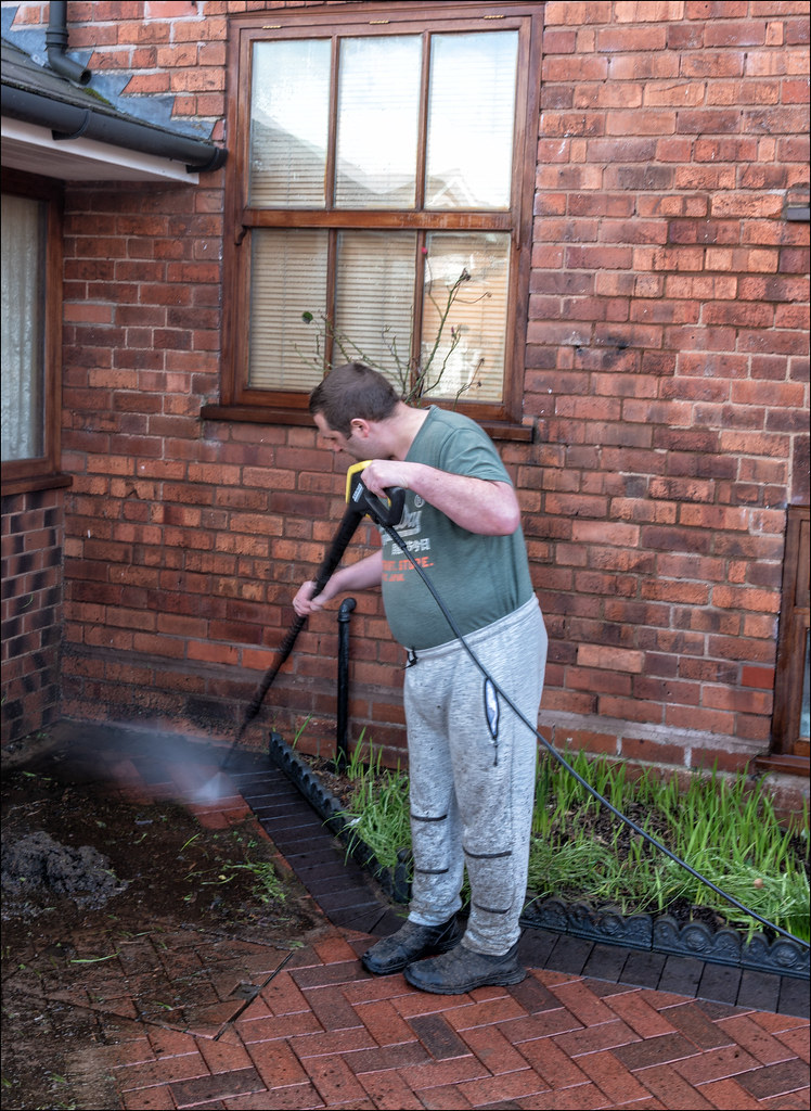
When I got back from my little wonder around Severn Valley Country Park I found my brother cleaning the drive it seamed like the perfect fit for the subject and a chance to get a rare picture of him doing something.........:naughty:

WEEK 2 CLEAN by Mark Gameson, on Flickr
 
Well that has got to be the best catch up in the history of the 52 Mark, all good shots and on theme but distant and waiting are the stand out ones for me. Beautifully taken both of them and if I had to pick one it would be waiting as it`s a cracker of a shot.

Thank you Dave I was determined to get as unto date as I could but really didn't want to use any archive images in doing so.
 
Well done on catching up Mark....done with style!!
These are terrific images, and all fit their respective themes nicely.

New: Very nice use of DoF here, and the colours are great. I think I prefer the third image....the cooler treatment works for me, though all are fab!
Clean: Nice shot, fits the theme well. If only all brothers would be so helpful....I would have to pay mine to do this....and then only maybe would he do it!!:giggle:
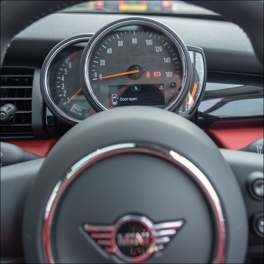
Open: Nice, detailed dash image, fits the theme and is well composed.
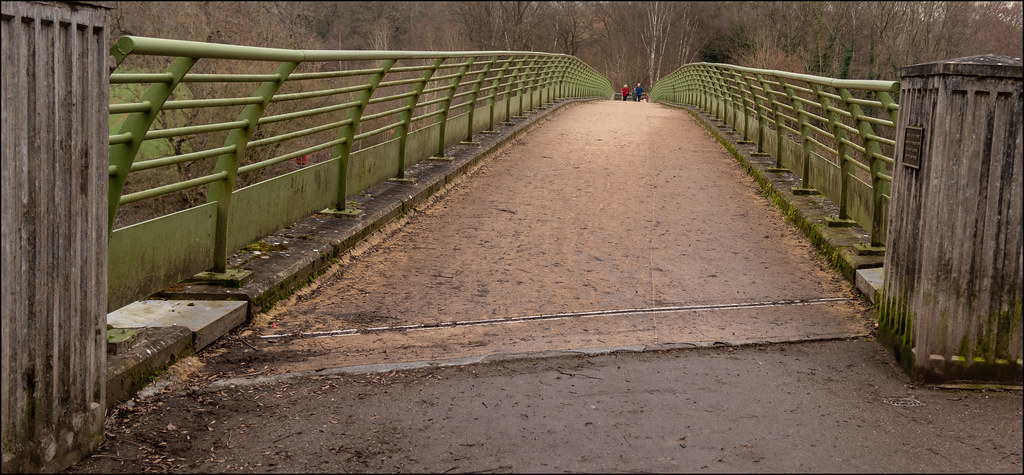
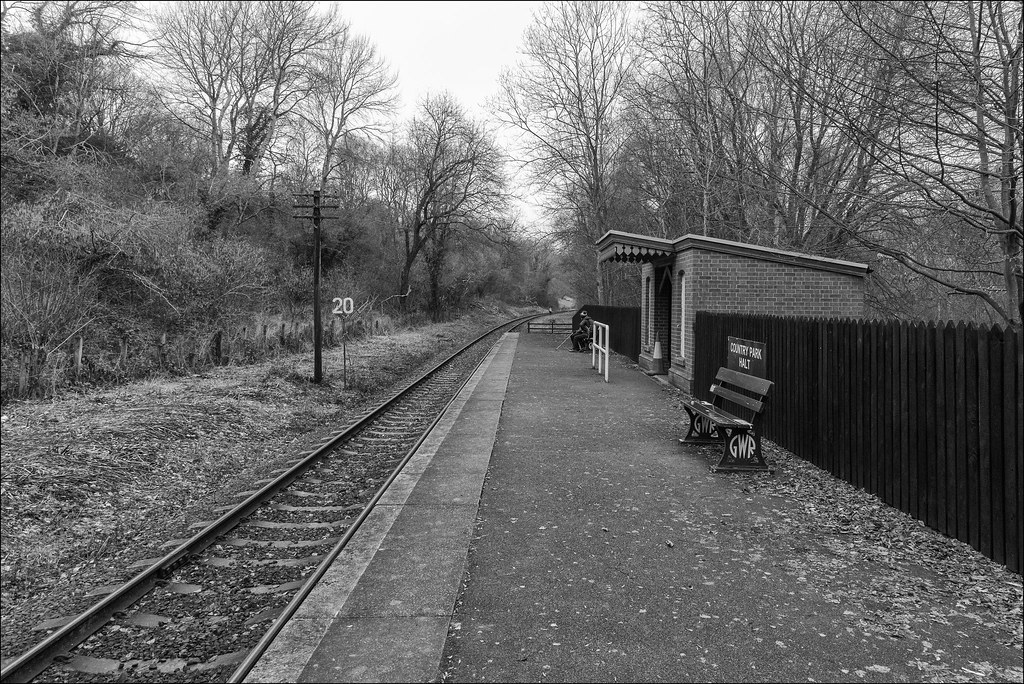
Distant: I love this....those railings work very well as leading lines to draw the eye to the people in the distance. Great front to back detail too, especially considering you were at f4. Nicely done.
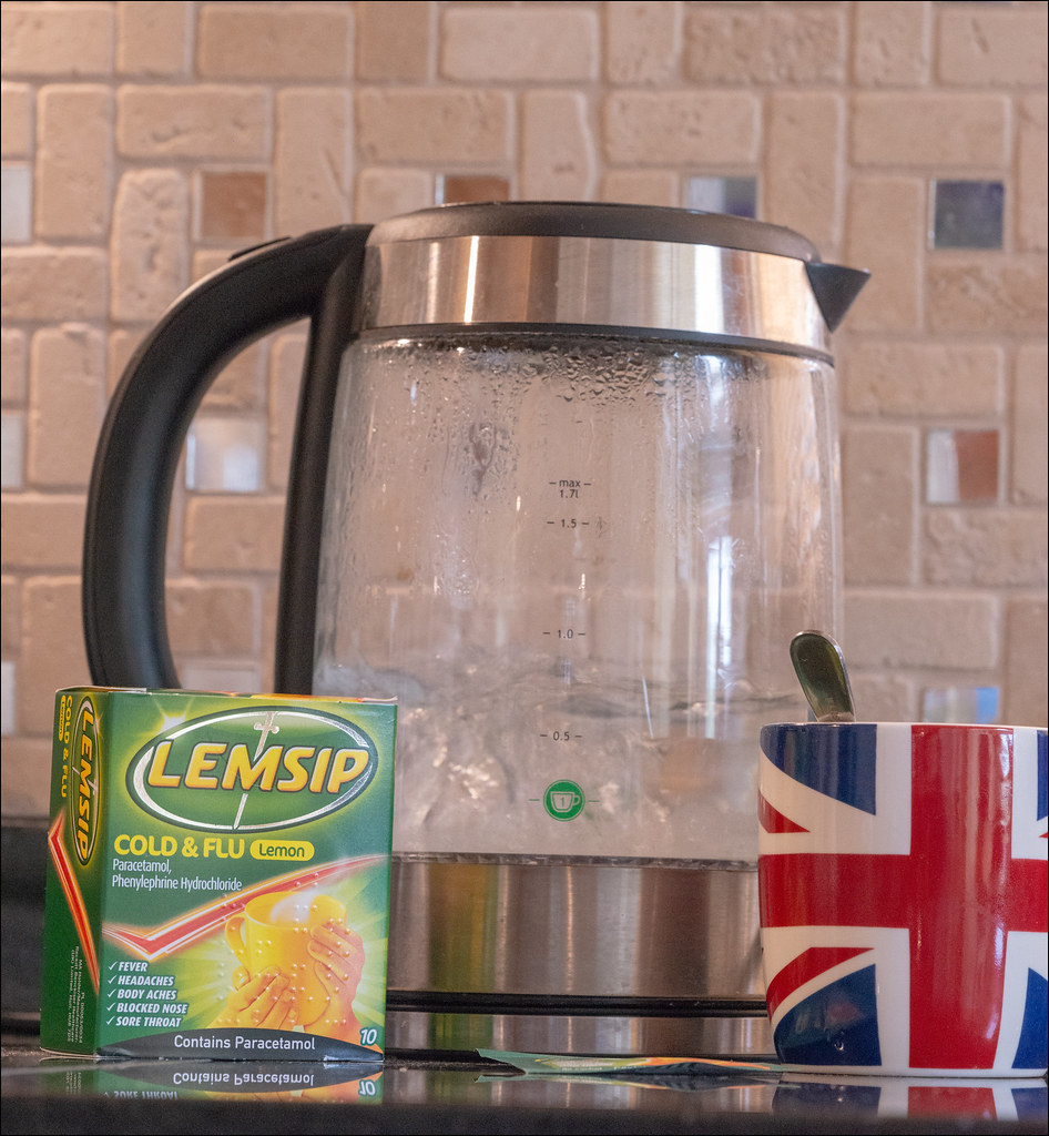
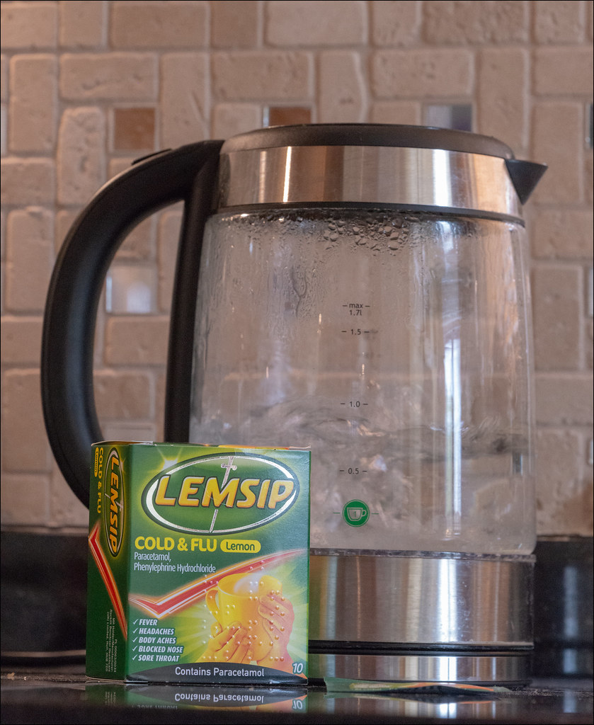
Cold: Very nice. I think I like the first image....but only because I have that very same mug! Fits the theme well.
Waiting: This is a terrific image! Very nicely processed in mono with some great details and you've used the tracks well to lead the eye up to the person waiting.
A great composition.
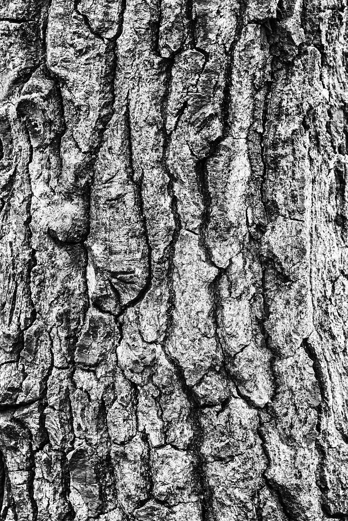
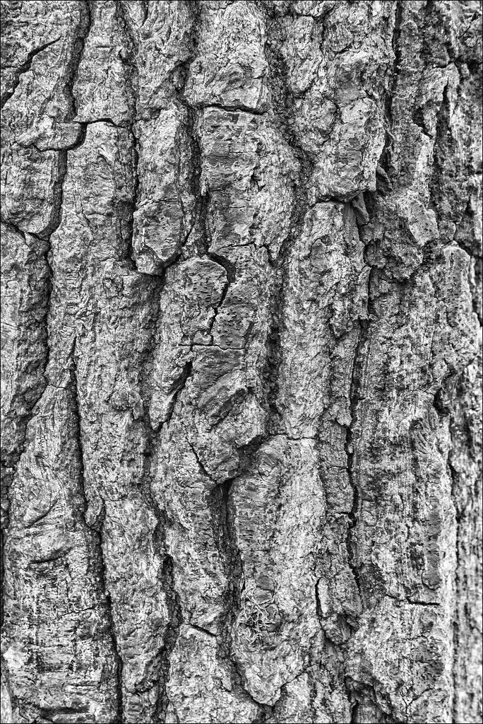
Rough: Very nice closeup of tree bark. Such amazing detail....takes on an almost abstract feel, which I like a lot!
I think I like the punchier/contrasty image better, though both are really good!

Terrific work Mark, and well done again for catching up!(y)
 
Epic catch up Mark :clap: All great images.

New - Image 2 for me. The light on the new buds makes the image for me.
Clean - Great for the theme. That looks like a cold and wet job!
Open - Very novel take on the theme - brilliant thinking.
Distant - I like this a lot. The railing take my eye to the figures in the distance. Great shot.
Cold - Good fits to the theme. I think the mug free version works best for me.
Waiting - Another great shot. Took me a while to see the waiting passenger at the far end.
Rough - The first one for me - I can really appreciate the rough texture.
 
Well done for the catch up the bridge shot is the stand out for me closely followed by the first bark shot for rough
 
Welcome back, Mark, and that's an excellent catch-up - well done :)

My favourites are the bridge with the people at the far end and the nicely curved rails, 'Cold' with the colourful mug to match the bright colours of the Lemsip packet, and the first image of the bark with strong contrast showing the deep fissures.
 
Well that has got to be the best catch up in the history of the 52 Mark, all good shots and on theme but distant and waiting are the stand out ones for me. Beautifully taken both of them and if I had to pick one it would be waiting as it`s a cracker of a shot.

Thanks Dave I was lucky with the waiting image as I wondered down to the station hoping for a train (didn't see any) I turned round and the 2 people had sat on the bench and then there was the guy in the distance too!

Great catch up!! I'll go along with Dave. Distant and waiting are superb!

Thanks Bob

Well done on catching up Mark....done with style!!
These are terrific images, and all fit their respective themes nicely.


New: Very nice use of DoF here, and the colours are great. I think I prefer the third image....the cooler treatment works for me, though all are fab!
Clean: Nice shot, fits the theme well. If only all brothers would be so helpful....I would have to pay mine to do this....and then only maybe would he do it!!:giggle:
Open: Nice, detailed dash image, fits the theme and is well composed.
Distant: I love this....those railings work very well as leading lines to draw the eye to the people in the distance. Great front to back detail too, especially considering you were at f4. Nicely done.
Cold: Very nice. I think I like the first image....but only because I have that very same mug! Fits the theme well.
Waiting: This is a terrific image! Very nicely processed in mono with some great details and you've used the tracks well to lead the eye up to the person waiting.
A great composition.
Rough: Very nice closeup of tree bark. Such amazing detail....takes on an almost abstract feel, which I like a lot!
I think I like the punchier/contrasty image better, though both are really good!

Terrific work Mark, and well done again for catching up!(y)

Thank you Gareth I really appreciate you taking the time to comment.

Epic catch up Mark :clap: All great images.

New - Image 2 for me. The light on the new buds makes the image for me.
Clean - Great for the theme. That looks like a cold and wet job!
Open - Very novel take on the theme - brilliant thinking.
Distant - I like this a lot. The railing take my eye to the figures in the distance. Great shot.
Cold - Good fits to the theme. I think the mug free version works best for me.
Waiting - Another great shot. Took me a while to see the waiting passenger at the far end.
Rough - The first one for me - I can really appreciate the rough texture.

Thanks Lee much appreciated

Well done for the catch up the bridge shot is the stand out for me closely followed by the first bark shot for rough

Thanks Allan glad to be up to date (for now....)

Welcome back, Mark, and that's an excellent catch-up - well done :)

My favourites are the bridge with the people at the far end and the nicely curved rails, 'Cold' with the colourful mug to match the bright colours of the Lemsip packet, and the first image of the bark with strong contrast showing the deep fissures.

Thanks Andrea glad to be back and determined to complete it this year!
 
Wow 7 themes in one trip - very resourceful and all fit the themes well. Waiting and rough are my favourites.
Waiting: Lovely processing and great lead in line of the track. The figures completes the image waiting for the train.
Rough: a good abstract type image with some real rough texture detail in the bark.
 
Love the first rough image. I love a nice contrasty black and which - it gives it so much texture
 
Welcome back Mark.

  • New - #3, I prefer the background colour.
  • Clean - I hope those joggers were going straight in the washing machine afterwards. Does it need that much headroom? I know it would cut the window in half, but not sure if that would be a problem or not.
  • Open - Works for the theme and you had to get a Mini into one of the catch-up shots :) Kind of surprised it's not in all of them...
  • Distant - This does work though, you've followed the golden rule of having a subject at the end of the leading line (y)
  • Cold - That's how I've been feeling for the past couple of days (though beechams rather than lemsip) so bang on as far as I'm concerned. I think the second of the two, without the extra colour the cup adds for me.
  • Waiting - That's the SVR isn't it? (Only GWR heritage railway I can think of running past a country park).
  • Works for me. The only thing I would have changed is I would have moved the cone before taking the shot.
  • Rough - #2 I think. The first feels a bit over processed.
 
Wow 7 themes in one trip - very resourceful and all fit the themes well. Waiting and rough are my favourites.
Waiting: Lovely processing and great lead in line of the track. The figures completes the image waiting for the train.
Rough: a good abstract type image with some real rough texture detail in the bark.

Thanks Mandy :)

Wow what a catch up ! I think I would of given up ! All images are on the themes for sure. I am an avid fan of trees so my favourite has to be rough

Cheers Chris I'm determined to finish this years challenge!:D

Love the first rough image. I love a nice contrasty black and which - it gives it so much texture

Thank you Ian :)

some interesting images going on there, and some good story telling for the themes, my favourite is distant as I really like the effect you have portrayed on the bridge.

Thank you :)

Welcome back Mark.

  • New - #3, I prefer the background colour.
  • Clean - I hope those joggers were going straight in the washing machine afterwards. Does it need that much headroom? I know it would cut the window in half, but not sure if that would be a problem or not.
  • Open - Works for the theme and you had to get a Mini into one of the catch-up shots :) Kind of surprised it's not in all of them...
  • Distant - This does work though, you've followed the golden rule of having a subject at the end of the leading line (y)
  • Cold - That's how I've been feeling for the past couple of days (though beechams rather than lemsip) so bang on as far as I'm concerned. I think the second of the two, without the extra colour the cup adds for me.
  • Waiting - That's the SVR isn't it? (Only GWR heritage railway I can think of running past a country park).
  • Works for me. The only thing I would have changed is I would have moved the cone before taking the shot.
  • Rough - #2 I think. The first feels a bit over processed.

Thanks Tim really appreciate your comments, yep waiting was taking at the Severn Valley well spotted :) Oh and I'm sure the minis will feature in the future throughout my 52 jus need the washer to hold now so I can get the old one out!

Rough
This first bark shot is the better of of the two. It has more contrast, which I like.

Thanks Dominic
 
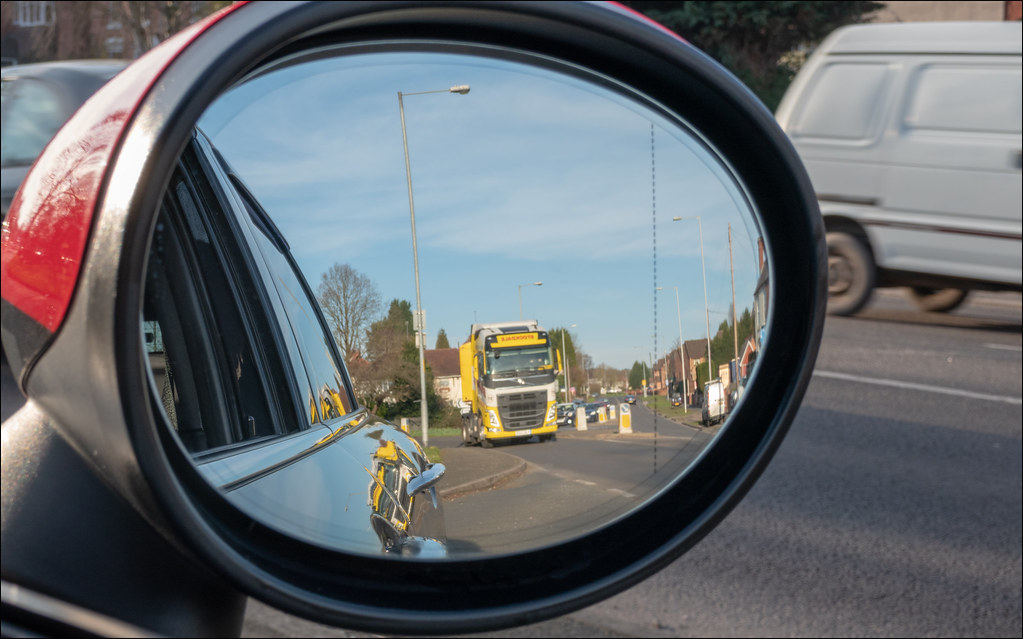
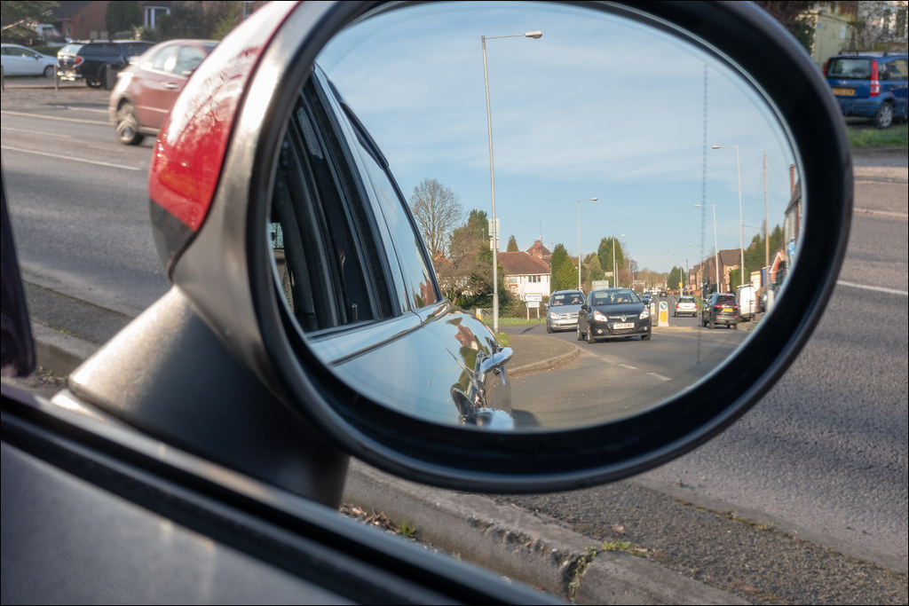
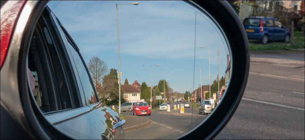
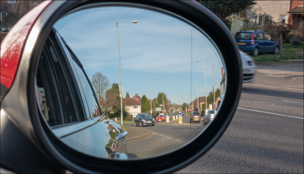
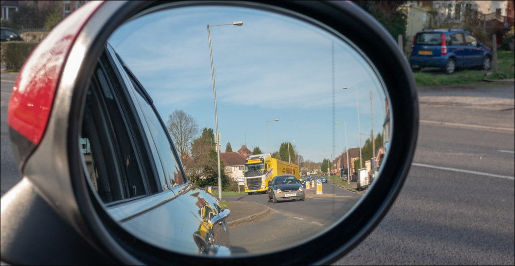
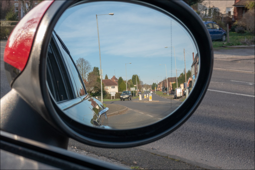
Thanks for all your comments so far guys now on to week 8 and Objects In The Rear View Mirror always appear closer then they are........

WEEK 8 OBJECT 4 by Mark Gameson, on Flickr

WEEK 8 OBJECT 1 by Mark Gameson, on Flickr

WEEK 8 OBJECT 2 by Mark Gameson, on Flickr

WEEK 8 OBJECT 3 by Mark Gameson, on Flickr

WEEK 8 OBJECT 5 by Mark Gameson, on Flickr

WEEK 8 OBJECT 6 by Mark Gameson, on Flickr

These were all taken on Sunday I was hoping to do a re shoot on this as I wanted to get a few whilst moving but I couldn't do it while driving.........:eek:
 
I like your rough image Mark. The first one works best for me because I love mono with heavy contrast to boost the details.

Very good take on object theme. Works well for the theme
 
A good set of images for Object. As other have said, the yellow lorry works well as it really adds colour and stands out. Thank you for not attempting it whilst driving :eek: :police: ;)
 
Definitely works for the theme. I seem to recall I had a car once with the text on the mirror as if you needed reminding! Out of them all I think your first shot with the yellow lorry is the best
 
I like your rough image Mark. The first one works best for me because I love mono with heavy contrast to boost the details.

Very good take on object theme. Works well for the theme

Thanks Ian much appreciated

1st image for object Mark, good and clear take on the theme.

Cheers Dave

Nice idea I think the first one works the best with the bright yellow truck

Thanks Allan I was lucky with the lorry!

Agreed, the first image works well with that big yellow truck.
Very creative idea, and well executed.
(y)

Thanks Gareth.

I think I'm going to opt for Object 5.
it has the yellow truck but doesn't have the Bedford Rascal (I think) photobombing the shot.

Thanks Tim yes that Rescal van photobombed my image!

A good set of images for Object. As other have said, the yellow lorry works well as it really adds colour and stands out. Thank you for not attempting it whilst driving :eek: :police: ;)

Thanks Lee yes I thought I had best be good I#m not sure blaming @Cobra would have gone down very well!!

Yes, a good set. hard to choose a fave, but maybe the first as others have said.

Thanks Bob
Definitely works for the theme. I seem to recall I had a car once with the text on the mirror as if you needed reminding! Out of them all I think your first shot with the yellow lorry is the best

Thanks Chris

Nice to see an original idea for Object, Mark, and the first one is my pick because of the bright colour and scale of the lorry (y)

Cheers Andrea.

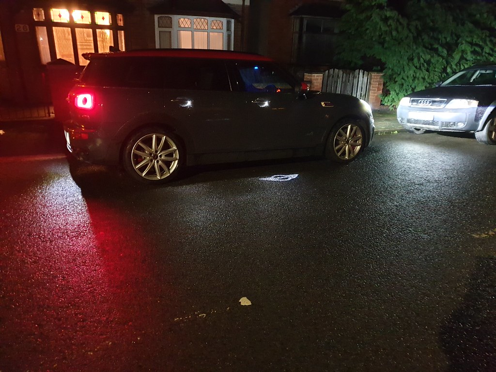
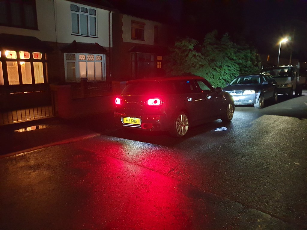
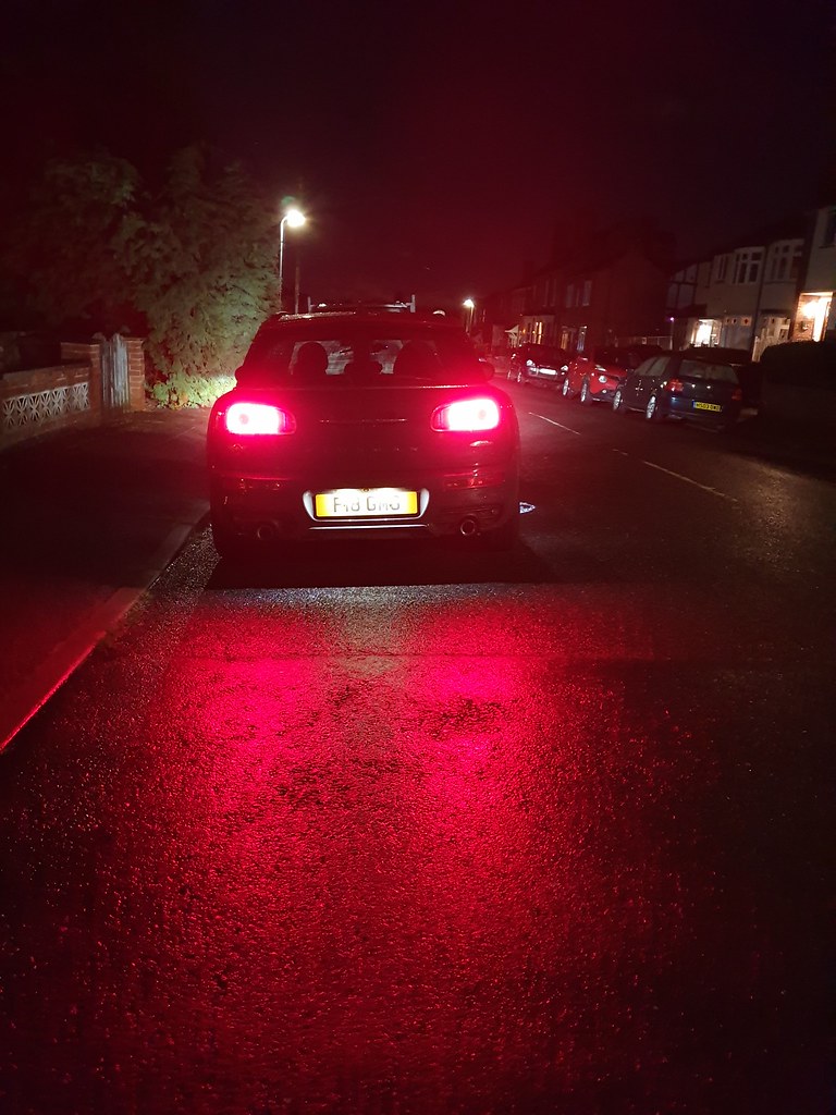
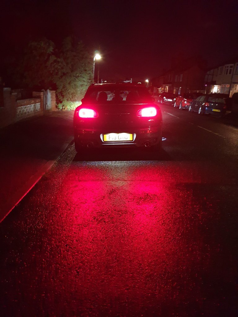
Thank you all for your comments and I even managed to get a MINI in the image too!:D
 
I#m not sure blaming @Cobra would have gone down very well!!
Every other bugger does, for all the worlds ills I don't see why you should be any different :D
 
Great set of images Mark!
The bright reflections from the tail lights on the wet road really work very nicely, and are well exposed....especially for SOOC.
Your posted image is excellent, and I'm curious about that 'Mini' logo shining on the road....is that a feature of the car?
It's pretty cool, and your image shows it nicely.(y)
 
I like the first one because the mini logo on the floor jumps out at you and catches your attention, but I like the red reflections on the wet floor in the second one as well.
 
Back
Top