You are using an out of date browser. It may not display this or other websites correctly.
You should upgrade or use an alternative browser.
You should upgrade or use an alternative browser.
weekly Fazers 2012 52 - Dun and Dusted
- Thread starter fazer
- Start date
- Messages
- 889
- Name
- John
- Edit My Images
- Yes
Week 46 and 47
Art - Shot through a shop window using P&S. Bit of a gamble but seems to meet the theme....I hope
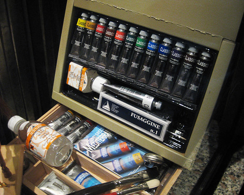
Week 46 Art by Fazer, on Flickr
Colour - Another P&S taken whilst raining.
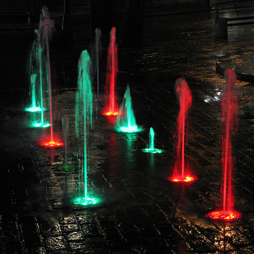
Week 47 Colour by Fazer, on Flickr
Art - Shot through a shop window using P&S. Bit of a gamble but seems to meet the theme....I hope

Week 46 Art by Fazer, on Flickr
Colour - Another P&S taken whilst raining.

Week 47 Colour by Fazer, on Flickr
- Messages
- 6,502
- Name
- Peter
- Edit My Images
- Yes
Art - It certainly does meet the theme. I've done well if you took this through a shop window.
Colour - It looks like the rain has helped with this as the reflections on the brick floor add to the image. Not as keen on the background but I guess there's nothing you could have done about that.
Colour - It looks like the rain has helped with this as the reflections on the brick floor add to the image. Not as keen on the background but I guess there's nothing you could have done about that.
- Messages
- 2,820
- Name
- Mark
- Edit My Images
- Yes
Hi John.
Art is a good shot, especially given how it was shot. I think the bottle bottom left spoils it a bit, but obviously you couldn't do anything about that.
Colour I love! I like the background and the contrast between the warm lights and the rainy ground. Nice composition too.
Art is a good shot, especially given how it was shot. I think the bottle bottom left spoils it a bit, but obviously you couldn't do anything about that.
Colour I love! I like the background and the contrast between the warm lights and the rainy ground. Nice composition too.
- Messages
- 8,398
- Name
- Lynne
- Edit My Images
- Yes
Hi John
Color....I'm liking this , great capture of the fountains , the reflections add to the shot as do the wet bricks...nice one , yup definately
Art...for shooting through a window you've done relly well to avoid reflections & got a great angle as well
Color....I'm liking this , great capture of the fountains , the reflections add to the shot as do the wet bricks...nice one , yup definately

Art...for shooting through a window you've done relly well to avoid reflections & got a great angle as well
blakester
Shine On Harvest Moon
- Messages
- 6,679
- Name
- Iain
- Edit My Images
- No
Art, yes John on theme, certainly. Just needs a little something else to set it apart from a straightforward capture John. Not a lot you can do about composition of the materials, maybe just a closer crop on the details 
Colour, I like this one John, good composition with some nice leading lines drawing the viewer in and through.

Colour, I like this one John, good composition with some nice leading lines drawing the viewer in and through.
- Messages
- 4,834
- Name
- Alan
- Edit My Images
- Yes
Hi John
Art - good spot, on theme. Agree with other comments re fold in box and composition
Colour - cracking shot - very hard to get right. Wet b/g helps.
Art - good spot, on theme. Agree with other comments re fold in box and composition
Colour - cracking shot - very hard to get right. Wet b/g helps.
The goblin
<span class="poty">POTY Winner 2015</span></br>
- Messages
- 4,407
- Name
- Marsha
- Edit My Images
- Yes
Hi John,
Art, I agree that you've done well considering it's through a window, definitely fits the theme.
Colour, love this, the rain really has helped. I hadn't really noticed the background, then took a closer look, is there a man stood at the back? It looks a bit ghostly blending in what the water
Art, I agree that you've done well considering it's through a window, definitely fits the theme.
Colour, love this, the rain really has helped. I hadn't really noticed the background, then took a closer look, is there a man stood at the back? It looks a bit ghostly blending in what the water
- Messages
- 889
- Name
- John
- Edit My Images
- Yes
Week 48 Shadow
Found this to be a really difficult subject and still not 100% happy with the result. No lack of ideas but the execution was never right.

Week 48 Shadow1 by Fazer, on Flickr
Found this to be a really difficult subject and still not 100% happy with the result. No lack of ideas but the execution was never right.

Week 48 Shadow1 by Fazer, on Flickr
- Messages
- 2,820
- Name
- Mark
- Edit My Images
- Yes
Hi John, I like that, especially with the B&W conversion, but the knots in the wood are distracting for me, being too similar to the shadows of the leaves. I think a different background might have given it more depth.
Not that I'd expect you to change your fence or dig the rose up; maybe place something different between the rose and the fence?
Not that I'd expect you to change your fence or dig the rose up; maybe place something different between the rose and the fence?
Last edited:
- Messages
- 4,834
- Name
- Alan
- Edit My Images
- Yes
John,
I agree with Mark on comp, b&w and knots
I agree with Mark on comp, b&w and knots
- Messages
- 889
- Name
- John
- Edit My Images
- Yes
Thanks Mark, Alan and Allan, I totally agree about the knots and would rather they were not there. The dark band is due to different colour fence panels. Will ask neighbhour to change these panels.  If I can find time may try a more PP to lower these annoyances.
 If I can find time may try a more PP to lower these annoyances.
- Messages
- 4,834
- Name
- Alan
- Edit My Images
- Yes
....Will ask neighbhour to change these panels........
Absolutely - doesn't he know that you are an artist?
blakester
Shine On Harvest Moon
- Messages
- 6,679
- Name
- Iain
- Edit My Images
- No
Good work John, bang on theme.
I don't mind the differing colour fence panels, they make for an interesting background contrast.
I would even consider cropping the actual flower itself out and just have the shadow and fence panels. The light/dark tones are wonderful with some lovey detail/texture in there. Iain
I don't mind the differing colour fence panels, they make for an interesting background contrast.
I would even consider cropping the actual flower itself out and just have the shadow and fence panels. The light/dark tones are wonderful with some lovey detail/texture in there. Iain
- Messages
- 19,461
- Name
- Andy
- Edit My Images
- Yes
Eeek, missed quite a few of yours :nono: ...if it's OK, I'll comment on last few 
Pack is on theme but appears time wasn't on your side.
Art, on theme and well captured with a P&S.
Colour, they look great. Lovely colours and well captured. BG is a tad distracting and a bit closer for me.
Shadow, again on theme and fairly well composed. Liking the angle of the shadow and the use of the wood BG works for me. I'd just like to see it without knots in the wood.
Good show...
Cheers.
- Messages
- 889
- Name
- John
- Edit My Images
- Yes
Thanks for all your comments. Thought I would revisit some of the other shots of shadow and find one without knots. Hopefully a more pleasing effect.

Week 48 Shadow2 by Fazer, on Flickr

Week 48 Shadow2 by Fazer, on Flickr
- Messages
- 4,834
- Name
- Alan
- Edit My Images
- Yes
Yes, that is nice. Quite a calming feeling to it. Good detail in the flowere and leaves
- Messages
- 6,502
- Name
- Peter
- Edit My Images
- Yes
I prefer this edit without the knots although a bit more distance between shadow and the edge would improve.
- Messages
- 889
- Name
- John
- Edit My Images
- Yes
Week 49 Glow
At the risk of melting parts of the equipment, a play with extension tubes.
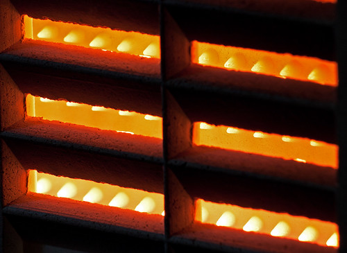
Week 49 Glow1 by Fazer, on Flickr
At the risk of melting parts of the equipment, a play with extension tubes.

Week 49 Glow1 by Fazer, on Flickr
- Messages
- 6,502
- Name
- Peter
- Edit My Images
- Yes
I quite like this John although would have suggested a bit more DoF to bring in the right hand side. How close were you to worry about melting things?
- Messages
- 4,834
- Name
- Alan
- Edit My Images
- Yes
Certainly fits the theme John and has a nice warm glow
- Messages
- 8,398
- Name
- Lynne
- Edit My Images
- Yes
hi John
shadow....1st image...another when on 1st viewing I went "WOW...brilliant " Liking the mono , the bg knots don't distract me as my eye immediately got the rose head...really good shot mister the 12nd version whilst still effective just doesn't grab me in the same way
Glow...another image where I can almost feel the heat...well exposed & good detail....hope no photography kit was harmed in the taking of this
shadow....1st image...another when on 1st viewing I went "WOW...brilliant " Liking the mono , the bg knots don't distract me as my eye immediately got the rose head...really good shot mister
 the 12nd version whilst still effective just doesn't grab me in the same way
Glow...another image where I can almost feel the heat...well exposed & good detail....hope no photography kit was harmed in the taking of this

The goblin
<span class="poty">POTY Winner 2015</span></br>
- Messages
- 4,407
- Name
- Marsha
- Edit My Images
- Yes
Hi John,
Shadow, I prefer the second version without knots.
Glow, I can feel the warmth from that, works for me. I agree with Summer (I think it was) about cropping the tiny slither off the top, I would crop a touch off the bottom too.
Shadow, I prefer the second version without knots.
Glow, I can feel the warmth from that, works for me. I agree with Summer (I think it was) about cropping the tiny slither off the top, I would crop a touch off the bottom too.
- Messages
- 889
- Name
- John
- Edit My Images
- Yes
Just as I thought I was ahead on submissions and reviewing all other 52'ers still on the final lap, everything went wrong. Have now spent a mad few hours catching up again.
Decided to reshoot Glow, taking account of comments and my own feelings for previous shot. My equipment survived the heat despite being so close to the gas fire. (Phew)
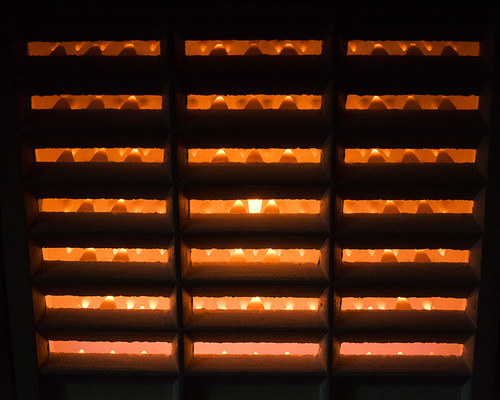
Week 49 Reshoot Glow by Fazer, on Flickr
Round
Another experiment with lighting and close up.

Week 50 Round by Fazer, on Flickr
Negative
A good reminder to check the fire alarm battery! Should point out I have deliberately left the 'Alarm Signal' writing OOF as this concentrates on the negative, but gives an idea of what the battery is used for.

Week 51 Negative by Fazer, on Flickr
P.S. Just noticed Peter's (Delta Skies) shot of battery. Did not use his idea as reviewed after taking my shot.
Decided to reshoot Glow, taking account of comments and my own feelings for previous shot. My equipment survived the heat despite being so close to the gas fire. (Phew)

Week 49 Reshoot Glow by Fazer, on Flickr
Round
Another experiment with lighting and close up.

Week 50 Round by Fazer, on Flickr
Negative
A good reminder to check the fire alarm battery! Should point out I have deliberately left the 'Alarm Signal' writing OOF as this concentrates on the negative, but gives an idea of what the battery is used for.

Week 51 Negative by Fazer, on Flickr
P.S. Just noticed Peter's (Delta Skies) shot of battery. Did not use his idea as reviewed after taking my shot.
Last edited:
- Messages
- 2,820
- Name
- Mark
- Edit My Images
- Yes
Hi John, I've missed a few of yours here; can you put them in the main thread please 
Glow, I think I prefer the original, which has more detail and therefore interest for me.
Round, a very nice shot of a very difficult subject (loads of dynamic range). I like the composition and the extra interest given by the texture of the ball, and the reflection.
Negative, very very nice indeed The DoF is perfect IMHO (in fact, better than I'd expect at f5, but what do I know!), and the context is good. I'd maybe lose the Tesco logo top right, but other than that I love it.
Glow, I think I prefer the original, which has more detail and therefore interest for me.
Round, a very nice shot of a very difficult subject (loads of dynamic range). I like the composition and the extra interest given by the texture of the ball, and the reflection.
Negative, very very nice indeed
- Messages
- 14,766
- Name
- Michael
- Edit My Images
- No
Hi John,
glow, nice warm colour in there, I would be tempted to get in a lit closer, I think a nice tight composition could work here,
Round, NIce composition and I really like the lighting, nice reflection too.
Negative, I quite like this, the dof around the negative terminal is very good. The oof alarm signal text is pulling my eye a little.
- Messages
- 6,502
- Name
- Peter
- Edit My Images
- Yes
Round - This works well especially with the reflection. I like the combination of gold and black as well
Negative - Aren't 9v batteries great As Mark and Michael have said the purposely shallow DoF works really well here. Not sure about the logo now it's been mentioned. I think the crop works so to get rid of it I guess some cloning would be required.
Negative - Aren't 9v batteries great
 As Mark and Michael have said the purposely shallow DoF works really well here. Not sure about the logo now it's been mentioned. I think the crop works so to get rid of it I guess some cloning would be required.
- Messages
- 889
- Name
- John
- Edit My Images
- Yes
Cheers Michael and Peter.
Taking account of comments, new submission
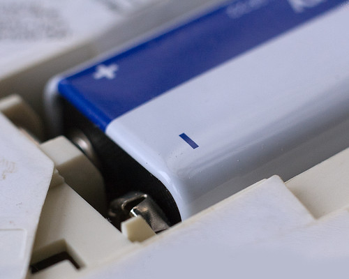
Week 51_1 Negative by Fazer, on Flickr
Taking account of comments, new submission

Week 51_1 Negative by Fazer, on Flickr

