OP
- Messages
- 4,159
- Name
- Jim
- Edit My Images
- Yes
Nice!
The silhouette against the foreboding sky really evokes the mood of the film.
Thanks Nick, appreciate the comments

Nice!
The silhouette against the foreboding sky really evokes the mood of the film.
Thats a really super stand alone shot, the colours are lovely, and it perfect for your film choice too, those birds look spooky!

Film title
I did correctly guess the title, with the clearly defined silhouette making the image
Fascinating, I never would have guessed. Thanks for explaining. I think you chose the better image and I like the border.
Very clever and interesting shot
Excellent - works really well.
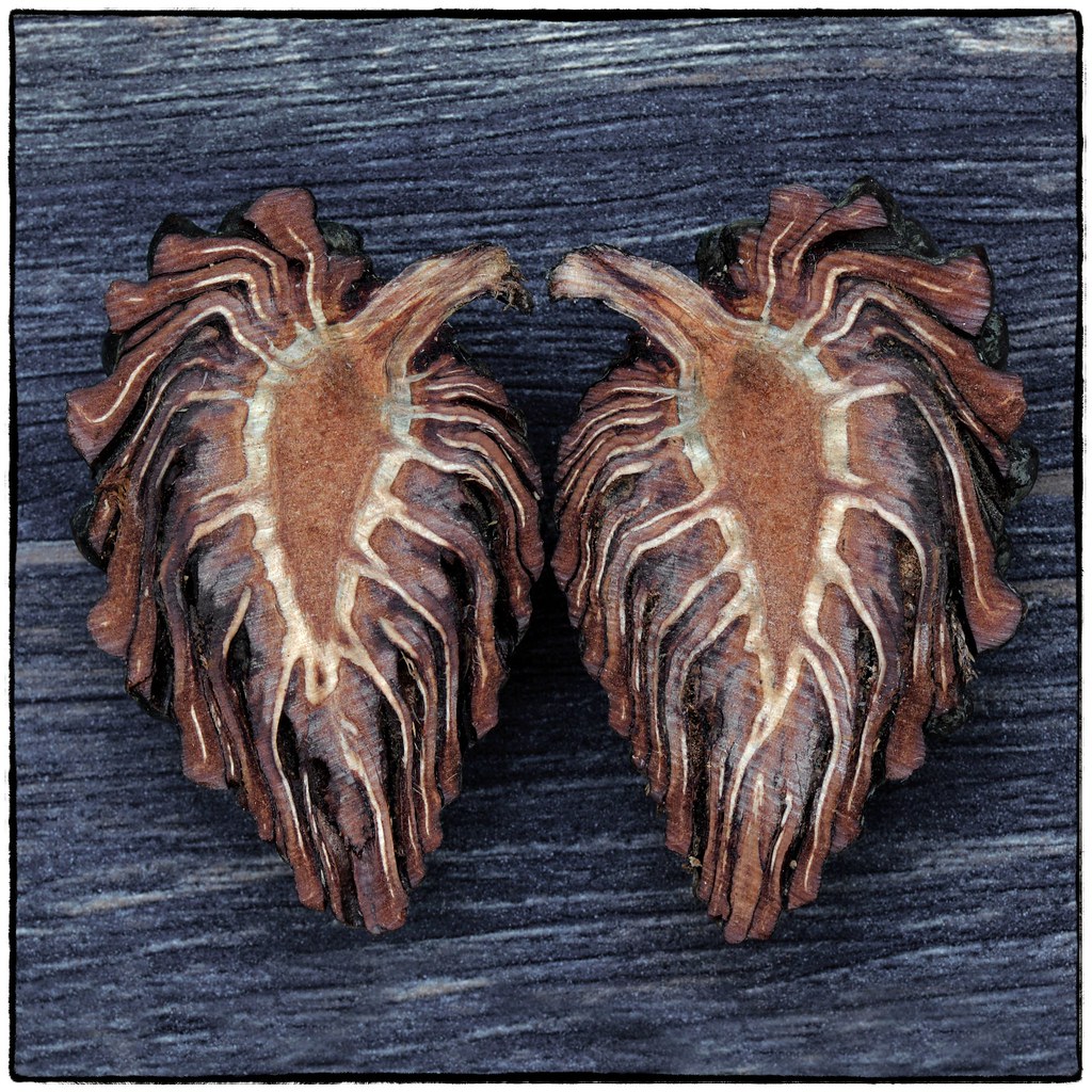
A clean cut.
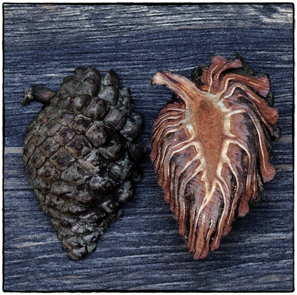
The first works well for the theme. The second tells us what it is.
A nice shot. It’s intriguing to see the internal structure, not something you tend to think about as a rule. I prefer the first shot due to the symmetry of the two halves but the second gives more context. All in all a cracking pair of halves
Really interesting. Never thought how a cone would look like in the inside before.
Fascinating, and something I've never seen before. Thanks for sharing it!
Halves
That looks great, I love the textures, patterns and tones.
Cracking job for halves, great to see what it looks like from inside.
Interesting! Honestly a question I've never asked myself, now I know.
I really like the first shot, the square crop and the symmetrical composition work really well. There's something odd about it to my eyes that must be the texture of the subject and background, but at first glance it looks almost noisy.... except I don't think it is.... weird!
Thanks Nick, I see what you mean about the noise, I think that's just because of all the textures in the image
Fascinating patterns, I would never have guessed what it was. I would maybe have moved it slightly down the wooden background to remove the highlight across the top especially in the right hand side.
Looks amazing when sawn in half. Good idea for the theme.
I think you chose the strongest of the selection.
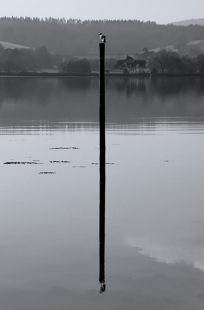
The pole shot is the one for me. Your chosen one is a bit cluttered for my liking (hence me preferring the clean, minimalist look) and the reflection less strong. It's a real part of that third image. Good stuff!
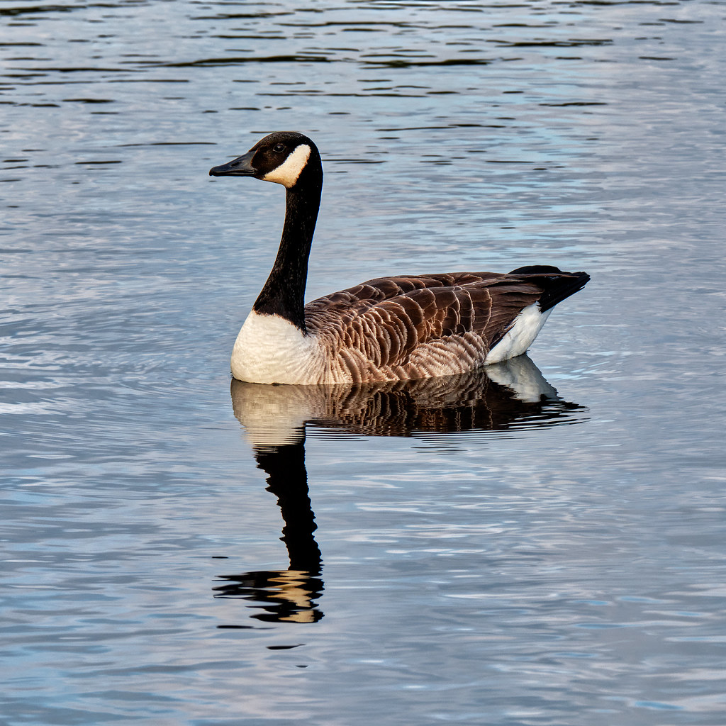
All good examples but the bird on the pole for me also
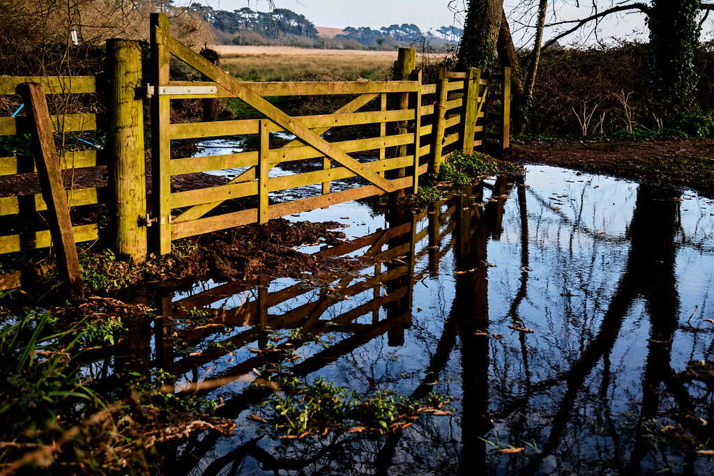
Nice set Jim, although the gate shot is nice and colourful, I'm with the others, the plain and simple pole shot is the best IMO
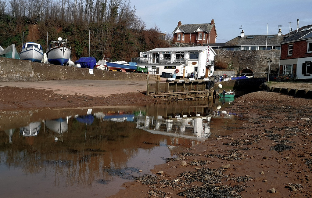
4 good choices, I like the choice you made. The light is lovely on the gate and I can just imagine my kids jumping around in a puddle like that. I do like the pole but it slightly disappoints me that the bird reflection at the bottom isn't clear.