You are using an out of date browser. It may not display this or other websites correctly.
You should upgrade or use an alternative browser.
You should upgrade or use an alternative browser.
Ian's 52 for 2021
- Thread starter Harlequin565
- Start date
- Messages
- 8,311
- Name
- Ian
- Edit My Images
- No
Week 16: Out & About
Thanks again for all the comments folks. Really encouraging me to keep up with this. Week 16 was where I fell down in 2015. My longest innings was week 21 in 2010 so this is currently the "joint worst" effort. Next week it will be 2nd best, so that's something to shoot for (pun intended!)
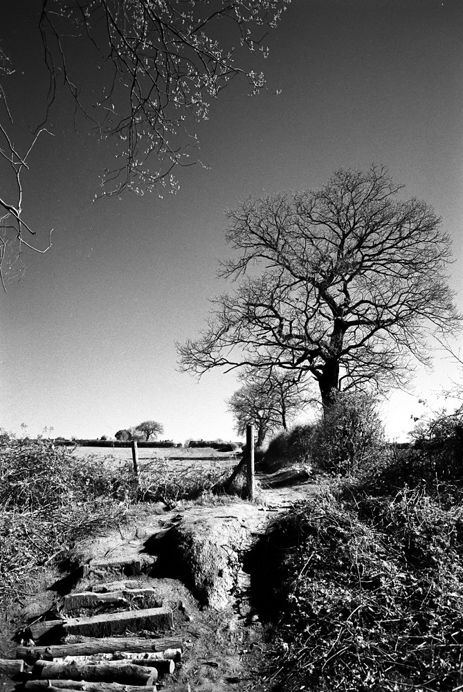
This was a nice theme for me, because I take my camera out every day on my local exercise walk. I decided to relax and just enjoy it. This was a roll of Maco TS Eagle surveillance film I have hand-rolled into cans. It's "supposed" to be IR, so I shot it with a red filter and I really do like the results hand-held. Not great shot in gloom but really nice on bright sunny days which helps with the exposure times too.

Some strong images on the contact sheet as well as a lot of junk (nothing unusual there!). Picking one was a bit tricky. 36 looks really nice small, but not so great when bigger. I really liked 14 which looks pretty miserable small, but quite nice larger...

But my final choice was this one. I have photographed this tree on a number of occasions. When we've had heavy rain, the vantage point is inaccessible due to flooding, and when summer is in full swing, it's all quite overgrown. Autumn and Spring are the best times to take this shot. And on a sunny day, with IR film, this has worked quite nicely I think. Might do a metallic print to see how it looks.
Week 16: Out & About by Ian, on Flickr
Been pretty terrible with commenting this last couple of weeks. No real excuse other than a pre-occupation with the zine exchange, and a poorly family member with lots of running about. Will Do Better this week and with an early entry I should hopefully get round to commenting.
Thanks for looking!
Thanks again for all the comments folks. Really encouraging me to keep up with this. Week 16 was where I fell down in 2015. My longest innings was week 21 in 2010 so this is currently the "joint worst" effort. Next week it will be 2nd best, so that's something to shoot for (pun intended!)
This was a nice theme for me, because I take my camera out every day on my local exercise walk. I decided to relax and just enjoy it. This was a roll of Maco TS Eagle surveillance film I have hand-rolled into cans. It's "supposed" to be IR, so I shot it with a red filter and I really do like the results hand-held. Not great shot in gloom but really nice on bright sunny days which helps with the exposure times too.

Some strong images on the contact sheet as well as a lot of junk (nothing unusual there!). Picking one was a bit tricky. 36 looks really nice small, but not so great when bigger. I really liked 14 which looks pretty miserable small, but quite nice larger...

But my final choice was this one. I have photographed this tree on a number of occasions. When we've had heavy rain, the vantage point is inaccessible due to flooding, and when summer is in full swing, it's all quite overgrown. Autumn and Spring are the best times to take this shot. And on a sunny day, with IR film, this has worked quite nicely I think. Might do a metallic print to see how it looks.

Week 16: Out & About by Ian, on Flickr
Been pretty terrible with commenting this last couple of weeks. No real excuse other than a pre-occupation with the zine exchange, and a poorly family member with lots of running about. Will Do Better this week and with an early entry I should hopefully get round to commenting.
Thanks for looking!
- Messages
- 7,130
- Edit My Images
- No
My commenting has also been falling behind. Congratulations on the milestone of equalling your worst 52 attempt so far 
There is a whole world to know about film isn't there and I am not party to it really - so thank you again for sharing background information. No. 15 looks quite interesting too - nice leading lines, and the final image. If it was me I might have to print them all as it looks difficult to choose - do you view with a magnifier or something?
I like your chosen shot because my eye follows the path up to the tree, and the overhead branches sort of hold you in to the frame.
- Messages
- 8,311
- Name
- Ian
- Edit My Images
- No
I scan them all at full resolution. The contact sheet is made because I make myself a book of contact sheets at the end of the year with all my photos, so I'm making it anyway, I find it interesting if people comment - like you did - on ones I discard.If it was me I might have to print them all as it looks difficult to choose - do you view with a magnifier or something?
Thanks for stopping by!
- Messages
- 7,130
- Edit My Images
- No
That makes sense! Hmm food for thought for printing a book of digital thumbnails and limiting myself to a certain number per month... I'm a bit worried my printer ink will be drying up at the minute as I've been lax lately.I scan them all at full resolution. The contact sheet is made because I make myself a book of contact sheets at the end of the year with all my photos, so I'm making it anyway, I find it interesting if people comment - like you did - on ones I discard.
Thanks for stopping by!
Sometimes I find when viewing thumbnails I spot something that I miss in a larger picture - distracting highlights, an overly done vignette, or even haloing around where shadows have been raised (something I noticed in Lightroom but less so these days, now I use Photolab).
- Messages
- 8,311
- Name
- Ian
- Edit My Images
- No
Sometimes I find when viewing thumbnails I spot something that I miss in a larger picture - distracting highlights, an overly done vignette, or even haloing around where shadows have been raised
For me, the thumbnails tell me whether I have a strong composition. I'm getting to the point now where I can look at a 35mm negative and see whether it's going to be good or not. The details are far less important than the overall impression (to me of course!)
The thumbnails also show me how incapable I am of taking a straight photo. I despair of myself sometimes
- Messages
- 7,130
- Edit My Images
- No
Ha ha! That made me chuckle. I have fairly recently bought a new camera and quite bizarrely I seem to get much better straight horizons on my kitesurfing shots. Sometimes I don't even have to adjust them which is a first. It must be something to do with the balance of it. Let's hope it continues!!The thumbnails also show me how incapable I am of taking a straight photo. I despair of myself sometimes
Good point on composition too and perhaps why I spotted the leading lines in number 15. The clouds look good in that one too.
- Messages
- 11,087
- Name
- Allan
- Edit My Images
- No
Some interesting images on the contact sheet 10-12 look good from what I can see, you have chosen well but there are definitely a few you could have used for the theme.
I also have the same problem with taking a straight picture a lot of mine slope to the left
I also have the same problem with taking a straight picture a lot of mine slope to the left

- Messages
- 8,311
- Name
- Ian
- Edit My Images
- No
It's something I did when I shot digital but a "roll" of film has a degree of start-finish to it that a 16Gb (or are they bigger these days?) card doesn't have. I tend to print them out occasionally and just leave them on the desk next to me so I can keep going back to them. It's what prompted me to print out #36 on metallic paper and put it on the wall... The strong contrast looks really good (although this photo of a print doesn't really do it justice!)I do enjoy looking at your contact sheets.

From 35mm to 13x19 - who says 35mm is too small!
LC2
Negan
- Messages
- 10,454
- Name
- Tim
- Edit My Images
- Yes
I use 32GB cards, but 256GB isn't uncommon.that a 16Gb (or are they bigger these days?) card doesn't have
32GB holds ~ 540 shots on my Fooj, a bit too much to print out
Mind you it would be far easier to deal with 36/72 images from a shoot that the 700 I took yesterday !!!
Continuous has a lot to answer for, though it does help a lot when the model blinks.
- Messages
- 4,659
- Name
- Pete
- Edit My Images
- Yes
I really like the Image you picked. The steps leading to the tree and the branch creating a frame as well.
Interesting write up as well.
Pete
Interesting write up as well.
Pete
- Messages
- 5,922
- Name
- Dominic
- Edit My Images
- Yes
Out and about
It's good to look at the contract sheet. All of those would be an excellent choice.
The image you've used is a great. I like how the branches in the top right corner, seem to reach out to the tree. The steps and path leads nicely to the main focal point. All in all, a lovely photo.
It's good to look at the contract sheet. All of those would be an excellent choice.
The image you've used is a great. I like how the branches in the top right corner, seem to reach out to the tree. The steps and path leads nicely to the main focal point. All in all, a lovely photo.
- Messages
- 8,311
- Name
- Ian
- Edit My Images
- No
Very much. Moab Slickrock Metallic is an incredible paper that only suits a very small number of images. I'm not good enough to figure out which, but for b&w, high contrast works really well.Good work as usual Ian, interesting hearing your thoughts on your contact sheets and your choices.
#36 looks great printed. Are you happy with it, given what you said about the difference in quality at the larger size?
At nose-up-close, the 13x19 print doesn't look super detailed from a 35mm scan, but from a normal distance of a few feet, it looks as good as any digital image.
- Messages
- 8,311
- Name
- Ian
- Edit My Images
- No
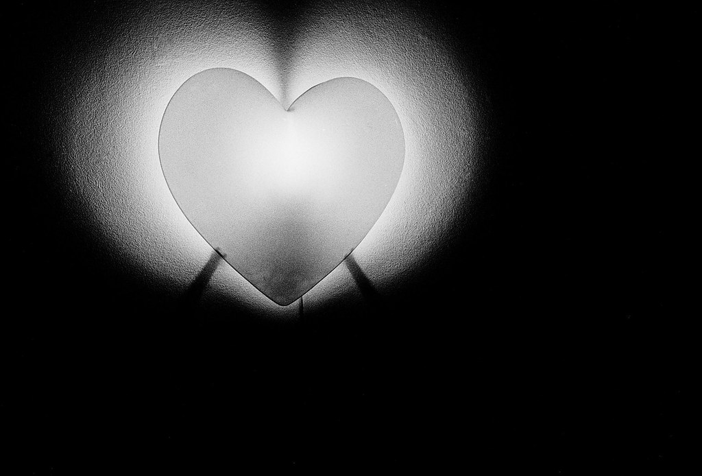
So I had a great idea for shape that just needed shadow. The only days I could get out with my camera were overcast. So I ended up with this...
Week 17: Shape by Ian, on Flickr
It's a lamp that needed to be a bit lower in the frame. It's in a hallway to 3 feet away is the best I can do with a 28mm lens. Could have gone wider but this was the widest lens I had for the camera that had film in it. Excuses, excuses....
Been a busy week and also the final week of the zine exchange so had quite a bit else going on and have managed 0 comments. Hope to resume normal service this coming week...
- Messages
- 8,311
- Name
- Ian
- Edit My Images
- No
Week 18: Numbers
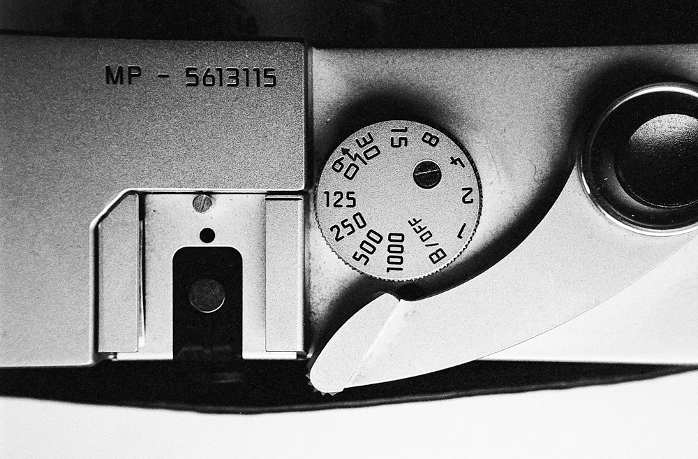
I enjoyed this one just wandering around the house with some Tri-X loaded and set to ISO 1600. Lots of camera photos!
Contact sheet if anyone is interested...

It's a higgledy piggledy import order.... I really enjoyed the T90 photos. That camera is a perfect balance of ergonomics, weight, balance and operability. I also liked my reflection in a puddle shot, so that's a win for this roll I think.
Week 18: Numbers by Ian, on Flickr
Canon EOS-1v, EF 40mm f/2.8 STM with Raynox DCR 250, Kodak Tri-X at 1600 developed in Ilford DD-X for 14 minutes.
It's the simplicity that works for me here. I should have moved a shade to the left to not chop the shutter button off but otherwise I really like it. Back on track!
I enjoyed this one just wandering around the house with some Tri-X loaded and set to ISO 1600. Lots of camera photos!
Contact sheet if anyone is interested...

It's a higgledy piggledy import order.... I really enjoyed the T90 photos. That camera is a perfect balance of ergonomics, weight, balance and operability. I also liked my reflection in a puddle shot, so that's a win for this roll I think.

Week 18: Numbers by Ian, on Flickr
Canon EOS-1v, EF 40mm f/2.8 STM with Raynox DCR 250, Kodak Tri-X at 1600 developed in Ilford DD-X for 14 minutes.
It's the simplicity that works for me here. I should have moved a shade to the left to not chop the shutter button off but otherwise I really like it. Back on track!
- Messages
- 1,246
- Edit My Images
- No
I like the simplicity of this picture too and how sharp it is. The grayscale of the picture works well and I didn’t notice the shutter button being cropped as my focus was on the dial.
The other shots are great too especially the cat but I am biased like that!
The other shots are great too especially the cat but I am biased like that!
- Messages
- 4,340
- Name
- Martin
- Edit My Images
- Yes
 The theme is numbers so having or not having the shutter button whole is largely irrelevant. Nice monochrome image.
- Messages
- 4,659
- Name
- Pete
- Edit My Images
- Yes
I love the T90 shots, does it still work?
I sold mine many years ago (for a pittance) when the internal battery started failing and it would have cost an arm and a leg to get it repaired.
Love the light on the photo you used, so simple.
Pete
I sold mine many years ago (for a pittance) when the internal battery started failing and it would have cost an arm and a leg to get it repaired.
Love the light on the photo you used, so simple.
Pete

