Ian's 52 for 2021

Two good shots.. I like the grain in the close up.. it makes a change from crystal clear macros.
 
I am in awe of you using film and developing your own shots. It really is a lot more work than most of us do before we even think about composing the shots or what subject to take.

Patterns works really well for the theme as you have patterns in the glass, plus patterns in the frames - or was it something leaning against the glass?

Up Close has lots of lovely detail in it and I like that the flower is off centre.

Congratulations on reaching a record for the 52 :)
 
Patterns works really well for the theme as you have patterns in the glass, plus patterns in the frames - or was it something leaning against the glass?

It's a cheap "stained glass" stick-on thing that my wife put on the window and the intent was for the double pattern thing...
No need to be in awe of using film. It's almost quicker for me to get 24/36 shots on to my computer because on digital I'd take a million and spend the evening curating. Half an hour to develop, another half hour to scan in (which I do while watching telly). The only major pain is when I only want to take a handful of photos for the 52 and have no camera with a handful of frames left. Worse if I'm shooting colour because I couldn't get that done in a 7 day turnaround (shoot, develop, scan, post).
I've been given a couple of old rolls of colour film and plan to put them into an old camera (one of those stuck at the back of the cupboard), but I'm worried it will be like the old days and I have to work up to taking the shot because of the expense :ROFLMAO: One day I might have to look into what it all involves if you develop your own B&W ones... something to think about when I have more time on my hands as no doubt there is quite a learning curve, and no doubt it's not cheap either.
 
Personal. Week 23.


Week 23: Personal
by Ian, on Flickr

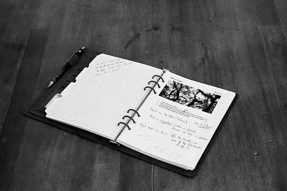
I really needed to get back on top of comments so wanted to get this out the door quick this week. Lots of things are personal to me, but my film journal is very personal because it's got all my notes about different films, what I like/dislike about them and how the developers react with them. Also got notes about some of my more "temperamental" cameras and what I need to remember when using them.

I'm not overly swung one way or another with the exposure/composition. I'm sure there are better ways of presenting a book, and with hindsight I should have done more research. I got a bit of a rude awakening on Flickr when I searched for "personal" (top tip - don't do this at work!).

Film choice was the last few frames of P3200 which I had in the camera. I need to work through this stock, because it's been sat in the fridge for months.

Alternative was the front cover, but comparing it to the one I chose - I found it less personal.

2021-06-11-p3200-mp-28.jpg
 
I had thought of doing a filofax/journal type shot, but this is far more interesting and relevant to photography.

I think the second shot just edges it for me, I'm not sure why, perhaps it's the composition or perhaps because it's a little less contrasty? Both fit the theme well and top marks for getting a film shot sorted so early in the week.
 
Patterns
A nice set of patterns, interesting glass too.

Close up
I feel it's lacking a little bit of contrast, but I do like the detail in the centre and the composition.
 
Personal, nicely interpreted Ian, it works well (y)
 
Its a good interpretation of the theme particularly the first one as it includes your handwritten notes
 
I agree with @Allan.H, lovely interpretation of the theme with the first one being more personal with your handwriting on the page. Good work Ian.
 
Yep - works a treat - and yes to No1 :)
 
The tones of #1 get it from me too!

I really like how the stain/mark on the wood is an integral part of the composition.
 
I really like how the stain/mark on the wood is an integral part of the composition.

Hah you spotted it... Thanks Nick. It was the only bit of the table I could work the composition into without a lot of clearing stuff and messing around with backgrounds. So I decided to make it a feature with the intent to see if anyone thought it was bad or good.
 
Hah you spotted it... Thanks Nick. It was the only bit of the table I could work the composition into without a lot of clearing stuff and messing around with backgrounds. So I decided to make it a feature with the intent to see if anyone thought it was bad or good.

It really stood out!
 
I like the "used" table top too - it adds something to the theme. Second shot for me as your handwritten notes are "personal"
 
Patterns
I can imagine this type of image with backlighting is a lot more difficult using film, do you have a set list of settings that work for specific scenarios?
Up close
Congrats on reaching your highest number of theme weeks, here's hoping you can continue to completion. A really nice image with lovely lighting

Personal
I can see where keeping info on what works with each film type will speed up the workflow. Any paper notes I have with technical info I have taken to capturing with a mobile, one advantage being Google Photos can find text within the uploaded images
 
do you have a set list of settings that work for specific scenarios?

In short - no :) With that shot I knew the glass needed to be rendered as a mid tone, so just let the meter do it's thing knowing that as long as I didn't utterly blow the highlights I'd be fine. With film, I find that the highlights are often quite forgiving, it's the shadows that can get blocked up. With that film in particular, I used Diafine as the developer which is even more generous with the tones.

I find digital to be the other way round - shadow detail is quite good, but highlights can get blown to white really easily.
 
Week 24: Green

So my initial panic here was the fact that I wouldn't get a colour image back in time. I do have a handful of frames left on a roll of colour, but I'm thinking of making a book of my 52, and having one colour image would have really upset my... tidyness...

So there had to be another option.


Week 25: Green
by Ian, on Flickr

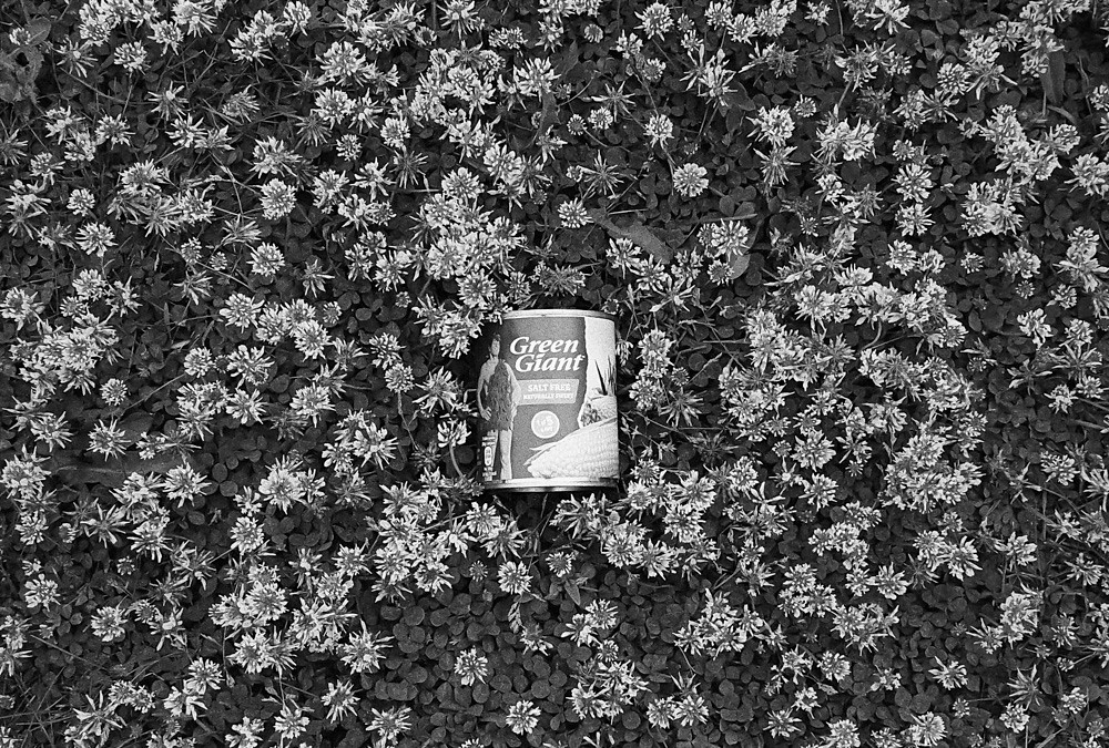
I have far more photos of this in different places than I'll ever need. Slightly hampered by picking the camera with P3200 in it because the only other roll I'm part way through is Acros and I'm not wasting money on it!

I quite liked this for the contrast and pattern that the clover gives off, and if I've got to mow round it for the next week or so I might as well get some use out of it along with the bees.
 
Its bang on, not subtle at all :) the clover makes an interesting BG.
I can only imagine how many situations that can has been in.
 
Very nice little shoe horn Ian. (y)
 
Nicely done, good for the theme on a couple of levels and clever use of the can.
 
Superb take on the theme :)
 
A literal take on the theme Ian but in the circumstances of shooting on B&W film I don't suppose you have many options :D
 
A literal take on the theme Ian but in the circumstances of shooting on B&W film I don't suppose you have many options :D
I think you did much better with a (mostly) non-green subject. Lesson learned for me.
 
Green
Absolutely nothing wrong with that. It's actually a bit like a billboard poster for Green giant, sweetcorn, or i can imagine seeing it in a 50's magazine.
 
Thanks for the comments folks. Please don't feel that you have to comment for a couple of weeks. I'm getting tardy again and slightly behind.

I'm thinking of making a book of my 52, and thought that come colour across the centre pages might work well. I shot the images on Saturday and got my download links for the scans this evening, so colour is absolutely prohibitive for a long term 52.

RB67, Portra 160. Pleased with the exposures, not so pleased with the compositions. The images I thought would work didn't so I had to do some jiggery pokery to get things how I wanted them.

We've been having a go at keeping roses since we lost our cat 3 years ago. Some have done well, some less so, but it's been a journey!

rose_tryptich.jpg

The intent is to split this across the double middle pages. I did think about putting a board behind them to black out the background, but as these roses all represent special things, it's less about technical excellence, and the background has context for me.

New printer coming tomorrow and will probably get round to setting it up at the weekend. Might christen it with a nice big wall print.
 
Last edited:
We planted a Cotoneaster where we buried our cat. We always call it the Jasper bush.

I think this will make a lovely colourful splash in the centre of your 52. The depth of field isolates the blooms nicely. I might have had to put the purple one in the middle, although you have a single bloom in the middle with a spray either side... and perhaps that does work better.
 
Week 26: Looking Down

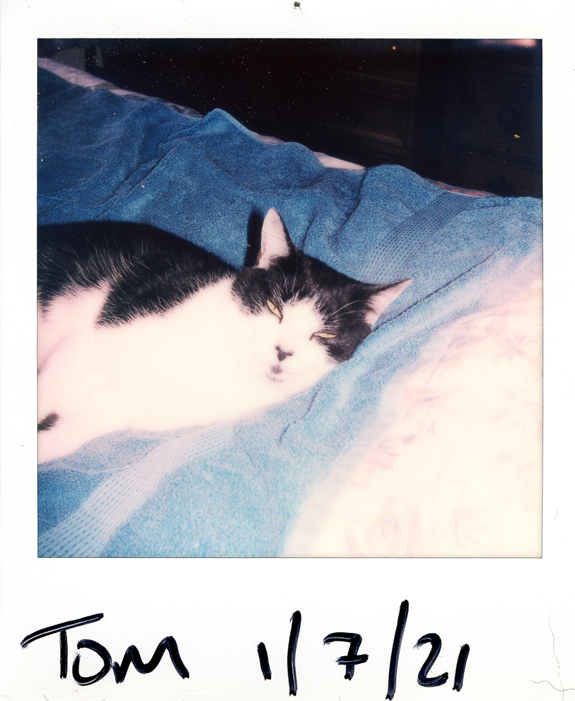
Got myself a Polaroid this week and the first pack went on having fun and getting into my Memento vibe. Such a cool film.


Week 26: Looking Down
by Ian, on Flickr

Looking down on the cat. We're half way aren't we? Must up my game because this is pretty shoehorny. I'd love a shot of the cat looking down at me from the roof, but with only 7 days I've very little chance...
 
Not a shoehorn at all says me who did something similar, sounds like you are enjoying your new toy.
 
I love the texture and colour of polaroids... especially when they fade over time. Bit of a shoehorn but cute cat too..
 
Back
Top