You are using an out of date browser. It may not display this or other websites correctly.
You should upgrade or use an alternative browser.
You should upgrade or use an alternative browser.
Nod's attempt at a 52 for '22. 52/52 - Showcase.
- Thread starter Nod
- Start date
Nod
Tootles
- Messages
- 45,619
- Name
- Nod (UK)
- Edit My Images
- Yes
- Messages
- 2,167
- Name
- Nick
- Edit My Images
- Yes
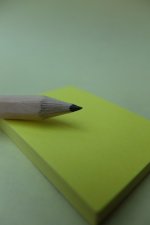
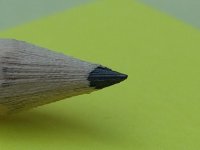
I'm less of a fan of the crop, it doesn't really say anything to me, it's a photograph 'of' something... nice detail though.
The wider shot is a different matter, the blank post-it awaiting something is reinforced (in my head anyway) by the blankness of the rest of the frame. Bang on theme... the future yet to be written. It could be new years resolutions, new ideas, a new to do list... anything. It works.
The wider shot is a different matter, the blank post-it awaiting something is reinforced (in my head anyway) by the blankness of the rest of the frame. Bang on theme... the future yet to be written. It could be new years resolutions, new ideas, a new to do list... anything. It works.
Nod
Tootles
- Messages
- 45,619
- Name
- Nod (UK)
- Edit My Images
- Yes
It was a bit rushed TBH - having the attention span of a drunken gnat, I knew that if I didn't shoot it straight away, I'd either forget or not get around to it! (One of my reasons for attempting the 52 is to improve the attention span.)
Nick, I completely agree. The blank sheet contains my resolutions - I don't make them any more since the chances of me keeping them are minimal!
Tech details...
Fuji X30 in manual mode.
f/2
1/500th
ISO 100
Daylight in the conservatory, set up so I was facing South. Backdrop is an A4 sheet of paper wedged to give a basic infinity cove. Pencil appears with no permission from the Swedish purveyor of meatballs.
Fuji Dave
I'm in Clover
- Messages
- 22,088
- Name
- Dave
- Edit My Images
- No
Hi Nod the close is good but no story to it at all, the wider view is much better. Could be anything you like new year new to do list new shopping list so a nice image. Oh you need to set the Link to bring others here to comment.
Nod
Tootles
- Messages
- 45,619
- Name
- Nod (UK)
- Edit My Images
- Yes
Oh you need to set the Link to bring others here to comment.
Done. Set the link to post #1 in the thread and will try to remember to set future links to the relevant post in this thread!
Paul, I still quite like the closer up version but the one I've posted is a bit underexposed to show the newness of the "lead" among other things. The pad is yellow BTW! Had I decided to redo the close up, I'd have taken the pencil off the pad and shot it against the paper, maybe even moving things around to get better light on the tip. The pencil was deliberately set straight across the frame.
Choice made, right or wrong!
- Messages
- 4,345
- Name
- Martin
- Edit My Images
- Yes
Nick, I completely agree. The blank sheet contains my resolutions - I don't make them any more since the chances of me keeping them are minimal!
I make only one New Year's resolution and that is to continue to make only one New Year's resolution. I've done that for decades and achieved it every time
Nod
Tootles
- Messages
- 45,619
- Name
- Nod (UK)
- Edit My Images
- Yes
That ticks the box - nicely done. The closeup works best for me as it appears to be better lit.
Interesting. They are exactly the same exposure and were taken within 10 seconds or so of each other. Both lit solely by what little natural light was available!
- Messages
- 2,835
- Name
- Pete
- Edit My Images
- No
A nice idea. I like the contrasting angles on the first one best. I might just have brightened it up a little in pp.
Nod
Tootles
- Messages
- 45,619
- Name
- Nod (UK)
- Edit My Images
- Yes
Going a bit brighter made the pad and background look quite different colours so I kept it relatively low key.
Trying (as a personal challenge) to do everything SOOC if possible, just cropping and resizing (again, in camera, hence the small size).
Trying (as a personal challenge) to do everything SOOC if possible, just cropping and resizing (again, in camera, hence the small size).
- Messages
- 4,665
- Name
- Pete
- Edit My Images
- Yes
I prefer the wider shot as the pad give some context and food for thought. Nice new pencil
- Messages
- 3,451
- Name
- Kell
- Edit My Images
- Yes
I prefer the wider shot too. I really like the colours too.
I don't dislike the crop, but I think it gives another meaning to 'NEW' - the pencil looks unused, so in that respect it's on theme, but the wider shot brings in more intrigue. As others have said, the crisp piece of paper could be the start of anything...
I don't dislike the crop, but I think it gives another meaning to 'NEW' - the pencil looks unused, so in that respect it's on theme, but the wider shot brings in more intrigue. As others have said, the crisp piece of paper could be the start of anything...
- Messages
- 3,145
- Name
- bill
- Edit My Images
- Yes
I like the image of the pencil with the paper. The colours work very well. I also like the image you've chosen rather than the macro of the pencil tip.
It gives a better sense of balance, depth and context.
It gives a better sense of balance, depth and context.
Nod
Tootles
- Messages
- 45,619
- Name
- Nod (UK)
- Edit My Images
- Yes
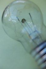
Had a couple of thoughts but a quick read of the comments thread showed me that my first idea was far from fresh - a selfie with ICM... Tried a couple but couldn't manage one I was happy with! (I'm anything BUT photogenic at the best of times!!!) Next up was the same shot as last week but with an old pencil on a crumpled PostIt. Didn't work as well as I hoped it would! As luck would have it, Mrs Nod brought home a blown incandescent light bulb from her studio so I set that up on the same backdrop as the one I used last week (a yellow A4 sheet of paper) to keep some continuity and managed to get the X-30 (compact) to focus on the burned end of the filament. OLD tech and a now OLD and broken example of it!

LC2
Negan
- Messages
- 10,459
- Name
- Tim
- Edit My Images
- Yes
Interesting shot, and having read your explanation I see what you were after and captured.
Though I must admit my eye was first drawn to the text on the outside of the bulb, which also seems in focus and didn't seem like it should have been the focus point.
Did you try any with the centre of the filament as the focal point? As that would seem more natural (albeit not what you were after).
Nod
Tootles
- Messages
- 45,619
- Name
- Nod (UK)
- Edit My Images
- Yes
That is a good effort, maybe a darker BG.
I considered a darker BG but felt that the filament would have been a bit lost against it and since I still had the
Interesting shot, and having read your explanation I see what you were after and captured.
Though I must admit my eye was first drawn to the text on the outside of the bulb, which also seems in focus and didn't seem like it should have been the focus point.
Did you try any with the centre of the filament as the focal point? As that would seem more natural (albeit not what you were after).
TBH, I didn't try any other parts as the focal point since it's the broken bit that (to me) signifies the age of the bulb (or lamp for any pedants!) You're quite right about the lettering being a bit of a distraction but it's there so I left it in.
Nod
Tootles
- Messages
- 45,619
- Name
- Nod (UK)
- Edit My Images
- Yes
Reading a response to one of my comments on someone else's shot (that I hope was taken in the light hearted way it was made), it occurred to me that my setup was old as well as the concept - same paper etc. and the camera's not THAT new (~2014 IIRC)!
- Messages
- 3,145
- Name
- bill
- Edit My Images
- Yes
To be honest Nod, I didn't even see the burnt out end of the filament until I read your comment and looked for it. My eye kept getting drawn to the printing on the bulb.
I think that it's a good concept but I think that I would have tried a couple of different focal points.
I think that it's a good concept but I think that I would have tried a couple of different focal points.
- Messages
- 8,330
- Name
- Ian
- Edit My Images
- No
I was surprised by how much I liked this one. The really subtle detail works well to add real interest to what might be a "nothing" shot otherwise.
Well done.
Well done.
- Messages
- 7,130
- Edit My Images
- No
I like the composition. I noticed the reflections more than the printing ha ha! Can't help but try and work out the surroundings  I think I'd have enjoyed a little more depth of field, but I understand it is the broken filament that reinforces the old theme as well as the old tech. A great idea.
Nod
Tootles
- Messages
- 45,619
- Name
- Nod (UK)
- Edit My Images
- Yes
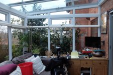
The surroundings are a conservatory, so the reflections are of our back wall with the roof supports of the conservatory running across it as well as the "view" out through the roof and main wall.I like the composition. I noticed the reflections more than the printing ha ha! Can't help but try and work out the surroundingsI think I'd have enjoyed a little more depth of field, but I understand it is the broken filament that reinforces the old theme as well as the old tech. A great idea.
- Messages
- 7,130
- Edit My Images
- No
Thank youThe surroundings are a conservatory, so the reflections are of our back wall with the roof supports of the conservatory running across it as well as the "view" out through the roof and main wall.
- Messages
- 4,665
- Name
- Pete
- Edit My Images
- Yes
I think you tried a difficult object in difficult surroundings which I now know to be your conservatory. Your idea of the theme works.

