You are using an out of date browser. It may not display this or other websites correctly.
You should upgrade or use an alternative browser.
You should upgrade or use an alternative browser.
Nod's attempt at a 52 for '22. 52/52 - Showcase.
- Thread starter Nod
- Start date
Nod
Tootles
- Messages
- 45,725
- Name
- Nod (UK)
- Edit My Images
- Yes
Abandoned that thought! I was considering just the blank sheet of paper - a receptacle for words but decided to use shoehorns later in the year!
Probably a common theme this week, I decided on a glass; in this instance, a shot glass of ouzo. I tried the bottle beside the glass but the framing was too tight to get enough of the bottle in beside the glass (having decided to use the same backdrop as weeks 1 & 2).
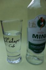
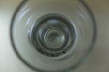
Next thought (to be a little different to other submissions) was to shoot straight down on the glass to make it vaguely abstract but I decided against using that one as well. It might have worked better with a coloured liquid but the ouzo was going back in the bottle so I didn't want to add any water to make it cloudy! I'd decided it had to be a Greek drink since the glass is from a friend's bar and has the bar's name in Greek (Chalaro translates as Ruin - the bar is in an old ruin) on it.
So I ended up with a straight on shot of a shot of ouzo in a receptacle...
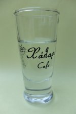
Probably a common theme this week, I decided on a glass; in this instance, a shot glass of ouzo. I tried the bottle beside the glass but the framing was too tight to get enough of the bottle in beside the glass (having decided to use the same backdrop as weeks 1 & 2).

Next thought (to be a little different to other submissions) was to shoot straight down on the glass to make it vaguely abstract but I decided against using that one as well. It might have worked better with a coloured liquid but the ouzo was going back in the bottle so I didn't want to add any water to make it cloudy! I'd decided it had to be a Greek drink since the glass is from a friend's bar and has the bar's name in Greek (Chalaro translates as Ruin - the bar is in an old ruin) on it.

So I ended up with a straight on shot of a shot of ouzo in a receptacle...

Personally. I would have gone for the shot looking down on the glass - more interesting I think.
Your chosen presentation is good, with nice lighting and seamless background, very tidy.
Don't approve of pouring the booze back in the bottle though, that sets a dangerous precedent.
Your chosen presentation is good, with nice lighting and seamless background, very tidy.
Don't approve of pouring the booze back in the bottle though, that sets a dangerous precedent.
Nod
Tootles
- Messages
- 45,725
- Name
- Nod (UK)
- Edit My Images
- Yes
So would (re!) starting drinking (especially spirits...) before 18:00! Been there, done that, can't remember much of my early 20s...
As with the first 2 weeks, natural light in the conservatory. I thought I had an A3 sheet of that paper but only got A4 so if there's a larger subject, I'll need to reset!
As with the first 2 weeks, natural light in the conservatory. I thought I had an A3 sheet of that paper but only got A4 so if there's a larger subject, I'll need to reset!
- Messages
- 3,145
- Name
- bill
- Edit My Images
- Yes
I think that I agree with Paul, I found the second shot to be more interesting. I don't think that you would need to use any coloured liquid. Just play with the crop, the lighting and maybe b&w conversion.
Nod
Tootles
- Messages
- 45,725
- Name
- Nod (UK)
- Edit My Images
- Yes
I think that I agree with Paul, I found the second shot to be more interesting. I don't think that you would need to use any coloured liquid. Just play with the crop, the lighting and maybe b&w conversion.
I'm trying to get everything SOOC - for one thing, I still haven't got my desktop machine sorted and also, I hate spending the time faffing! (I used to shoot on slide film so had to get it right in the camera!) Part of the shot is also the bar's logo and the straight down shot loses that.
Shame the first shot didn't work out, as that might have been the one..... second one has more interest, but your chosen one ticks the box.
IF I had the right colour paper in A3, I'd agree with the first being the one but since I don't (and wanted to use the same colour and set up as many times as possible!), it wasn't really possible. I did try with putting the bottle behind the glass but that just created a mushy mess!
Thanks for the comments and suggestions.
Nod
Tootles
- Messages
- 45,725
- Name
- Nod (UK)
- Edit My Images
- Yes
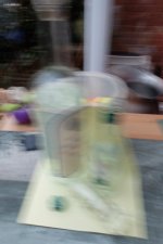
Having slurpished myslef (ok, I'll admit it, I haven't been drinking. Yet!) by managing 3 weeks on the same micro studio set up, I will now have to retire it - slight (deliberate but invisible) spillage of a drop of Ouzo will leave the paper unusable (other than as notepaper). The subject also lent itself to the introduction of a little ICM. Took several tries to get enough to blur but not so much to render the bottles unrecognisable as well as to get them reasonably well centred in the frame (and close to vertical!) I did try a bit of rotation and off kilterness but I didn't like them as much as the end result.
f/4.5, 1/14th seconds, ISO 100. Fuji X-30. Resized in camera.
f/4.5, 1/14th seconds, ISO 100. Fuji X-30. Resized in camera.

- Messages
- 3,145
- Name
- bill
- Edit My Images
- Yes
On point Nod, good shot.
- Messages
- 1,293
- Name
- Stuart
- Edit My Images
- Yes
New - Nice lateral thinking, both are interesting with the main image just "shading" it with the better lighting (?!)
Old - Any time there is words your first instinct is to try and read it which does take me away a bit from the main element for the theme. A tighter crop without the words if possible could be an option.
Receptacle - The image straight through the glass is the most interesting, maybe some coloured liquid in the bottom could provide different effects
Bottle(s) - Ticked off the ICM tech. initially I couldn't see the bottles, is it a white frame that vertically behind them. Did you try any other backgrounds?
Last edited:
Nod
Tootles
- Messages
- 45,725
- Name
- Nod (UK)
- Edit My Images
- Yes
The white frame is a bit of the conservatory. The idea behind the "shot" was that "shots" had been taken, hence the ICM! It's the same background (well, the yellow paper bit is!) as the other 3 shots, partially to see if I could do the whole month with the one background, however, it was too small to accommodate the ICM aspect so I took a step back.
Nod
Tootles
- Messages
- 45,725
- Name
- Nod (UK)
- Edit My Images
- Yes
Purely and simply to see if I could get all 5 of the challenges so far in one shot...
A NEW season Camelia, and OLD season Rose in a RECEPTACLE that just happens to be a BOTTLE with a touch of pull back ICM and a dash of flash. IF it was part of the challenge, I'd reshoot it without the flash to get more ICM but it isn't so I won't!
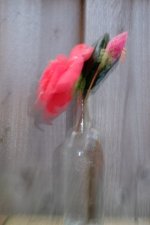
A NEW season Camelia, and OLD season Rose in a RECEPTACLE that just happens to be a BOTTLE with a touch of pull back ICM and a dash of flash. IF it was part of the challenge, I'd reshoot it without the flash to get more ICM but it isn't so I won't!

- Messages
- 7,134
- Edit My Images
- No
I think it's quite hard to tell it's a bottle, but then ICM is often unrecognisable from what I can tell. At least you have the technique behind you, and hopefully enjoyed a drink in the process ha ha! I have yet to do it. My only attempts in the past have resulted in completely unrecognisable subjects.
Nod
Tootles
- Messages
- 45,725
- Name
- Nod (UK)
- Edit My Images
- Yes
I was half hoping that the new, old etc. series would continue with blue and borrowed but I knew it was a rather unlikely scenario - I was going to use an uncirculated (well, fresh out of the cashpoint!) blue fiver for the whole set - old but new, often borrowed and very blue!
Looking forward to tomorrow's challenge for the next week...
Looking forward to tomorrow's challenge for the next week...
Nod
Tootles
- Messages
- 45,725
- Name
- Nod (UK)
- Edit My Images
- Yes
Mondays being Mrs Nod's day off (well, daytime - she teaches from 17:30 - 2100), we usually go somewhere fairly local for a wander and a bite to eat so I'd decided that today was the day to get my snapper's choice shot while we were wandering along at Dawlish Warren. Light could have been better and the X-H1 with the 100-400 would have done one of the shots better but I'm enjoying the freedom that the X-30 is giving me as well as the limitations it imposes. Anyway, here's what it threw up at me!
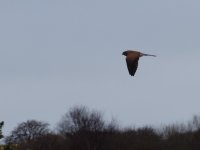
As we were parking up, we spotted something in one of the trees very close to the car park and when someone else got too close, it took off, revealing itself as a kestrel. A quick grab shot caught it in flight but against a relatively bright sky, it hasn't retained much detail in the SOOC shot. I dare say that a stop or 2 of EC would have helped it but 1) it would have blown the sky and 2) would have missed me the shot or some PP would bring it up quite well but I'm aiming for everything to be done in-camera. This is a bit of a crop from the original to put the bird on a third and to lose some of the bushes.
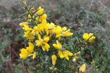
Next to the path, just before crossing to the beach, there was a little gorse bush right by the path and while the light wasn't great for some things, it was pretty good for this! I love the smell of gorse blossoms so it was a little extra treat for me!
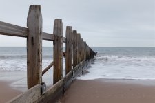
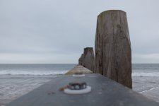
Once on the beach, there are a load of groynes so I had a little play at leading lines and exaggerated perspective. Shame the sky was so uninteresting!
And the winner is...
As we were parking up, we spotted something in one of the trees very close to the car park and when someone else got too close, it took off, revealing itself as a kestrel. A quick grab shot caught it in flight but against a relatively bright sky, it hasn't retained much detail in the SOOC shot. I dare say that a stop or 2 of EC would have helped it but 1) it would have blown the sky and 2) would have missed me the shot or some PP would bring it up quite well but I'm aiming for everything to be done in-camera. This is a bit of a crop from the original to put the bird on a third and to lose some of the bushes.

Next to the path, just before crossing to the beach, there was a little gorse bush right by the path and while the light wasn't great for some things, it was pretty good for this! I love the smell of gorse blossoms so it was a little extra treat for me!

Once on the beach, there are a load of groynes so I had a little play at leading lines and exaggerated perspective. Shame the sky was so uninteresting!


And the winner is...
Last edited:
- Messages
- 1,293
- Name
- Stuart
- Edit My Images
- Yes
Well done still managing to capture the kestrel. Not sure about the extra water at the right hand side of the post in the last image. Personally I viewed it more balanced zooming in which effectively cropped to the edge of the post. Prefer the third one as it's more open.
- Messages
- 3,145
- Name
- bill
- Edit My Images
- Yes
I think that it's the third shot for me Nod but I would have loved to see the Kestrel shot after a little TLC in Lightroom.
- Messages
- 2,836
- Name
- Pete
- Edit My Images
- No
The third one for me too. Those lines work nicely.
Nod
Tootles
- Messages
- 45,725
- Name
- Nod (UK)
- Edit My Images
- Yes
Thanks for all the kind comments.
Better light brings out the colours in the wood much better BUT that tends to be in Summer when the beach is crawling with tourists! Getting the sand with no footprints is all but impossible, even on a fastish falling tide. And that's if I could find a parking spot!
I had the camera on its way up to my eye when the Kestrel took off from the tree so it was relatively simple to pan with it (one of my photographic interests is motorsport and the Kestrel was moving slower than a race car!)
I get what you mean about there being too much water - a square crop suits the image well but isn't an in-camera option for PP (although I THINK I can shoot in square format with the X-30.)
Feel free to do a little lift and post the result. I always shoot in JPEG so lifting is slightly limited. In an ideal world, I'd have dialled in some EC but it was a bit of a grab shot so I didn't have time to think and twiddle the knob!
It was quite chilly (about 7°C according to the car) and fairly windy. Better light would help with the wood and conditions are sometimes right to have the late Sun on the groynes and beach with a brooding sky behind - unfortunately, not yesterday! (Actually, I tell a lie! On the way back to the pub for lunch, the Sun did poke through the cloud for about 10 seconds and even then, it was lunchtime so not the ideal angle or colour!
I may have to revisit in Autumn and take a wider lens. Ain't life a beach!
All nice shots nod, but I really like the first ground shot - the leading lines, the overall composition, colours etc. I’d happily hang that on a wall.
Better light brings out the colours in the wood much better BUT that tends to be in Summer when the beach is crawling with tourists! Getting the sand with no footprints is all but impossible, even on a fastish falling tide. And that's if I could find a parking spot!
Well done still managing to capture the kestrel. Not sure about the extra water at the right hand side of the post in the last image. Personally I viewed it more balanced zooming in which effectively cropped to the edge of the post. Prefer the third one as it's more open.
I had the camera on its way up to my eye when the Kestrel took off from the tree so it was relatively simple to pan with it (one of my photographic interests is motorsport and the Kestrel was moving slower than a race car!)
I get what you mean about there being too much water - a square crop suits the image well but isn't an in-camera option for PP (although I THINK I can shoot in square format with the X-30.)
I think that it's the third shot for me Nod but I would have loved to see the Kestrel shot after a little TLC in Lightroom.
Feel free to do a little lift and post the result. I always shoot in JPEG so lifting is slightly limited. In an ideal world, I'd have dialled in some EC but it was a bit of a grab shot so I didn't have time to think and twiddle the knob!
As above, I really like the leading lines in shot 3. I don't think the sky matters much, there is interest in it, just cold, horrible wintery interest, and that lends itself to how the image feels.
It was quite chilly (about 7°C according to the car) and fairly windy. Better light would help with the wood and conditions are sometimes right to have the late Sun on the groynes and beach with a brooding sky behind - unfortunately, not yesterday! (Actually, I tell a lie! On the way back to the pub for lunch, the Sun did poke through the cloud for about 10 seconds and even then, it was lunchtime so not the ideal angle or colour!
I may have to revisit in Autumn and take a wider lens. Ain't life a beach!
Nod
Tootles
- Messages
- 45,725
- Name
- Nod (UK)
- Edit My Images
- Yes
I'll just have to go back and reshoot! Some of the other groynes there have marker posts on the end which could add a little extra aspect as well. Another couple of hundred yards and there shouldn't be (but often are...) any dog prints - it's a nature reserve.
Note to self - get a 2022 tide table!!!
Note to self - get a 2022 tide table!!!
Nod
Tootles
- Messages
- 45,725
- Name
- Nod (UK)
- Edit My Images
- Yes
Onwards and upwards!
For this week, I had a couple of options for alleys that are easy to get at, although neither is actually an alley! BUT, one was originally an alley before it was renamed a street and the other was thought to have been an inspiration for Diagon Alley in the Harry Potter books - JKR was a student here. (I reckon a small covered walkway between that and a small car park is more likely to be that inspiration but it was too dark to get a naturally lit shot and the "fill in" flash I attempted [I'm anything BUT a flash master!!!] took over.)
So, here are the shots, with a shoehorn added for fun!
Parliament Street (Formerly Parliament ALLEY)
From the High Street end.
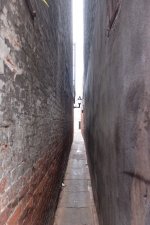
Being a little wider than 2'1", I had to turn sideways to shuffle down it to the far end.
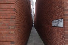
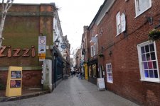
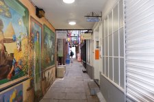
Next up is Gandy Street and New Buildings. Gandy Street is the open air one and New Buildings is rather more enclosed.
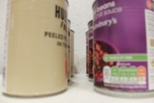
Finally, a weak visual pun on Tin Pan Alley, using Tin Cans...
Torn between the first and 4th, with the first just taking it IMO.
For this week, I had a couple of options for alleys that are easy to get at, although neither is actually an alley! BUT, one was originally an alley before it was renamed a street and the other was thought to have been an inspiration for Diagon Alley in the Harry Potter books - JKR was a student here. (I reckon a small covered walkway between that and a small car park is more likely to be that inspiration but it was too dark to get a naturally lit shot and the "fill in" flash I attempted [I'm anything BUT a flash master!!!] took over.)
So, here are the shots, with a shoehorn added for fun!
Parliament Street (Formerly Parliament ALLEY)
From the High Street end.

Being a little wider than 2'1", I had to turn sideways to shuffle down it to the far end.

Next up is Gandy Street and New Buildings. Gandy Street is the open air one and New Buildings is rather more enclosed.


Finally, a weak visual pun on Tin Pan Alley, using Tin Cans...

Torn between the first and 4th, with the first just taking it IMO.
- Messages
- 3,145
- Name
- bill
- Edit My Images
- Yes
I think that you've chosen the best one. Visually interesting and great DOF.
